The Chicago Bears logo stands as one of the most recognizable symbols in professional football. It represents more than a century of NFL history.
The franchise, founded in 1919 as the Decatur Staleys, has used variations of its current logo since 1962. That famous wishbone C has become synonymous with Chicago football itself.
Within NFL logos, the Bears mark holds a unique position. It’s one of the few that relies entirely on a letterform rather than a mascot image. The team has gone through approximately eight logo versions throughout its existence.
The current design was refined in 1974 and remains largely unchanged today.
What Is the Chicago Bears Logo?
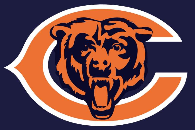
The Chicago Bears logo is a stylized wishbone-shaped letter C rendered in navy blue with a burnt orange outline. Officially introduced in 1962 and refined in 1974, it symbolizes Chicago’s identity and the team’s connection to its city. No specific designer has been publicly credited.
Design Specifications
- Design Type: Lettermark (single letter emblem)
- Primary Elements: Wishbone-shaped capital C with rounded terminals
- Official Introduction Date: 1962 (current form refined 1974)
- Designer/Agency: Not publicly attributed
- Trademark Status: Registered trademark of the Chicago Bears Football Club
- Color Palette: Navy Blue (PMS 5395) and Burnt Orange (PMS 1665)
- Usage Context: Helmets, uniforms, merchandise, Soldier Field signage, digital platforms, official communications
How Has the Chicago Bears Logo Evolved Over Time?
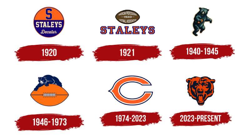
The Bears logo has transformed from text-based wordmarks to the iconic C we know today.
Early versions featured full team names and bear imagery.
The shift to a simplified letterform happened in 1962, reflecting broader design trends toward cleaner sports branding.
Original Decatur Staleys Era (1919-1921)
- Years Active: 1919-1921
- Design Description: Simple text-based wordmark reading “Staleys”
- Color Scheme: Navy and orange (established early)
- Designer: Unknown
- Context: Team founded by A.E. Staley as a company team for the Staley Starch Works
- Key Changes from Previous: Original design, no predecessor
- Cultural Significance: Represented the team’s industrial origins in Decatur, Illinois
Early Chicago Bears Wordmark (1922-1939)
- Years Active: 1922-1939
- Design Description: Text-based “Bears” wordmark, sometimes accompanied by bear illustrations
- Color Scheme: Navy blue and orange
- Designer: Unknown
- Context: George Halas moved the team to Chicago in 1921 and renamed them Bears in 1922
- Key Changes from Previous: New name reflecting Chicago identity and proximity to Cubs (baseball bears)
- Cultural Significance: Established the Bears name that would become legendary
Bear Mascot Logo (1940-1945)
- Years Active: 1940-1945
- Design Description: Running bear figure in an aggressive stance
- Color Scheme: Navy blue, orange, white
- Designer: Unknown
- Context: Era of the “Monsters of the Midway” dominance
- Key Changes from Previous: First use of actual bear imagery
- Cultural Significance: Matched the team’s fierce on-field reputation during championship years
Bear Head Logo (1946-1961)
- Years Active: 1946-1961
- Design Description: Stylized bear head facing forward or in profile
- Color Scheme: Navy blue and orange with white accents
- Designer: Unknown
- Context: Post-war era, professional football gaining national popularity
- Key Changes from Previous: Shifted from full bear body to head only
- Cultural Significance: Represented a more focused, modern approach to team branding
Wishbone C Introduction (1962-1973)
- Years Active: 1962-1973
- Design Description: Stylized C with distinctive wishbone shape
- Color Scheme: Navy blue with orange outline
- Designer: Unknown
- Context: NFL expanding nationally, teams needed cleaner broadcast-friendly logos
- Key Changes from Previous: Complete departure from bear imagery to abstract letterform
- Cultural Significance: Bold move that created one of sports’ most distinctive marks
Current Refined Logo (1974-Present)
- Years Active: 1974-present
- Design Description: Refined wishbone C with cleaner lines and standardized proportions
- Color Scheme: PMS 5395 Navy Blue, PMS 1665 Burnt Orange
- Designer: Unknown (internal refinement)
- Context: Standardization era for NFL branding and merchandise
- Key Changes from Previous: Subtle refinements to curves and stroke weight for better reproduction
- Cultural Significance: Became cemented as the definitive Bears symbol through Super Bowl XX era
What Do the Design Elements of the Chicago Bears Logo Mean?
The wishbone C carries layered meaning beyond just representing Chicago.
Its distinctive shape creates instant recognition while connecting to the city’s identity.
The form suggests strength and tradition without relying on literal bear imagery.
Why Did the Chicago Bears Choose These Specific Colors?
Navy blue and burnt orange have defined Bears branding since the earliest days. The navy communicates strength, stability, and professionalism. It’s a color that photographs well and reads clearly on television.
Orange brings energy and aggression to the palette. The specific burnt orange shade avoids looking too bright or cartoonish. Together, these colors create a complementary color scheme that stands out on the field.
According to color psychology, blue builds trust while orange triggers excitement. That combination works well for a sports franchise.
- Navy Blue (PMS 5395): Hex #0B162A, represents tradition, authority, and Chicago’s working-class strength
- Burnt Orange (PMS 1665): Hex #C83803, symbolizes energy, determination, and competitive fire
- White: Used as accent for contrast and clarity in certain applications
What Typography Style Is Used in the Chicago Bears Logo?
The primary logo doesn’t include traditional typography. It’s purely the wishbone C letterform.
But that C functions as a custom glyph. The stroke weight stays consistent throughout. Terminals curve inward with a specific radius that gives the mark its distinctive character.
For wordmarks and supporting text, the Bears use custom and proprietary fonts. These typically feature bold sans-serif characteristics that match the logo’s strength.
What Are the Hidden Meanings in the Chicago Bears Logo?
The “wishbone” shape isn’t accidental. Some believe it references the wishbone offensive formation popular in football.
Others see it as symbolizing good luck and fortune for the team.
The open ends of the C could represent arms reaching out, embracing Chicago’s fans and community. The thick stroke weight communicates power and permanence.
There’s no official statement on hidden meanings. But the design’s longevity suggests it resonates on multiple levels with fans.
How Does the Chicago Bears Logo Compare to Competitor Logos?
Within the NFC North, the Bears logo takes a distinctly different approach than its rivals.
The Green Bay Packers logo uses a similar letterform concept with its iconic G.
The Detroit Lions logo and Minnesota Vikings logo both feature animal imagery.
Looking across the NFL, few teams commit so fully to a single letter. The Cincinnati Bengals logo uses a B with stripes. The Cleveland Browns logo famously uses just a helmet.
The Bears mark aligns more closely with minimalist design principles than most NFL teams. It proves that white space and simplicity can create powerful brand recognition.
What Are the Technical Specifications of the Chicago Bears Logo?
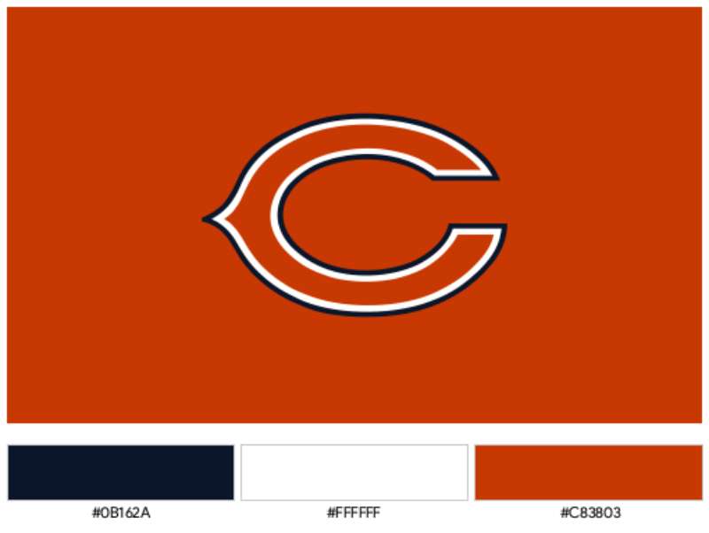
Official Color Codes
- Navy Blue (Primary)
- Hex: #0B162A
- RGB: (11, 22, 42)
- CMYK: (100, 90, 50, 60)
- Pantone: PMS 5395 C
- Burnt Orange (Secondary)
- Hex: #C83803
- RGB: (200, 56, 3)
- CMYK: (0, 85, 100, 10)
- Pantone: PMS 1665 C
- White (Accent)
- Hex: #FFFFFF
- RGB: (255, 255, 255)
- CMYK: (0, 0, 0, 0)
Dimensions and Proportions
- Aspect Ratio: Approximately 1:1 (the C fits within a square bounding box)
- Stroke Weight: Consistent throughout the letterform
- Minimum Size: Must remain legible at 0.5 inches in print applications
- Clear Space: Minimum padding equal to the height of the orange outline on all sides
- Digital Usage: Vector graphics preferred for scalability; minimum 50 pixels for web
What Cultural Impact Has the Chicago Bears Logo Had?
The wishbone C transcends football in Chicago. You see it everywhere, on hats in coffee shops, tattoos on lifelong fans, murals in neighborhoods.
It became a symbol of the city itself during the 1985 Super Bowl run. That team turned the logo into a cultural phenomenon.
The design has influenced how other sports franchises think about simplicity. It proved that you don’t need a detailed mascot illustration to build powerful brand recognition.
How Does the Chicago Bears Logo Fit Into the Overall Brand Identity?
The logo serves as the anchor for everything Bears-related. It connects to Soldier Field, the team’s uniforms, merchandise, and digital presence.
The GSH sleeve patch (honoring George S. Halas) complements the primary mark. Staley Da Bear, the team mascot, exists alongside but separate from the logo identity.
The brand guidelines ensure consistency across all touchpoints. Navy and orange appear throughout the stadium, website, and official communications. This creates a unified brand style that fans instantly recognize.
How Should the Chicago Bears Logo Be Used?
Official Usage Guidelines
- Do: Use official logo files from NFL or Chicago Bears media resources
- Do: Maintain proper clear space around the logo
- Do: Use approved color combinations only
- Don’t: Stretch, rotate, or distort the logo
- Don’t: Add effects like shadows, gradients, or outlines
- Don’t: Place the logo on busy backgrounds that reduce legibility
- Don’t: Recreate or modify the logo shape
Accessing Official Assets
Media members can access official logos through NFL Media. Licensed merchandise manufacturers receive assets through NFL Properties.
Fan use falls under standard trademark restrictions. Personal, non-commercial use is generally tolerated. Commercial use requires licensing agreements with the Chicago Bears organization.
Trademark Protection
The wishbone C is a registered trademark. The Chicago Bears actively protect their intellectual property. Unauthorized commercial use can result in legal action.
This includes knockoff merchandise, unauthorized apparel, and digital misuse. If you’re creating something for sale, you need proper licensing.
FAQ on The Chicago Bears Logo
What Does the Chicago Bears Logo Represent?
The wishbone C represents Chicago itself. Not the bear. Not the team mascot.
Just the city.
It connects the NFL franchise to its hometown identity. The shape suggests strength and tradition while keeping the design clean and memorable for fans and merchandise.
Why Is the Chicago Bears Logo a C Instead of a Bear?
The team switched to a lettermark in 1962. Bear imagery felt dated.
A simple C worked better on helmets and television broadcasts. It created stronger visual hierarchy than detailed animal illustrations ever could.
Sometimes less actually works better.
When Was the Current Chicago Bears Logo Introduced?
The current version dates to 1974. That’s when the team refined the original 1962 wishbone C design.
They cleaned up the lines. Standardized the proportions. Made it reproduce better across different media and team merchandise applications.
Who Designed the Chicago Bears Logo?
Nobody knows for sure. The Bears have never publicly credited a specific designer or agency.
It likely came from internal team decisions during the early 1960s. George Halas probably had final say on the direction.
What Are the Official Chicago Bears Logo Colors?
Navy blue and burnt orange. Those are the only two colors in the primary Bears emblem.
The navy reads as PMS 5395. The orange is PMS 1665. White appears in some uniform applications but isn’t part of the core color palette.
Has the Chicago Bears Logo Changed Over Time?
Yes. The franchise has used roughly eight different logos since 1919.
Early versions featured bear mascots and wordmarks. The Decatur Staleys era had completely different branding. The wishbone C brought stability that’s lasted over 60 years now.
What Is the Wishbone C?
It’s the distinctive curved shape of the Bears lettermark. The terminals curve inward like a wishbone.
Some say it references the wishbone football formation. Others think it just looks good. The psychology of shapes suggests curved forms feel approachable yet strong.
Why Don’t the Bears Use a Bear in Their Logo Anymore?
They did until 1962. Bear imagery appeared on uniforms and promotional materials for decades.
The shift toward abstract logo design changed things. Clean letterforms worked better for the growing NFL brand and Soldier Field merchandise.
What Font Does the Chicago Bears Use?
The primary logo isn’t really a typeface. It’s a custom letterform.
For supporting text, the Bears use proprietary fonts with bold characteristics. These complement the logo’s weight and create consistent team identity across jerseys and marketing.
Can I Use the Chicago Bears Logo for My Own Projects?
Depends on the project. Personal, non-commercial use is generally tolerated by the franchise.
Commercial use requires licensing through NFL Properties. The trademark is actively protected. Selling knockoff Bears gear or apparel will get you in trouble.
Conclusion
The Chicago Bears logo proves that simplicity wins. One letter. Two colors. Over sixty years of recognition.
That wishbone C connects generations of fans to Soldier Field, to the Monsters of the Midway, to Super Bowl XX glory.
Few NFL team logos achieve this kind of staying power. The Bears helmet design hasn’t needed a trendy redesign or flashy update. It just works.
George Halas built a franchise. The logo became its visual shorthand.
Navy and burnt orange will keep flying over Chicago for decades to come. That’s the power of good logo design principles at work.

Renowned for his expertise in logo design and visual branding, Bogdan has developed a multitude of logos for various clients.
His skills extend to creating posters, vector illustrations, business cards, and brochures. Additionally, Bogdan's UI kits were featured on marketplaces like Visual Hierarchy and UI8.
He also wrote in the past years on sites like Design Your Way, WebDesignerDepot, WPDean, Designmodo, Speckyboy, Slider Revolution, and more.
- Best Email Design System Examples From Leading Brands - 5 October 2026
- Canva AI Features Reviewed: Are They Actually Useful? - 4 October 2026
- The Substack Logo History, Colors, Font, And Meaning - 2 October 2026

Bogdan Sandu is a seasoned designer who has been designing websites since 2008. Renowned for his expertise in logo design and visual branding, Bogdan has developed a multitude of logos for various clients. His skills extend to creating posters, vector illustrations, business cards, and brochures. Additionally, Bogdan's UI kits were featured on marketplaces like Visual Hierarchy and UI8. He also wrote in the past years on sites like Design Your Way, WebDesignerDepot, WPDean, Designmodo, Speckyboy, Slider Revolution, and more.
You Might Also Like