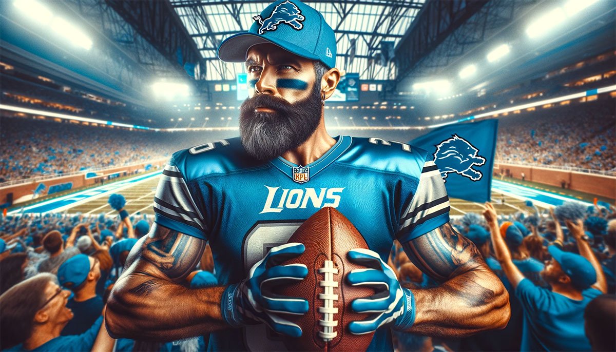
The Detroit Lions logo represents one of the NFL’s oldest franchises, carrying decades of football history in a single image. This fierce lion emblem has become synonymous with professional football in Michigan.
The franchise joined the league in 1930 as the Portsmouth Spartans before relocating to Detroit in 1934. That move brought the Lions name and the iconic feline symbol that fans recognize today.
Understanding what makes a logo work requires looking at both design and emotion. The Detroit Lions logo does both well. It connects generations of fans through consistent visual identity while adapting to modern design standards.
The current version debuted in 2017. It marks the eighth major iteration since the team’s founding. The logo has gone through subtle refinements and complete overhauls across nine decades of professional football.
What Is the Detroit Lions Logo?
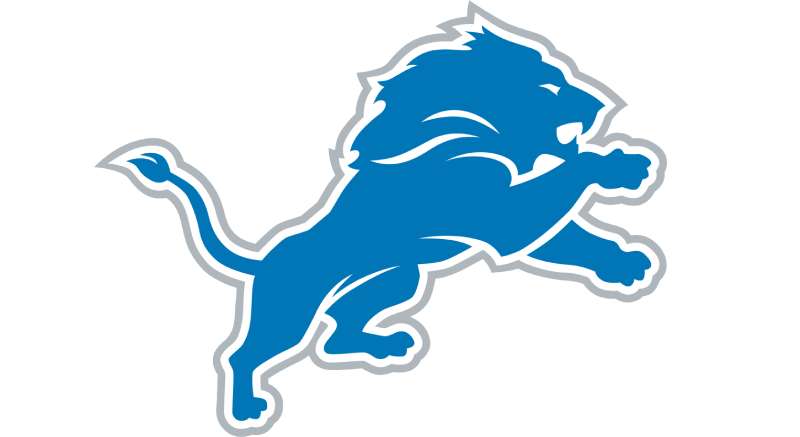
The Detroit Lions logo features a silver lion in mid-stride facing left, set against Honolulu blue. Introduced in 2017, this mascot-based emblem symbolizes strength, speed, and competitive spirit central to the franchise identity.
Design Type: Mascot-based primary mark with supporting wordmark
Primary Elements: Stylized leaping lion silhouette with angular, aggressive features
Official Introduction Date: April 2017
Designer/Agency: NFL Properties in collaboration with the Detroit Lions organization
Trademark Status: Registered trademark of the Detroit Lions and NFL Properties LLC
Color Palette:
- Honolulu Blue (Hex: #0076B6)
- Silver (Hex: #B0B7BC)
- White (Hex: #FFFFFF)
- Black (Hex: #000000)
Usage Context: Helmets, uniforms, Ford Field signage, merchandise, digital platforms, and broadcast graphics
How Has the Detroit Lions Logo Evolved Over Time?
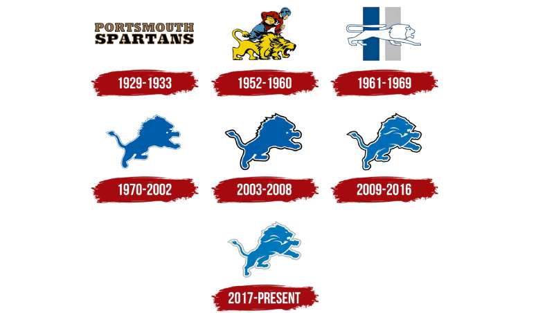
The Detroit Lions logo has transformed eight times since 1934. Each version reflected design trends of its era while maintaining the core lion imagery.
Early designs featured realistic lion illustrations. Later versions moved toward stylized, aggressive representations.
The franchise has never abandoned the lion concept. That consistency built one of the most recognizable brands among NFL logos.
Original Detroit Lions Logo (1934-1945)
Years Active: 1934-1945
Design Description: A crouching lion in a realistic illustration style. The animal appeared ready to pounce, with detailed fur texturing and naturalistic proportions.
Color Scheme: Blue and silver from day one. The team established these colors immediately upon relocating from Portsmouth.
Designer: Unknown, likely internal team decision
Context: The Portsmouth Spartans became the Detroit Lions when radio executive G.A. Richards purchased the team. He wanted a name that conveyed royalty and power. Lions are king of the jungle. The Detroit Tigers already dominated local baseball. A lion felt like the natural football counterpart.
Cultural Significance: This first logo established the visual foundation that still exists today. It gave Detroit fans their first symbol to rally behind.
Post-War Detroit Lions Logo (1945-1951)
Years Active: 1945-1951
Design Description: A simplified lion facing right. The design removed some detail from the original while keeping the crouching stance.
Color Scheme: Maintained Honolulu blue and silver
Key Changes from Previous: Cleaner lines, less realistic rendering. The lion appeared more graphic than illustrative.
Context: Post-war America saw design trends shift toward simplification. The Lions followed suit.
Championship Era Logo (1952-1960)
Years Active: 1952-1960
Design Description: The lion took on a running pose. This version showed more movement and athleticism than earlier static designs.
Color Scheme: Honolulu blue remained primary with silver accents
Key Changes from Previous: Dynamic pose replaced the crouching position. The lion now appeared in full stride.
Cultural Significance: This logo coincided with the franchise’s most successful period. The Lions won three NFL championships in 1952, 1953, and 1957. Fans associate this era with Bobby Layne and the glory days.
Transitional Logo (1961-1969)
Years Active: 1961-1969
Design Description: A leaping lion with a more aggressive facial expression. The body showed muscular definition.
Color Scheme: Blue and silver continued
Key Changes from Previous: Fiercer expression, more athletic build. The design projected power over grace.
Context: The NFL expanded during this decade. Teams invested more in brand identity as television brought football into homes nationwide.
Modernization Era Logo (1970-2002)
Years Active: 1970-2002
Design Description: A streamlined lion in mid-leap. This became the longest-running design in franchise history.
Color Scheme: Honolulu blue, silver, white, and black outline
Key Changes from Previous: Cleaner geometry, bolder outlines. The design translated well to television broadcasts and merchandise.
Cultural Significance: This logo appeared on Barry Sanders’ helmet. It became inseparable from his highlight-reel runs. An entire generation of fans grew up with this version.
Silver Stretch Era Logo (2003-2008)
Years Active: 2003-2008
Design Description: A silver and blue lion with a more menacing expression. The design added depth through shading.
Color Scheme: Shifted emphasis to silver as primary with blue accents
Key Changes from Previous: Three-dimensional appearance, more aggressive facial features. The color balance changed significantly.
Context: The team rebranded alongside Ford Field’s opening. New stadium, new look. Unfortunately, this era included the 0-16 season in 2008.
Return to Blue Logo (2009-2016)
Years Active: 2009-2016
Design Description: The lion returned to Honolulu blue dominance. Refined details gave the design a cleaner look.
Color Scheme: Honolulu blue primary, silver secondary
Key Changes from Previous: Color hierarchy flipped back to blue. The lion’s pose remained similar but with subtle refinements.
Cultural Significance: Calvin Johnson’s record-breaking years happened under this logo. Fans watched Megatron dominate with this emblem on his helmet.
Current Detroit Lions Logo (2017-Present)
Years Active: 2017-present
Design Description: The most angular and aggressive lion yet. Sharp lines create a powerful, modern appearance.
Color Scheme: Honolulu blue, silver, white, black
Designer: NFL Properties with Detroit Lions input
Key Changes from Previous: Sharper angles throughout. The mane features more defined points. The overall shape reads faster and more athletic.
Context: The team wanted a logo that worked across digital platforms. Flat design trends influenced the direction. The result scales beautifully from massive stadium graphics to tiny social media icons.
What Do the Design Elements of the Detroit Lions Logo Mean?
The leaping lion represents forward momentum and predatory excellence. Every angle points toward progress.
The leftward orientation breaks NFL convention. Most team logos face right, symbolizing moving forward. Detroit’s lion faces left intentionally.
This mirrors the direction players face when lined up on offense. The lion leads the charge.
Why Did Detroit Lions Choose These Specific Colors?
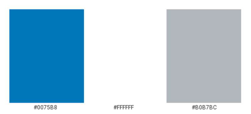
The franchise selected Honolulu blue because it stood apart from other teams. No one else had it.
Blue carries significant meaning in color psychology. It suggests loyalty, trust, and confidence. Perfect for a sports brand.
Honolulu Blue
- Hex: #0076B6
- Pantone: PMS 7462
- Meaning: Uniqueness, tropical vibrancy despite cold Michigan winters
- Impact: Instant recognition, differentiates from standard navy blues
Silver
- Hex: #B0B7BC
- Meaning: Sophistication, strength, industrial heritage
- Connection: Reflects Detroit’s automotive legacy, particularly the connection to the Ford family ownership
This color palette makes the Lions instantly recognizable among blue logos across professional sports.
What Typography Style Is Used in the Detroit Lions Logo?
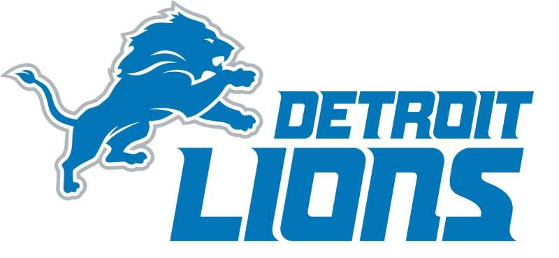
The Lions wordmark uses a custom sans-serif font with sharp angles matching the lion mark.
Letter shapes echo the aggressive geometry of the primary logo. Consistency matters.
The typography choices changed alongside logo updates. Earlier wordmarks featured rounder letterforms.
Current font characteristics include pointed terminals and angled cuts. These details reinforce the predatory theme.
What Are the Hidden Meanings in the Detroit Lions Logo?
The lion’s mane flows backward in pointed sections. Some see these as speed lines suggesting rapid movement.
The eye position creates direct engagement. The lion appears to make eye contact with viewers.
Leg positioning implies mid-leap action. The animal never appears at rest. Always pursuing, always hunting.
The psychology of shapes comes into play here. Angular forms suggest aggression and action. Curved elements indicate friendliness. The Lions went almost entirely angular.
How Does the Detroit Lions Logo Compare to Competitor Logos?
NFC North rivals take different design approaches. The Green Bay Packers logo uses simple geometry. Just a G in an oval.
The Chicago Bears logo features a wishbone C. Another lettermark approach.
The Minnesota Vikings logo uses a horn-helmeted Norseman. That’s the only mascot-based mark in the division besides Detroit.
The Lions logo carries the most literal representation. You see a lion. No abstraction needed. This works well for merchandise and gives fans a clear symbol to rally behind.
Compared to other cat-based logos in the league like the Carolina Panthers logo and Jacksonville Jaguars logo, Detroit’s lion appears less fierce in expression but more dynamic in pose.
What Are the Technical Specifications of the Detroit Lions Logo?
Official Color Codes:
Honolulu Blue (Primary)
Silver (Secondary)
- Hex: #B0B7BC
- RGB: (176, 183, 188)
- CMYK: (7, 3, 0, 26)
- Pantone: PMS 429
Black (Accent)
- Hex: #000000
- RGB: (0, 0, 0)
- CMYK: (0, 0, 0, 100)
White (Accent)
- Hex: #FFFFFF
- RGB: (255, 255, 255)
Dimensions and Proportions:
- Aspect ratio: Approximately 1.2:1 (width to height)
- Minimum size: 0.5 inches for print applications
- Clear space: Equal to half the logo height on all sides
- The logo exists as vector graphics for infinite scalability
What Cultural Impact Has the Detroit Lions Logo Had?
The Honolulu blue lion transcends football in Detroit. It represents the city’s resilience and pride.
Fans wear the logo year-round. Not just on game days. It shows up at weddings, graduations, and funerals.
The Thanksgiving Day tradition made this logo nationally familiar. Decades of holiday football put the leaping lion in living rooms across America.
Despite playoff struggles, the logo never lost its power. Fans stayed loyal to the symbol even through the 0-16 season.
How Does the Detroit Lions Logo Fit Into the Overall Brand Identity?
The logo anchors a complete visual system. Every touchpoint connects back to the leaping lion.
Ford Field’s interior design incorporates the blue and silver throughout. The logo appears on the 50-yard line, in premium suites, and on every concession stand.
Team brand guidelines dictate exact usage rules. Typography, colors, and logo placement follow strict standards.
The lion mark works with supporting elements like the script “Lions” wordmark and the “WCF” patch honoring William Clay Ford Sr.
How Should the Detroit Lions Logo Be Used?
Official Usage Guidelines:
Do:
- Use official logo files from NFL Properties or team sources
- Maintain clear space requirements around the mark
- Use approved color variations (full color, single color, reversed)
- Keep proportions locked when scaling
Don’t:
- Stretch, skew, or rotate the logo
- Add effects like drop shadows or gradients
- Place on busy backgrounds that reduce legibility
- Recreate or modify the design in any way
- Use for commercial purposes without licensing
Where to Access Official Logos: NFL Properties manages team logos. Licensed vendors receive approved files. Personal use versions appear on the Detroit Lions official website media section.
Licensing Information: Commercial use requires NFL licensing agreements. The league protects team marks aggressively. Unauthorized use faces legal consequences.
Trademark Protection: The Detroit Lions name, logo, and Honolulu blue color combination hold federal trademark registration. The NFL monitors and enforces these protections league-wide.
FAQ on The Detroit Lions Logo
What Colors Are in the Detroit Lions Logo?
The official colors are Honolulu blue and silver. White and black serve as accent colors.
Honolulu blue (hex #0076B6) sets the Lions apart from every other NFL franchise. No one else uses this specific hue.
Silver reflects Detroit’s automotive heritage and Ford family ownership.
When Was the Current Detroit Lions Logo Introduced?
The current logo debuted in April 2017. It replaced the previous version used since 2009.
This redesign brought sharper angles and a more aggressive appearance. The team wanted a modern look that worked across digital platforms and merchandise.
Who Designed the Detroit Lions Logo?
NFL Properties developed the 2017 logo in collaboration with the Detroit Lions organization. Individual designer credits remain unpublished.
Most NFL team logos come through league-affiliated design teams. This ensures consistency with broadcast standards and trademark requirements.
What Does the Detroit Lions Logo Represent?
The leaping lion symbolizes strength, speed, and competitive excellence. It represents the king of beasts in full attack mode.
Lions paired naturally with the Detroit Tigers baseball team. Owner G.A. Richards wanted that royal connection when he renamed the franchise in 1934.
How Many Times Has the Detroit Lions Logo Changed?
The franchise has used eight distinct logo versions since 1934. Each reflected design trends of its era.
The longest-running version lasted from 1970 to 2002. Barry Sanders wore that logo throughout his Hall of Fame career at Ford Field’s predecessor, the Pontiac Silverdome.
Why Is the Lions’ Blue Called Honolulu Blue?
The name references the vibrant blue waters of Hawaii. Original team owner G.A. Richards selected this unique shade in 1934.
He wanted a color no other team had. Mission accomplished. The saturation level makes it instantly recognizable among NFC North rivals.
Can I Use the Detroit Lions Logo for Personal Projects?
Personal, non-commercial use typically gets tolerated. Commercial use requires licensing through NFL Properties.
The league actively protects team trademarks. Selling merchandise or using the logo for business purposes without permission brings legal consequences. Always check official guidelines first.
Where Can I Download the Official Detroit Lions Logo?
The Detroit Lions official website offers media resources. NFL Properties provides licensed files to approved vendors.
For high-resolution versions, check the team’s press kit section. Most fan downloads work fine for personal wallpapers and social media. Avoid random websites with questionable file quality.
What Font Does the Detroit Lions Wordmark Use?
The Lions use a custom typeface designed specifically for the brand. Sharp angles match the primary lion mark.
You won’t find this exact typography style available for public download. Similar aggressive sans-serif fonts exist, but the official version remains proprietary to the franchise.
Why Does the Detroit Lions Logo Face Left?
The leftward orientation mirrors offensive players lined up before the snap. The lion leads the charge toward the end zone.
Most NFL logos face right. Detroit breaks convention intentionally. This creates a distinct focal point and visual tension that grabs attention.
Conclusion
The Detroit Lions logo stands as one of professional football’s most enduring visual identities. Eight decades of evolution brought us to today’s angular, aggressive lion mark.
Honolulu blue remains unmatched across the NFL. That commitment to a unique team color scheme built instant recognition.
From the Portsmouth Spartans origins to NFC North battles at Ford Field, this franchise emblem carried fans through championships and heartbreak alike.
The leaping lion does what great storytelling should. It connects generations through a single, powerful image.
Few sports logos achieve that kind of lasting emphasis in their market.

Renowned for his expertise in logo design and visual branding, Bogdan has developed a multitude of logos for various clients.
His skills extend to creating posters, vector illustrations, business cards, and brochures. Additionally, Bogdan's UI kits were featured on marketplaces like Visual Hierarchy and UI8.
He also wrote in the past years on sites like Design Your Way, WebDesignerDepot, WPDean, Designmodo, Speckyboy, Slider Revolution, and more.
- Minecraft Font Generator - 8 October 2026
- How Top Meta Ad Creative Is Designed for E-commerce Brands - 8 October 2026
- How photo recovery software works and when to use it - 7 October 2026

Bogdan Sandu is a seasoned designer who has been designing websites since 2008. Renowned for his expertise in logo design and visual branding, Bogdan has developed a multitude of logos for various clients. His skills extend to creating posters, vector illustrations, business cards, and brochures. Additionally, Bogdan's UI kits were featured on marketplaces like Visual Hierarchy and UI8. He also wrote in the past years on sites like Design Your Way, WebDesignerDepot, WPDean, Designmodo, Speckyboy, Slider Revolution, and more.
You Might Also Like