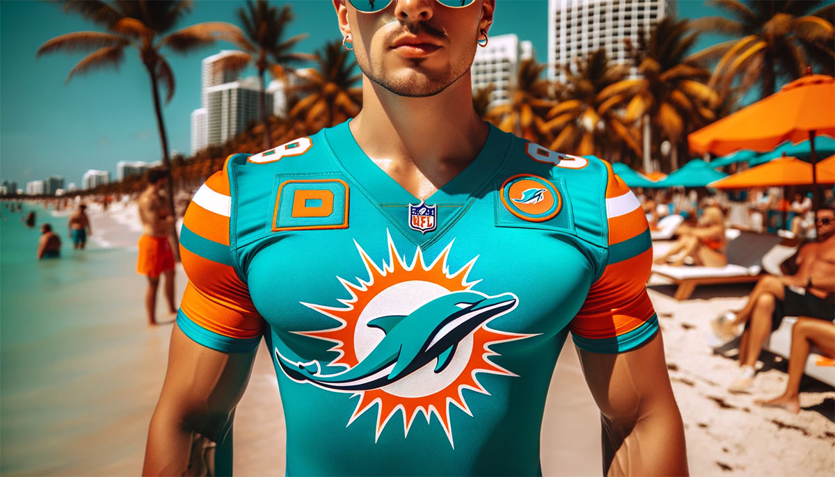
The Miami Dolphins logo stands as one of the most recognizable emblems in professional football. Since 1966, this aquatic mascot has represented South Florida’s NFL franchise through multiple design iterations.
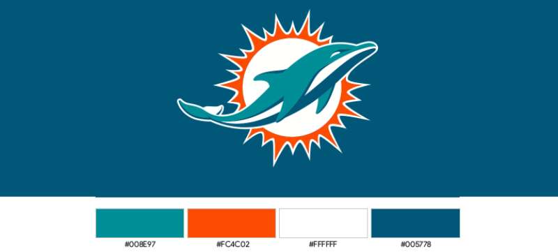
The current version debuted in 2013, marking the team’s most significant visual overhaul in decades. It features a streamlined dolphin silhouette positioned in front of a sunburst pattern.
Understanding what makes a logo work helps explain why this design has maintained such strong fan recognition. The Dolphins have used five primary logo versions since their founding, each reflecting different eras in both team history and graphic design trends.
What Is the Miami Dolphins Logo?
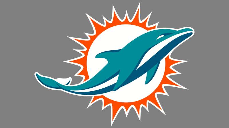
The Miami Dolphins logo is a combination mark featuring a stylized dolphin jumping through a circular sunburst design. Introduced in 2013, it was created by Advent Design Group. The logo symbolizes speed, agility, and the sunny Florida identity.
Design Type: Combination mark (mascot plus abstract elements)
Primary Elements:
- Stylized leaping dolphin in profile view
- Navy blue sunburst background
- Circular frame suggesting motion and energy
Official Introduction Date: April 18, 2013
Designer/Agency: Advent Design Group
Trademark Status: Registered trademark of the Miami Dolphins Ltd.
Color Palette:
- Aqua (#008E97)
- Orange (#FC4C02)
- Navy Blue (#005778)
- White (#FFFFFF)
Usage Context: Helmets, uniforms, stadium signage, merchandise, digital platforms, broadcast graphics, and all official team communications.
How Has the Miami Dolphins Logo Evolved Over Time?
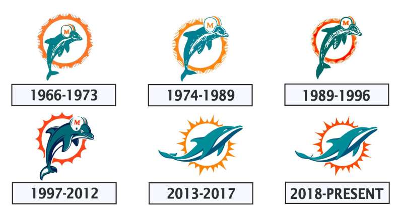
The Miami Dolphins have gone through five distinct logo designs since 1966. Each version reflected changing tastes in sports branding.
The original cartoon dolphin gave way to increasingly refined designs. The most dramatic shift came in 2013 when the team abandoned its helmet-wearing mascot entirely.
Looking at NFL logos across the league, you can see how the Dolphins’ evolution mirrors broader trends in professional sports branding.
Original Miami Dolphins Logo (1966-1973)
Years Active: 1966-1973
Design Description: A cartoonish teal dolphin wearing an “M” branded football helmet, positioned in front of a coral sunburst. The dolphin appeared to be smiling and leaping upward.
Color Scheme: Aqua, coral orange, and white
Designer: The exact designer remains undocumented in official team records.
Context: Created for the franchise’s inaugural AFL season. The playful design reflected the optimistic, fun-loving spirit of 1960s Miami.
Cultural Significance: This logo accompanied the team through its early struggles and eventual rise to dominance, including the perfect 1972 season.
Modified Classic Logo (1974-1989)
Years Active: 1974-1989
Design Description: Essentially the same dolphin and sunburst concept with subtle refinements. The colors became slightly more saturated. Line work was cleaned up for better reproduction.
Color Scheme: Deeper aqua, brighter orange, white
Key Changes from Previous: Minor proportional adjustments. The sunburst rays became more uniform. Overall appearance remained largely consistent with the original.
Cultural Significance: This version witnessed the Dan Marino era begin. It became synonymous with high-powered offensive football.
Updated Classic Logo (1989-1996)
Years Active: 1989-1996
Design Description: The dolphin retained its helmet but received sharper detailing. The sunburst stayed but with cleaner edges. Colors were standardized for television broadcast requirements.
Color Scheme: Aqua, orange, white with improved color consistency
Key Changes from Previous: Better suited for emerging digital media. The design held up across merchandise and broadcast graphics.
Context: Television was changing how fans experienced sports. The logo needed to read clearly on smaller screens.
Modernized Logo (1997-2012)
Years Active: 1997-2012
Design Description: A darker, more aggressive interpretation. The dolphin appeared more muscular. The helmet featured an updated “M” design. Navy blue replaced some aqua tones. The overall feel became more serious.
Color Scheme: Navy blue, aqua, orange, white
Designer: Internal team redesign with NFL Properties oversight
Key Changes from Previous: Significantly darker palette. More athletic, less playful aesthetic. The dolphin’s expression seemed more determined.
Cultural Significance: This logo marked a clear break from the franchise’s past glories. It represented attempts to build a new identity after Marino’s retirement.
Current Logo (2013-Present)
Years Active: 2013-present
Design Description: A completely reimagined dolphin without a helmet. The aquatic mammal now appears as a sleek silhouette leaping through a stylized sunburst. The design embraces minimalist design principles.
Color Scheme: Return to brighter aqua (#008E97), vibrant orange (#FC4C02), navy blue (#005778), white
Designer: Advent Design Group
Key Changes from Previous: Removal of the football helmet. Complete stylistic overhaul. Return to brighter color values. More contemporary, streamlined appearance.
Cultural Significance: The redesign sparked debate among fans. Some mourned the loss of the classic helmet-wearing dolphin. Others embraced the modern look.
What Do the Design Elements of the Miami Dolphins Logo Mean?
Every element in the current logo carries specific meaning. The leaping dolphin represents speed and athleticism.
The sunburst behind it symbolizes Florida’s sunshine and warmth. Together, they create a complete picture of the Miami identity.
Understanding the psychology of shapes reveals why circles and curved forms feel so appropriate here. They suggest motion, continuity, and approachability.
Why Did Miami Dolphins Choose These Specific Colors?
Aqua (#008E97)
The primary aqua represents ocean waters surrounding South Florida. It suggests coolness, clarity, and depth.
Understanding color psychology explains why this shade works. Aqua communicates trust and calm confidence.
Orange (#FC4C02)
The vivid orange reflects Florida sunsets and citrus heritage. It provides energy and warmth against the cooler aqua tones.
Orange signals enthusiasm and creativity. It demands attention without aggression.
Navy Blue (#005778)
Navy adds depth and authority to the palette. It grounds the brighter colors with professional stability.
This shade conveys strength and reliability. It also improves overall contrast in the design.
White (#FFFFFF)
White provides breathing room between elements. It keeps the logo from feeling heavy or cluttered.
What Typography Style Is Used in the Miami Dolphins Logo?
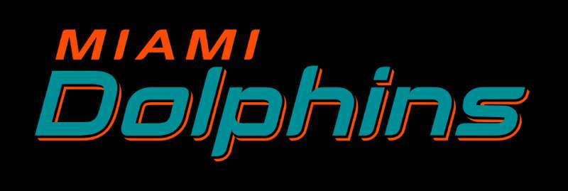
The Dolphins use a custom sans-serif typeface for their wordmark. It features bold, athletic letterforms with subtle curves.
The letters have slightly rounded terminals. This softens the otherwise strong appearance.
Understanding sans-serif fonts helps explain this choice. They communicate modernity and straightforward strength.
The typeface evolved alongside the logo. Earlier versions used more traditional sports lettering.
What Are the Hidden Meanings in the Miami Dolphins Logo?
The dolphin faces right, suggesting forward movement. In Western design, rightward motion implies progress and optimism.
The sunburst contains exactly eight rays in the current version. Some fans see this as representing championship aspirations.
The dolphin’s eye placement creates a sense of determination. It appears focused on a goal ahead.
Designers have not confirmed specific hidden meanings. But the overall composition encourages these interpretations naturally.
How Does the Miami Dolphins Logo Compare to Competitor Logos?
Among AFC East rivals, the Dolphins logo stands apart through its use of a full animal mascot. The Buffalo Bills logo features a charging bison that shares the dynamic animal approach.
The New England Patriots logo uses a more stylized head profile. The New York Jets logo takes a completely different direction with its text-based football design.
Looking beyond the division, the Dolphins share aquatic themes with no other NFL team. This uniqueness strengthens brand recognition.
The Jacksonville Jaguars logo offers the nearest comparison with its leaping cat design. Both use animal silhouettes in profile view.
Color-wise, the Dolphins own their aqua shade. No other green-toned logo in the league comes close to this specific hue.
What Are the Technical Specifications of the Miami Dolphins Logo?
Official Color Codes:
Primary – Aqua
Secondary – Orange
- Hex: #FC4C02
- RGB: (252, 76, 2)
- CMYK: (0, 70, 99, 1)
- Pantone: 166 C
Tertiary – Navy Blue
- Hex: #005778
- RGB: (0, 87, 120)
- CMYK: (100, 28, 0, 53)
- Pantone: 7700 C
Dimensions and Proportions:
- Aspect ratio: Approximately 1:1 for primary mark
- Minimum size: 0.5 inches (12.7mm) for print applications
- Clear space: Equal to the height of the dolphin’s dorsal fin on all sides
- The logo must maintain proportions when scaled
For digital applications, vector graphics formats preserve quality at any size. The team provides official assets in AI, EPS, and SVG formats.
What Cultural Impact Has the Miami Dolphins Logo Had?
The helmet-wearing dolphin became a pop culture icon during the team’s dominant 1970s era. It represented excellence and perfection.
That 1972 perfect season cemented the logo’s legendary status. Fans worldwide recognized the smiling dolphin instantly.
The 2013 redesign generated national conversation about sports branding. Debates about the change made mainstream news coverage.
Miami’s aqua color influenced fashion trends beyond football. The shade became synonymous with South Florida style.
How Does the Miami Dolphins Logo Fit Into the Overall Brand Identity?
The logo serves as the centerpiece of a comprehensive visual system. Everything connects back to its colors and shapes.
Stadium architecture incorporates the sunburst motif. Merchandise uses the aqua and orange palette consistently.
The team’s brand guidelines specify exactly how all elements work together. Typography, photography style, and graphic treatments all align.
Even the cheerleaders’ uniforms and stadium concourse designs reflect logo colors. Nothing feels disconnected from the core identity.
How Should the Miami Dolphins Logo Be Used?
Official Usage Guidelines:
Do:
- Use official files from NFL Properties or team media resources
- Maintain clear space around the logo
- Keep proportions locked when resizing
- Use approved color versions (full color, single color, reversed)
Don’t:
- Alter colors or add effects
- Stretch or compress the logo
- Place on busy backgrounds that reduce visibility
- Combine with other logos or graphics without approval
Where to Access Official Logos:
Media members can request assets through the Miami Dolphins communications department. NFL media portals provide broadcast-quality files.
Licensing Information:
Commercial use requires licensing through NFL Properties. The league manages all trademark protections for member clubs.
Fan artwork falls into gray areas. Personal, non-commercial use typically faces no enforcement. Selling merchandise without licensing brings legal consequences.
Trademark Protection:
The logo enjoys federal trademark registration. Both the current design and vintage versions receive protection. The team actively monitors unauthorized commercial usage.
FAQ on The Miami Dolphins Logo
What Does the Miami Dolphins Logo Represent?
The dolphin mascot symbolizes speed, intelligence, and agility. These traits reflect the team’s playing style.
The sunburst element represents
Conclusion
The Miami Dolphins logo remains one of professional football’s most distinctive team emblems. From the original 1966 cartoon dolphin to today’s streamlined silhouette, each version tells part of the franchise story.
The aqua and orange color scheme stands alone in the NFL. No other team comes close.
Good storytelling drives lasting brand recognition. The Dolphins understand this well.
Whether you prefer the classic helmet-wearing mascot or the modern emphasis on clean lines, the jumping dolphin connects generations of South Florida fans to their team.

Renowned for his expertise in logo design and visual branding, Bogdan has developed a multitude of logos for various clients.
His skills extend to creating posters, vector illustrations, business cards, and brochures. Additionally, Bogdan's UI kits were featured on marketplaces like Visual Hierarchy and UI8.
He also wrote in the past years on sites like Design Your Way, WebDesignerDepot, WPDean, Designmodo, Speckyboy, Slider Revolution, and more.
- Minecraft Font Generator - 8 October 2026
- How Top Meta Ad Creative Is Designed for E-commerce Brands - 8 October 2026
- How photo recovery software works and when to use it - 7 October 2026

Bogdan Sandu is a seasoned designer who has been designing websites since 2008. Renowned for his expertise in logo design and visual branding, Bogdan has developed a multitude of logos for various clients. His skills extend to creating posters, vector illustrations, business cards, and brochures. Additionally, Bogdan's UI kits were featured on marketplaces like Visual Hierarchy and UI8. He also wrote in the past years on sites like Design Your Way, WebDesignerDepot, WPDean, Designmodo, Speckyboy, Slider Revolution, and more.
You Might Also Like