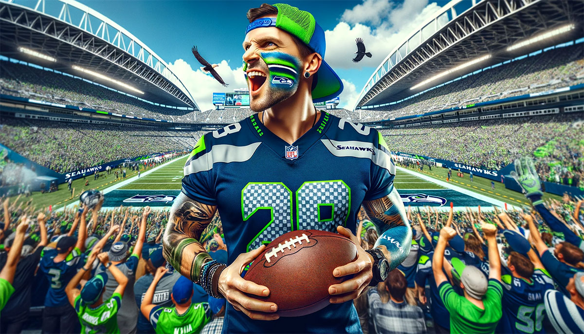
The Seattle Seahawks logo stands as one of the most recognizable symbols in professional football. It features a stylized hawk head that draws from Pacific Northwest Native American art traditions.
Within the broader context of NFL logos, the Seahawks emblem occupies a unique position. It blends regional cultural heritage with modern sports branding in ways few other team marks achieve.
The current version was introduced in 2012. The team has used three primary logo designs since joining the NFL in 1976. Seattle itself was founded in 1851, and the franchise name honors the region’s connection to the sea and its indigenous peoples.
What is the Seattle Seahawks Logo?
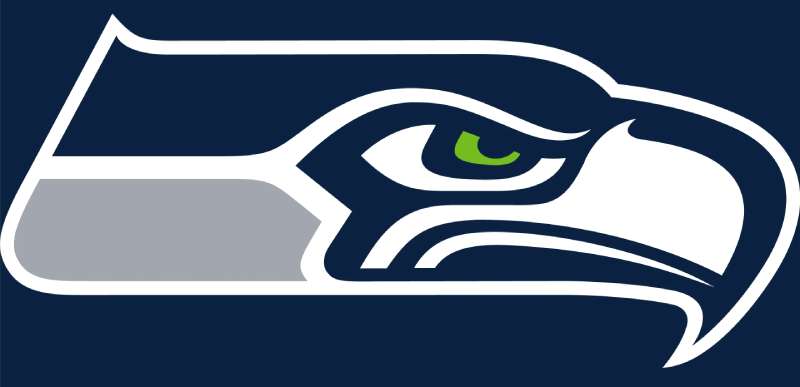
The Seattle Seahawks logo is a stylized hawk head facing left, officially introduced in its current form in 2012. NFL Properties handled the redesign. The mark symbolizes power, vision, and the Pacific Northwest’s Native American artistic heritage through bold geometric shapes and sharp angles.
Design Type: Mascot-based combination mark
Primary Elements:
- Hawk head silhouette facing left
- Curved beak with sharp point
- Stylized eye with fierce expression
- Feather details along the head
Official Introduction Date: Current version debuted April 2012
Designer/Agency: NFL Properties in collaboration with Nike
Trademark Status: Registered trademark of the Seattle Seahawks, owned by the Paul Allen Trust
Official Color Palette:
- College Navy (#002244)
- Action Green (#69BE28)
- Wolf Grey (#A5ACAF)
Usage Context: Helmets, jerseys, stadium signage, merchandise, digital platforms, broadcast graphics, and all official team communications
How Has the Seattle Seahawks Logo Evolved Over Time?
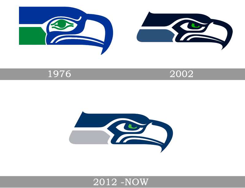
The Seahawks have gone through three distinct logo eras since 1976.
Each redesign reflected changing trends in sports branding while maintaining the hawk as the central figure.
The transitions weren’t dramatic overhauls. They were refinements that modernized the look without abandoning the team’s visual identity.
Original Seattle Seahawks Logo (1976-2001)
Years Active: 1976 to 2001
Design Description: A blue and silver hawk head with Native American art influences. The design featured softer curves and a more traditional illustration style. The eye had a distinct spiral pattern inspired by Coast Salish artwork.
Color Scheme: Royal Blue, Silver, and Green accents
Designer: NFL Properties
Context: Created when Seattle received its expansion franchise. The logo needed to represent both the city and the broader Pacific Northwest region. Designers looked to indigenous art forms for inspiration.
Key Features: Rounder shapes, visible feather texturing, and a more illustrative quality compared to later versions
Cultural Significance: Established the connection between the team and Native American artistic traditions. This set the Seahawks apart from other bird-themed teams in professional sports.
Transitional Seattle Seahawks Logo (2002-2011)
Years Active: 2002 to 2011
Design Description: A sharper, more aggressive hawk head. The lines became cleaner and more geometric. The color palette shifted from royal blue to a darker navy.
Color Scheme: Seahawks Blue (darker navy), Seahawks Green, and Silver
Designer: NFL Properties
Context: Coincided with Paul Allen’s ownership and the move to what is now Lumen Field. The team wanted a fresher look for the new stadium era.
Key Changes from Previous: Darker blue tones replaced the lighter royal blue. Sharper angles throughout. The eye design became more streamlined.
Cultural Significance: Marked the beginning of the modern Seahawks era and aligned with the franchise’s push toward becoming a consistent playoff contender.
Current Seattle Seahawks Logo (2012-Present)
Years Active: 2012 to present
Design Description: The most aggressive and modern version. Extremely sharp angles create a sense of speed and power. The hawk appears more fierce and determined.
Color Scheme: College Navy, Action Green, Wolf Grey
Designer: NFL Properties with Nike involvement following Nike’s takeover of NFL uniform production
Context: Launched alongside new uniforms as part of Nike’s NFL redesign initiative. The team was building toward what would become a Super Bowl championship roster.
Key Changes from Previous: Introduction of “Action Green” as a prominent accent color. Sharper geometric forms throughout. Enhanced contrast between elements.
Cultural Significance: Became associated with the “Legion of Boom” era and the team’s 2013 Super Bowl victory. The neon green became a signature element fans either loved or found polarizing.
What Do the Design Elements of the Seattle Seahawks Logo Mean?
Every part of the Seahawks logo carries specific meaning.
The hawk head facing left suggests forward movement in Western visual culture.
Sharp angles communicate aggression and competitiveness. The overall shape draws directly from Coast Salish and Pacific Northwest tribal art traditions.
Why Did Seattle Choose These Specific Colors?
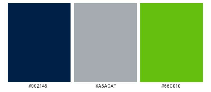
The Seahawks’ colors connect to regional identity and color psychology in sports branding.
College Navy (#002244)
- Pantone: 289 C
- Represents the deep waters of Puget Sound
- Conveys authority, stability, and professionalism
- Common among blue logos in professional sports
Action Green (#69BE28)
- Pantone: 368 C
- Represents the evergreen forests of the Pacific Northwest
- Creates energy and visibility on the field
- Distinguishes the team from other NFL franchises using traditional green logos
Wolf Grey (#A5ACAF)
- Pantone: 429 C
- Represents the overcast skies Seattle is famous for
- Provides neutral balance between the bold navy and green
What Typography Style Is Used in the Seattle Seahawks Logo?

The Seahawks wordmark uses a custom sans-serif font designed specifically for the team.
The letters feature sharp, angular cuts that mirror the hawk head’s geometry.
Readability works at both large stadium scales and small merchandise applications. The typography has evolved alongside the primary logo, becoming more aggressive with each iteration.
What Are the Hidden Meanings in the Seattle Seahawks Logo?
The logo’s design contains several intentional elements beyond the obvious hawk imagery.
The curved lines reference traditional formline art used by Pacific Northwest indigenous peoples for centuries.
The eye shape echoes Native American depictions of supernatural vision. Some fans see the overall silhouette as resembling the Seattle skyline, though designers haven’t confirmed this interpretation.
How Does the Seattle Seahawks Logo Compare to Competitor Logos?
Among NFC West rivals, the Seahawks logo stands out for its cultural specificity.
The San Francisco 49ers logo uses simple oval lettering. The Arizona Cardinals logo features a more realistic bird head. The Los Angeles Rams logo went through a controversial modern redesign.
Compared to other bird-themed NFL teams, the Seahawks’ Native American art influence creates a distinct aesthetic. The Philadelphia Eagles logo uses a more traditional sports illustration approach. The Atlanta Falcons logo emphasizes speed through its streamlined falcon shape. The Baltimore Ravens logo incorporates a shield element.
The Seahawks’ Action Green makes them instantly identifiable on any broadcast. No other NFL team uses such a bright accent color as prominently.
What Are the Technical Specifications of the Seattle Seahawks Logo?
Official Color Codes:
College Navy (Primary)
Action Green (Secondary)
- Hex: #69BE28
- RGB: (105, 190, 40)
- CMYK: (45, 0, 79, 25)
- Pantone: 368 C
Wolf Grey (Accent)
- Hex: #A5ACAF
- RGB: (165, 172, 175)
- CMYK: (6, 2, 0, 31)
- Pantone: 429 C
Dimensions and Proportions:
- Aspect ratio: Approximately 1:1 for the hawk head mark
- Minimum size: 0.5 inches for print, 50 pixels for digital
- Clear space: Minimum of 10% of logo width on all sides
- The logo must appear on approved background colors only
The mark exists as vector graphics for infinite scalability across all applications.
What Cultural Impact Has the Seattle Seahawks Logo Had?
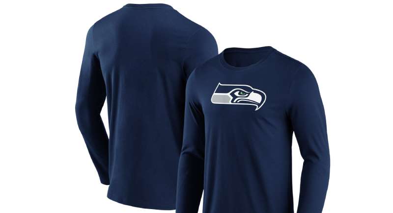
The Seahawks logo has become synonymous with Seattle’s sports identity.
You see it everywhere in the city. Coffee shops, car windows, tattoos.
The “12th Man” fan culture adopted the logo as a badge of regional pride. During the team’s Super Bowl run in 2013-2014, the hawk head became a national symbol of Seattle itself. The Action Green color sparked both praise and criticism, but nobody forgot it.
How Does the Seattle Seahawks Logo Fit Into the Overall Brand Identity?
The logo serves as the anchor for everything the Seahawks do visually.
Uniforms, stadium design, digital content, and merchandise all build from the hawk head’s design language.
The sharp angles appear in secondary graphics. The color palette extends to Lumen Field’s interior. Even the team’s social media presence maintains the aggressive, modern aesthetic established by the logo. The team’s brand guidelines ensure consistency across every touchpoint.
How Should the Seattle Seahawks Logo Be Used?
Official Usage Guidelines:
- Never alter the logo’s colors or proportions
- Maintain required clear space around the mark
- Use only approved logo files from official sources
- Don’t place the logo on busy backgrounds that reduce visibility
- Never rotate or distort the hawk head
Where to Access Official Logos:
- NFL Media portal for credentialed media members
- Seattle Seahawks official website press resources
- Licensed merchandise manufacturers receive files directly
Licensing Information:
- All commercial use requires NFL licensing approval
- Fan art exists in a gray area but commercial sales are prohibited without license
- The team actively protects its trademarks against unauthorized use
Trademark Protection:
- Registered with the U.S. Patent and Trademark Office
- Protected under NFL Properties intellectual property agreements
- Counterfeit merchandise is subject to legal action
FAQ on The Seattle Seahawks Logo
What Does the Seattle Seahawks Logo Represent?
The Seahawks emblem represents Pacific Northwest heritage and Native American artistic traditions.
The hawk head symbolizes vision, power, and competitive spirit. Coast Salish formline art directly influenced the curved lines and shapes.
It connects the NFL franchise to Seattle’s regional identity.
When Was the Current Seahawks Logo Introduced?
The current Seattle Seahawks logo debuted in April 2012.
Nike’s takeover of NFL uniform production drove the redesign. The team wanted a more aggressive look to match their rising on-field performance.
It arrived just before their Super Bowl championship run.
Who Designed the Seattle Seahawks Logo?
NFL Properties created all three Seahawks logo versions. The 2012 redesign involved collaboration with Nike’s design team.
No individual designer receives public credit. The original 1976 mark drew from logo design principles rooted in indigenous Pacific Northwest artwork.
What Are the Official Seahawks Logo Colors?
Three colors define the Seahawks brand: College Navy, Action Green, and Wolf Grey.
The navy represents Puget Sound waters. Action Green reflects the evergreen forests. Wolf Grey mirrors Seattle’s famous overcast skies.
Understanding color theory explains why this combination works so well together.
Why Does the Seahawks Logo Use Native American Art Styles?
Seattle sits in traditional Coast Salish territory. The team chose to honor that heritage through their visual identity.
The psychology of shapes in the logo connects to indigenous artistic traditions. Curved formlines and the stylized eye reference centuries of Pacific Northwest art.
How Many Times Has the Seahawks Logo Changed?
The franchise has used three primary logos since 1976.
The original lasted until 2001. A transitional version ran from 2002 to 2011. The current aggressive design launched in 2012.
Each evolution maintained the hawk as the focal point while modernizing the overall aesthetic.
What Font Does the Seahawks Wordmark Use?
The Seahawks use a custom typeface designed specifically for the team.
Sharp angular cuts mirror the hawk head’s geometry. The letterforms feature aggressive edges that match the overall brand personality.
No commercially available font replicates it exactly.
Can I Use the Seahawks Logo for Personal Projects?
Personal, non-commercial use exists in a gray area. Selling anything with the logo requires official NFL licensing.
The team actively protects their trademark. Fan art stays mostly tolerated, but commercial products face legal action.
Always check the team’s brand style guide for restrictions.
What File Formats Is the Seahawks Logo Available In?
Official sources provide the logo in multiple formats. Vector files allow infinite scaling for merchandise and stadium graphics.
Bitmap versions work for digital applications. JPEG and PNG files suit web use.
Media members access files through NFL credentialing portals.
Why Did Seattle Add Action Green to Their Color Scheme?
Action Green arrived with the 2012 rebrand. Nike pushed for a distinctive accent color that would pop on television broadcasts.
The neon hue creates instant recognition. Love it or hate it, nobody confuses the Seahawks with any other NFL team on the field.
Conclusion
The Seattle Seahawks logo stands as a masterclass in sports branding. It blends Coast Salish artistic heritage with modern athletic identity.
Few NFL team emblems achieve this level of regional authenticity.
From the original 1976 design to today’s aggressive hawk head, each version maintained strong visual hierarchy and clear emphasis on the bird imagery.
The College Navy, Action Green, and Wolf Grey palette creates instant recognition across merchandise, Lumen Field signage, and broadcast graphics.
Whether you love the neon green or find it too bold, the Seahawks brand identity remains unforgettable. That’s exactly what great logo design should accomplish.

Renowned for his expertise in logo design and visual branding, Bogdan has developed a multitude of logos for various clients.
His skills extend to creating posters, vector illustrations, business cards, and brochures. Additionally, Bogdan's UI kits were featured on marketplaces like Visual Hierarchy and UI8.
He also wrote in the past years on sites like Design Your Way, WebDesignerDepot, WPDean, Designmodo, Speckyboy, Slider Revolution, and more.
- Minecraft Font Generator - 8 October 2026
- How Top Meta Ad Creative Is Designed for E-commerce Brands - 8 October 2026
- How photo recovery software works and when to use it - 7 October 2026

Bogdan Sandu is a seasoned designer who has been designing websites since 2008. Renowned for his expertise in logo design and visual branding, Bogdan has developed a multitude of logos for various clients. His skills extend to creating posters, vector illustrations, business cards, and brochures. Additionally, Bogdan's UI kits were featured on marketplaces like Visual Hierarchy and UI8. He also wrote in the past years on sites like Design Your Way, WebDesignerDepot, WPDean, Designmodo, Speckyboy, Slider Revolution, and more.
You Might Also Like