The Dallas Cowboys logo stands as one of the most recognized symbols in professional sports. A single blue star. Nothing else.
That simplicity is the whole point.
Introduced in 1964, this mark has represented “America’s Team” through five Super Bowl victories and countless memorable moments. The franchise itself dates back to 1960, making it one of the NFL’s younger original expansion teams.
What makes this logo fascinating is what it lacks. No mascot. No wordmark. No elaborate illustration. Just geometry and color working together.
The Cowboys have used only two primary logo versions in their entire history. Most NFL teams have gone through five or more redesigns in the same period. That consistency says something about brand confidence.
What Is the Dallas Cowboys Logo?
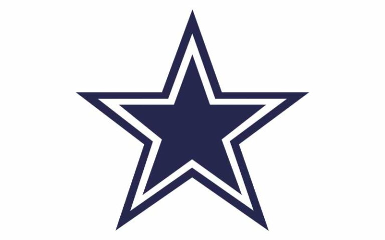
The Dallas Cowboys logo is a navy blue five-pointed star outlined in white, officially introduced in 1964. Created by the team’s original staff, it symbolizes Texas heritage and the “Lone Star State” identity while representing competitive excellence.
Design Specifications
- Design Type: Abstract symbol (standalone icon)
- Primary Elements: Five-pointed star with white border, no accompanying text in primary mark
- Official Introduction Date: 1964 (current version)
- Designer/Agency: Internal team design, specific designer undocumented
- Trademark Status: Registered trademark of Dallas Cowboys Football Club, Ltd.
- Color Palette: Navy Blue (Pantone 289 C), Royal Blue (accent), White, Silver (metallic)
- Usage Context: Helmets, jerseys, merchandise, AT&T Stadium branding, digital platforms, licensed products
How Has the Dallas Cowboys Logo Evolved Over Time?
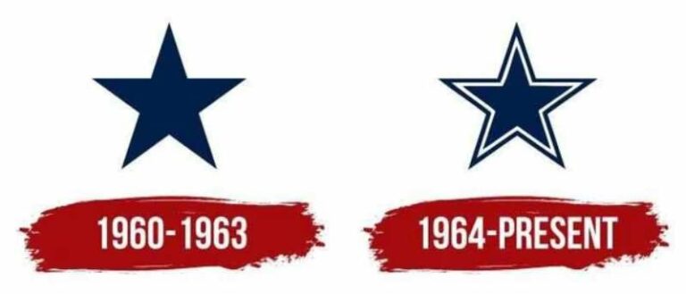
The Cowboys logo has seen minimal changes since the franchise began in 1960. The original design featured a simpler star shape.
By 1964, the refined version we know today was established. Most updates since then have involved color adjustments rather than structural redesigns.
This evolution shows remarkable restraint compared to other NFL logos.
Original Dallas Cowboys Logo (1960-1963)
- Years Active: 1960-1963
- Design Description: Simple blue star with less refined proportions, slightly different angle orientation
- Color Scheme: Royal blue with white outline
- Designer: Team founding staff
- Context: Created for the NFL expansion franchise entering a Texas market already claimed by the AFL’s Dallas Texans
- Key Changes from Previous: First iteration, no predecessor
- Cultural Significance: Established immediate connection to Texas state identity and frontier heritage
Refined Dallas Cowboys Logo (1964-Present)
- Years Active: 1964-present
- Design Description: Geometrically precise five-pointed star with clean white border, optimized proportions
- Color Scheme: Navy blue (darker than original), white border, silver accents on merchandise
- Designer: Internal refinement
- Context: Introduced as the team began building its championship dynasty under Tom Landry
- Key Changes from Previous: Darker blue shade, more precise geometric construction, refined star angles
- Cultural Significance: Became synonymous with NFL excellence during the team’s Super Bowl era
What Do the Design Elements of the Dallas Cowboys Logo Mean?
The five-pointed star directly references the Texas state flag and its “Lone Star” nickname. This connection ties the franchise to regional pride.
Stars in American culture also represent excellence and achievement. The Cowboys claimed both meanings.
Understanding psychology of shapes explains why this works so well.
Why Did Dallas Cowboys Choose These Specific Colors?
Navy blue projects authority and stability. It reads as professional without being aggressive.
Silver adds a premium quality. Think trophies. Think excellence.
White provides necessary contrast and keeps the star readable at any size.
The color psychology here is deliberate. Blue builds trust. Silver suggests success. Together they communicate “elite franchise” without saying a word.
- Navy Blue: Pantone 289 C. Symbolizes loyalty, depth, and Texas evening skies. Creates strong brand recognition.
- Silver/Metallic Gray: Represents achievement, modernity, and championship aspirations. Used heavily on helmets.
- White: Provides clarity, clean separation, and visibility at distance.
What Typography Style Is Used in the Dallas Cowboys Logo?

The primary logo contains no typography at all. Just the star.
When text appears in extended branding, the team uses a custom Western-style serif. It has angular terminals and a slightly condensed width.
This typeface reinforces the Texas frontier theme without overwhelming the star’s simplicity.
The wordmark “COWBOYS” appears in all caps with strong kerning adjustments for readability.
What Are the Hidden Meanings in the Dallas Cowboys Logo?
The five points can represent the five Super Bowl victories. This was not intentional originally, but fans have adopted the interpretation.
The star’s orientation with one point facing up suggests reaching toward goals. It also mirrors how stars appear on military insignia.
Some designers note the proportions follow classical geometric ratios, though this has never been officially confirmed by the organization.
How Does the Dallas Cowboys Logo Compare to Competitor Logos?
Most NFL teams use complex imagery. Animal mascots. Elaborate letterforms. Action poses.
The Cowboys went the opposite direction. That decision created instant differentiation.
Compare it to the Philadelphia Eagles logo with its detailed bird illustration. Or the Chicago Bears logo featuring a stylized “C” letterform.
The Cowboys star achieves what those marks cannot: perfect scalability at any size.
Within the NFC East division alone, the differences are stark. The New York Giants logo relies on typography. The Green Bay Packers logo uses a simple “G” but lacks the symbolic depth.
The Cowboys approach aligns more with European football club badges than typical American sports branding. Simple. Heraldic. Timeless.
What Are the Technical Specifications of the Dallas Cowboys Logo?

Official Color Codes
- Navy Blue (Primary)
- Hex: #041E42
- RGB: (4, 30, 66)
- CMYK: (100, 76, 30, 52)
- Pantone: 289 C
- Metallic Silver (Secondary)
- Hex: #869397
- RGB: (134, 147, 151)
- CMYK: (44, 28, 26, 5)
- Pantone: 8180 C (metallic)
- White (Accent)
- Hex: #FFFFFF
- RGB: (255, 255, 255)
- CMYK: (0, 0, 0, 0)
Dimensions and Proportions
- Aspect Ratio: 1:1 (star fits within perfect square)
- Minimum Size: 0.5 inches for print, 50 pixels for digital
- Clear Space: Minimum padding equal to 25% of logo width on all sides
- File Formats: Available as vector graphics (AI, EPS, SVG) and raster formats (PNG, JPEG)
What Cultural Impact Has the Dallas Cowboys Logo Had?

The star transcended football. It became a symbol of Texas pride worn by people who have never watched a game.
During the 1990s dynasty years, Cowboys merchandise outsold every other NFL team globally. The logo appeared on everything from pickup trucks to wedding cakes.
“America’s Team” branding turned the star into shorthand for success, ambition, and a certain swagger.
The mark influenced how other sports franchises thought about minimalist design. Sometimes less really does work better.
How Does the Dallas Cowboys Logo Fit Into the Overall Brand Identity?
The logo anchors everything. Jersey designs. Stadium architecture. Marketing campaigns. Digital presence.
AT&T Stadium in Arlington features the star prominently on the field, visible from aerial broadcasts. The building itself echoes the angular geometry.
Cheerleader uniforms incorporate the star. Team merchandise extends the navy and silver color palette across hundreds of products.
The organization maintains strict brand guidelines ensuring consistent application across all touchpoints.
How Should the Dallas Cowboys Logo Be Used?
Official Usage Guidelines
Do:
- Maintain minimum clear space around the logo
- Use official color codes only
- Reproduce from approved vector files
- Scale proportionally without distortion
Don’t:
- Alter colors or add effects
- Rotate or flip the star orientation
- Place on busy backgrounds without proper contrast
- Combine with other team marks
Accessing Official Assets
Licensed vendors receive logo files through NFL Properties. Media outlets can access press assets through the team’s official media portal.
The trademark is actively enforced. Unauthorized commercial use results in legal action.
Fan use for personal, non-commercial purposes typically falls under fair use, but selling merchandise requires proper licensing through the NFL.
FAQ on The Dallas Cowboys Logo
What Does the Dallas Cowboys Star Logo Represent?
The star emblem represents Texas and its “Lone Star State” identity. It connects the franchise to regional pride and frontier heritage.
The five-pointed star also symbolizes excellence and achievement in professional football. Simple geometry with deep meaning.
When Was the Dallas Cowboys Logo Created?
The original logo debuted in 1960 when the NFL expansion team launched. The refined version we recognize today was introduced in 1964.
That makes the current team logo over 60 years old. Few sports marks have lasted this long without major changes.
Who Designed the Dallas Cowboys Logo?
The franchise’s founding staff created the original design. No single designer receives official credit for the iconic blue star.
Tex Schramm, the team’s first general manager, oversaw early branding decisions. The design elements were likely collaborative.
What Are the Official Dallas Cowboys Colors?
Navy blue, metallic silver, and white form the official team colors. The blue connects to many successful blue logos across sports.
These colors appear on everything from helmets to jerseys to AT&T Stadium branding. The combination reads as premium and authoritative.
Has the Dallas Cowboys Logo Ever Changed?
Barely. The Cowboys have used essentially the same star since 1964. Color refinements happened, but the core shape stayed identical.
Most NFL franchises redesign every decade or so. The Cowboys brand identity proves that consistency builds recognition over time.
Why Is the Dallas Cowboys Logo So Simple?
Simplicity works. The lone star creates instant recognition at any size, from helmet decals to stadium displays.
This approach follows core graphic design principles. A strong focal point beats visual clutter every time. The star achieves that.
Can I Use the Dallas Cowboys Logo for Personal Projects?
Personal, non-commercial use typically falls under fair use guidelines. Selling merchandise or using it commercially requires NFL licensing.
The Cowboys actively protect their trademark. Unauthorized commercial use of the franchise symbol results in legal consequences.
What Font Does the Dallas Cowboys Use?
The wordmark uses a custom Western-style serif font with angular details. It reinforces the Texas frontier theme.
The primary logo contains no text at all. Just the star. That is the whole point of the design.
How Big Is the Star on the Cowboys Helmet?
The helmet logo measures approximately 4.5 inches at its widest point. It sits centered on each side of the silver helmet shell.
This placement creates strong symmetry. The star pops against metallic silver during game broadcasts.
Why Don’t the Dallas Cowboys Have a Mascot in Their Logo?
The team chose abstract symbolism over literal imagery. A cowboy character would date quickly and limit brand flexibility.
The star works globally without cultural translation issues. It also avoids the cartoonish look that many sports logo designs fall into.
Conclusion
The Dallas Cowboys logo proves that restraint beats complexity. One star. Two colors. Six decades of recognition.
From Tom Landry’s early championship teams to Jerry Jones’s modern era, the iconic star logo has remained untouched. That consistency built one of the most valuable sports brands on earth.
The design follows timeless logo design principles. Strong visual hierarchy. Smart use of white space. Perfect scale and proportion.
Whether on a Super Bowl helmet or official Cowboys merchandise, that blue star means the same thing everywhere. America’s Team earned its name.

Renowned for his expertise in logo design and visual branding, Bogdan has developed a multitude of logos for various clients.
His skills extend to creating posters, vector illustrations, business cards, and brochures. Additionally, Bogdan's UI kits were featured on marketplaces like Visual Hierarchy and UI8.
He also wrote in the past years on sites like Design Your Way, WebDesignerDepot, WPDean, Designmodo, Speckyboy, Slider Revolution, and more.
- Jujutsu Kaisen Font Generator - 12 October 2026
- The Windsurf Logo History, Colors, Font, And Meaning - 10 October 2026
- How to Remove Background From Product Photos (No Photoshop) - 10 October 2026

Bogdan Sandu is a seasoned designer who has been designing websites since 2008. Renowned for his expertise in logo design and visual branding, Bogdan has developed a multitude of logos for various clients. His skills extend to creating posters, vector illustrations, business cards, and brochures. Additionally, Bogdan's UI kits were featured on marketplaces like Visual Hierarchy and UI8. He also wrote in the past years on sites like Design Your Way, WebDesignerDepot, WPDean, Designmodo, Speckyboy, Slider Revolution, and more.
You Might Also Like