The Philadelphia Eagles Logo History, Colors, Font, and Meaning
Eagles soar; none more prominently than the heraldic sentinel perched upon the sports world’s collective consciousness.
In the realm of fierce competition and undying loyalty, the Philadelphia Eagles logo emerges, a symbol transcending mere identity. It embodies passion, heritage, and the unyielding spirit of a city and its team.
Crafting visuals that capture such essence is no menial endeavor. Here, we unfurl the tapestry behind this iconic emblem.
From the careful stitches of brand identity in sports to the vibrant splashes of midnight green and silver, we delve into the logo’s mystique, its evolution, and the intricate dance between graphics and fandom.
By article’s end, decode the elements hidden in plain sight within the logo—a repository of history, the anchor of Philadelphia Eagles merchandise, and an emblem that flies high in the hearts of the Philly faithful.
Venture through an odyssey of design, where tradition meets modernity, and witness how an NFL team logo becomes immortal.
The Meaning Behind the Philadelphia Eagles Logo
Deep Dive into the Eagle
Okay, so the Philadelphia Eagles logo is more than just a bird on a football helmet, right? This bird is an eagle, and not just any eagle but a Bald Eagle.
A bald eagle represents freedom and strength, something that really vibes with the American culture. It’s a visual shoutout to America’s national bird, but also to the indomitable spirit of the sports team and their die-hard fans.
The Direction Matters
Ever notice the eagle is looking to its right? In heraldry, the direction an animal faces totally matters.
The eagle’s gaze is toward the right, which represents looking forward to the future, not stuck in the past. It’s like a hidden message, “Let’s focus on the win, the next game, the next season!”
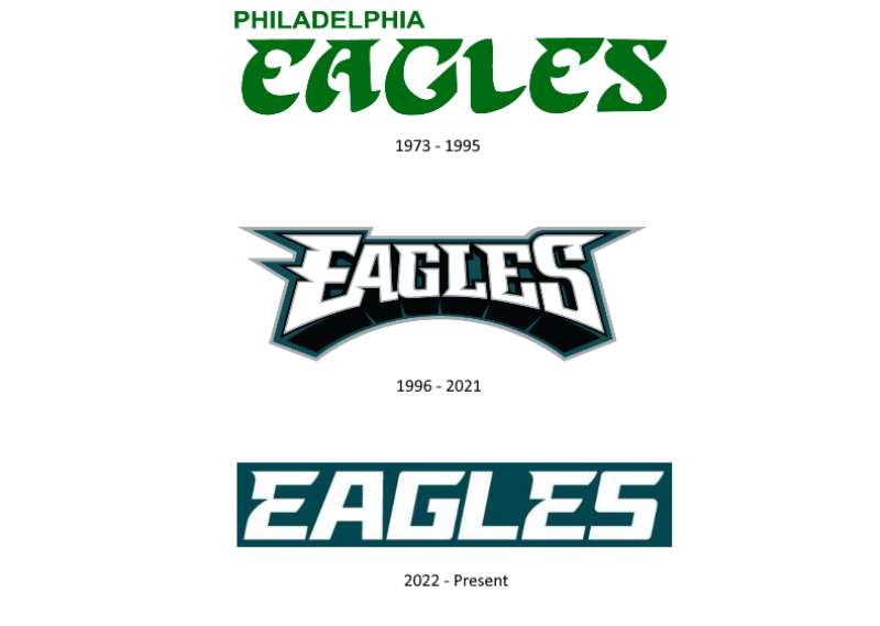
The History of the Philadelphia Eagles Logo
The Evolution Over Time
You wanna talk about change, right? The Eagles logo has had its share. Way back in the day, the logo used to be a green eagle holding a football in a more “cartoony” form.
Not to forget the “Eagles” script which was part of the old logos. It was kind of like their “baby photos,” you know? Cute but needed to grow up.
Landmark Changes
1996 was like the Eagles logo’s “prom night.” Everything changed! The cartoony eagle transformed into the sleek and fierce bird we know now. This new look was far more aerodynamic and badass, and it really resonated with fans who were all about tough and modern aesthetics.
The Colors of the Philadelphia Eagles Logo
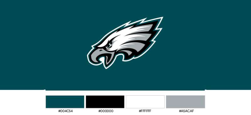
Midnight Green
Ah, the infamous Midnight Green. Not your regular green, this shade gives off a vibe that’s a mix of determination and swagger. It’s unique to the Eagles and it’s something fans wear with a certain kind of pride.
Silver and White
Besides the green, we’ve got silver and white making the logo pop. Silver can be seen as a nod to the gleam of a football trophy, perhaps? White just balances it all, like the calm amidst the chaos on the field.
The Font Used in the Philadelphia Eagles Logo
Bold and Italicized
Talk about strong visual cues! The font is set in a bold and italicized style, making it ooze energy. It’s kind of like how you’d shout at a game; it demands your attention.
Custom Touch
Nope, they didn’t just pick this font off some random list. It’s customized, giving it that edge and personality that you can’t copy-paste. This ensures the logo’s text is as unique as the team it represents.
The Logo’s Impact on Merchandise
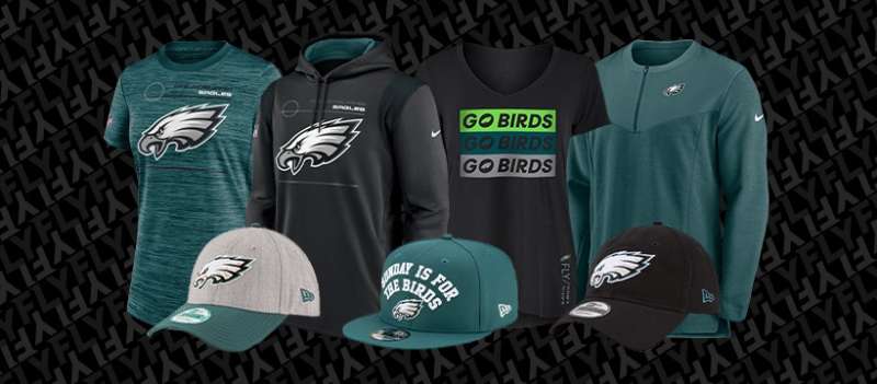
Fan Apparel
Think about jerseys, hats, and even tattoos. Yes, people get this logo inked on them. That’s the level of commitment we’re talking about. The logo’s design makes it extremely wearable and displayable.
Collectibles
From mini-helmets to coffee mugs, the logo turns everyday items into cherished keepsakes. The unique color and fierce eagle give even the smallest trinket some heavy-duty fan power.
The Psychology of the Design
Why it Works
Sometimes you wonder why certain logos just stick in your mind, right? The Eagles logo has a balance, man. The colors, the bold font, and the fierce but not overly complex eagle all work in unison to hook you in.
How It Represents the Fanbase
This logo isn’t just a symbol for the players; it’s a banner for every fan out there. The power, the pride, and even the color scheme all feed into the Philly fanatic’s soul.
FAQ On The Philadelphia Eagles Logo
What does the Philadelphia Eagles logo represent?
The wings spread wide, dynamic as the team’s fighting spirit. It represents speed, precision, and the heights of ambition rooted in Philadelphian pride.
A silhouette that ignites the passions of fans, it soars beyond a simple badge, encapsulating a storied history in its flight.
How has the Eagles logo evolved over time?
From the early sketches depicting a staunch eagle to the sleek design today, it has transcended time.
Adopting elements like a more streamlined eagle, the emblem has remained contemporary, reflecting the growth of the team while preserving the legacy of Philadelphia Eagles tradition.
What are the official colors of the Philadelphia Eagles logo?
Midnight green and silver—these are the hues that dress the emblem. A distinct palette chosen carefully to exemplify the team’s unique identity.
This color choice has become synonymous with Eagles pride, omnipresent from jerseys to avid fan’s memorabilia.
Who designed the current Philadelphia Eagles logo?
A detail often glossed over, yet the artist’s identity remains cloaked.
What is known is that logo design is an intricate graphic design process, typically undertaken by professionals in collaboration with the team’s branding strategists, to ensure it resonates with every touchpoint of the Eagles’ identity.
Why did the Philadelphia Eagles logo face left, and now faces right?
Market finesse and thoughtful design converge here. The turn of the head to the right symbolically gestures towards the future.
It suggests forward motion, a hallmark of the team’s relentless drive—always looking ahead to the next play, the next victory, the next chapter.
How is the Philadelphia Eagles logo used in marketing?
The emblem spearheads the Eagles’ sports marketing efforts. It’s a brand beacon—on merchandise, digital platforms, and throughout Lincoln Financial Field.
It galvanizes outreach, inviting a connection to the team’s spirit, a signifier of rallying cries, and a token of community kinship.
Is there symbolism in the details of the Eagles logo?
Indeed. The feathers, the gaze—all are meticulous by intent. The logo’s essence is rooted in symbolism, each feather etched with purpose, echoing the detail-oriented ethos of the team, while the eagle’s gaze commands respect, emblematic of the team’s focus and determination on the field.
Has the Eagles logo ever faced controversy?
In the clashing realm of trademarks, the Eagles logo has seen its share of turmoil. Legal squabbles over likenesses have arisen, though the trademark held by the NFL ensures the integrity of this emblem remains undiluted, protected against misuse or misinterpretation.
What impact has the Eagles logo had on fan culture?
The logo is an integral thread in the fanbase fabric. It adorns faces in paint, flutters on flags, and is worn with honor.
As a sports team insignia, it unites a diverse community, fostering an inclusive fellowship—a common language spoken proudly by the Eagles Fan Base.
Where can I buy official Philadelphia Eagles logo merchandise?
Head over to the Eagles’ official store, brimming with authorized gear.
Here, the logo pervades—the merchandise ranging from apparel to souvenirs, all waiting to find a place in the home or heart of those who bleed Eagles green. It’s not just merchandise; it’s a token of allegiance.
Conclusion
In these passages, we have journeyed through the evolution, the pulse that thrums beneath the Philadelphia Eagles logo. A narrative woven with threads of midnight green, symbolism, and fierce loyalty, culminating in an emblem revered by the city and its Eagles Fan Base.
The ascension of this icon, from its first iteration to the streamlined emblem casting its gaze rightward, continues to mirror the very ethos of the team—forward momentum, undying resolve. As fans don the logo on match days, swathed in the vibrant hues of their cherished team, it becomes ever clearer, the power this insignia holds—a motif uniting individuals as a collective, a family.
To understand the logo is to understand its people. A symbol, a sentinel, it watches over the heart of Philadelphia, everlastingly etched in the grand tapestry that is the Eagles’ history and future. This is more than a design; it’s an identity—a legacy carried aloft on the wings of tradition.
If you liked this article about the Philadelphia Eagles logo, you should check out this article about the Dallas Cowboys logo.
There are also similar articles discussing the Denver Broncos logo, the Green Bay Packers logo, the Buffalo Bills logo, and the New England Patriots logo.
And let’s not forget about articles on the Kansas City Chiefs logo, the Carolina Panthers logo, the Arizona Cardinals logo, and the Atlanta Falcons logo.
Bogdan Sandu, a seasoned designer with 15 years of diverse experience, has been designing websites since 2008.
Renowned for his expertise in logo design and visual branding, Bogdan has developed a multitude of logos for various clients.
His skills extend to creating posters, vector illustrations, business cards, and brochures. Additionally, Bogdan's UI kits were featured on marketplaces like Visual Hierarchy and UI8.
Latest posts by Bogdan Sandu (see all)
- Out of This World: Space Color Palettes for Cosmic Designs - 28 April 2024
- The Bungie Logo History, Colors, Font, And Meaning - 27 April 2024
- After Dark: Night Color Palettes for Mysterious Designs - 27 April 2024