
The Carolina Panthers Logo History, Colors, Font, and Meaning
Envision a symbol that encapsulates the vigor and spirit of the Carolinas—one that leaps from the fabric of sports attire and ignites a roaring stadium.
Such is the allure of the Carolina Panthers logo, an emblem weaving together tradition and regional pride with the dynamic world of the NFL. As a graphic designer, these icons fascinate me, telling stories far beyond their contours.
This article peels back layers of design, spotlighting the intricate dance between brand identity and fan fervor, all captured within the Panthers’ emblem.
Exploring its conception, evolution, and influence, you will comprehend how a logo transcends mere graphics, becoming a rallying cry for community, an anchor for team spirit in Charlotte, North Carolina.
Join me in unraveling the threads of the Carolina Panthers’ illustrious symbol and its place in sports merchandising helmet to cleat, across jerseys, and through the seas of memorabilia.
By the end, you’ll view this iconic logo through a new lens of appreciation—and perhaps, with the same reverence that lights up the eyes of a Panther on the prowl.
The Meaning Behind the Carolina Panthers Logo
![]()
Honestly? Logos are like the silent storytellers of a brand. They whisper secrets that only the keenest of eyes can catch. So, let’s dive deep into what the Carolina Panthers logo is trying to say, shall we?
Silent Roar
The first thing you’ll notice? The fierce panther in the logo. It’s not just there to look cool (although, let’s be real, it does). Panthers symbolize power, stealth, and strength.
It gives a shoutout to the agility and determination of the team. Every time the players wear that logo, they’re embodying that fierce panther spirit. Roar.
The Forward Stance
Notice how the panther is lunging forward? This is not by accident. The forward stance shows a readiness, an eagerness to move ahead, always striving for the next touchdown.
The History of the Carolina Panthers Logo
Humble Beginnings
When the Panthers burst onto the scene, they needed an identity—a look that would capture the spirit of the Carolinas. The panther, being both ferocious and graceful, was a fitting choice. But the logo has evolved since then.
The Evolution
The logo underwent a significant redesign. Sharp lines, a sleeker look, all to keep pace with the modern vibes. But through every change, the panther’s essence remained, always reminding us of where it all began.
The Colors of the Carolina Panthers Logo
![]()
Ever looked at a canvas and felt something? Colors do that. They evoke feelings, moods, memories. So, what’s the Carolina Panthers logo throwing down?
Black: The Backbone
Black stands for strength, power, and determination. It’s the dominant color in the logo and symbolizes the robust foundation of the team.
Electric Blue: The Flash
That vibrant blue? It’s not just there for aesthetics. Blue stands for depth, trust, and loyalty. It adds that spark, that energy which resonates with the Panthers’ spirit.
The Font Used in the Carolina Panthers Logo
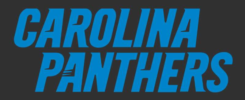
Typography is a world of its own. The right font speaks volumes, right? So, when you gaze upon the words “Carolina Panthers”, what story is unfolding?
Bold and Proud
The thick, bold letters scream confidence. The Panthers are here, and they mean business.
Modern Touch
The sleek design of the font marries beautifully with the modern aesthetic of the logo. It’s all about making a statement while staying rooted in tradition.
Artistry and Design: Beyond the Basics
Let’s chat about the artistic side of things. Design isn’t just about slapping together some shapes and colors.
Symmetry and Balance
The logo’s got this harmonious balance. Everything feels just right, doesn’t it? That’s no accident. Designers ensured that there’s symmetry, so your eyes feel at ease when you’re checking it out.
The Hidden Details
Good designs have layers. Like an onion… or maybe a cake? Whatever analogy floats your boat. Point is, every time you look at the logo, there’s a chance you’ll spot something new. A curve here, an angle there. It’s intricate and yet so seamlessly put together.
Fan Love and Pop Culture
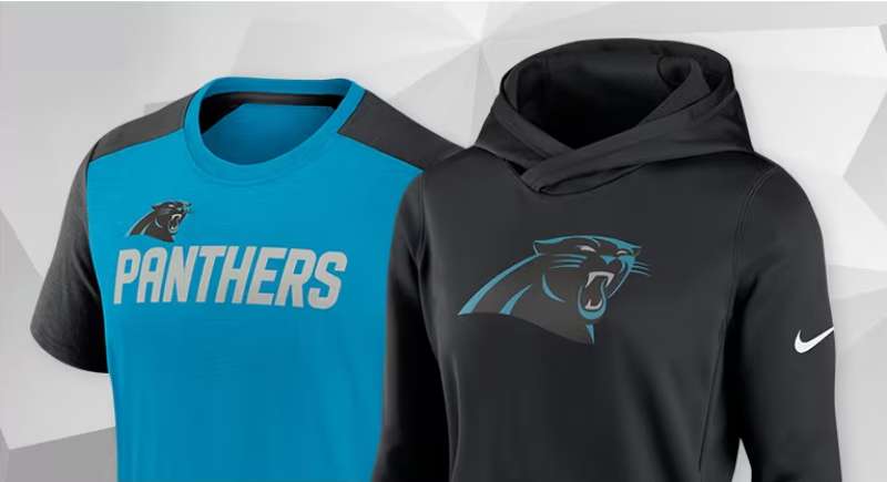
Ever seen fans with the logo tattooed on them? Or maybe on T-shirts, mugs, and, heck, even car decals?
A Symbol of Pride
For many fans, the logo isn’t just a design. It’s a symbol of pride, of belonging. It’s a beacon that says, “Hey! I belong to this awesome tribe!”
Pop Culture Moments
With the rise of the team’s popularity, the logo’s been spotted in movies, TV shows, and even music videos. It’s become a part of the broader cultural landscape, echoing the love and passion of its fans.
FAQ On The Carolina Panthers Logo
What inspired the Carolina Panthers logo design?
The logo mirrors the fierce, sleek essence of the panther. Fans often ask about the muse behind its look—rest assured, it was a creative nod to the strength and agility synonymous with the majestic big cat, crafting a visual metaphor for the tenacity of the NFL team.
Has the Carolina Panthers logo changed over the years?
Yes, it has evolved. Initially introduced in 1995, the design was refined in 2012 for a modern edge. The changes were subtle, enhancing its features, sharpening its lines, and updating the blue to a vibrant, electric shade to resonate with the vibrancy of sports team branding.
What do the colors in the Carolina Panthers logo signify?
The black, blue, and silver palette is rich in symbolism. Black and silver symbolize strength and sophistication, while the vibrant blue—known as “Panther Blue”—adds a burst of energy and represents the skies and waters of the Carolinas.
Is the Panthers logo one of the best in the NFL?
Opinions on logos are subjective, but the Panthers emblem garners respect for its contemporary design and regional resonance. Its recognition and popularity among merchandise and fans certainly place it in the higher echelons of NFL team insignias.
How does the Panthers logo reflect the team’s identity?
The panther is a solitary, stealthy predator—a fitting image for a team that prides itself on strategic plays and powerful performances. The logo embodies the Carolina Panthers’ spirit, highlighting their intent to dominate on the football field.
Can you find hidden messages in the Carolina Panthers logo?
While not officially stated, observers point to the logo’s outline resembling the combined borders of North and South Carolina, an artistic tip of the hat to the team’s fan base rooted deeply in Charlotte, North Carolina, and beyond.
Why is the Carolina Panthers logo so popular in merchandise?
Timeless yet modern, the logo crosses over nicely into fan gear. Fans cherish the undeniable cool factor of the design along with the team’s history and successes, making it a staple on sports apparel and memorabilia.
What role has the logo played in the Carolina Panthers’ branding?
Critical, without a doubt. As a central aspect of the team’s branding efforts, it adorns everything from jerseys to digital platforms, acting as a beacon for the team’s marketing and sports merchandising strategy.
How does the Panthers logo compare to traditional sports logos?
It’s a harmonious blend of traditional and contemporary. This has enabled the sports logo design to maintain relevance and signal the Carolina Panthers’ commitment to progress while honoring their history within the ever-evolving narrative of the NFL.
Could the Panthers logo be considered a symbol of Charlotte?
Emphatically, yes. The logo has grown to be much more than an NFL team insignia; it stands as a cultural icon within Charlotte, representing the unyielding support and pride of the Panthers’ wider community.
Conclusion
Through a kaleidoscope of sleek lines and bold colors, the Carolina Panthers logo emerges not just as a graphic but as a symbol. It is the heart of a brand narrative tangled in the threads of competition, community, and unyielding energy that fuels the stadiums on game days.
- The emblem’s subtle evolution over years echoes a commitment to modernity while clutching firmly to traditions that define the Charlotte area and its zealous fan base.
- From the merch that adorns countless fans to the flag that whips in the Carolina wind, the logo stands as a beacon—a lighthouse guiding the Panthers faithful through the ebb and flow of seasons.
In this tapestry of sharp angles and hues lies more than design; here is history, spirit, and identity stitched into a visual roar. May it continue to be an enduring badge of honor, lighting up faces with pride and painting a vivid picture of relentless pursuit inherent to the thrilling odyssey of American football.
If you liked this article about the Carolina Panthers logo, you should check out this article about the Dallas Cowboys logo.
There are also similar articles discussing the Denver Broncos logo, the Green Bay Packers logo, the Buffalo Bills logo, and the New England Patriots logo.
And let’s not forget about articles on the Philadelphia Eagles logo, the Kansas City Chiefs logo, the Arizona Cardinals logo, and the Atlanta Falcons logo.
Bogdan Sandu, a seasoned designer with 15 years of diverse experience, has been designing websites since 2008.
Renowned for his expertise in logo design and visual branding, Bogdan has developed a multitude of logos for various clients.
His skills extend to creating posters, vector illustrations, business cards, and brochures. Additionally, Bogdan's UI kits were featured on marketplaces like Visual Hierarchy and UI8.
Latest posts by Bogdan Sandu (see all)
- The Capcom Logo History, Colors, Font, And Meaning - 26 April 2024
- Earth Color Palettes Grounded in Nature: 40 Examples - 26 April 2024
- The EA Logo History, Colors, Font, And Meaning - 25 April 2024