The Golden State Warriors logo is a blue and gold circular emblem with the Bay Bridge’s eastern span at its center. It debuted in June 2010 and was refined in June 2019 for the move to Chase Center in San Francisco.
The franchise was founded in 1946 as the Philadelphia Warriors, moved to the San Francisco Bay Area in 1962 and became the Golden State Warriors for the 1971-72 season. The current logo design is a modern take on “The City” logo of the late 1960s.
What is the Golden State Warriors Logo?
The Golden State Warriors logo shows the Bay Bridge’s eastern span in gold inside a blue circle, with “Golden State” arched above and “Warriors” below. It was unveiled on June 17, 2010, as an update of the 1969-71 “The City” logo, and revised on June 12, 2019. No individual designer has been credited; the 2010 identity came from a team, NBA and adidas collaboration.
| Golden State Warriors logo at a glance | |
|---|---|
| Symbol | The Bay Bridge’s eastern span in a circular badge with arched “Golden State” and “Warriors” lettering |
| Designer/Agency | Not publicly credited; the 2010 identity was an 18-month collaboration between the Warriors, the NBA and adidas |
| Current version since | June 12, 2019 (the first Bay Bridge logo dates from June 17, 2010) |
| Colors (hex) | Royal blue approx. #1D428A and golden yellow approx. #FFC72C |
| Typeface | Custom lettering since 2019; Copperplate Gothic was used from 2010 to 2019 |
| Previous major version | The 2010-2019 Bay Bridge logo with Copperplate lettering; before it, the 1997-2010 lightning-bolt “warrior” logo |
How Has the Golden State Warriors Logo Evolved Over Time?
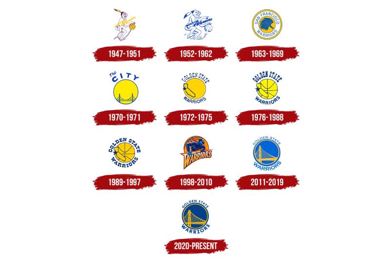
The Warriors have had about ten primary logos since 1946. The big breaks came with the 1969 “The City” logo, the 1971 California outline, the 1997 lightning-bolt look and the 2010 return to the bridge.
Philadelphia Warriors Logos (1946-1962)
The team was a charter member of the Basketball Association of America in 1946. Its Philadelphia logos were cartoon mascot drawings of a figure dribbling a basketball, in the Native American imagery common among sports teams in that era. I could not verify exact years or designers for each version.
San Francisco Warriors Logo (1962-1969)
Franklin Mieuli bought a majority stake in 1962 and moved the team to the Bay Area as the San Francisco Warriors. The logo was a circular badge with “San Francisco Warriors” around a headdress image, in gold, white and blue.
“The City” Logo (1969-1971)
The uniform worn for the rest of the San Francisco years carried “The City” with a Golden Gate Bridge silhouette and a cable car. The logo was a gold circle with a bridge and the words “The City,” in blue and gold. The team moved to Oakland in 1971, which is why a bridge linking the two cities later became part of the story.
California Outline Logo (1971-1988)
After the team became the Golden State Warriors before the 1971-72 season, the logo showed “Golden State” over a circle with a California outline and a star marking the Bay Area. The team won its 1975 NBA championship under this look.
Run TMC Era Logo (1988-1997)
The uniforms of this period are tied to the Run TMC trio of Tim Hardaway, Mitch Richmond and Chris Mullin, and kept the blue and gold. Logo timelines show a redrawn California-and-basketball emblem, though I could not verify the exact changes or the designer.
Lightning-Bolt Warrior Logo (1997-2010)
In 1997 the team swapped blue and gold for a navy, gold and orange scheme and a masked warrior with a lightning bolt, an identity Wikipedia calls the “Thunder” look. The 2007 “We Believe” playoff team played in this logo.
Bay Bridge Logo (2010-2019)
The team unveiled the new logo on June 17, 2010, and it brought back a blue and gold scheme. The bridge is the eastern span of the San Francisco-Oakland Bay Bridge, which was not yet finished at the time. Team president Robert Rowell said it paid homage to the organization’s history and its standing in the Bay Area. The lettering was Copperplate Gothic.
Current Bay Bridge Logo (2019-Present)
On June 12, 2019, during the NBA Finals, the team revealed an updated logo for its first season at Chase Center. It shows a more accurate portrayal of the Bay Bridge and replaces Copperplate with a custom typeface, which also appears in the wordmark. SportsLogos.net called the changes minor.
2024 Secondary “W” Logo
Ahead of the 2024-25 season the team added a secondary mark: a stylized “W” that also reads as a basketball net and rim, created by Goodby, Silverstein & Partners Design. It replaced the circled “W” from 2019-20 and does not replace the primary Bay Bridge logo.
What Do the Design Elements of the Golden State Warriors Logo Mean?
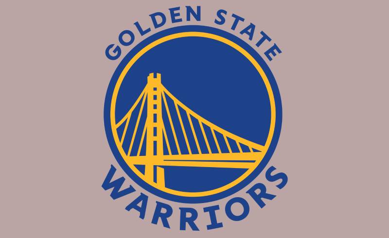
The Bay Bridge connects San Francisco and Oakland, and the team has said the logo honors its Bay Area standing. The circle was kept from the 1969-71 “The City” logo, with added depth, and the round shape gives the emblem good balance around the bridge.
What Does the Bay Bridge Represent?
The bridge ties together the two cities that have hosted the franchise: San Francisco, where it moved in 1962, and Oakland, where it played from 1971 to 2019. It replaced the Golden Gate Bridge of the 1960s “The City” design, a change that matched the team’s Oakland home. Moving into Chase Center in San Francisco in 2019 did not change the symbol.
Why Did Golden State Choose These Specific Colors?
The team’s colors are royal blue and golden yellow, which Arena Digest described as the two primary colors used on most of the team’s logos and jerseys since 1962. The yellow connects naturally to the “Golden State” nickname for California, though the team has not given an official meaning for each color.
The approximate values are royal blue near #1D428A and golden yellow near #FFC72C, taken from common team-color references, not from a published team page. Some sites say the blue was darkened in 2019 from approx. #006BB6; that is unconfirmed. For other conversions, such as RGB, CMYK or Pantone, there is no official set to quote. Studies in color psychology link blue with trust, but the team has not said that was the reasoning. Blue and yellow give strong contrast, and the saturation of the royal blue is higher than that of the dark navy used in 1997. The two-color color palette was used from 1962 except during the 1997-2010 orange period.
What Typography Style Is Used in the Warriors Logo?

From 2010 to 2019 the logo used Copperplate Gothic, a glyphic serif font drawn by Frederic W. Goudy for American Type Founders in 1901. The image above shows that older lettering. Since the June 2019 update the lettering is a custom typography face drawn for the team, so no exact font exists for the current logo.
If you need a stand-in, Copperplate Gothic is the closest widely available option for the older version. It differs from a plain sans-serif font because of its small blunt serifs. Overall, the typeface choice changed in 2019 from a stock face to a custom one.
What Are the Hidden Meanings in the Warriors Logo?
No hidden meanings have been confirmed. One detail is documented: the eastern span in the 2010 logo was still unfinished when the logo was unveiled, so the design showed a bridge that did not yet exist in final form. Everything else, such as the circle standing for fan unity, is interpretation.
How Does the Warriors Logo Compare to Other NBA Logos?
The Warriors logo stands out among NBA logos because it is built around a landmark. Many teams use animals, such as the Chicago Bulls logo, the Memphis Grizzlies logo and the Toronto Raptors logo, or basketballs, as in the Brooklyn Nets logo and the Boston Celtics logo. The place references are more direct than in the Miami Heat logo or the Los Angeles Lakers logo.
Round emblems appear in the Phoenix Suns logo and the Washington Wizards logo. Blue and yellow also appear in the Denver Nuggets logo and the Indiana Pacers logo.
It is calmer than a busy design such as the Charlotte Hornets logo, and it shares a regional focus with the San Antonio Spurs logo.
What Are the Golden State Warriors Logo Colors?
The current Warriors logo uses royal blue and golden yellow. The hex codes in the table above are approximate. The 1997-2010 logo was the exception, using navy, gold and orange. NBC Sports praised the 2010 move toward cleaner, simpler logos, and the Bay Bridge emblem is flat, with no gradient effects.
What Cultural Impact Has the Warriors Logo Had?
“The City” jerseys were popular throwbacks with fans long before 2010, and NBC Sports reported in 2010 that the team’s Hardwood Classics versions were best-sellers. That popularity helped push the team to adopt the older look full time.
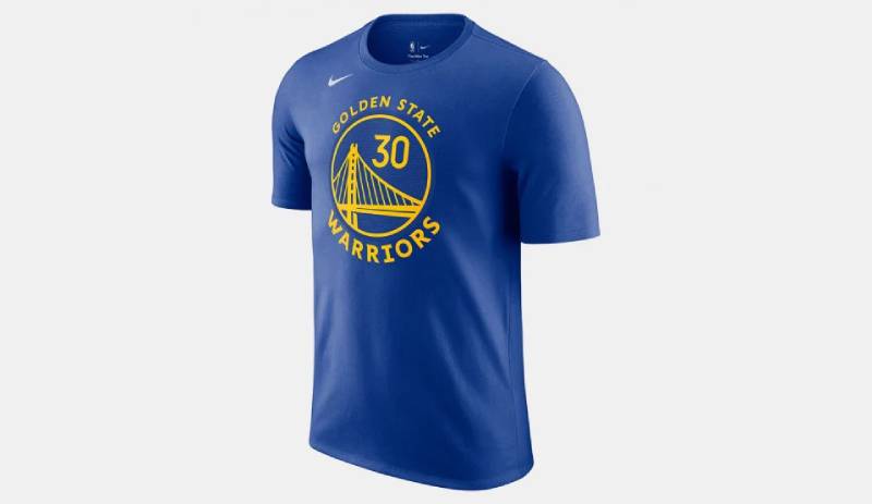
The current logo has been the face of the team’s championships in 2015, 2017, 2018 and 2022. It also appears on merchandise such as the player t-shirt shown above.
How Does the Warriors Logo Fit Into Overall Brand Identity?
The Bay Bridge logo is the main mark, and a “The City” throwback and a California outline appear as alternates on uniforms. In 2024 the team added a secondary “W” net mark, and in September 2019 the Statement uniform carried “The Bay” over a sunset illustration. The team’s own brand guidelines are not public.
How Should the Warriors Logo Be Used?
The Warriors logo is a trademark of the franchise, so use on merchandise or in ads needs a license. Editorial use, such as in an article, is treated differently. As a general rule, do not stretch, recolor or redraw a team logo. Official vector graphics should come from the team or its licensed partners, and a JPEG or PNG copy needs enough pixels to stay sharp.
FAQ on the Golden State Warriors Logo
When was the Warriors logo created?
The current Bay Bridge logo was introduced on June 17, 2010, and updated on June 12, 2019. The franchise’s first logos date to 1946, when it was the Philadelphia Warriors.
Who designed the Warriors logo?
No individual designer has been credited. The 2010 logo came from an 18-month collaboration between the Warriors, the NBA and adidas, and the 2019 update used a custom typeface. The 2024 secondary “W” logo was made by Goodby, Silverstein & Partners Design.
What is the Golden State Warriors old logo?
The previous logo, from 2010 to 2019, was the same Bay Bridge design with Copperplate Gothic lettering. Before that, the team used a masked warrior with a lightning bolt from 1997 to 2010.
What are all the Golden State Warriors logos?
In order: Philadelphia cartoon logos (1946-62), the San Francisco headdress badge (1962-69), “The City” (1969-71), the California outline (1971-88 and its variations until 1997), the lightning-bolt warrior (1997-2010), the Bay Bridge logo (2010-19) and the updated Bay Bridge logo (2019-present).
What is “The City” Warriors logo?
It is the late-1960s logo with a Golden Gate Bridge silhouette and the words “The City,” used when the team was the San Francisco Warriors. It was the inspiration for the 2010 Bay Bridge logo.
What font does the Warriors logo use?
Since 2019 the lettering is custom, so there is no exact font. From 2010 to 2019 it was Copperplate Gothic, designed by Frederic W. Goudy in 1901.
What are the Golden State Warriors colors?
Royal blue and golden yellow. Approximate hex codes are #1D428A and #FFC72C.
Why did the Warriors choose the Bay Bridge?
The bridge links San Francisco and Oakland, the two cities tied to the team, and it replaced the Golden Gate Bridge of the 1960s logo. The team said the logo honors its history and its place in the Bay Area.
Why are they called the Golden State Warriors?
The team took the name before the 1971-72 season to suggest it represented all of California, not one city.
Is the Warriors logo trademarked?
Yes, it is a trademark of the franchise, so commercial use needs permission. Editorial use is handled differently.
Conclusion
The Golden State Warriors logo moved from Philadelphia cartoons to a San Francisco bridge, a California outline, a lightning-bolt warrior and back to the bridge in 2010.
The 2019 update refined the bridge and replaced Copperplate with custom lettering as the team moved into Chase Center. The blue-and-gold scheme and the bridge keep the identity tied to the Bay Area, and the design is a good example of graphic design principles working through a landmark.
Sources
- Arena Digest, Warriors Unveil New Logo, Branding – https://arenadigest.com/201006173023/basketball/nba-basketball/warriors-unveil-new-logo-branding
- NBC Sports, Warriors go retro with new logo – https://www.nbcsports.com/nba/news/warriors-go-retro-with-new-logo
- CBS Sports, Warriors reveal updated logo for next season – https://www.cbssports.com/nba/news/warriors-reveal-updated-logo-for-next-season-as-they-relocate-from-oakland-to-new-san-francisco-arena
- SportsLogos.net, Warriors logo changes for 2019 – https://news.sportslogos.net/?p=40719
- SportsLogos.net, Golden State Warriors unveil 2024-25 Statement Edition uniforms, new secondary logo – https://news.sportslogos.net/2024/06/26/golden-state-warriors-unveil-2024-25-statement-edition-uniforms-new-secondary-logo/basketball/
- Wikipedia, Golden State Warriors – https://en.wikipedia.org/wiki/Golden_State_Warriors
- Wikipedia, Copperplate Gothic – https://en.wikipedia.org/wiki/Copperplate_Gothic

Renowned for his expertise in logo design and visual branding, Bogdan has developed a multitude of logos for various clients.
His skills extend to creating posters, vector illustrations, business cards, and brochures. Additionally, Bogdan's UI kits were featured on marketplaces like Visual Hierarchy and UI8.
He also wrote in the past years on sites like Design Your Way, WebDesignerDepot, WPDean, Designmodo, Speckyboy, Slider Revolution, and more.
- The YouTube Logo History, Colors, Font, and Meaning - 10 November 2026
- Monthly Retainer Billing for Freelance Designers: How to Get Paid on Time, Every Month - 10 November 2026
- How Design Studios Lose New Clients Between the First Email and the Signed Proposal - 10 November 2026

Bogdan Sandu is a seasoned designer who has been designing websites since 2008. Renowned for his expertise in logo design and visual branding, Bogdan has developed a multitude of logos for various clients. His skills extend to creating posters, vector illustrations, business cards, and brochures. Additionally, Bogdan's UI kits were featured on marketplaces like Visual Hierarchy and UI8. He also wrote in the past years on sites like Design Your Way, WebDesignerDepot, WPDean, Designmodo, Speckyboy, Slider Revolution, and more.
You Might Also Like