The Toronto Raptors Logo History, Colors, Font, and Meaning
Picture it: a single image that captures the heart-pounding excitement of a city’s pride, a roar of fans in a bustling arena, the embodiment of athleticism, and the fierce spirit of competition—all distilled into one iconic emblem.
The Toronto Raptors logo is not just a symbol but a beacon that unites and ignites.
In this mosaic of lines and colors lies a story, a narrative of a team’s evolution amidst the urban tapestry of Toronto and the electric courts of the NBA.
As one delves into its design elements, every brushstroke, every shade is a deliberate choice shaping the dynamic identity of this beloved franchise.
Within the scope of this article, a journey beckons—through the inception of the claw, past the threads of the Raptors’ uniform crest, into the core of this emblem’s very essence.
You’ll emerge with a profound appreciation of how deeply rooted sports iconography entwines with both fan base psychology and brand prowess.
Let’s unravel the stitches of this quintessential symbol of Canadian basketball and reveal the craft behind the Raptors’ emblem design.
The Meaning Behind the Toronto Raptors Logo
![]()
Ah, the heart and soul of any brand: its symbolism. You see, logos aren’t just doodles. They’re stories, mantras, or in this case, a fierce raptor that seems to growl, “Come at us!”
The Claw and the Ball
Beneath the surface, the Toronto Raptors’ logo, especially that iconic claw mark gripping a basketball, symbolizes the fierce and relentless spirit of the team. Raptors, by nature, are agile predators, and in a way, the logo shouts out to the world: We’re here to dominate!
The Circle Encompassing It
The circular frame, though subtle, plays a big role. It’s like a protective force, signifying unity, cohesion, and the strong bond of the team with its fans and the city.
The History of the Toronto Raptors Logo
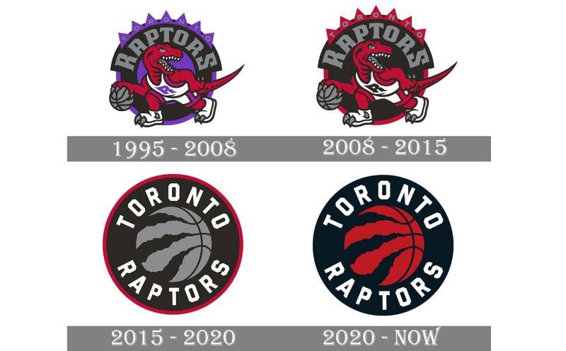
You know how fashion changes over time? So do logos. The Toronto Raptors logo has had its own style evolution, and oh boy, it’s a trip down memory lane.
The Birth of the Dino
Back in the ’90s, the logo showcased a full-bodied, cartoonish dino dribbling a basketball. It was quirky, fun, and so 90’s-tastic.
Evolution to Minimalism
As time rolled on, there was a switch up. The Raptor morphed into the streamlined, modern claw and ball design we recognize today. Gone was the dino, replaced by a more mature, bold symbol.
The Colors of the Toronto Raptors Logo
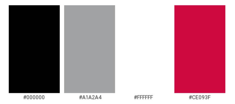
Colors, my friend, are more than just eye candy. They carry emotions and vibes.
The Power of Red
Red is bold, fiery, and passionate. No wonder it’s the dominant hue for the Raptors. It resonates with energy, determination, and the burning will to win.
The Subtle Black and Silver
Contrasting the red is the strategic use of black and silver. While black offers depth and seriousness, the glint of silver provides sophistication and a modern flair.
The Font Used in the Toronto Raptors Logo
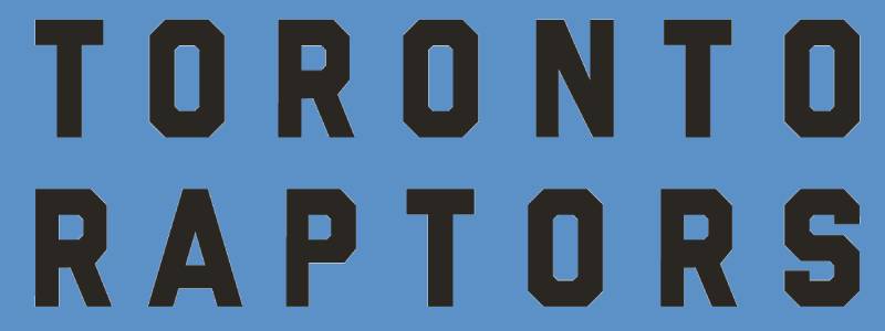
Ever noticed the distinct typography? It ain’t no random pick.
The Strength of Bold
With thick, uppercase letters, the Raptors’ wordmark stands strong and unyielding. This choice in font gives an air of stability and authority.
Simplicity in Design
Despite its robustness, the typography is clean without unnecessary frills. Just like the team’s gameplay – straightforward and impactful.
Aesthetic and Pop Culture Influence
Logo designs don’t live in a vacuum. They’re influenced by the world around them, and vice versa.
The ’90s Nostalgia
That initial dino design? Pure ’90s pop culture essence. Think about those early days of edgy cartoons and comic book flair. The logo captured that spirit perfectly.
Modern-Day Merch Magic
Today’s sleek claw design is a merchandising dream. Its minimal yet distinctive look is sported on jerseys, hats, and even trendy streetwear.
The Universal Appeal of the Logo
Brands dream of having logos that resonate far beyond their primary audience.
Beyond the Basketball Court
The Toronto Raptors’ emblem has done just that. Basketball fan or not, many are drawn to its design, seeing it as a symbol of resilience, passion, and a touch of the wild.
Its Place in Toronto’s Heart
The logo isn’t just a brand mark; for many Torontonians, it’s a symbol of homegrown pride, representing a city that’s as fierce and forward-moving as the raptor it sports.
FAQ On The Toronto Raptors Logo
What inspired the Toronto Raptors logo?
The Raptors’ logo draws its inspiration from the fierce nature of the prehistoric velociraptor, aiming to embody the energy and tenacity of Toronto’s basketball team.
The inclusion of the dinosaur is a nod to the popularity of dinosaurs at the time of the team’s inception, largely due to the movie “Jurassic Park.”
How does the logo represent Toronto?
The logo represents Toronto through its utilization of the city’s colors and by embodying the spirit of its inhabitants. The red and black color scheme mirrors the Canadian flag, while the silver hints at technological innovation synonymous with this metropolitan hub.
Has the Toronto Raptors logo changed over time?
Indeed, the logo has evolved, mirroring the team’s growth and matured brand identity. Initially featuring a more cartoonish dinosaur, the current iteration embraces a sharper, more streamlined aesthetic, reflecting a modern and competitive edge.
What is the significance of the colors in the Raptors logo?
Each hue in the Toronto Raptors logo is awash with meaning; red signifies passion and energy, black conveys power and determination, and silver (once prominent but now more subtle) suggests sophistication and innovation, resonating with the cutting-edge culture of Toronto and the fierce competition in the NBA.
Who designed the original Toronto Raptors logo?
The original design was the product of a nationwide contest in Canada and the creative insights of the NBA’s marketing team. It was a collective effort to encapsulate the essence of a franchise that was, at the time, a gleaming newcomer.
Can the Raptors logo be found on merch?
Absolutely, the Raptors emblem adorns a myriad of merchandise, from jerseys and caps to an expansive array of fan gear. It’s a symbol of loyalty and pride that permeates the Raptors’ fan base, making it a staple on sports apparel throughout Canada and beyond.
What do the claw marks in the logo symbolize?
The claw marks slice through the design, signifying the fierce competitive nature of the Raptors. They represent the relentless drive and assault on the basketball court, leaving a striking impression that resonates with the ferocity of a raptor’s hunt.
How does the logo impact the Toronto Raptors’ brand?
It’s the cornerstone of Raptors’ branding strategy, a visual promise of strength and dynamism. It shapes the perception of the team and fuels marketing endeavors, playing a crucial role in engaging the community and cementing the team’s identity.
How is the Toronto Raptors logo used in sports marketing?
In sports marketing, this iconic logo operates as a focal point—it’s a medium through which stories are told, allegiance is sparked, and the brand’s narrative is woven into the larger tapestry of NBA folklore.
What do fans think of the Toronto Raptors logo?
The Raptors logo captivates fans’ hearts, often heralded for its sleek design that bridges the gap between tradition and evolution.
It echoes the passion of Toronto—a token of unity that Raptors supporters hold dear, manifest across banners, jerseys, and the vibrant thrum of Scotiabank Arena.
Conclusion
Embarking on this expedition through the curves, colors, and contours of the Toronto Raptors logo, we’ve navigated a design landscape rich with intention and ripe with symbolism. This beacon of Canadian basketball isn’t merely a motif stitched on merchandise; it’s a heartbeat pulsating through Toronto, a banner uniting basketball aficionados and casual observers alike.
As the chapter closes on our journey, what remains crystal clear is the transformative power of such an emblem—how it transcends sports branding to embed itself within the cultural fabric of a city. Beyond a mere sports iconography, it weaves a narrative of competitiveness, community, and unyielding spirit.
- Remember, every claw mark is a story of tenacity.
- Each color swath carries the weight of history and pride.
- The emblem’s evolution reflects the team’s journey from underdogs to titans.
This logo does what all iconic designs aspire to—it endures, it evolves, and above all else, it inspires.
If you liked this article about the Toronto Raptors logo, you should check out this article about the Chicago Bulls logo.
There are also similar articles discussing the Golden State Warriors logo, the Miami Heat logo, the Houston Rockets logo, and the Detroit Pistons logo.
And let’s not forget about articles on the Milwaukee Bucks logo, the Cleveland Cavaliers logo, the Utah Jazz logo, and the Memphis Grizzlies logo.
Bogdan Sandu, a seasoned designer with 15 years of diverse experience, has been designing websites since 2008.
Renowned for his expertise in logo design and visual branding, Bogdan has developed a multitude of logos for various clients.
His skills extend to creating posters, vector illustrations, business cards, and brochures. Additionally, Bogdan's UI kits were featured on marketplaces like Visual Hierarchy and UI8.
Latest posts by Bogdan Sandu (see all)