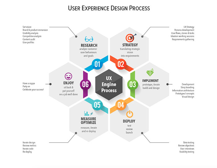
The Principles Of Information Architecture

Imagine web design as a bustling city: Information Architecture (IA) is its masterplan, shaping streets (navigation) and erecting landmarks (key content) that guide visitors to their desired destinations effortlessly. In this digital landscape, getting the fundamentals right can mean the difference between a delightful stroll through information and a frustrating maze of dead ends.
In the heart of every successful online experience, IA principles lay the groundwork; they are the blueprints of usability, the subtle signposts of user experience design, and the core of content organization.
This article serves as your compass to understanding how these principles come together to create a seamless interface that resonates with users.
By the end, you’ll have unpacked the building blocks of effective site mapping, explored the intricacies of taxonomy, deciphered the metadata enigma, and gained a new perspective on crafting navigational pathways.
Prepare to dive into strategies like card sorting and wireframing that bring structure to your content and allow your users to find what they need with intuitive ease.
Core Principles of Information Architecture
The Principle of Objects
Content as Living Entities
Let’s dive right in. Think of web content as living, breathing things. They’re not just static words on a screen. Each piece of content has its own life, you know?
It’s born, it evolves, and sometimes, it even retires. This is super important in the principles of information architecture. It’s like having a bunch of digital pets. Each one needs care and understanding to thrive.
Lifecycle, Behaviors, and Attributes
Now, every piece of content has a lifecycle. It’s kind of like watching a plant grow. You’ve got the seedling stage, where it’s just an idea.
Then it sprouts, becoming a rough draft. After some nurturing (like editing and revising), it blossoms into its final form. But it’s not just about growth stages.
Each type of content behaves differently and has unique attributes. Think about a blog post versus a product description. They serve different purposes and need different treatments in the grand scheme of your site’s ecosystem.
The Principle of Choices
Offering Meaningful Choices
Choices, choices everywhere! But here’s the deal: not all choices are good choices. In the world of web design, you want to offer choices that make sense.
It’s like guiding someone through a maze; you want to give them the right turns that lead to the treasure, not dead ends.
This means understanding what your users are looking for and presenting those options clearly. It’s a big part of the principles of information architecture, making sure people can navigate your content without feeling overwhelmed.
Focusing on User Tasks and Needs
Here’s a pro tip: always keep your users’ tasks and needs front and center. It’s like being a mind reader, but not in a creepy way.
You want to anticipate what they’re looking for and make it super easy to find. This could mean organizing content in a way that’s intuitive to them or making sure search functions are top-notch. Remember, if they can’t find it, it might as well not exist.
The Principle of Disclosure
Progressive Disclosure Concept
Alright, let’s talk about not spilling all the beans at once. Progressive disclosure is a fancy way of saying, “reveal information as it becomes relevant.” It’s like telling a story.
You don’t give away the ending in the first chapter. Instead, you provide information bit by bit to keep the reader engaged.
In web design, this means not overwhelming users with too much info at once. Give them what they need to know at that moment, and then reveal more as they go deeper into your site.
Layered Presentation of Information
This is where it gets artsy. Layered presentation is all about depth. Think of your website like an onion (minus the tears).
You’ve got layers of information. The top layer is your broad overview – easy to digest and understand. But as users get curious and peel back the layers, they find more detailed information.
This approach keeps your site clean and user-friendly, while also packing it with all the juicy details for those who want to dig deeper.
The Principle of Exemplars
Using Examples to Describe Categories
Ever heard the saying, “Show, don’t tell”? That’s what using exemplars is all about. It’s showing examples to make a point or explain a category.
Say you’re categorizing different types of music. Instead of just listing genres, you show examples of songs or artists that define those genres.
It’s a more engaging way to help users understand and navigate through different categories on your site. Plus, it adds a bit of personality, which is always a win.
Cognitive Science and Categorization
Here’s a bit of brainy stuff. Our brains love categories. It’s like mental file folders. When we categorize information, it helps us process and remember it better.
So, when you’re designing a website, think about how you can categorize content in a way that makes sense to the human brain.
It’s not just about throwing things into random buckets. It’s about creating meaningful, logical groups that resonate with users. This makes navigating your site a breeze and keeps users coming back for more.
The Principle of Front Doors
Designing Beyond the Home Page
Okay, let’s get this straight: every page on your website is like a front door. Yeah, you heard that right. It’s not just the homepage that needs to sparkle.
When we’re talking about the principles of information architecture, we’re saying that every page is a potential landing spot.
Imagine someone dropping by your site for the first time, landing on some random page. That page needs to be welcoming, informative, and, most importantly, it should guide them to where they want to go. It’s like every page is a mini-home page in its own right.
Each Page as a Potential Entry Point
So, here’s the thing: each page needs to stand on its own. It’s like each one is its own little universe, but still part of a bigger galaxy.
You’ve got to make sure that no matter where someone lands, they can easily figure out where they are and where they can go next. Clear signposts, easy navigation – these are your best friends. Keep in mind, a lost visitor is a lost opportunity.
The Principle of Multiple Classification
Diverse User Preferences and Mental Models
People think differently, right? What makes sense to one person might be total gibberish to another.
That’s why, in the world of principles of information architecture, we’ve got to play the game of multiple classification. It’s like having different maps for the same territory, each highlighting different paths. Some users might think categorically, others spatially.
The trick is to offer different ways to browse and find info, catering to as many mental models as possible. It’s a balancing act, but when you get it right, it’s pure magic.
Different Ways to Organize and Find Information
Here’s where creativity meets logic. You need to offer different ways to slice and dice the info on your site. Think filters, search bars, categories, tags – the whole shebang.
It’s like giving users their own toolbox to navigate your content. Some might go straight for the search bar, others might prefer a more leisurely stroll through categories. The key is to make all these tools intuitive and easy to use.
The Principle of Focused Navigation
Clear and Relevant Navigation Paths
Alright, let’s talk about not getting lost. Navigation is like the GPS of your website. It needs to be clear, direct, and to the point.
Focused navigation means guiding your visitors through your site like a pro tour guide. No unnecessary detours, no confusing crossroads. Every menu, button, and link should serve a purpose, taking users closer to what they’re looking for. It’s like creating a path of breadcrumbs, but way more sophisticated.
Avoiding Confusion in Navigation Schemes
Ever been lost in a maze? Not fun, right? That’s exactly what we want to avoid on a website. Overly complex or vague navigation is a big no-no. Keep it simple, keep it clear.
Use language that everyone understands and make sure that each navigation element leads somewhere useful. It’s about creating a seamless journey, where each click feels natural and expected.
The Principle of Growth
Designing for Scalability
Today’s tiny blog could be tomorrow’s go-to resource.
That’s why when we discuss about the principles of information architecture, we have to factor in growth. Designing for scalability means thinking ahead. It’s like planting a tree and leaving enough room for it to grow.
Your site should be able to handle more content, more users, and more interactions without crumbling under the weight. It’s all about building a solid foundation that can support future expansions.
Anticipating Future Content Expansion
Here’s where the crystal ball comes in. Okay, not literally, but you get the idea. Anticipating future content expansion means you’re always a few steps ahead.
What new content might you add down the line? How will it fit into the existing structure?
It’s like playing a game of Tetris where you need to think about where each new piece will fit. The goal is to keep your site fresh and exciting, without messing up the user experience you’ve worked so hard to create.
Practical Application of IA Principles
Understanding User Needs and Behaviors
User Research and Mental Models

To nail this whole information architecture (IA) thing, you gotta get into the heads of your users. It’s all about understanding what ticks their boxes.
User research? It’s the golden ticket here. We’re talking surveys, interviews, maybe even some sneaky observation to really get the gist of what users are after. Mental models are key too. It’s like figuring out the roadmap in people’s heads – how they think a site should work.
Once you’ve got that down, aligning your IA to these mental maps is a game-changer. It’s about making your site feel like home to them.
Adapting IA to User Expectations
Now, it’s all about tweaking and fine-tuning. You’ve got your research, you’ve got insights into their mental models – next up, making your IA sing the same tune as your user’s expectations.
It’s a balancing act – keeping your site’s personality while making it super user-friendly.
Designing for Diverse Access Points
Catering to Various User Entry Points
Picture this: users dropping into your site like paratroopers landing all over the map.
Each one’s got a different starting point. Your job? Make sure they all have a smooth landing, no matter where they touch down. This means thinking beyond the homepage.
Every page needs to be a mini-hub, a launchpad that helps users easily navigate to where they need to be. It’s like being a good host at a party, making sure everyone’s comfortable and can find the snacks and drinks without getting lost.
Ensuring Intuitive User Experience on All Pages
And here’s the thing – intuition is your best friend.
You want your users to navigate your site like they’ve been there a thousand times, even if it’s their first visit. It’s like setting up a room so well that people know where everything is without asking.
This is where those principles of information architecture really shine. A clean layout, logical navigation, clear labels – these are your tools to create an intuitive experience on every single page.
Balancing Simplicity and Complexity
Managing Cognitive Load

Cognitive load is basically how much mental effort a person needs to navigate your site. You want to keep this as low as possible. It’s like a puzzle – too easy and it’s boring, too hard and it’s frustrating.
The sweet spot?
Just enough complexity to keep it interesting, but simple enough that users don’t feel like they’re solving the Da Vinci Code. Use clear headings, straightforward language, and a clean design to keep that cognitive load in check.
Effective Use of White Space and Typography
And don’t forget the power of white space and typography.
White space isn’t just empty space, it’s breathing room for content. It helps highlight what’s important and makes your site look neat and organized. Typography, on the other hand, is the style of your written content.
Choose fonts that are easy on the eyes and match your site’s vibe. Think of white space and typography as the interior design of your site – they set the mood and atmosphere.
Developing a Robust Information Architecture
Steps in Developing IA
Gathering User Requirements
First things first, let’s talk about getting the lowdown from the users. It’s like being a detective, but for website stuff. You gotta ask questions, listen hard, and really understand what your users need.
It’s not just about what they say they want, but also figuring out what they actually need.
This step is crucial because, hey, you’re building this for them, right? You want to nail those principles of information architecture by making sure your site’s as user-friendly as a puppy.
Conducting Content Audits and Defining Types
Next up, we’re diving into the content pool. You gotta know what you have to work with. It’s like doing inventory in a store – what’s selling, what’s not, and what’s missing.
Conducting a content audit is all about taking stock of your existing content, seeing how it fits with your user needs, and identifying gaps. Then, you categorize this content into types, like blog posts, product pages, FAQs – you name it. It’s about organizing your content troops so they’re ready for action.
Testing and Iteration
Importance of Continuous Testing
Alright, so your IA’s in place. Time to sit back and relax, right? Nope, not even close. Testing is where the real fun begins. Think of your site as a lab experiment.
You’ve got hypotheses about how users will navigate and engage with your site, and now it’s time to test them. Continuous testing means checking, tweaking, and rechecking.
It’s a never-ending cycle of improvement. You’re like a gardener, constantly pruning and nurturing your website to perfection.
Iterative Design for User-Centric IA
Iterative design is your best pal here. It’s all about making small changes, one at a time, and seeing how they perform. It’s a bit like playing a video game where you level up bit by bit.
You try something new, measure how it goes, learn from it, and then try again.
This approach keeps you flexible and responsive to user feedback, which is super important in sticking to the principles of information architecture.
Information Architecture vs. UX Design
Distinction and Interrelation
Okay, so there’s often a bit of confusion between information architecture (IA) and user experience design.
Here’s the deal: they’re like peanut butter and jelly – different, but amazing together. IA is all about the structure – organizing content and navigation in a way that makes sense.
UX, on the other hand, is about how users interact with that structure – the overall experience. They’re two sides of the same coin, and both crucial for a killer website.
IA as a Foundation for UX
Think of IA as the foundation of a house and UX as the design and decor. You can’t have a cozy, beautiful home (a great user experience) without a solid foundation (a robust IA).
IA sets the stage for UX. It ensures that users can find what they’re looking for quickly and easily, which is a big part of a positive user experience.
When you nail the principles of information architecture, you’re halfway to creating a website that users will love to visit and revisit.
FAQ on IA Principles
What Exactly Is Information Architecture?
Information Architecture (IA) is the framework that shapes our digital spaces.
Think of it like the art and science behind organizing and labeling websites, apps, or even offline archives to support usability and findability. It’s the secret sauce making sure everything feels just right and easy to use.
How Does IA Affect User Experience?
It’s all about the journey, not just the destination. IA directly influences how smoothly users navigate and interact with content.
A well-planned IA equals a better experience; one that guides visitors effortlessly to their goals, be it information or interaction.
What’s the Difference Between IA and Navigation Design?
IA is the blueprint, the big picture of your whole digital ecosystem. Navigation design? That’s a crucial part of this plan focusing strictly on how users move through information.
Think IA as the entire game board and navigation as the paths you take to reach different spaces.
Why Are Taxonomies and Ontologies Important in IA?
Taxonomies classify your content into organized groups. It’s like making sure there’s a place for everything.
Ontologies? They’re about the relationships, the invisible threads that connect all that content. Both are core in crafting IA that makes sense to users and search engines.
Can IA Impact SEO?
Absolutely. Search engines love a clear structure. A logical IA boosts SEO by making content more discoverable, understandable, and indexable.
Think of IA as scaffolding that holds up content so search engines can easily climb through it.
What Role Does Card Sorting Play in IA?
Card sorting is a hands-on way to understand user thinking. Users sort content into categories that make sense to them.
This usually uncovers the golden nuggets of insight into how to structure your IA, ensuring it aligns with how they search and browse.
How Important Is Metadata in IA?
Metadata is your content’s silent spokesperson. It whispers hints to search engines and whispers king insights to users about what’s on your page.
It’s a key player in making content easily findable and well-indexed, a must-have for any IA strategist.
What Are Information Scent and Findability?
Information scent is all about clues. Are users picking up the right hints on their search for info? If the scent’s good, they’re on track.
Findability means users find what they’re after. Nail both and you’ve got happy visitors who stick around.
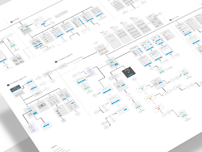
How Do Wireframes Fit Into IA?
Wireframes are the skeleton of your digital project, bare-bones visuals that don’t get swayed by fancy design.
They’re about laying out elements according to your IA, making sure everything’s where it should be, showing you the IA in action, plain and simple.
Is IA Only Relevant For Large Websites?
Not at all. Even the smallest websites benefit from strong IA. It ensures users can find what they need quickly, no matter the size.
Skimp on IA, and you risk creating a digital labyrinth that could frustrate and drive away even the most determined of visitors.
Conclusion on these IA Principles
We’ve untangled the principles of information architecture, and it’s clear why they’re the backbone of any digital space that’s built to last.
These principles are more than just rules; they’re a way of thinking, a mindset to engage users with content that’s as findable as it is usable.
Boldly diving into the depths of taxonomy, we surfaced with a killer strategy to categorize and spruce up the IA framework.
Steered through site maps and wireframes, we’ve charted a path that’s laser-focused on creating pathways as straightforward as a bee-line.
By embodying the principles we’ve shared today, your digital world – no matter the scale – will resonate with clarity and purpose.
You’re now equipped with the know-how to dial up user experience and ensure that every interaction with your content is a navigational no-brainer. Ready? Let’s build spaces where every click counts.
Bogdan Sandu, a seasoned designer with 15 years of diverse experience, has been designing websites since 2008.
Renowned for his expertise in logo design and visual branding, Bogdan has developed a multitude of logos for various clients.
His skills extend to creating posters, vector illustrations, business cards, and brochures. Additionally, Bogdan's UI kits were featured on marketplaces like Visual Hierarchy and UI8.
Latest posts by Bogdan Sandu (see all)
- The Capcom Logo History, Colors, Font, And Meaning - 26 April 2024
- Earth Color Palettes Grounded in Nature: 40 Examples - 26 April 2024
- The EA Logo History, Colors, Font, And Meaning - 25 April 2024