The Epic Games logo is one of the most recognized marks in gaming. It represents a company that grew from a solo bedroom operation in Potomac, Maryland, into a billion-dollar force behind Fortnite and Unreal Engine.
The current version, a black shield with white text and a downward-pointing triangle, has been in use since November 2015. It’s the sixth iteration of the brand’s visual identity. Tim Sweeney founded the company in 1991 under the name Potomac Computer Systems, and the logo has gone through five major redesigns since then.
That’s a lot of change for one mark. But the through-line has always been a sense of weight and authority, something that says “we build worlds” without actually saying it.
What Is the Epic Games Logo?
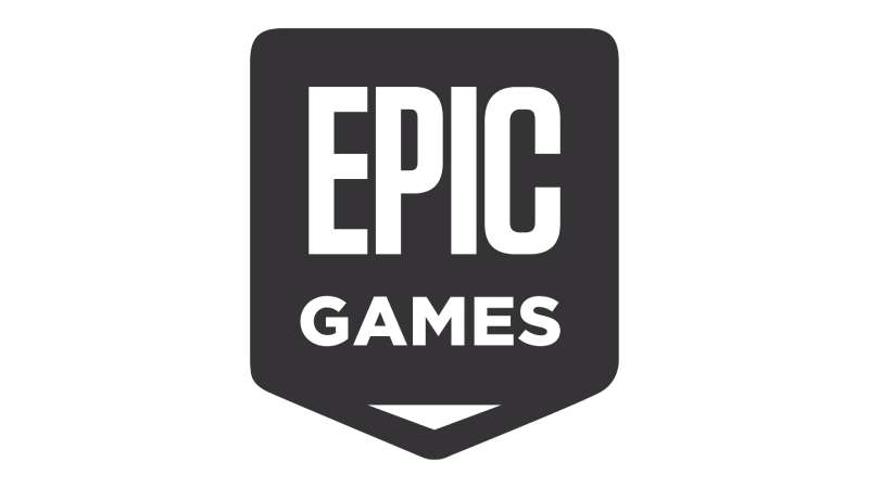
The Epic Games logo is a combination mark featuring a pentagon-shaped shield containing the stacked words “EPIC” and “GAMES” in white sans-serif uppercase lettering, with a small inverted triangle beneath the text. It was introduced in November 2015 and uses a black-and-white monochrome color scheme.
Here’s what you need to know about the mark:
- Design Type: Combination mark (shield emblem + wordmark)
- Primary Elements: Inverted pentagon shield shape, stacked “EPIC GAMES” wordmark, downward-pointing triangle
- Official Introduction Date: November 2015
- Designer/Agency: In-house design with community input. Epic asked fans to vote on the final version
- Trademark Status: Registered with the USPTO under Serial Number 87842183. The mark is described as “an upside down pentagon shape containing the words EPIC GAMES over a triangle shape”
- Color Palette: Black (#2F2D2E) and White (#FFFFFF). The brand also uses Dodger Blue (#25BCFF) as an accent across digital platforms
- Usage Context: Epic Games Store, Unreal Engine branding, Fortnite launcher, merchandise, social media profiles, in-game splash screens, developer documentation
How Has the Epic Games Logo Evolved Over Time?
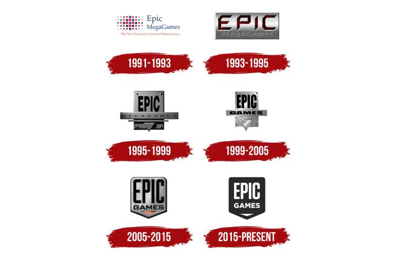
The logo has gone through six versions across 30+ years. Each one tracked a specific growth phase of the company, from shareware publisher to AAA studio to platform holder.
The early versions were busy. Lots of metallic textures, 3D effects, and red accents. The progression toward flat, minimal branding mirrors what happened across the entire tech and gaming company logos space during the 2010s.
Potomac Computer Systems Logo (1991)
Years Active: 1991
The very first mark. Before Epic was Epic. Tim Sweeney was running a computer consultancy from his parents’ house, and the logo reflected that.
It was a two-level wordmark. “POTOMAC” sat on top in purple uppercase letters with a sans-serif feel and pointed edges, backed by black drop shadows. Below it, “Computer Systems” was set in an italicized handwritten style.
Nothing about it screamed “future gaming giant.” But that’s the point, really. Every brand starts somewhere.
Epic MegaGames Logo (1992–1996)
Years Active: 1992–1996
Sweeney renamed the company to Epic MegaGames in early 1992. He wanted it to sound bigger than it was (one guy in a bedroom, basically). The name worked. People assumed it was a large studio.
The new logo featured “Epic MegaGames” in thin blue serif lettering placed beside a geometric emblem made of blue and red squares in different sizes. A red tagline underneath read “The New Name in Computer Entertainment.”
It was simple. Modest. A first real attempt at brand identity for a company that was just starting to figure itself out.
3D Metallic Epic MegaGames Logo (1996–1999)
Years Active: 1996–1999
This is when things got interesting. The logo went three-dimensional with a metallic plate effect. Think steel textures and a pressed look on the text.
The emblem took on a vertical rectangle shape with a triangle protruding downward from the bottom. “EPIC” appeared in gradient blood-red lettering, and “MEGAGAMES” sat beneath it. The metallic sheen gave the whole thing a CGI quality that was very much of its time.
This version dropped right as Epic was gaining serious traction with the Unreal Engine.
Epic Games Logo (1999–2005)
Years Active: 1999–2005
The word “Mega” got dropped in 1999 when the company moved to Cary, North Carolina. They didn’t need the illusion of size anymore. They were actually big.
The logo kept the metallic look but sharpened up. Bolder lettering. Cleaner edges. The downward triangle became more pronounced. “EPIC” and “GAMES” were stacked inside the shield shape with heavier weight.
This version first appeared with Unreal Tournament in 1999 and stuck around through some of the company’s most defining years.
Streamlined Epic Games Logo (2005–2015)
Years Active: 2005–2015
May 2005 brought another overhaul. The shield got thicker contours and the overall shape became more streamlined. Still metallic grey, but cleaner.
“EPIC GAMES” was inscribed in two levels inside the shield. And below the brand name, a small glowing red-orange triangle pointed downward, adding a subtle focal point to the composition.
This was the Gears of War era. The logo needed to feel bolder and more impactful. It did.
Current Epic Games Logo (2015–Present)
Years Active: November 2015–Present
The current logo is a flat, minimalist redesign that strips away every 3D effect, every metallic texture, every trace of the old style.
Black shield. White text. Small white triangle at the bottom. That’s it.
The community actually helped choose this one. Epic ran a public vote, and the majority of fans picked this version. It runs on products, the Epic Games Store launcher, social profiles, and in-game branding.
Took me a while to appreciate it when it first dropped, honestly. After years of that metallic look, this felt almost too stripped down. But it works. Especially at small sizes and on screens.
What Do the Design Elements of the Epic Games Logo Mean?
The shield shape communicates protection and strength. It’s a visual shorthand that gaming audiences read immediately. The inverted triangle at the base doubles as a directional arrow pointing downward, suggesting forward motion or a play button.
The stacked text arrangement, with “EPIC” taking up roughly three-quarters of the shield and “GAMES” sitting smaller beneath it, creates a clear visual hierarchy where the brand name dominates.
Why Did Epic Games Choose These Specific Colors?

The current color palette uses only black and white. Specifically, the black sits at #2F2D2E (a charcoal, not pure black), and white at #FFFFFF.
The brand also uses a Dodger Blue (#25BCFF) as a secondary accent on digital platforms and the Epic Games Store interface.
Black and white together create maximum contrast. No distractions. The choice connects to black logos across tech and gaming, where the color signals authority and sophistication. The white elements on the dark field make the mark readable at any size, from a phone icon to a conference banner.
What Typography Style Is Used in the Epic Games Logo?
The logo uses two different typefaces. “EPIC” is set in Social Gothic Bold. “GAMES” uses Pluto Sans Heavy.
Both are sans-serif faces with strong geometric characteristics. The tracking is tight, and the uppercase letters fill the shield width precisely.
Using two different fonts for a two-word logo is actually kind of unusual. Most brands stick to one family. But the weight difference between Social Gothic Bold and Pluto Sans Heavy creates a subtle size and texture variation that reinforces the hierarchy without being obvious about it.
What Are the Hidden Meanings in the Epic Games Logo?
The downward triangle at the base of the shield has been interpreted as a play button, a sword tip, or an arrow. Epic hasn’t officially confirmed any single reading.
The shield shape itself mirrors the psychology of shapes: angular forms suggest stability and protection. The inverted pentagon is unique, though. You don’t see it much in tech company logos.
The fact that the community voted on this design is probably the most meaningful “hidden” element. It’s a logo chosen by the people who use the products. That’s pretty rare for a company this size.
How Does the Epic Games Logo Compare to Competitor Logos?
Most major gaming studios lean toward either wordmarks or stylized icon-plus-text combinations. Epic’s shield shape sits in a different category. It’s more emblem than wordmark.
Compare it to the EA logo, which uses a circular enclosure, or the Valve logo with its anatomical illustration approach. The Ubisoft logo uses a swirl shape. Rockstar Games relies on its star-and-R combination.
Epic’s mark is arguably the most “corporate” of the major game publishers. It doesn’t try to be playful. It doesn’t wink at you. The Nintendo logo, for instance, feels approachable. The Riot Games logo has an aggressive edge. Epic sits somewhere in between, leaning toward the serious end.
Compared to its direct competitor in game engines, the Unity Software logo uses a more open, three-dimensional cube mark. Epic’s flat shield feels heavier. More grounded.
What Are the Technical Specifications of the Epic Games Logo?
Official Color Codes
- Primary Color: Black – Hex: #2F2D2E, RGB: (47, 45, 46), CMYK: (0, 4, 2, 82), Pantone: PMS Black C
- Secondary Color: White – Hex: #FFFFFF, RGB: (255, 255, 255), CMYK: (0, 0, 0, 0), Pantone: PMS 7436 C
- Accent Color: Dodger Blue – Hex: #25BCFF, RGB: (37, 188, 255), CMYK: (85, 26, 0, 0)
Dimensions and Proportions
The logo uses an inverted pentagon (shield) shape with an approximate aspect ratio of 647:751 based on the official SVG file. That’s slightly taller than it is wide.
“EPIC” occupies roughly three-quarters of the horizontal space within the shield. “GAMES” matches the width of “EPIC” in a smaller font size. The triangle sits centered beneath both words, its width roughly matching the text block.
Clear space requirements follow standard brand guidelines practice: the logo needs breathing room equal to at least the height of the triangle on all sides. Official assets are available through Epic’s press and media kit pages, and the logo is distributed as vector graphics (SVG) for scalability.
What Cultural Impact Has the Epic Games Logo Had?
The logo became shorthand for free games. Every Thursday, people see that black shield and associate it with the Epic Games Store’s weekly giveaways. That’s a powerful brand connection that most companies would kill for.
It also became a flash point during the Epic vs. Apple legal battle in 2020–2021. The logo appeared in courtroom exhibits, on protest imagery, and across social media campaigns. For a stretch, it was as much a symbol of antitrust debate as it was a game logo.
The Fortnite logo is probably more famous globally, if we’re being honest. But the corporate mark carries the weight of the whole ecosystem: Unreal Engine, the store, all the acquisitions.
How Does the Epic Games Logo Fit Into the Overall Brand Identity?
The Epic Games logo sits at the top of a brand architecture that includes separate identities for Fortnite, Unreal Engine, the Epic Games Store, and acquired properties like Rocket League.
Each sub-brand has its own look. Fortnite is colorful and loud. Unreal Engine is darker with technical precision. The corporate logo acts as the parent identity, the one mark that ties everything together.
The brand style guide keeps it tight. Black and white for the master brand, with the Dodger Blue accent bleeding into digital interfaces. The typography choices (Social Gothic Bold and Pluto Sans Heavy) are specific enough to be ownable but flexible enough to work across web design, print, and motion graphics.
How Should the Epic Games Logo Be Used?
Epic publishes official logo guidelines through their developer documentation portal. Here’s the short version of what to know:
- Do: Use official assets from Epic’s press kit or developer portal. Maintain clear space around the logo. Use the black-on-white or white-on-black versions as provided
- Don’t: Stretch, rotate, recolor, or add effects to the logo. Don’t place it on busy backgrounds without proper contrast. Don’t use outdated versions
- Official Assets: Available through dev.epicgames.com and the Epic Games press page. SVG and PNG formats are provided
- Licensing: The logo is a registered trademark of Epic Games, Inc. Using it requires explicit permission or a formal licensing agreement. Developers on the Epic Games Store or using Unreal Engine should check their specific agreements for permitted usage
- Trademark Protection: The mark is federally registered with the USPTO. Epic actively protects its brand assets, and unauthorized commercial use can result in legal action
If you’re a developer building on Unreal Engine or publishing through the Epic Games Store, your usage rights are typically outlined in your developer agreement. But always double-check. Took me an embarrassing number of projects before I started reading the fine print on these things.
FAQ on The Epic Games Logo
What does the Epic Games logo look like?
It’s a black inverted pentagon (shield shape) with “EPIC GAMES” stacked in white uppercase letters inside. A small downward-pointing triangle sits beneath the text.
Clean. Two colors. No extras. The whole thing reads instantly at any size.
Who designed the current Epic Games logo?
Epic’s in-house team created it, but here’s the interesting part. The company ran a public vote. Fans and gamers chose the final design from multiple options.
That was back in 2015. The designer’s specific name hasn’t been publicly credited.
When was the Epic Games logo introduced?
The current version launched in November 2015. It replaced a metallic-grey shield that had been around since 2005.
The company itself started in 1991 as Potomac Computer Systems, so the brand has been through six logo versions total.
What font is used in the Epic Games logo?
Two fonts, actually. “EPIC” uses Social Gothic Bold and “GAMES” is set in Pluto Sans Heavy. Both are sans-serif typefaces with strong geometric qualities.
Using two different font families in a two-word logo is uncommon. Most brands pick one and stick with it.
What are the official Epic Games logo colors?
Black (#2F2D2E) and white (#FFFFFF). The brand also uses a Dodger Blue (#25BCFF) as an accent on digital platforms like the Epic Games Store.
No gradients. No extra shades. Just high-contrast monochrome.
What does the triangle in the Epic Games logo mean?
The downward-pointing triangle has been read as a play button, an arrowhead, or a sword tip. Epic hasn’t confirmed one official meaning.
It echoes the shield’s pointed base, so it works as a design element that reinforces the overall shape.
Can I use the Epic Games logo for my project?
Not without permission. The logo is a registered trademark with the USPTO (Serial Number 87842183). Commercial use requires a licensing agreement.
Unreal Engine developers and Epic Games Store publishers should check their developer agreements for specific usage terms.
How has the Epic Games logo changed over the years?
It went from a basic wordmark (1991) to a geometric emblem with blue and red squares (1992), then a 3D metallic shield (1996), a refined metallic version (1999), a streamlined shield with a red triangle (2005), and finally the flat black-and-white version (2015).
Where can I download the official Epic Games logo?
Official logo files are available through Epic’s developer portal at dev.epicgames.com and their press page. You’ll find SVG and PNG formats there.
The SVG file dimensions are 647 × 751 pixels. Always grab assets from official sources.
Why did Epic Games simplify its logo in 2015?
The shift followed broader branding trends across the gaming industry toward flat, minimalist design. The company had grown big enough that a simple mark carried more weight than a detailed one.
Recognition was already high. The logo didn’t need to work hard anymore.
Conclusion
The Epic Games logo tells the story of a company that went from shareware games in a Maryland bedroom to running one of the biggest digital storefronts in PC gaming. Six versions over three decades, and each one tracked a real shift in what the company was becoming.
The current black shield works because it doesn’t try too hard. It lets Fortnite be loud and Unreal Engine be technical while the corporate mark stays quiet and confident.
Tim Sweeney’s company has always understood that good branding gets out of the way. The logo proves it.

Renowned for his expertise in logo design and visual branding, Bogdan has developed a multitude of logos for various clients.
His skills extend to creating posters, vector illustrations, business cards, and brochures. Additionally, Bogdan's UI kits were featured on marketplaces like Visual Hierarchy and UI8.
He also wrote in the past years on sites like Design Your Way, WebDesignerDepot, WPDean, Designmodo, Speckyboy, Slider Revolution, and more.
- The Windsurf Logo History, Colors, Font, And Meaning - 10 October 2026
- How to Remove Background From Product Photos (No Photoshop) - 10 October 2026
- How Designers can Build a Stronger Online Creative Identity - 9 October 2026

Bogdan Sandu is a seasoned designer who has been designing websites since 2008. Renowned for his expertise in logo design and visual branding, Bogdan has developed a multitude of logos for various clients. His skills extend to creating posters, vector illustrations, business cards, and brochures. Additionally, Bogdan's UI kits were featured on marketplaces like Visual Hierarchy and UI8. He also wrote in the past years on sites like Design Your Way, WebDesignerDepot, WPDean, Designmodo, Speckyboy, Slider Revolution, and more.
You Might Also Like