

The Rockstar Games Logo History, Colors, Font, And Meaning
Imagine an emblem so ingrained in pop culture that it conjures a universe of its own – the Rockstar Games logo does exactly that. Each curve and star speaks volumes of a legacy cemented in interactive entertainment, an insignia that echoes throughout the gaming cosmos.
As you traverse this article, unfold the nuances of design that took a mere symbol and escalated it to an icon synonymous with adrenaline-pumping narratives and groundbreaking gameplay.
You’re here because you seek a deeper understanding, a foray into the genesis of visual identity within the gaming industry.
Lean in, as we peel back the layers of this iconic gaming symbol, mirroring the ethos of Rockstar Games itself – bold, audacious, yet meticulously crafted.
By article’s end, insights into the alchemy of graphic elements and brand recognition in gaming shall be yours.
Delve into the anatomy of the Rockstar Games emblem and its transcendence beyond mere game company emblems, into a cultural icon cherished by legions of fans worldwide.
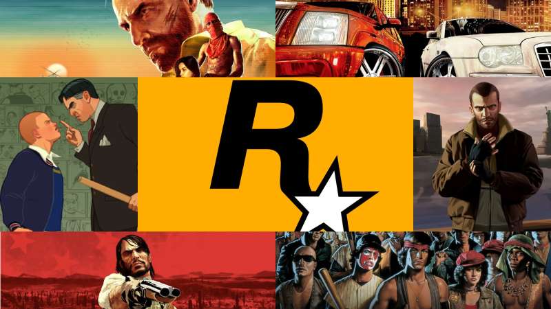
The Meaning Behind the Rockstar Games Logo
![]()
Dude, ever taken a close look at the Rockstar Games logo? I mean, really looked at it? It’s a brilliant piece of branding, I must say.
Visual Impact
So, you see that star, right? Well, it’s not just there because it looks cool. It represents being the top, the best – a Rockstar. You get it?
It’s also about the gaming company being the star in the industry, always in the limelight, just like a real rockstar.
Subtle Messaging
Another point to consider? That R-star logo subtly tells us that their games are unique, and they stand out. Remember playing their games? They’ve got this distinct style, and their logo matches that – distinct and unforgettable.
The History of the Rockstar Games Logo
![]()
Now, let’s take a trip down memory lane. A nostalgic one for many of us!
Origins
Way back, when the logo first started making waves, it immediately stood out. The industry was flooded with generic, predictable logos. But Rockstar? Nah, they marched to the beat of their own drum.
Evolution
Over time, while the essence of the logo remained the same, there were slight shifts. It grew sharper, more refined, just like their games. Every change mirrored the evolution of the company itself, giving fans a little piece of their journey.
The Colors of the Rockstar Games Logo
You can’t miss those colors, right?
The Dominance of Black
Black is classic. It’s elegant. In the world of design, black screams sophistication. And in the Rockstar logo, it’s not just about aesthetics.
It also speaks of mystery, depth, and the unknown adventures their games offer.
The Splash of Yellow
Now, that yellow? It’s the pop, the surprise element. Think of it as a flashlight in a dark room. It grabs attention and adds a dose of energy to the otherwise sleek and somber black.
The Font Used in the Rockstar Games Logo
The font, my friends, isn’t just letters. It tells a story.
Uniqueness
Rockstar went for a custom font – bold choice, but totally worth it. It’s strong, solid, and has a commanding presence. Just like their games.
Consistency
Despite the logo’s various evolutions, the font has remained pretty consistent. It gives off that vibe of reliability. It’s like they’re saying, “We change, we innovate, but our core remains rock solid.”
The Texture of the Rockstar Games Logo
Ever noticed the texture?
The Grunge Look
That slightly worn-out, grunge feel? It screams rebellion, a break from the norm, much like the narratives of their games. They’re not just about playing; they’re about experiencing stories, challenges, and often, going against the grain.
Relatability
The texture gives it a real-world, tangible feel. It’s not glossy; it’s not polished to the point of being unrecognizable. It’s something gamers can relate to, grounding the brand in reality.
Rockstar’s Broader Branding Elements
Beyond the logo, there’s a universe.
Swag and Merchandise
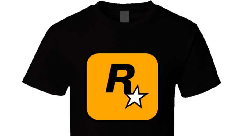
From tees to caps, the Rockstar logo has found its way into the wardrobes of millions. It’s not just about gaming anymore; it’s a lifestyle. The logo, with its unique design and colors, makes for some rad merchandise.
Influence on Other Designs
Over time, many gaming companies have been inspired by Rockstar’s branding. Its influence is undeniable. They set a trend, and many tried to follow, trying to encapsulate that same bold and rebellious spirit.
FAQ On The Rockstar Games Logo
What is the meaning behind the Rockstar Games logo?
The emblem of Rockstar Games, with its modern and edgy design, symbolizes the rebellious spirit of the brand. It encompasses a zest for innovation, a nod to the rockstar ethos within the world of video game development.
How has the Rockstar Games logo evolved over time?
It’s fascinating, the evolution. The logo has undergone subtle refinements while maintaining its iconic ‘R’ and star. These changes reflect shifts in design trends and the evolving identity of Rockstar as leaders in the ever-dynamic gaming landscape.
Who designed the Rockstar Games logo?
The original design was masterminded by in-house artists at Rockstar. These creatives have encapsulated the essence of the company’s vision: to be the rockstars of the video game industry, an entity now synonymous with cutting-edge interactive entertainment.
What do the colors of the Rockstar Games logo represent?
The bold black and yellow hues are a statement. They shout confidence, energy, and expertise. This color scheme is intentionally chosen to make a strong visual impact, mirroring the impact of their game titles on the gaming community.
Are there different versions of the Rockstar Games logo for various games?
Indeed, variations exist. Each game might tweak the logo subtly to align thematically with the game’s setting and tone, like Red Dead Redemption‘s old-west flair, for instance. Yet, the core logo’s integrity remains, a steadfast beacon of the brand.
Is the Rockstar Games logo trademarked?
Protection of identity is key. The logo is, without doubt, trademarked. It’s safeguarded fiercely, just as you’d expect from a leader in digital entertainment, a true guardian of their unique brand identity in a competitive industry.
Has the Rockstar Games logo ever faced controversy?
Amidst the logo’s fame, controversy has snaked its way in. It’s trivial, really—chatter about alleged hidden meanings. Yet, Rockstar stands tall, unshaken. The logo remains a proud flag for games that have left an indelible mark on the gaming community.
How do merchandisers get the right to use the Rockstar Games logo?
Merchandising thrives on proper channels. Interest in logo use necessitates a licensing agreement directly from Rockstar Games Inc., where terms and conditions are delineated clear as day—a standard in brand usage operations.
Can the Rockstar Games logo be customized for fan art?
Creativity within fan circles flourishes. While fans are often inspired to create their own renditions of the logo, such artworks fall under fan art and are generally not for commercial use. Always a thin line, one must tread carefully to respect the trademark.
Why is the Rockstar Games logo so recognizable among gamers?
Recognition stems from consistent branding paired with game-changing titles. It’s an avatar for quality, storytelling, and immersive experiences.
Like a signature, it signs off on memories crafted within virtual worlds, leaving endless trails of nostalgia in the heartstrings of its global audience.
Conclusion
And so we reach the terminus of our intricate dance around the Rockstar Games logo, a symbol that’s more than just graphic design; it’s the heart of a juggernaut in digital entertainment. An emblem transcending mere video game developer status to embed itself in the very fabric of gaming culture.
The takeaway is this: a logo, while a silent guardian of brand identity, speaks volumes. Rockstar’s insignia—a beacon of storytelling prowess, innovation, and the rockstar ethos—stands as a testament to their commitment to interactive entertainment. It’s a flag under which millions gather, where narratives and virtual worlds collide with the reality of millions.
As the pixel dust settles, remember the power of graphic elements and the resonance of visual identity. They are the unsung heroes that, when woven together with intention, can spellbind an audience, transforming a simple ‘R’ and star into a cultural icon that, for many, beats with the tempo of an adventure-laden heart.
If you enjoyed reading this article about the Rockstar Games logo, you should read these as well:
- 9 Types of Logos You Can Create as a Graphic Designer
- Cool video game fonts to use for designing game related projects
- 6 Alternatives To Invideo in 2023
Bogdan Sandu, a seasoned designer with 15 years of diverse experience, has been designing websites since 2008.
Renowned for his expertise in logo design and visual branding, Bogdan has developed a multitude of logos for various clients.
His skills extend to creating posters, vector illustrations, business cards, and brochures. Additionally, Bogdan's UI kits were featured on marketplaces like Visual Hierarchy and UI8.
Latest posts by Bogdan Sandu (see all)
- The Tecate Logo History, Colors, Font, And Meaning - 5 May 2024
- REM to PX Converter - 5 May 2024
- The Asahi Logo History, Colors, Font, And Meaning - 4 May 2024