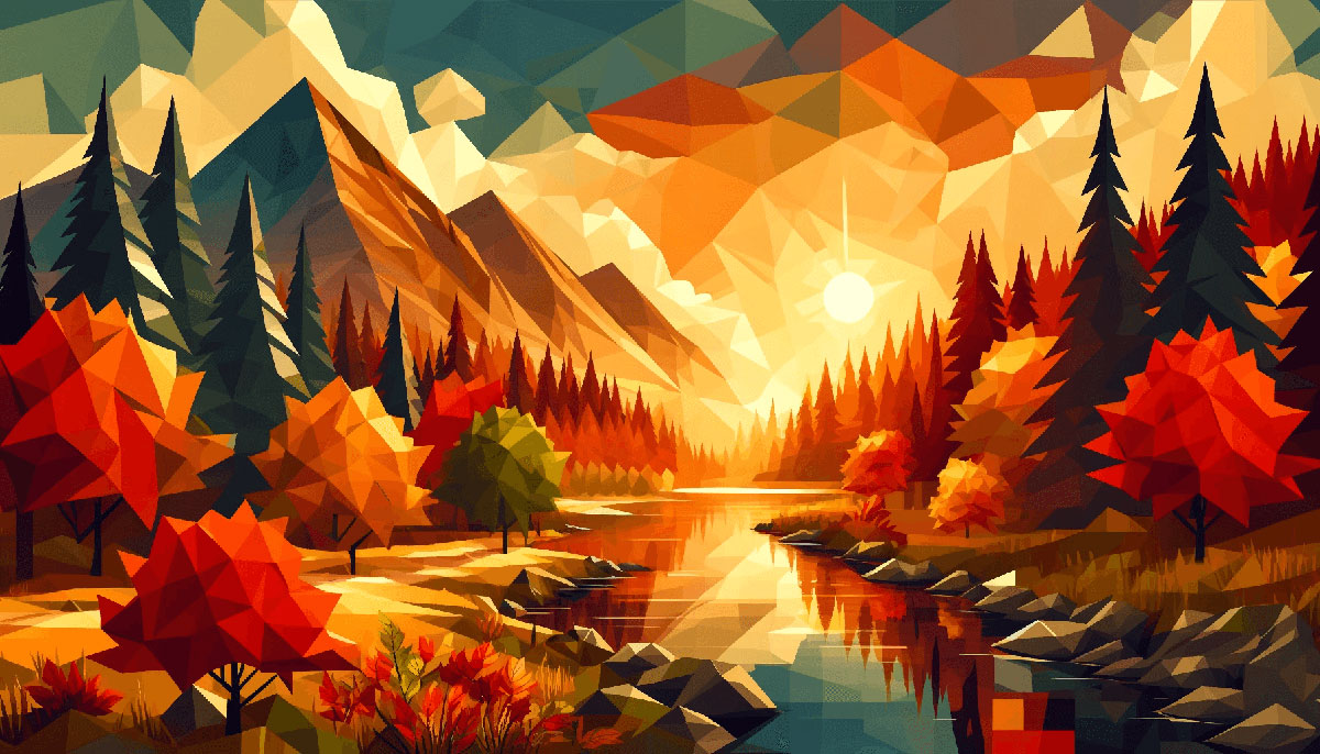
Dive Deep into Design with Dark Color Palettes
Dive into the depths of dark color palettes; a realm where the muted whispers of deep shades and moody hues create an allure that commands attention.
In the ever-evolving tapestry of the digital design world, the bold choice to embrace the somber yet rich colors of a darker spectrum can set a tone that’s both sophisticated and impactful.
It’s a canvas where contrast becomes the artist and low light design the muse.
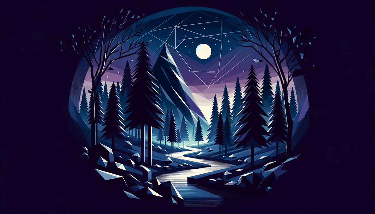
Navigating through the nuances of dark UI/UX design, this article unfurls the secrets of crafting visual experiences that resonate.
With a fine brush, we’ll trace the contours of accessibility, ensuring that every subtle transition from the intense dark to the delicate dark is both seen and felt.
The knowledge to be gleaned is potent; unraveling the threads of color theory in design to render web pages that are not only aesthetically pleasing but also functionally brilliant.
Prepare to illuminate the shadows as we explore the intricacies of color palette inspiration and the alchemy of turning night mode colors into digital gold.
Examples of Dark Color Palettes
| #9290C3 | #F6B17A | #78A083 | #910A67 |
| #7077A1 | #EEE4B1 | #00224D | #F2613F |
| #424769 | #A0153E | #EEEEEE | #9B3922 |
| #5D0E41 | #76ABAE | #BB8493 | #5F374B |
| #7E6363 | #720455 | #31363F | #481E14 |
| #3C0753 | #DBAFA0 | #FF204E | #0C0C0C |
| #503C3C | #A87C7C | #704264 | #535C91 |
| #8C6A5D | #49243E | #50727B | #070F2B |
| #3E3232 | #1B1A55 | #2D3250 | #35374B |
| #222831 | #344955 | #430A5D | #030637 |
| #93B1A6 | #191919 | #BED754 | #F39F5A |
| #5C8374 | #872341 | #435585 | #1B4242 |
| #818FB4 | #FAF0E6 | #DA0C81 | #940B92 |
| #232D3F | #F5E8C7 | #750E21 | #9EC8B9 |
| #3F1D38 | #A2678A | #F05941 | #008170 |
| #005B41 | #092635 | #BE3144 | #4D3C77 |
| #363062 | #610C9F | #5C5470 | #E19898 |
| #183D3D | #E3651D | #B9B4C7 | #E95793 |
| #040D12 | #352F44 | #0F0F0F | #AE445A |
| #662549 | #451952 | #D6DAC8 | #FBF3D5 |
| #643A6B | #D21312 | #526D82 | #84A7A1 |
| #9DB2BF | #27374D | #A76F6F | #DDE6ED |
| #D4ADFC | #1D267D | #957777 | #512B81 |
| #8CABFF | #070A52 | #116D6E | #393646 |
| #B0A4A4 | #435B66 | #2E8A99 | #CD1818 |
| #4E3636 | #35155D | #5C469C | #1F6E8C |
| #3F2E3E | #2D4356 | #4477CE | #EAB2A0 |
| #A78295 | #0C134F | #321E1E | #0E2954 |
| #F4EEE0 | #EFE1D1 | #331D2C | #6D5D6E |
| #5F264A | #ED2B2A | #4F4557 | #F15A59 |
| #03001C | #66347F | #0B2447 | #4E31AA |
| #D27685 | #B6EADA | #576CBC | #9E4784 |
| #F2F7A1 | #E5E5CB | #3795BD | #19376D |
| #2F58CD | #5B8FB9 | #1C82AD | #D5CEA3 |
| #443C68 | #6D67E4 | #3A1078 | #46C2CB |
| #A5D7E8 | #CBE4DE | #2E4F4F | #3C2A21 |
| #37306B | #393053 | #144272 | #2C3333 |
| #301E67 | #1A120B | #2C74B3 | #205295 |
| #0E8388 | #03C988 | #453C67 | #635985 |
| #18122B | #00337C | #0A2647 | #13005A |
FAQ on Dark Color Palettes
Why are dark color palettes popular in UI/UX design?
Dark color palettes resonate deeply in UI/UX design for their classy, modern feel and eye-strain reduction in low-light conditions.
They bring the focus to content, create an immersive experience, and often enhance battery life on OLED and AMOLED screens—critical in today’s mobile-first world.
How do you choose the right dark colors for a website?
Selecting the right dark colors hinges on balancing aesthetics with legibility. Aim for muted hues that complement each other, and ensure there’s enough contrast with text and other elements.
Adobe Color CC can be a helpful tool for experimenting with and visualizing these dark palettes.
What considerations are important for dark mode accessibility?
Accessibility in dark mode requires a keen eye on contrast ratios—text and interactive elements must pop against the background, ensuring legibility for all users.
A11y best practices guide the way, emphasizing that design choices must never compromise the functionality for users with visual impairments.
How can dark color palettes affect a brand’s perception?
Dark color palettes can articulate elegance, sophistication, and authority, influencing a brand’s perception intensely.
However, they need to align with your brand’s identity and values, creating a consistent and authentic user experience that reflects the core of your brand’s story and ethos.
What is the impact of dark color palettes on user emotions?
Color psychology posits dark shades can evoke strong emotions—mystery, strength, luxury. These moody hues can create a dramatic backdrop, stirring an emotional connection that makes user experiences memorable.
As designers, we harness these emotions to craft a narrative that resonates with our audience.
How can one ensure text readability against dark backgrounds?
Readability against dark backgrounds requires high-contrast colors for text. Hex Codes are precise tools for selecting these colors. Rule of thumb: lighter, brighter text against dark backgrounds.
And always test readability across various devices to confirm that the user experience remains clear and uncompromised.
How do dark color palettes impact the visual hierarchy of a design?
Visual hierarchy in a design with dark color palettes shifts dramatically. Color becomes a tool to guide the user’s eye, with brighter elements claiming attention and darker ones receding. This hierarchy ensures that users can easily navigate and digest content without visual fatigue.
Can dark color palettes work for any industry?
While especially beloved in tech and entertainment, dark color palettes can transcend across industries, given the right execution.
The key is to tailor these deep shades to convey the correct message, whether it’s a luxury spa’s promise of tranquility or a legal firm’s bastion of professionalism.
How do you balance dark themes with colorful elements?
Balancing dark themes with color needs a deft touch; too much brightness can jar, too little can swamp. The secret lies in splashes of color for emphasis—think of it as strategic illumination.
Select colorful elements that will emerge as beacons in the night, guiding the user purposefully.
What are the best practices when transitioning a website to a dark color palette?
Transitioning to a dark color palette is not merely flipping a switch—it’s a thematic overhaul. Begin with a thorough audit, selecting core hues that support readability and mood.
Gradually phase elements, testing rigorously with tools like Google’s Material.io, to ensure seamless adaptability and consistent user experience.
Conclusion
As the curtain falls on the exploration of dark color palettes, it’s clear that these rich and moody hues are more than just a stylistic choice—they’re a strategic narrative device in visual storytelling.
Wrapping elements in sombre tones and muted whispers, they offer unparalleled depth to design, encapsulating both elegance and functionality.
Remember, a visual hierarchy sculpted from darkness does more than please the eye; it guides it. It highlights the importance of contrast ratios and the user experience in the low light design—key players in the game of legibility.
With tools like Adobe Color and concepts like color theory as allies, the potential for dark-themed artistry is vast.
In a tapestry where night mode colors can be spun into digital silk, one must weave with intent, ensuring accessibility remains unfaltering. Therein lies the art of mastering dark color palettes—not just as a design trend, but as a conduit for poignant, resonant, and inclusive experiences.
If you liked this article about dark color palettes, you should check out this article about winter color palettes.
There are also similar articles discussing spring color palettes, popular color palettes, vintage color palettes, and neon color palettes.
And let’s not forget about articles on gold color palettes, light color palettes, warm color palettes, and cold color palettes.
Bogdan Sandu, a seasoned designer with 15 years of diverse experience, has been designing websites since 2008.
Renowned for his expertise in logo design and visual branding, Bogdan has developed a multitude of logos for various clients.
His skills extend to creating posters, vector illustrations, business cards, and brochures. Additionally, Bogdan's UI kits were featured on marketplaces like Visual Hierarchy and UI8.
Latest posts by Bogdan Sandu (see all)