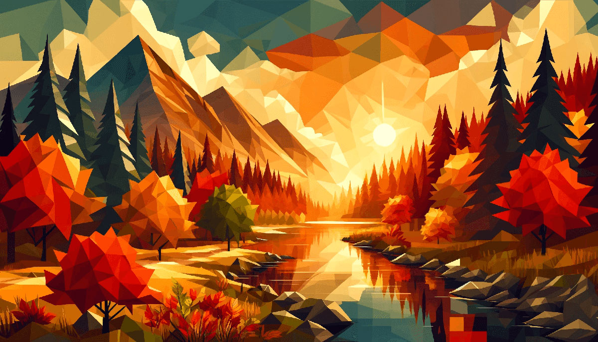


Warm Color Palettes for Cozy Designs
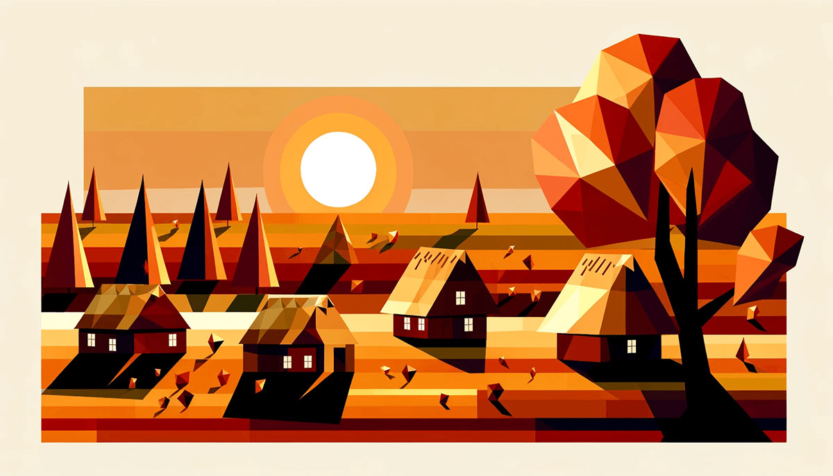
Imagine settling into a room aglow with the hues of a late autumn sunset; you’re instantly enveloped by a sense of warmth—a testament to the transformative power of warm color palettes.
As an artisan of the web, these palettes are a palette of my trade, carefully curated to evoke emotions and craft experiences.
This piece unfolds the secrets of integrating earth tones and vibrant warm colors into digital canvases. It’s more than just splashing amber or gold tones; it’s about weaving the essence of warmth into the very fabric of visual design.
With each paragraph, delve into the color theory and psychology that underpin compelling designs.
By the conclusion, expect to be equipped with the savvy to blend color temperature into your projects seamlessly, whether for web interfaces, branding, or interior design applications.
Let’s embark on an exploration of cozy color schemes—a journey through hue and chroma, down to the last pixel.
Examples of Warm Color Palettes
| #E9C874 | #FFAF45 | #C08B5C | #00224D |
| #FFB38E | #5D0E41 | #FF5BAE | #A0153E |
| #673F69 | #A34343 | #E178C5 | #EAD8C0 |
| #F7C566 | #E5C287 | #453F78 | #BB8493 |
| #FFF2E1 | #FFC94A | #6C0345 | #C0D6E8 |
| #FF8E8F | #DC6B19 | #DBAFA0 | #704264 |
| #FFF8DC | #FBF3D5 | #D1BB9E | #FDA403 |
| #673F69 | #898121 | #E8751A | #795458 |
| #FFFDCB | #FF204E | #D74B76 | #49243E |
| #FBF8DD | #D1BB9E | #A79277 | #E72929 |
| #FFFDD7 | #FFE4CF | #FB6D48 | #FFC94A |
| #FFE5E5 | #E0AED0 | #AC87C5 | #756AB6 |
| #E2BFB3 | #F7DED0 | #FEECE2 | #FFBE98 |
| #643843 | #85586F | #AC7D88 | #FDF0D1 |
| #FFE7E7 | #CAA6A6 | #B47B84 | #944E63 |
| #F7418F | #FC819E | #FEC7B4 | #FFF3C7 |
| #E8D8C4 | #C7B7A3 | #6D2932 | #561C24 |
| #EEA5A6 | #E493B3 | #B784B7 | #8E7AB5 |
| #E4DEBE | #E6BAA3 | #D24545 | #A94438 |
| #A87C7C | #7E6363 | #503C3C | #3E3232 |
| #DC84F3 | #E9A8F2 | #F3CCF3 | #FFE7C1 |
| #F1EB90 | #BE3144 | #FFC47E | #22092C |
| #F4EAE0 | #9A031E | #FAF6F0 | #FFF78A |
| #BF3131 | #F05941 | #FFAD84 | #872341 |
| #DED0B6 | #7D0A0A | #F5CCA0 | #FFF78A |
| #E36414 | #F3EDC8 | #6B240C | #FFE382 |
| #711DB0 | #FB8B24 | #F3B664 | #B0926A |
| #EAD196 | #5F0F40 | #BBAB8C | #C21292 |
| #994D1C | #FAE7C9 | #000000 | #706233 |
| #9FBB73 | #EF4040 | #FFA732 | #F4DFC8 |
| #E48F45 | #EC8F5E | #FAEED1 | #FDF7E4 |
| #ED7D31 | #451952 | #FFB000 | #EAD7BB |
| #940B92 | #F6F1EE | #662549 | #E95793 |
| #FFF2D8 | #004225 | #FF9B82 | #FFCF9D |
| #4F4A45 | #113946 | #F4DFB6 | #BCA37F |
| #6C5F5B | #60345D | #F5F5DC | #DA0C81 |
| #F4BF96 | #D80032 | #EBEF95 | #1F1717 |
| #DE8F5F | #D6D46D | #CE5A67 | #FF3FA4 |
| #9A4444 | #F9DEC9 | #F78CA2 | #610C9F |
| #F39F5A | #FCF5ED | #3D0C11 | #EF9595 |
| #EFD595 | #FFC8C8 | #AE445A | #EFB495 |
FAQ on Warm Color Palettes
What precisely defines a warm color palette?
A warm color palette brims with reds, oranges, and yellows, channeling the fervor of a crackling fire or the serene embrace of a sunkissed beach. These hues, intersection of color theory and emotion, craft spaces that resonate with energy and coziness simultaneously.
How can I incorporate warm colors into my home without it feeling overwhelming?
Balance is key. Infuse earth tones with neutral backgrounds, or introduce a color temperature shift through accent pieces. Combining warmer shades with cool counterparts can create a harmonious aesthetic color combination that invites, not overpowers.
Can warm color palettes work well in small spaces?
Abundantly. Smaller spaces are perfect canvases for warm hues, as they can make a room feel intimate and inviting. Opt for cozy color schemes with lighter warm neutrals to maintain a sense of spaciousness.
Do warm color palettes have an impact on mood?
Indisputably. Color psychology suggests that warm colors can elicit feelings of happiness, excitement, and comfort. Integrating vibrant warm colors into a visual design element strategically can uplift a space’s energy and the mood of its inhabitants.
What’s the best way to choose the right warm colors for branding?
Start with your brand’s essence. Translate keywords that represent your brand into a color scheme where amber and gold tones might communicate luxury, while rich reds and oranges might signify dynamism.
Align colors with your brand’s interior design ethos and values.
Are there specific warm colors that are currently trendy in design?
Trends ebb and flow, but currently, palette inspiration often draws from nature’s own seasonal color trends, with organic hues like terracotta and saffron, witnessing a surge in popularity. They’re sophisticated yet grounded, ideal for contemporary aesthetic applications.
What is the role of color temperature in choosing a warm palette?
Color temperature accentuates the feel of a design. Warm palettes inherently have a higher temperature, radiating an inviting aura. In your selection, consider the environment you’re designing for and how a hue’s temperature will marriage with its surroundings.
How do warm colors affect visual perception in art?
Warm colors tend to pop, catching the eye and often advancing toward the viewer, forging a sense of intimacy and immediacy. They can transform the perception of an artwork, bringing certain elements into the foreground and adding depth.
What are the best complementary colors for a warm palette?
Seek harmony with colors that contrast yet balance. Cool blues or greens can complement a warm palette, providing a refreshing counterpoint. Think of a color wheel warmth dichotomy, finding colors that offer visual breaks and cohesion.
How can a warm palette enhance my online brand presence?
A warm palette exudes comfort and accessibility, resonating with viewers on an instinctual level.
Harness it in your web design to project a welcoming image, using warm tone combinations that echo your brand’s heartbeat. Remember, colors can be persuasive brand storytellers.
Conclusion
Embarking on this chromatic journey, one realizes the profound impact warm color palettes can imprint on any venture, whether it’s web design or the canvas of our daily lives. As our exploration concludes, the takeaway is unmistakable: hues like amber, gold, and earth tones do more than fill space. They enkindle emotions, infuse energy, and dictate atmosphere.
- The narrative crafted through seasonal color trends and rich reds has shown that color is a language in itself.
- Harnessing color psychology, understand that every hue and chroma holds the power to create a dialogue with the viewer.
- The strategic implementation of aesthetic color combinations turns ordinary designs into resonant tales.
This final note serves as a beacon, illuminating the way to leverage the inherent warmth of these palettes, sparking connectivity and inviting engagement in every pixel, every stroke. Go forth, create with purpose, and let colors, those silent yet eloquent storytellers, enrich the narratives yet to unfold.
If you liked this article about warm color palettes, you should check out this article about winter color palettes.
There are also similar articles discussing spring color palettes, popular color palettes, vintage color palettes, and neon color palettes.
And let’s not forget about articles on gold color palettes, light color palettes, dark color palettes, and cold color palettes.
Bogdan Sandu, a seasoned designer with 15 years of diverse experience, has been designing websites since 2008.
Renowned for his expertise in logo design and visual branding, Bogdan has developed a multitude of logos for various clients.
His skills extend to creating posters, vector illustrations, business cards, and brochures. Additionally, Bogdan's UI kits were featured on marketplaces like Visual Hierarchy and UI8.
Latest posts by Bogdan Sandu (see all)
- The Amstel Logo History, Colors, Font, And Meaning - 3 May 2024
- Deep Dive: Sea Color Palettes for Tranquil Designs - 3 May 2024
- The Stella Artois Logo History, Colors, Font, And Meaning - 2 May 2024