


Trending Tones: The Most Popular Color Palettes of the Year
Imagine a canvas awaiting a stroke of genius, a white space that solely relies on color to breathe life into it. With our fast-paced world’s visual dialogue, popular color palettes are more than mere hues; they are a narrative.
The right selection stands as an unspoken communicator influencing moods, perceptions, and even behaviors; a potent tool in the arsenal of any creator aiming to convey a message.
This contemplation isn’t just an artistic endeavor. In the digital realm, where interfaces become increasingly the face of first impressions, understanding the power of color coordination is vital.
Within this article unfolds the secret symphony of shades where vibrant and muted tones come together to create resonance within a viewer’s mind.
Explore the transformative influence of trending color schemes, from Pantone’s seasonal trends to interior design colors that inform the ambiance of a space.
Unlock the psychological subtleties nestled within each palette with insights that dive deep into color theory and the psychology of hues.
By the article’s conclusion, expect not just an expanded palette but a refined eye for crafting color stories that captivate and resonate.
Whether for digital landscapes, brand identity, or a personal project, let’s embark on a journey to decode the spectrum of popular color palettes.
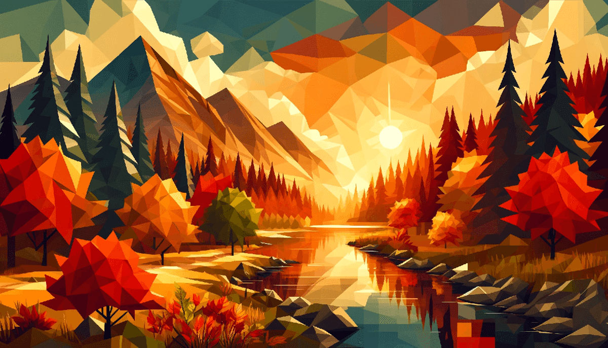
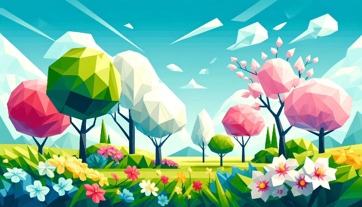
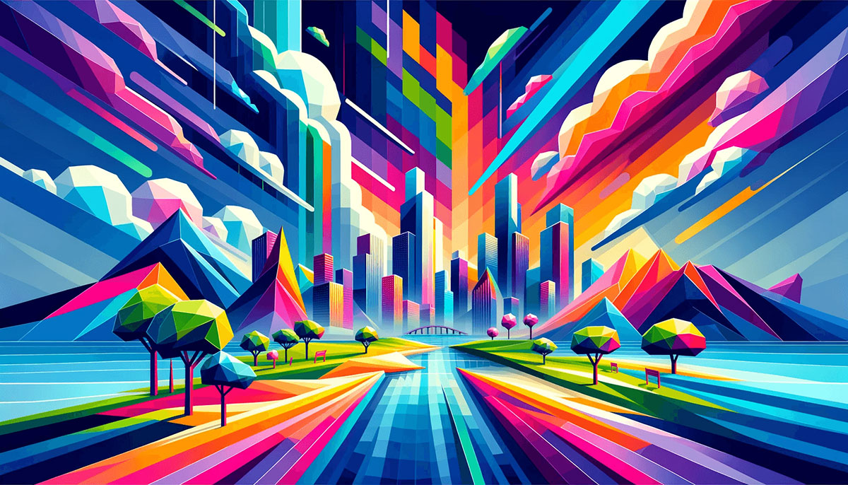
Examples of Popular Color Palettes
| #E2F4C5 | #A8CD9F | #58A399 | #496989 |
| #9CAFAA | #D6DAC8 | #FBF3D5 | #EFBC9B |
| #FDAF7B | #BE7B72 | #824D74 | #401F71 |
| #FFF2E1 | #EAD8C0 | #D1BB9E | #A79277 |
| #EEEEEE | #DDDDDD | #76885B | #627254 |
| #F7EEDD | #ACE2E1 | #41C9E2 | #008DDA |
| #A1C398 | #C6EBC5 | #FEFDED | #FA7070 |
| #E5DDC5 | #F1EEDC | #BED7DC | #B3C8CF |
| #7AA2E3 | #6AD4DD | #97E7E1 | #F8F6E3 |
| #00224D | #5D0E41 | #A0153E | #FF204E |
| #D74B76 | #FFAF45 | #FB6D48 | #673F69 |
| #FF71CD | #FFF7FC | #5755FE | #8B93FF |
| #90D26D | #FF9800 | #2C7865 | #D9EDBF |
| #E3FEF7 | #77B0AA | #135D66 | #003C43 |
| #F2613F | #9B3922 | #481E14 | #0C0C0C |
| #FFCDEA | #FB9AD1 | #BC7FCD | #86469C |
| #DBAFA0 | #BB8493 | #704264 | #49243E |
| #FFFDD7 | #FFE4CF | #FF5BAE | #E72929 |
| #C0D6E8 | #FBF8DD | #E9C874 | #A34343 |
| #C4E4FF | #D895DA | #D6589F | #D20062 |
| #8B322C | #DD5746 | #FFC470 | #4793AF |
| #AFD198 | #E8EFCF | #ECCA9C | #DBA979 |
| #453F78 | #795458 | #C08B5C | #FFC94A |
| #FFF8DC | #F7C566 | #DC6B19 | #6C0345 |
| #912BBC | #D875C7 | #E9A89B | #FFEBB2 |
| #C5FF95 | #5DEBD7 | #1679AB | #074173 |
| #8644A2 | #D862BC | #E59BE9 | #FFEBB2 |
| #A3FFD6 | #7BC9FF | #8576FF | #1C1678 |
| #FFEFEF | #F3D0D7 | #F0EBE3 | #F6F5F2 |
| #7EA1FF | #FFD1E3 | #FFFAB7 | #5BBCFF |
FAQ on Popular Color Palettes
What Determines a Color Palette’s Popularity?
Color palettes gain popularity based on various factors. Trending color schemes in the fashion and design industries often influence public preference.
Additionally, market research, social media impact, and color psychology play significant roles. Current events and cultural moments can also sway trends, solidifying certain palettes as favored choices.
How Do Color Palettes Influence Mood and Behavior?
The hues within a palette carry psychological weight, influencing mood and perception. Warm colors can evoke warmth and energy, while cool tones may instill calmness.
Designers use color harmony to create desired emotional responses in environments ranging from interior spaces to visual design elements on screens.
What Are the Current Trending Color Palettes?
Pantone’s color of the year often sets a precedent for the trending palette. Additionally, seasonality plays a role; pastels may rule spring while rich earthy tones could define autumn.
Design platforms offer insights on palettes that gain traction, reflecting the zeitgeist in creative color strategies.
How Are Color Palettes Chosen for Branding?
Branding requires a strategic approach to color. Brands usually choose colors that reflect their identity and values, applying color theory to convey messages.
Market research is instrumental, ensuring a palette resonates with the target audience while differentiating from competitors, cementing a brand’s visual and emotional brand identity colors.
Can Color Palettes Affect Conversion Rates in Digital Marketing?
Absolutely. Strategic use of colors in digital marketing and advertising can draw attention, guide user experience, and evoke the right call-to-action response.
Certain palettes have been linked with increased engagement rates, by enhancing readability and creating a visual hierarchy, directly influencing user behavior and conversion rates.
What Is the Role of Cultural Context in Color Palettes?
Cultural context is crucial. Colors can carry different meanings in different societies—a color that signifies joy in one culture might represent mourning in another.
This cultural understanding is particularly important for global brands and events that might use cultural festivals to inspire palette choices.
How Do Seasonal Changes Affect Color Palette Choices?
As the seasons turn, they bring with them a shift in palette preferences. Seasonal color trends, reflecting nature’s own shifts, dictate the choice in industries like fashion and interior design.
Cooler seasons often favor muted tones, while warmer months may push brighter hues to the forefront.
How Can a Beginner Learn Color Coordination?
Delve into basic color theory fundamentals, understanding the color wheel and how hues interact. Utilize online color matching tools and study palette inspiration from various sectors like art and design.
Practice by creating mood boards or experimenting with software that can help in custom color curation.
What Impact Does Lighting Have on Color Palettes?
Lighting can dramatically alter the appearance of colors. Natural daylight reveals true color, while artificial lighting can cast varying tones.
It’s essential when selecting a palette to consider the lighting context—what looks vibrant under one condition might fall flat under another, especially in interior design colors.
How to Stay Updated With Popular Color Palettes?
Following industry leaders, subscribing to design magazines, and engaging with design platforms are effective ways to keep a pulse on evolving trends.
Social media platforms like Pinterest and Instagram are also fertile grounds for discovering emerging palettes, directly from the creative spheres of influencers and visual content creators.
Conclusion
Navigating through the world of popular color palettes feels akin to orchestrating a visual symphony, each hue adding a unique note to the collective melody. Understanding that the power lies not just in individual colors but in their relational dynamics is akin to discovering a secret language.
It’s an art, balancing the aesthetic color schemes that resonate in our digital era—a blend of intuition and strategy, as enigmatic as the user interface colors that capture our Gazes. The insights provided woven through trendy color combinations and color psychology lend themselves as the palette from which one can paint their own masterpiece.
To conclude, this intricate dance of shades is our playfield. Whether creating the next web sensation or retouching a digital canvas, remain mindful. Be playful with vibrant shades, daring with neutral color selections, and strategic with each monochromatic theme. Invariably, the right palette is not just seen—it is felt, echoing beyond the screen into the core of experience.
Bogdan Sandu, a seasoned designer with 15 years of diverse experience, has been designing websites since 2008.
Renowned for his expertise in logo design and visual branding, Bogdan has developed a multitude of logos for various clients.
His skills extend to creating posters, vector illustrations, business cards, and brochures. Additionally, Bogdan's UI kits were featured on marketplaces like Visual Hierarchy and UI8.
Latest posts by Bogdan Sandu (see all)
- The Activision Blizzard Logo History, Colors, Font, And Meaning - 29 April 2024
- Rainbow Color Palettes for Joyful Designs - 29 April 2024
- The Bethesda Logo History, Colors, Font, And Meaning - 28 April 2024