The Riot Games logo is one of the most recognized marks in competitive gaming. It belongs to Riot Games, Inc., the American video game developer and publisher behind League of Legends, Valorant, and several other titles. The company was founded in 2006 by Brandon Beck and Marc Merrill in Los Angeles, California.
Within the gaming industry, this logo carries serious weight. It’s been through three major versions since the company started, each one reflecting where Riot stood as a business at that point. The current version, refined in 2022, keeps the iconic raised fist but presents it in a cleaner, more scalable form that works across everything from mobile app icons to 80,000-seat arena screens.
Few gaming company logos have managed to maintain the same core symbol for nearly two decades while still feeling modern. That’s a tricky thing to pull off, and Riot has done it better than most.
What Is the Riot Games Logo?
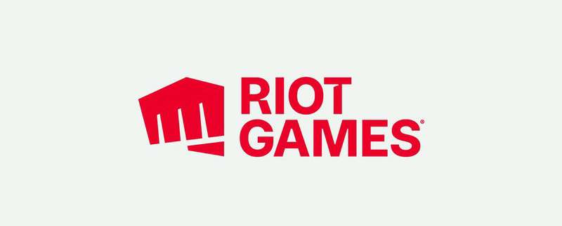
The Riot Games logo is a combination mark featuring a stylized raised fist symbol paired with bold uppercase lettering spelling “RIOT GAMES.” It was originally introduced in 2006, redesigned by Rinker Design and Riot’s in-house team in 2019, then refined again in 2022. The fist represents rebellion and player-driven community spirit.
Here’s a breakdown of the key attributes:
- Design Type: Combination mark (symbol + wordmark). The fist icon and text function both together and independently.
- Primary Elements: A right-handed raised fist (changed from left-handed during the 2019 redesign), paired with a two-level geometric sans-serif wordmark. The fist mirrors the angular structure of the letter “R” in the wordmark.
- Official Introduction Date: The original logo launched in 2006. The current iteration debuted in 2022 as a refinement of the 2019 redesign.
- Designer/Agency: The original 2006 logo was drawn by Riot’s art director. The 2019 redesign was handled by Rinker Design working with Riot’s in-house team. The 2022 refinement and broader brand system expansion was developed with Stink Studios and illustration studio Ilovedust.
- Trademark Status: “RIOT GAMES” is a registered trademark with the United States Patent and Trademark Office (Registration #6411893, filed May 10, 2019, registered July 6, 2021). Riot holds multiple trademark registrations covering the name and fist design across categories including entertainment services, clothing, toys, and software.
- Color Palette: Riot Red (#D13639) as the primary color, with Cod Gray (#111111) and White (#FFFFFF) as supporting colors. The red has been brightened slightly from the pre-2022 shade.
- Usage Context: Game launchers, esports broadcasts, merchandise, social media profiles, marketing materials, physical event signage, and all Riot-published game title screens.
How Has the Riot Games Logo Evolved Over Time?
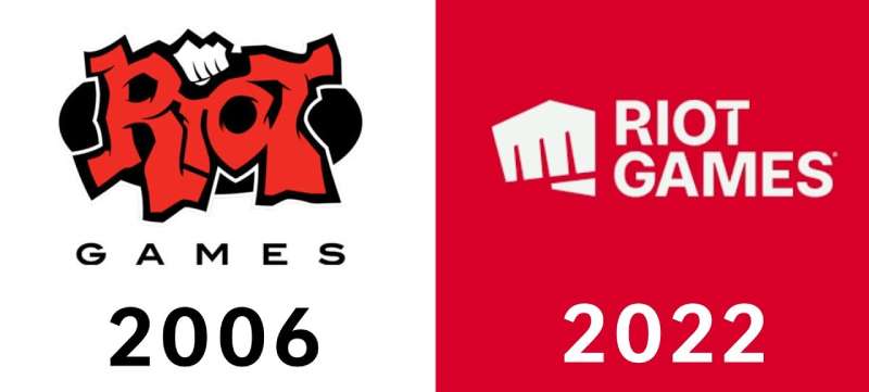
The Riot Games logo has gone through three distinct phases since 2006. It started as a raw, graffiti-style mark designed for a startup gaming company. Then it became a clean, geometric identity for a global esports powerhouse. And it was refined once more in 2022 to tighten up details.
Each version tells you exactly where the company was at the time. The changes weren’t arbitrary. They tracked real growth.
Original Riot Games Logo (2006-2019)
Years Active: 2006 to 2019. Thirteen years, which is a long run for any logo in the gaming space.
Design Description: The word “RIOT” was rendered in a graffiti-like style, with rough, hand-drawn lettering in bright red against a dark background. A white left-handed fist sat on top of the text, doubling as a dot over the letter “I.” The word “GAMES” appeared beneath in all caps, set in an extended sans-serif font.
Color Scheme: Red, black, and white. The red was bold and slightly grungy, fitting the rebellious tone.
Designer: Riot’s original art director.
Context: When Beck and Merrill started the company, they were two USC friends who loved Warcraft 3 and Starcraft. The logo matched that scrappy energy. Nobody was thinking about scalability for app icons or arena jumbotrons back then.
Cultural Significance: This version became deeply associated with League of Legends and the early growth of esports. The punching fist intro animation before Riot’s videos was something every player recognized. It was raw, a bit rough around the edges, but it had genuine character that players connected with.
Redesigned Riot Games Logo (2019-2022)
Years Active: 2019 to 2022.
Design Description: A complete overhaul. The fist was separated from the wordmark, enlarged, and redrawn with sharp geometric angles and clean lines. It switched from a left hand to a right hand. The typography went from graffiti to a custom blocky sans-serif with square-cut terminals. “RIOT” and “GAMES” stacked in a clean two-level layout.
Color Scheme: Red on white, stripped down from the black-heavy palette of the original. Much simpler.
Designer: Rinker Design, working alongside Riot’s in-house creative team with input from co-founders Brandon Beck, Marc Merrill, and CEO Nicolo Laurent.
Key Changes from Previous: The graffiti lettering was gone. The fist lost its gritty texture and became a vectorized icon that could function independently. The whole thing was designed to scale properly across digital platforms, something the original never accounted for.
Context: By 2019, Riot was no longer a single-game studio. Valorant was on the way. Teamfight Tactics had launched. The company needed a logo that worked as a corporate identity, not just a League of Legends intro card. The community had mixed reactions at first, with many preferring the old version. But the practical reasons were hard to argue against.
Cultural Significance: This was the moment Riot signaled it was growing beyond League. The logo went from “indie game studio” to “global entertainment company,” and the design reflected that shift clearly.
Current Riot Games Logo (2022-Present)
Years Active: 2022 to present.
Design Description: A refinement, not a revolution. The red shade was brightened. The typeface was swapped to a more traditional geometric sans-serif, with small sharp cut-outs added to the first and last characters of “RIOT” for added personality. The fist was tilted slightly, placed at a subtle angle.
Color Scheme: Brighter Riot Red (#D13639), Cod Gray (#111111), and White (#FFFFFF).
Designer: Riot’s in-house brand team, with the broader brand system developed alongside Stink Studios. The fist-bump animations and custom fist illustrations were created by Ilovedust. The custom headline typeface, Riot Sans, was designed by Colophon Type Foundry.
Key Changes from Previous: The typeface shift is the most noticeable thing. The 2019 version had a very custom, angular feel. The 2022 version is closer to fonts like Eloquia Display Bold or Okomito Next Bold. Subtle, but it changes the overall feel. The fist angle adjustment is small but gives the icon more dynamic energy.
Context: With Arcane on Netflix, Valorant growing, and multiple game titles under the Riot umbrella, the company needed a brand system, not just a logo. The 2022 update was part of a larger effort to create patterns, color palettes, and layout systems drawn from the visual worlds of each Riot game.
Cultural Significance: The fist has been described internally as a “fist bump to the community.” It’s no longer just a symbol of rebellion. It’s a handshake between company and players. Custom illustrated fists have been created for specific events, game launches, and esports tournaments, turning the logo into a living, adaptable mark.
What Do the Design Elements of the Riot Games Logo Mean?
Every piece of the Riot Games logo was chosen to communicate something specific about the company and its audience. The raised fist is the centerpiece, obviously. But the angles, the color, even the way the type is cut all carry meaning.
These choices aren’t decorative. They’re structural to the brand.
What Does the Fist Symbol Represent?
The fist has been part of Riot’s identity from day one. It started as a symbol of rebellion, the idea of challenging the way games were made and distributed.
Over time, its meaning has shifted. It still carries that defiant energy, but it’s become more about community solidarity. Riot now frames it as a “fist bump,” a gesture of shared passion between the company and its player base.
The angular design of the current fist mirrors the letter “R” in the wordmark. That’s intentional. It ties the symbol and text together visually, even when they’re used separately.
Why Did Riot Games Choose These Specific Colors?
Riot Red (#D13639)
This is the dominant brand color. In color psychology, red triggers feelings of energy, excitement, and urgency. For a gaming company built around competitive, fast-paced experiences, that tracks.
Red also sits in the same family as many other aggressive, action-oriented brands. It’s a common choice among brands that use red in their logos, and Riot’s specific shade leans warm without going orange. It photographs well on merch and glows on screens.
Cod Gray (#111111)
Not true black. It’s a near-black dark gray. This matters for print and screen rendering. True black (#000000) can look flat and harsh on certain displays. Cod Gray adds just enough warmth to feel intentional rather than default.
White (#FFFFFF)
Standard white for backgrounds and reversed logo applications. Clean. Functional. It provides the contrast the red needs to pop.
What Typography Style Is Used in the Riot Games Logo?
The current wordmark uses a geometric sans-serif in bold uppercase. The closest commercially available matches are Eloquia Display Bold and Okomito Next Bold.
Two characters have custom modifications. Sharp cut-outs appear on the first and last letters of “RIOT,” giving the wordmark a distinctive edge that keeps it from feeling generic.
Riot also uses a custom headline font called Riot Sans, designed by Colophon Type Foundry. The design of Riot Sans takes cues from the angles of the fist icon, which creates consistency between the logo and broader brand materials.
What Are the Hidden Meanings in the Riot Games Logo?
The fist’s angular structure was specifically designed to echo the geometry of the “R” in the wordmark. So even when the icon is used alone, it subconsciously reinforces the company name.
Look, Riot published a diagram showing how all the angles in the logo align with each other. Some people thought it was a bit over-the-top. But the angular consistency is real, and it gives the whole mark a sense of structural cohesion that most video game logos don’t have.
The switch from left hand to right hand in 2019 also meant the fist now mirrors natural reading direction (left to right), which subtly guides the eye from icon to wordmark.
How Does the Riot Games Logo Compare to Competitor Logos?
Most gaming company logos fall into one of two camps. You’ve got the text-heavy, corporate route (think EA or Ubisoft), and then you’ve got the more illustrative, character-driven marks. Riot sits somewhere in between. It has a strong symbol plus readable text, which gives it more flexibility than either extreme.
Compare it to the Epic Games logo, which is essentially just a wordmark. Or the Valve logo, which relies on a highly specific (and slightly unsettling) illustration. Riot’s fist is more abstract than Valve’s mark but more memorable than Epic’s plain text.
Nintendo takes a completely different approach with its rounded, friendly wordmark. Rockstar Games uses a star icon that’s simple but lacks the built-in narrative of a raised fist. And Activision Blizzard went through years of logo confusion trying to merge two brand identities into one.
The strength of Riot’s approach is that the fist works solo. You don’t need to see the text. That’s something most competitors can’t claim.
What Are the Technical Specifications of the Riot Games Logo?
Official Color Codes
- Primary Color: Riot Red
- Hex: #D13639
- RGB: (209, 54, 57)
- CMYK: (0, 74, 73, 18)
- Secondary Color: Cod Gray
- Hex: #111111
- RGB: (17, 17, 17)
- CMYK: (0, 0, 0, 93)
- Accent Color: White
- Hex: #FFFFFF
- RGB: (255, 255, 255)
- CMYK: (0, 0, 0, 0)
Dimensions and Proportions
The logo uses a modular system. The fist icon and wordmark are designed to function together or separately. The fist is roughly square in proportion. When paired with the stacked “RIOT GAMES” text, the overall mark sits in a horizontal rectangle.
Clear space around the logo is defined by the height of the fist icon. No other graphic elements or text should fall within that buffer zone.
Minimum size requirements are set to keep the wordmark legible at small sizes. For digital use, the fist icon alone is preferred when space drops below a certain threshold.
The whole system is built around the fist’s angular geometry. Riot’s internal brand guidelines use these angles as a cropping device for layout grids, image masks, and divider elements across all brand communications.
What Cultural Impact Has the Riot Games Logo Had?
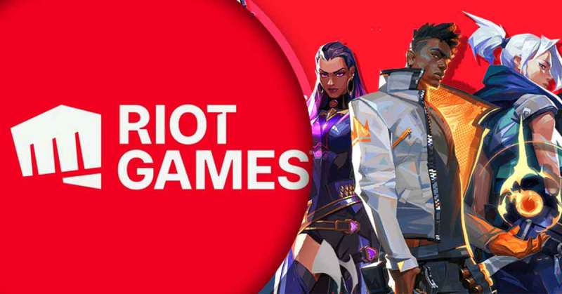
The fist has become one of the most recognizable symbols in esports. It shows up on fan tattoos, custom team logos, cosplay accessories, and thousands of streaming overlays.
When Riot expanded the fist concept into custom illustrated versions for events like the League of Legends World Championship and Valorant Champions Tour, it turned a static mark into a cultural artifact that fans actively engage with.
The animated fist-bump intro before Riot’s videos is probably the single most-seen brand animation in competitive gaming. Players across the world recognize it instantly, even without sound.
And the brand’s reach beyond gaming is real. The Arcane series on Netflix brought the Riot logo to an audience that had never played any of the company’s games. That kind of crossover recognition is rare for a mark that started as a scrappy startup doodle.
How Does the Riot Games Logo Fit Into the Overall Brand Identity?
The logo is the anchor of a much larger brand system. It connects directly to every game Riot publishes. Each title, from League of Legends to Valorant, has its own distinct visual identity. But the Riot fist sits above all of them as the parent brand mark.
Stink Studios built the current system to pull visual references from each game world. Patterns, textures, and an expanded color palette draw from in-game environments and maps. Characters and cosplayers are treated as brand ambassadors, showing up in corporate communications alongside the logo.
The fist’s angular structure also informs layout decisions. It shapes the cropping devices, framing systems, and even the ink traps in the Riot Sans typeface. Everything in the brand system traces back to that one symbol.
This kind of design cohesion, where a single icon generates an entire visual language, is something you see in the strongest tech company brands. Riot has applied that thinking specifically to gaming, which is still a space where most brand systems are pretty loose.
How Should the Riot Games Logo Be Used?
Official Usage Guidelines
Do:
- Use the logo in its original colors (Riot Red on white, or white on dark backgrounds)
- Maintain required clear space around the mark
- Use the fist icon alone when space is limited
- Download official logo files from Riot’s brand assets page
Don’t:
- Modify, stretch, rotate, or recolor the logo
- Place the logo on busy backgrounds that reduce legibility
- Combine the logo with other marks or icons in ways that suggest endorsement
- Use any Riot logos or trademarks in commercial projects without written permission
Licensing and Legal Details
Riot allows non-commercial fan projects under their Legal Jibber Jabber policy. You can use Riot IP in free community content, with some restrictions. Fan art, stream overlays, and community-driven projects are generally fine as long as they’re not monetized directly.
For anything commercial, you need a written license agreement from Riot Games. No exceptions. They actively enforce this, especially within the esports industry. Riot has pursued legal action against companies using “RIOT” in their branding within gaming contexts.
The brand assets (SVG, PNG) can be found through Riot’s official channels. But the brand style guide and detailed usage specs are primarily internal. What’s publicly available covers the basics: don’t mess with the logo, keep the colors accurate, and reach out if you’re doing anything beyond fan content.
FAQ on The Riot Games Logo
What Does the Riot Games Logo Look Like?
It’s a red raised fist icon paired with a bold uppercase wordmark spelling “RIOT GAMES.” The fist sits to the left of stacked text in a geometric sans-serif font. Both elements work together or independently depending on the placement.
Who Designed the Current Riot Games Logo?
The 2019 redesign came from Rinker Design and Riot’s in-house team. The 2022 refinement involved Stink Studios and Ilovedust for animated fist illustrations. Colophon Type Foundry created the Riot Sans headline typeface used across the brand system.
When Did Riot Games Change Its Logo?
Three versions exist. The original graffiti-style mark ran from 2006 to 2019. A clean geometric redesign launched in April 2019. Then a refined version with a brighter red shade and updated variable font arrived in 2022.
What Color Is the Riot Games Logo?
The primary color is Riot Red, hex #D13639. Supporting colors are Cod Gray (#111111) and White (#FFFFFF). The red was deliberately brightened during the 2022 update. It’s a warm, high-energy shade that reads well on screens and printed merchandise.
What Font Does the Riot Games Logo Use?
The wordmark uses a custom geometric sans-serif close to Eloquia Display Bold. Sharp cut-outs appear on select characters for uniqueness. Riot also uses Riot Sans with custom spacing, designed by Colophon, as their primary brand display font.
Why Is There a Fist in the Riot Games Logo?
The raised fist originally symbolized rebellion against traditional game publishing. Now it represents a fist bump between the company and its global player community. The shape psychology behind the angular design communicates strength, action, and forward momentum.
Can I Use the Riot Games Logo for My Project?
Non-commercial fan projects are allowed under Riot’s Legal Jibber Jabber policy. Commercial use requires a written license agreement. Riot actively protects its trademarks and has pursued legal action against unauthorized usage within the esports and gaming space.
What Is the Difference Between the Old and New Riot Games Logo?
The old logo used graffiti-style red lettering on a dark background with a white left-handed fist. The new version flips to a right-handed fist, uses cleaner vector graphics, and drops the gritty texture for a minimalist design approach.
Where Can I Download the Official Riot Games Logo?
Official assets are available through Riot’s brand channels and media resources. Files come in SVG and PNG formats. Third-party sites like Brandfetch also host verified versions. Always use official sources to get accurate colors and proportions.
How Does the Riot Games Logo Compare to Other Game Studio Logos?
Most competitors use either plain wordmarks or abstract symbols. Riot’s combination of a narrative-driven fist icon with scalable text gives it more range than studios like Bethesda or Capcom. Few game logos carry this much built-in story.
Conclusion
The Riot Games logo has gone from a rough startup sketch to one of the most recognized esports brand marks on the planet. That’s not an accident. Every version tracked a real shift in the company’s identity and ambitions.
The raised fist still carries the original rebellious energy, but it’s grown into something bigger. It’s a brand asset that works on a game launcher icon just as well as on a stadium jumbotron.
With titles like Valorant, Teamfight Tactics, and Wild Rift all sitting under the same visual system, the logo holds everything together. Riot Sans, the angular fist geometry, and that specific shade of red create a cohesive brand identity that most logo design systems in gaming still haven’t matched.

Renowned for his expertise in logo design and visual branding, Bogdan has developed a multitude of logos for various clients.
His skills extend to creating posters, vector illustrations, business cards, and brochures. Additionally, Bogdan's UI kits were featured on marketplaces like Visual Hierarchy and UI8.
He also wrote in the past years on sites like Design Your Way, WebDesignerDepot, WPDean, Designmodo, Speckyboy, Slider Revolution, and more.
- How to Install Fonts on Mac (Step-by-Step Guide) - 20 September 2026
- From Mockup to Code: How AI-Augmented Development Speeds Up the Design Handoff - 19 September 2026
- The Beehiiv Logo History, Colors, Font, And Meaning - 18 September 2026

Bogdan Sandu is a seasoned designer who has been designing websites since 2008. Renowned for his expertise in logo design and visual branding, Bogdan has developed a multitude of logos for various clients. His skills extend to creating posters, vector illustrations, business cards, and brochures. Additionally, Bogdan's UI kits were featured on marketplaces like Visual Hierarchy and UI8. He also wrote in the past years on sites like Design Your Way, WebDesignerDepot, WPDean, Designmodo, Speckyboy, Slider Revolution, and more.
You Might Also Like