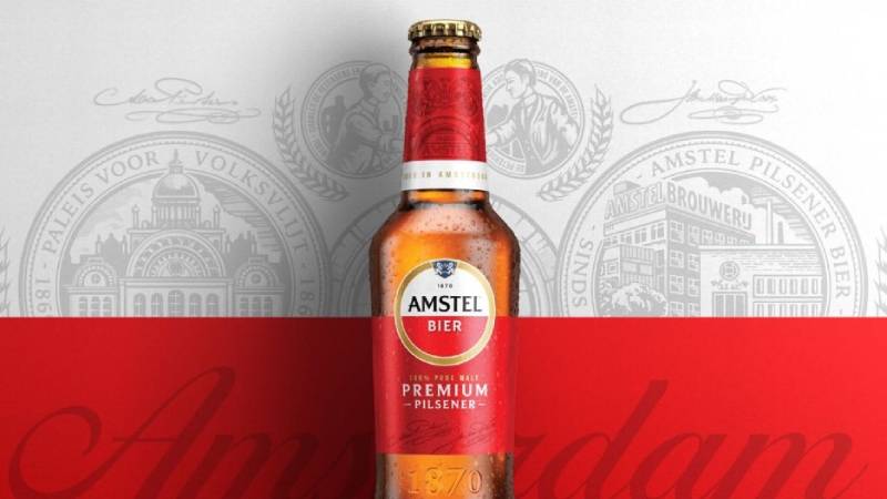
The Amstel logo is one of the most recognized beer brand marks in Europe. It centers on a red-and-white circular emblem framed by a gold ring, with the word “Amstel” in bold black serif lettering. The mark has been part of the Dutch brewing landscape since 1870, when the brewery was first established on the banks of the Amstel River in Amsterdam.
Within the broader history of beer logos, Amstel holds a specific position. It predates most of the corporate identity systems we take for granted today. The brand went through Heineken’s acquisition in 1968, multiple name changes before that, and a full global identity refresh by London-based studio Elmwood in 2020. The current version keeps the red-and-white roundel but strips back decorative excess. The founding year, 1870, sits inside the circle. The coat of arms (two lions, a blue shield) got smaller. The gold frame got thinner. And the whole thing feels cleaner without losing what made it stick in people’s minds for over 150 years.
What Is the Amstel Logo?
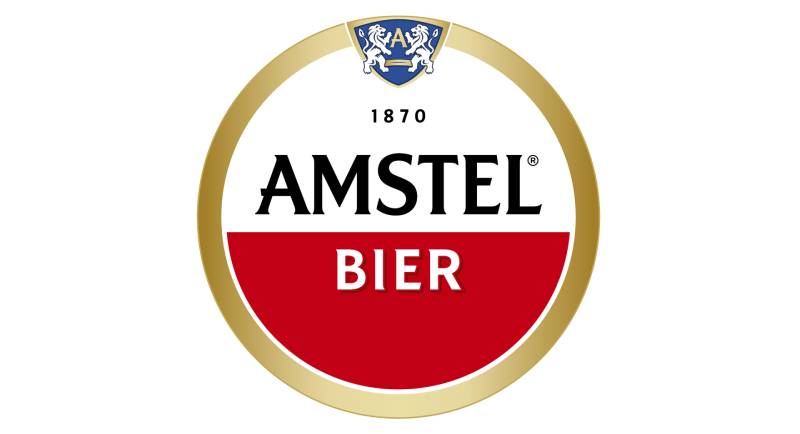
The Amstel logo is a circular emblem featuring the brand name in custom serif lettering over a split red-and-white field, enclosed by a gold ring. It was introduced in its foundational form in 1870 and redesigned most recently in 2020 by Elmwood London. The roundel symbolizes tradition, quality, and the founders’ friendship.
Here’s what you need to know about the mark’s key attributes:
- Design Type: Combination mark (emblem with wordmark). The circular badge format contains both the logotype and graphic elements like the coat of arms shield.
- Primary Elements: The word “Amstel” in custom bold serif uppercase, the word “Bier” in white below, a bicolor circle (white upper half, red lower half), a blue heraldic shield with lions and the letter “A,” a gold circular frame, and the founding year “1870.”
- Official Introduction Date: The brewery was founded in 1870, and the red-and-white roundel has been in use in various forms since then. The most recent global identity rolled out in April 2020.
- Designer/Agency: The 2020 redesign was handled by Elmwood London. Earlier versions were developed internally or through unnamed agencies over the brand’s history.
- Trademark Status: The Amstel logo is a registered trademark owned by Heineken N.V. It cannot be reproduced for commercial use without express permission.
- Color Palette: Red (#C8102E approximate), White (#FFFFFF), Gold/Yellow (gradient, approximate #C5A04E), Black (#000000), Blue (#003DA5 approximate for the shield).
- Usage Context: Bottles, cans, draught tap handles, bar signage, marketing materials, digital platforms, merchandise, and event sponsorship branding across 115+ markets worldwide.
How Has the Amstel Logo Evolved Over Time?
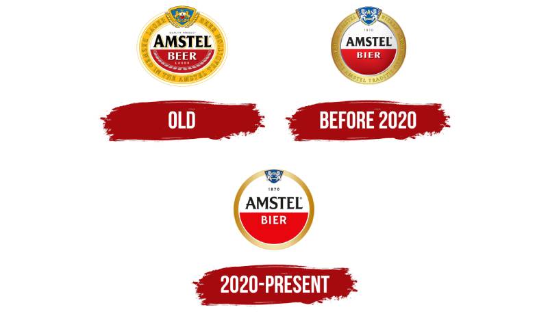
The Amstel logo has gone through several changes since 1870, mostly refining details rather than scrapping the core design. The red-and-white roundel has remained the constant. Each update reflected the company’s growth, from a small Amsterdam brewery to a global Heineken-owned brand sold in over 115 countries.
Original Amstel Logo (1870 to 1960s)
Years Active: 1870 to late 1960s
The original branding went by the company name “Beiersch Bierbrouwerij De Amstel.” Early labels featured detailed, ornate typography common in 19th-century Dutch beer branding. Think busy layouts with lots of text, decorative borders, and a general look that wouldn’t feel out of place on a Victorian-era certificate.
The red-and-white color split was already forming during this period. But the roundel as we know it hadn’t fully taken shape yet.
The name changed to “Amstel Brouwerij” in 1947, which started simplifying things. Still, nothing close to what you’d call a modern logo system.
Post-Heineken Acquisition Logo (1968 to 2019)
Years Active: 1968 to 2019
After Heineken bought Amstel in 1968, the visual identity got more structured. The round red-and-white emblem became the standard. A gold ring enclosed the whole thing.
The coat of arms sat at the top of the ring. Two heraldic elements (white lions on a blue shield with the letter “A”) referenced Amsterdam’s own coat of arms. The ring carried inscriptions like “Lager Beer Brewed in the Amstel Tradition.”
There were three-dimensional effects. The colored sections had gradient shading to make the emblem look like a shiny medal. The gold frame had layered rings and decorative details.
Key Changes: Formalized the roundel as the primary mark. Added the coat of arms prominently. Introduced the medal-like dimensional treatment. Solidified “Amstel” as the brand name (dropping the longer company names).
This version ran for decades with only minor tweaks. Different countries, though, started adapting it to local tastes. By the 2010s, there were pretty different-looking Amstel logos floating around depending on which market you were in.
Current Amstel Logo (2020 to Present)
Years Active: 2020 to present
Elmwood London handled this one. They looked at about 30 different emblem options before landing on the final design. Their research went deep into the brand archives, pulling from old medals, the original brewery’s architecture, and even the founders’ personal signatures.
The red-and-white split stayed. The word “Amstel” kept its black serif styling with triangular serifs. The letter “A” still has that small horizontal protrusion that’s become a recognizable quirk.
What changed? The blue shield with the lions got smaller. It no longer sticks out beyond the circle’s edge. The gold frame narrowed down. All the inscriptions and decorative rings on the frame disappeared. The gradient is the only thing adding depth to the gold ring now.
Actually, the biggest change wasn’t visual. It was structural. Elmwood built a flexible identity system with two master logo options and a set of illustration assets organized around three stories: “Born from better beer,” “Born in Amsterdam,” and “Born from friendship.” Local markets pick which elements fit their audience.
The two-color semicircles represent the partnership between the two main founders. And the full circle? It’s a billiard ball. The founders apparently loved playing billiards together. A fun detail that most people don’t know about.
What Do the Design Elements of the Amstel Logo Mean?
Every piece of the Amstel logo ties back to something specific. The red-and-white split circle references both the founders’ partnership and the colors of Amsterdam. The heraldic shield borrows from the city’s coat of arms. The gold framing suggests quality and tradition, much like an award medal.
Let’s break the elements down.
Why Did Amstel Choose These Specific Colors?
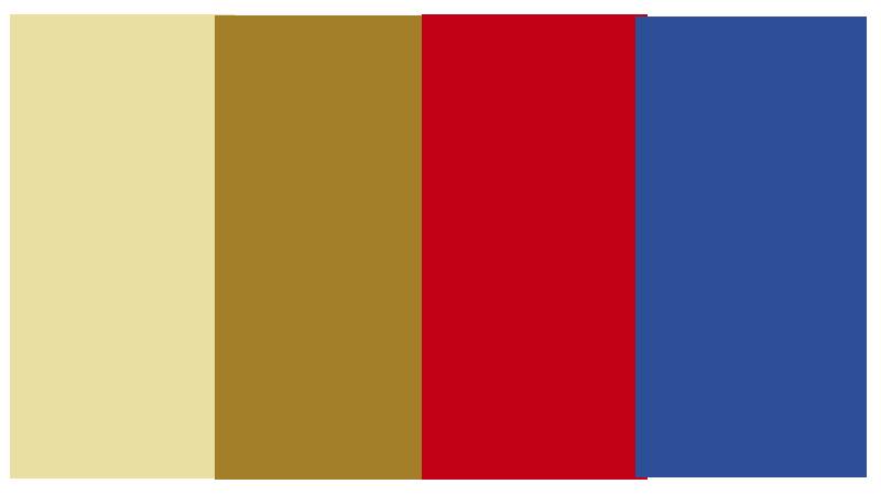
Red (approximately #C8102E). It’s the dominant color in the lower semicircle. Red connects to Amsterdam’s city colors and carries associations with energy and boldness. In color psychology, red grabs attention fast. For a beer brand competing on crowded shelves, that matters a lot. You’ll find similar red-heavy approaches across many red logos in the food and drink space.
White (#FFFFFF). The upper semicircle. White signals purity, cleanliness, and quality. It also provides the contrast needed for the black “Amstel” wordmark to remain readable at any size.
Gold (gradient, approximately #C5A04E). The circular frame. Gold implies premium quality and heritage. The gradient treatment makes it look like metal, reinforcing that medal-like feel the designers were going for.
Black (#000000). The “Amstel” text. Black on white is about as readable as it gets. No tricks here, just legibility.
Blue (approximately #003DA5). The heraldic shield background. Blue ties directly to Amsterdam’s coat of arms. It’s a small accent that roots the entire design in its place of origin.
What Typography Style Is Used in the Amstel Logo?
The “Amstel” wordmark uses a custom serif typeface with bold, uppercase characters. The serifs are triangular, which gives the letters a slightly pointed, sharp quality.
The closest publicly available matches are probably Majesty Bold and Naveid Arabic Semi Bold, but with significant modifications. It’s a custom job, not something you’d pull from a font library.
The letter “A” has a distinctive horizontal stroke extension. A small protrusion that’s become one of those details you notice once and can’t unsee. The x-height and letter proportions keep things sturdy and grounded. Took me a while to appreciate how much personality that one small stroke adds.
Overall, the typographic elements lean traditional without looking dated. Bold weight. Consistent stroke widths. Good kerning. It reads well whether it’s printed small on a bottle cap or blown up on a billboard.
What Are the Hidden Meanings in the Amstel Logo?
The two semicircles (red and white) represent the two founders, Johannes van Marwijk Kooy and Charles de Pesters. Two halves coming together to form a whole. That’s straight from the designers.
The full circle shape? A billiard ball. The founders bonded over billiards. It’s one of those background stories that adds character if you know it, and doesn’t hurt the design if you don’t.
The heraldic lions on the shield aren’t the same as Amsterdam’s official coat of arms lions. Amstel’s version uses horses in some iterations, connecting to agriculture and brewing ingredients. The blue shield with the large “A” is both a brand initial and a nod to the city’s heraldic traditions.
How Does the Amstel Logo Compare to Competitor Logos?
Amstel sits in a category with other heritage European beer brands that lean on circular or badge-style marks. Think Heineken (its parent company), Stella Artois, Carlsberg, and Budweiser. They all use some form of crest, emblem, or roundel.
What sets Amstel apart is the simplicity of the red-and-white split. Where Stella Artois goes heavy on heraldic detail and Budweiser packs in text and graphic layers, Amstel’s core mark is cleaner. The two-tone circle is the most recognizable asset, and the 2020 refresh leaned even harder into that stripped-back direction.
Heineken, by comparison, uses a green palette with its red star. Completely different color territory. Corona takes a different path too, going for a more relaxed, sun-and-beach vibe. Guinness stands in its own lane with the Arthur harp mark.
Amstel’s approach is closer to what you’d see in minimalist design thinking, at least relative to its competitors. Not minimal in the modern tech-company way. But restrained, for a beer brand.
What Are the Technical Specifications of the Amstel Logo?
Official Color Codes
- Red: Hex #C8102E (approximate), RGB (200, 16, 46), CMYK (0, 92, 77, 22), close to Pantone 186 C
- White: Hex #FFFFFF, RGB (255, 255, 255), CMYK (0, 0, 0, 0)
- Gold: Hex #C5A04E (approximate, gradient), RGB (197, 160, 78), CMYK (0, 19, 60, 23)
- Black: Hex #000000, RGB (0, 0, 0), CMYK (0, 0, 0, 100)
- Blue (shield): Hex #003DA5 (approximate), RGB (0, 61, 165), CMYK (100, 63, 0, 35)
Dimensions and Proportions
The logo is circular, so its aspect ratio is 1:1. The inner red-and-white circle is enclosed by the gold ring, which accounts for roughly 10-12% of the total diameter on each side.
Minimum size for legibility depends on context, but the “Amstel” text generally needs at least 15mm in print width to stay readable. The coat of arms shield gets lost at very small sizes, which is partly why the 2020 redesign reduced it.
Clear space around the logo should be at least the width of the “A” in “Amstel” on all sides. For digital use, the logo works best as a vector graphic (SVG or EPS) to preserve the gradient detail in the gold ring. Bitmap versions at lower DPI tend to muddy the gold gradient and small shield details.
Official brand guidelines from Heineken N.V. govern exact specifications for each market. Since 2020, two master logo versions exist for local teams to choose from.
What Cultural Impact Has the Amstel Logo Had?
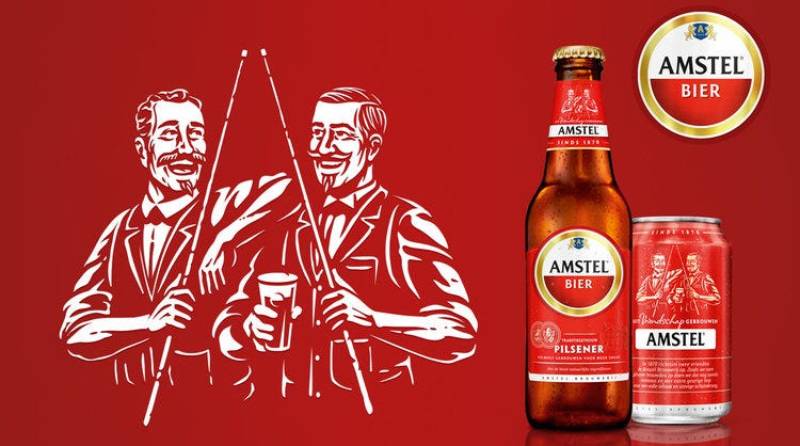
The Amstel roundel is deeply tied to Amsterdam’s identity. You see it on tap handles across bars in the city, on event banners, and as part of the local visual landscape. It sponsored the Dutch football cup (known as the Amstel Cup from 1995 to 2004) and has had ties to UEFA Champions League events.
Outside the Netherlands, the logo carries different cultural weight depending on the market. In some countries, it reads as “premium European import.” In others, it’s more of an everyday lager brand. The 2020 redesign tried to address exactly this by letting each of the 115+ markets tell their own version of the Amstel story through a shared set of visual assets.
For design communities, it’s become a case study in how to refresh a heritage mark without breaking what makes it recognizable. Elmwood’s approach of creating flexible asset categories rather than a single rigid identity is something that gets referenced in brand strategy discussions pretty regularly now.
How Does the Amstel Logo Fit Into the Overall Brand Identity?
The logo is the anchor. Everything else builds from it. The red-and-white color split shows up on packaging, advertising, event materials, and digital touchpoints. The gold framing carries through to label borders and premium product lines.
Amstel’s broader identity system (since 2020) adds illustration sets, the founders’ signatures as graphic elements, architectural details from the original brewery, and period-style coin and medal motifs. These exist as a toolkit that local marketing teams across the world can draw from.
The three “Born from…” story categories give structure. “Born from better beer” highlights the Bavarian brewing method. “Born in Amsterdam” features the Amstel River and its bridge. “Born from friendship” centers on the founders’ relationship.
The connection to Heineken as the parent company creates an interesting dynamic. Amstel maintains its own distinct identity while existing within the Heineken portfolio. The red-and-white scheme versus Heineken’s green creates clear differentiation on shelves and in bars.
A brand style guide governs all of this. It specifies how the logo interacts with secondary elements, what gets used where, and how much flexibility local teams actually have.
How Should the Amstel Logo Be Used?
Do:
- Use the official logo files provided by Heineken N.V. or authorized distributors
- Maintain the required clear space around the mark
- Use the logo on approved background colors that preserve legibility
- Follow the two master logo options established in the 2020 identity system
Don’t:
- Alter the colors, proportions, or arrangement of logo elements
- Use the logo for commercial purposes without trademark authorization
- Place the logo on busy backgrounds that compromise the red-white-gold color scheme
- Separate the wordmark from the roundel unless specifically approved by brand guidelines
Official logo files for authorized use can be accessed through Heineken’s brand portal or through regional marketing teams. Unauthorized reproduction, especially for commercial use, is restricted by trademark registration laws.
For personal or editorial use, fair use doctrines may apply depending on jurisdiction. But if you’re doing anything commercial with it, you need permission. The trademark covers not just the full emblem but also the distinctive elements like the red-and-white split circle and the custom “Amstel” lettering.
FAQ on The Amstel Logo
What Does the Amstel Logo Look Like?
The Amstel logo is a circular emblem split into red and white halves. The word “Amstel” appears in bold black serif lettering across the white section. A gold ring frames the whole thing. The year “1870” sits above the brand name.
Who Designed the Current Amstel Logo?
London-based studio Elmwood redesigned the Amstel visual identity in 2020. They reviewed about 30 emblem options before finalizing the design. The project was commissioned by Heineken International, which has owned the Amstel brewery since 1968.
What Do the Colors in the Amstel Logo Mean?
Red represents energy and ties to Amsterdam’s city colors. White signals quality and purity. The gold frame suggests premium heritage, like an award medal. These choices follow basic color theory principles used across beer industry branding.
Why Is the Amstel Logo Split Into Two Halves?
The two semicircles represent the brand’s founders, Johannes van Marwijk Kooy and Charles de Pesters. Two people, two halves, one circle.
The full circle itself is a billiard ball. The founders bonded over the game. Most people don’t know that part.
Has the Amstel Logo Changed Over the Years?
Yes, but not dramatically. The red-and-white roundel has been the core element since the brewery’s early days. The 2020 refresh simplified the coat of arms, narrowed the gold frame, and removed ring inscriptions. The typeface stayed mostly the same.
What Font Does the Amstel Logo Use?
Amstel uses a custom serif typeface with triangular serifs and bold uppercase characters. It’s not a stock font. The closest matches are Majesty Bold and Naveid Arabic Semi Bold, but with heavy modifications to the letter shapes.
Is the Amstel Logo Trademarked?
Yes. Heineken N.V. holds the trademark. You can’t reproduce it for commercial purposes without permission. The protection covers the full emblem, the red-and-white split circle, and the distinctive “Amstel” lettering. Editorial and personal fair use may apply depending on local laws.
What Is the Shield Symbol in the Amstel Logo?
The blue shield with white lions and the letter “A” references Amsterdam’s coat of arms. It connects the Dutch beer brand to its place of origin.
In the 2020 redesign, this shield was reduced in size. It no longer extends past the circle’s boundary.
Where Can I Download the Official Amstel Logo?
Official logo files are available through Heineken’s brand portal or regional marketing teams. For authorized use in packaging or promotions, you’d need to go through their approval process. Unauthorized commercial use violates trademark registration protections.
How Does the Amstel Logo Compare to Other Beer Logos?
It’s simpler than most. Stella Artois packs in more heraldic detail. Guinness uses the harp as its focal point. Amstel’s strength is the two-tone roundel, which reads fast at any size and works across 115+ markets worldwide.
Conclusion
The Amstel logo has done something that most beer brand marks fail at. It stayed recognizable for over 150 years while still feeling current after the 2020 Elmwood refresh.
The red-and-white roundel works because it’s rooted in something real. Amsterdam’s heritage, the founders’ friendship, Bavarian brewing traditions. None of that was invented for marketing purposes.
Its color palette reads instantly on draft tap handles, bottle labels, and digital screens across 115+ countries. The custom serif wordmark holds up at every size.
For anyone studying beer brand identity or logo longevity, Amstel’s approach is worth paying attention to. Simple geometry. Meaningful color choices. And enough flexibility built into the system that local markets can make it their own without breaking the whole thing.

Renowned for his expertise in logo design and visual branding, Bogdan has developed a multitude of logos for various clients.
His skills extend to creating posters, vector illustrations, business cards, and brochures. Additionally, Bogdan's UI kits were featured on marketplaces like Visual Hierarchy and UI8.
He also wrote in the past years on sites like Design Your Way, WebDesignerDepot, WPDean, Designmodo, Speckyboy, Slider Revolution, and more.
- How to Install Fonts on Mac (Step-by-Step Guide) - 20 September 2026
- From Mockup to Code: How AI-Augmented Development Speeds Up the Design Handoff - 19 September 2026
- The Beehiiv Logo History, Colors, Font, And Meaning - 18 September 2026

Bogdan Sandu is a seasoned designer who has been designing websites since 2008. Renowned for his expertise in logo design and visual branding, Bogdan has developed a multitude of logos for various clients. His skills extend to creating posters, vector illustrations, business cards, and brochures. Additionally, Bogdan's UI kits were featured on marketplaces like Visual Hierarchy and UI8. He also wrote in the past years on sites like Design Your Way, WebDesignerDepot, WPDean, Designmodo, Speckyboy, Slider Revolution, and more.
You Might Also Like