The Bud Light logo stands as one of the most recognized beer brand marks in North America. It represents Anheuser-Busch’s flagship light lager, a product that has dominated the American beer market since its 1982 launch.
Within the beverage industry, this logo holds significant weight. It competes directly with other major light beer brands and has shaped how consumers perceive the entire category.
The current version was introduced in 2016 as part of a major brand refresh. The design has gone through roughly five significant iterations since the brand’s founding.
Anheuser-Busch, the parent company, traces its roots back to 1852 in St. Louis, Missouri.
What Is the Bud Light Logo?

The Bud Light logo is a combination mark featuring a stylized wordmark with the brand name in custom sans-serif lettering, accompanied by a distinctive blue ribbon or wave element. It was redesigned in 2016 by the Jones Knowles Ritchie agency and symbolizes refreshment, approachability, and American brewing tradition.
Design Attributes
- Design Type: Combination mark (wordmark with graphic element)
- Primary Elements: Custom “Bud Light” wordmark, blue ribbon wave, occasional crest element
- Official Introduction Date: Current version launched March 2016
- Designer/Agency: Jones Knowles Ritchie (JKR)
- Trademark Status: Registered trademark of Anheuser-Busch LLC
- Color Palette: Bud Light Blue (#004B8D), White (#FFFFFF), Silver accents
- Usage Context: Beer cans, bottles, packaging design, stadium signage, TV commercials, merchandise, digital ads
How Has the Bud Light Logo Evolved Over Time?

The Bud Light logo has transformed significantly across four decades. It started with a more traditional approach and gradually moved toward modern simplicity.
Each redesign reflected changing consumer tastes and market positioning strategies.
Original Bud Light Logo (1982-1990)
- Years Active: 1982-1990
- Design Description: The first logo featured “Bud Light” in a bold, slightly italicized typeface. It incorporated red, white, and blue colors with a more traditional beer label aesthetic.
- Color Scheme: Red, white, blue, gold accents
- Designer: Anheuser-Busch in-house team
- Context: Launched during the light beer boom of the early 1980s. Miller Lite had proven the category viable, and Anheuser-Busch needed a strong visual identity to compete.
- Cultural Significance: Established Bud Light as a serious player in the light beer market. The patriotic colors connected with American consumers.
Second Generation Logo (1990-2001)
- Years Active: 1990-2001
- Design Description: A refined version with cleaner lines. The wordmark became more streamlined while keeping the red, white, and blue theme.
- Color Scheme: Maintained traditional patriotic palette
- Key Changes from Previous: Sharper letterforms, more polished overall appearance
- Context: The 1990s brought increased competition. This update aimed to modernize without losing brand recognition.
Third Generation Logo (2001-2016)
- Years Active: 2001-2016
- Design Description: This version introduced a more three-dimensional look. Metallic effects and gradients became part of the visual language.
- Color Scheme: Blue became more dominant, silver metallic accents
- Key Changes from Previous: Shifted away from flat design toward a glossy, premium feel
- Context: The craft beer movement was starting to grow. Bud Light responded by trying to look more premium and sophisticated.
Current Logo (2016-Present)
- Years Active: 2016-present
- Design Description: A dramatic simplification. The new logo strips away dimensional effects in favor of flat, bold graphics. A heraldic crest element was introduced for certain applications.
- Color Scheme: Deep blue (#004B8D), clean white
- Designer: Jones Knowles Ritchie
- Key Changes from Previous: Removed all gradients and 3D effects. Introduced a crest symbol. The wordmark became bolder and more confident.
- Context: A complete brand overhaul responding to craft beer competition. The goal was to own blue in the beer aisle.
What Do the Design Elements of the Bud Light Logo Mean?
The Bud Light logo communicates refreshment and accessibility through its visual components. The blue color immediately suggests coolness and thirst-quenching qualities.
The clean wordmark projects honesty and straightforward value.
The crest element adds a touch of heritage and brewing tradition to an otherwise modern design.
Why Did Bud Light Choose These Specific Colors?
Blue dominates the Bud Light color palette for good reason. According to color psychology, blue triggers feelings of trust, calmness, and refreshment.
For a light beer, these associations work perfectly.
- Bud Light Blue: Hex #004B8D, Pantone 295 C. Symbolizes refreshment, trust, and coolness. Creates immediate shelf differentiation.
- White: Hex #FFFFFF. Represents purity, lightness, and clean taste. Reinforces the “light” positioning.
- Silver (accent): Used in secondary applications. Adds premium feel without competing with the primary blue.
The blue also connects Bud Light to blue logos across many trusted brands, from banking to technology.
What Typography Style Is Used in the Bud Light Logo?
The current Bud Light wordmark uses a custom sans-serif font designed specifically for the brand.
It features bold, rounded letterforms that feel approachable rather than aggressive.
The typography evolved from earlier versions that used more condensed, italicized styles.
Today’s version prioritizes readability at any size. You can spot it across a crowded stadium or on a small mobile ad.
What Are the Hidden Meanings in the Bud Light Logo?
The crest element introduced in 2016 carries deliberate symbolism. It references European brewing heritage and suggests quality craftsmanship.
The wave or ribbon shape implies motion and refreshment. Some see it as water, others as a cool breeze.
The overall simplicity was intentional. Designers wanted to strip away clutter and let the brand speak confidently.
No hidden messages here. Just clear, direct communication.
How Does the Bud Light Logo Compare to Competitor Logos?

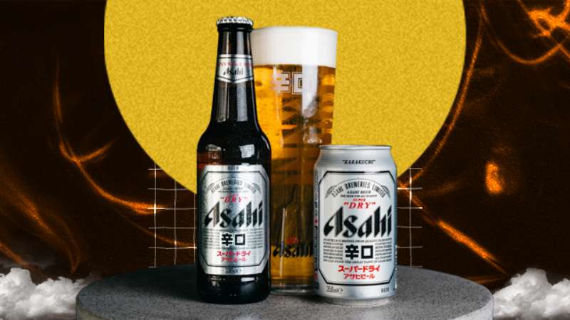
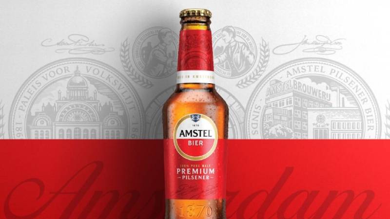
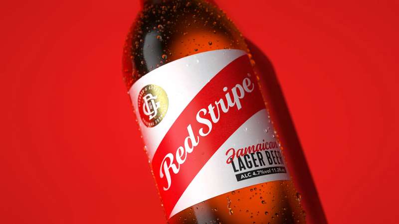
Bud Light occupies a unique position in beer branding. While Miller Lite uses red and gold, Coors Light leans into silver and mountain imagery.
Bud Light owns blue in the light beer category.
This color strategy creates instant recognition. Walk down any beer aisle and the blue cans jump out immediately.
Compared to craft beer logos, which often use intricate illustrations and vintage aesthetics, Bud Light keeps things stripped down. That’s the point. It signals mass appeal and consistency rather than artisanal exclusivity.
Corona uses a similar simplicity approach but with warm colors and beach imagery. Bud Light stays cooler, literally and figuratively.
What Are the Technical Specifications of the Bud Light Logo?
Official Color Codes
- Primary Color (Bud Light Blue): Hex #004B8D, RGB (0, 75, 141), CMYK (100, 68, 0, 26), Pantone 295 C
- Secondary Color (White): Hex #FFFFFF, RGB (255, 255, 255), CMYK (0, 0, 0, 0)
- Accent (Silver): Hex #A7A9AC, RGB (167, 169, 172), CMYK (0, 0, 0, 35)
Dimensions and Proportions
- Aspect Ratio: Approximately 3:1 for horizontal lockup
- Minimum Size: 0.5 inches width for print, 50 pixels for digital
- Clear Space: Minimum clear space equal to the height of the “B” in Bud on all sides
- File Formats Available: Vector graphics (AI, EPS, SVG), JPEG, PNG with transparency
What Cultural Impact Has the Bud Light Logo Had?

The Bud Light logo appears everywhere in American sports culture. Stadium signage, NASCAR vehicles, UFC octagon mats, Super Bowl commercials.
It’s become visual shorthand for “game day” in the United States.
The 2016 rebrand specifically aimed to make the logo more “Instagrammable.” The clean design photographs better on social media than the old glossy version.
For better or worse, the logo also became a flashpoint in cultural debates during 2023. Brand visibility cut both ways that year.
How Does the Bud Light Logo Fit Into the Overall Brand Identity?

The logo serves as the anchor for a broader visual system. The brand guidelines specify how it interacts with photography, advertising copy, and product packaging.
Blue dominates everything. From the website to the beer trucks.
The wordmark rarely appears alone. It typically sits alongside lifestyle imagery featuring social situations, sports events, or outdoor gatherings.
Sub-brands like Bud Light Lime and Bud Light Seltzer modify the logo with color variations while keeping the core structure intact.
How Should the Bud Light Logo Be Used?
Official Usage Guidelines
- Do: Use official files from Anheuser-Busch brand portal
- Do: Maintain minimum clear space requirements
- Do: Use approved color variations (full color, white, or blue)
- Don’t: Stretch, rotate, or distort the logo
- Don’t: Change the colors or add effects
- Don’t: Place on busy backgrounds that reduce readability
Access and Licensing
Official logos are available through the Anheuser-Busch media portal for authorized partners. Retailers, distributors, and licensed venues can request files.
Unauthorized commercial use is prohibited. The logo is a registered trademark with active legal protection.
For editorial use, standard fair use guidelines apply. News organizations and educational content can reference the logo without licensing.
FAQ on The Bud Light Logo
What Font Does Bud Light Use in Its Logo?
Bud Light uses a custom typeface designed exclusively for the brand. It’s a bold sans-serif with rounded edges.
The letterforms prioritize readability at all sizes. You won’t find this font available for public download.
What Are the Official Bud Light Logo Colors?
The primary color is Bud Light Blue (Hex #004B8D). White serves as the secondary color.
Silver appears in accent applications. This hue selection creates strong shelf presence in the beer aisle.
When Was the Bud Light Logo Last Redesigned?
The current Bud Light logo launched in March 2016. Anheuser-Busch introduced it as part of a complete brand refresh.
This update embraced minimalist design principles. Gone were the glossy effects and gradients from the previous version.
Who Designed the Current Bud Light Logo?
Jones Knowles Ritchie (JKR) created the 2016 redesign. They’re a global branding agency with offices in New York and London.
The project aimed to own blue in the light beer category. JKR delivered a cleaner visual identity that photographs well on social media.
Can I Download the Bud Light Logo for Free?
Official logo files require authorization from Anheuser-Busch. Licensed partners access them through the brand portal.
Unauthorized commercial use violates trademark law. For print design or marketing, always request proper licensing first.
What Does the Bud Light Crest Symbol Mean?
The heraldic crest references European brewing heritage. It suggests tradition and craftsmanship.
This psychology of shapes approach adds perceived quality. The shield form implies protection and reliability to consumers.
Why Is the Bud Light Logo Blue?
Blue communicates refreshment and trust. It’s the obvious choice for a light beer brand.
Understanding color theory explains this decision. Blue also differentiates Bud Light from competitors using red, gold, or silver.
How Has the Bud Light Logo Changed Over the Years?
The logo evolved through roughly five major versions since 1982. Early designs featured patriotic red, white, and blue themes.
The 2000s brought dimensional effects. Today’s version strips everything back to flat, bold graphics with strong contrast.
What File Formats Is the Bud Light Logo Available In?
Official files come in vector formats (AI, EPS, SVG) and bitmap formats (PNG, JPG).
Higher DPI versions exist for large-format printing. Digital applications typically use lower resolution files.
Is the Bud Light Logo Trademarked?
Yes. The Bud Light logo is a registered trademark of Anheuser-Busch LLC.
Active legal protection covers the wordmark, crest, and overall brand identity. Infringement cases are pursued aggressively by the company’s legal team.
Conclusion
The Bud Light logo demonstrates how a major American beer brand can stay relevant through smart redesigns. Its evolution from patriotic red-white-blue to owning blue entirely shows strategic thinking.
Good logo design principles drove every update. The current version uses white space effectively and creates clear visual hierarchy.
Whether you’re studying beverage branding or building your own brand style guide, this logo offers real lessons. Simple works. Consistency builds recognition.
Anheuser-Busch proved that sometimes stripping away complexity creates the strongest brand identity.

Renowned for his expertise in logo design and visual branding, Bogdan has developed a multitude of logos for various clients.
His skills extend to creating posters, vector illustrations, business cards, and brochures. Additionally, Bogdan's UI kits were featured on marketplaces like Visual Hierarchy and UI8.
He also wrote in the past years on sites like Design Your Way, WebDesignerDepot, WPDean, Designmodo, Speckyboy, Slider Revolution, and more.
- Jujutsu Kaisen Font Generator - 12 October 2026
- The Windsurf Logo History, Colors, Font, And Meaning - 10 October 2026
- How to Remove Background From Product Photos (No Photoshop) - 10 October 2026

Bogdan Sandu is a seasoned designer who has been designing websites since 2008. Renowned for his expertise in logo design and visual branding, Bogdan has developed a multitude of logos for various clients. His skills extend to creating posters, vector illustrations, business cards, and brochures. Additionally, Bogdan's UI kits were featured on marketplaces like Visual Hierarchy and UI8. He also wrote in the past years on sites like Design Your Way, WebDesignerDepot, WPDean, Designmodo, Speckyboy, Slider Revolution, and more.
You Might Also Like