The font you put on a title does more work than any other typographic decision on the page.
It sets the tone before a single word is read. It signals whether your design is editorial, modern, luxury, or authoritative, and it determines whether readers stay or scroll past.
Choosing the right title typeface isn’t about personal taste. It comes down to stroke contrast, weight range, optical size behavior, and how a font holds up across screen resolutions and print conditions.
This guide covers the best fonts for titles used by professionals across editorial design, web interfaces, poster work, fashion branding, and publishing. For each font, you’ll find classification details, size recommendations, pairing logic, and licensing information.
No guesswork. Just the structural data you need to make the right call.
The Best Fonts For Titles
Picking a title font isn’t about what looks good in isolation. It’s about what holds visual hierarchy, reads cleanly at large sizes, and doesn’t collapse when scaled across devices. The fonts below are consistently used by professionals for exactly that reason.
| Font | Classification | Best Title Context | License |
|---|---|---|---|
| Playfair Display | Transitional serif | Editorial, luxury branding | OFL Free |
| Montserrat | Geometric sans-serif | Web headers, branding | OFL Free |
| Bebas Neue | Condensed display | Posters, film titles | OFL Free |
| Oswald | Condensed gothic sans-serif | News, editorial, sports | OFL Free |
| Abril Fatface | Modern display serif | Magazine covers, advertising | OFL Free |
| Raleway | Neo-grotesque sans-serif | Fashion, portfolio headings | OFL Free |
| Bodoni | Didone serif | Fashion, luxury, print | Commercial |
| Lora | Transitional serif | Blog titles, editorial | OFL Free |
| Garamond | Old-style humanist serif | Books, academic, publishing | Varies |
| Gotham Bold | Geometric sans-serif | Brand campaigns, UI headers | Commercial |
Playfair Display

Playfair Display is a transitional serif typeface designed by Claus Eggers Sørensen in 2011, available through Google Fonts and Adobe Fonts under the SIL Open Font License.
It delivers high stroke contrast and a large x-height optimized for large heading sizes. Vogue and other fashion publications have used it consistently for editorial titles.
What makes Playfair Display suitable for titles?
Playfair Display has a high stroke contrast ratio between thick and thin strokes, producing strong visual impact at 48px and above. Its x-height is generous, and short descenders keep the display proportions tight without wasted vertical space. The transitional structure – influenced by Baskerville – gives it authority without feeling stiff.
Key attributes:
| Attribute | Value |
| Classification | Transitional serif |
| Designer | Claus Eggers Sørensen, 2011 |
| Weight range | Regular 400 to Black 900 (variable font since v2.0) |
| Variable font | Yes (v2.0, 2022+) – Weight, Width, Optical Size axes |
| Optical sizes | Yes – Needlepoint, Hairline, Titling, Display, Headline, Trumpet |
| Recommended sizes | 32px+ for titles; 88px for large display headings |
| Letter-spacing default | 0 (tight at display sizes) |
| License | OFL – free for personal and commercial use |
| Available on | Google Fonts, Adobe Fonts, Font Squirrel |
| Price | Free |
How does Playfair Display perform for title use?
At 48px and above, the high stroke contrast reads sharply on both screen and print. The delicate thin strokes, however, become problematic below 24px – they can break or disappear on low-DPI screens. Best used strictly for display and heading sizes, not subheadings below 28px.
What are the best pairings for Playfair Display in titles?
Playfair Display pairs with Lora when you want a warm, editorial all-serif system, and with Montserrat or Open Sans when serif-vs-sans contrast is needed for the body copy. The Montserrat pairing is standard editorial practice across web design.
What are the limitations of Playfair Display for titles?
High stroke contrast causes the thin strokes to render poorly below 24px, making it unsuitable for subheadings or navigation. The italic style, while expressive, requires careful sizing – it can feel overdone when overused at large scales.
Playfair Display – Recommended Use Cases Within Title Typography
- Best for: Magazine cover titles, editorial landing pages, luxury brand headings at 48px+
- Avoid for: Navigation labels, subheadings below 24px, reversed-out text on textured backgrounds
- Optimal weight: Regular 400 or Bold 700 for standard titles; Black 900 for high-impact display
- Optimal size range: 36px–120px for title use
Montserrat
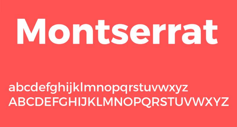
Montserrat is a geometric sans-serif font designed by Julieta Ulanovsky in 2011, released through Google Fonts. It is used on over 19 million websites globally and is the fourth most popular font on Google Fonts by views.
Montserrat works best for web title and heading use because its large x-height, wide apertures, and 9-weight range give designers full control over visual hierarchy.
What makes Montserrat suitable for titles?
Montserrat features a large x-height with short descenders, producing wide optical spacing that keeps letterforms clear at large heading sizes. It supports 9 weights from Thin 100 to Black 900, including a variable font format covering the full range in a single file. Wide apertures in letters like ‘c’, ‘e’, and ‘a’ prevent misread characters at any display size.
Key attributes:
| Attribute | Value |
| Classification | Geometric sans-serif |
| Designer | Julieta Ulanovsky, 2011 |
| Weight range | Thin 100 to Black 900 (9 weights, 18 styles with italics) |
| Variable font | Yes |
| Recommended sizes | 20px+ for headings; Bold/ExtraBold 800 at 32px+ for titles |
| Letter-spacing default | 0 to slightly wide |
| License | OFL – free for personal and commercial use |
| Available on | Google Fonts, Adobe Fonts, Font Squirrel |
| Price | Free |
How does Montserrat perform at title sizes?
At Bold 700 or ExtraBold 800, Montserrat renders clearly across screen resolutions from mobile to 4K. Its uniform stroke weight keeps visual texture consistent at large display sizes, making it reliable for hero section headings and landing page titles. The Government of Mexico adopted Montserrat as its official font for documentation and presentations in 2018, which is a fair indicator of its reliability at scale.
What are the best pairings for Montserrat in titles?
Montserrat font pairing works well with Lora for editorial warmth, and with Roboto when you need a system that scales across Android and web interfaces. Pairing Montserrat with Playfair Display body text is unconventional but can work in luxury contexts where the headline needs to feel contemporary.
What are the limitations of Montserrat for titles?
Montserrat’s widespread use – 19 million+ websites – means it reads as generic in competitive design contexts. Its geometric uniformity also means it lacks the character differentiation needed for premium or editorial brand identities that require distinction.
Montserrat – Recommended Use Cases Within Title Typography
- Best for: Website hero headings, landing page titles, presentation slide headers
- Avoid for: Premium or luxury brand titles where distinctiveness is required
- Optimal weight: SemiBold 600 or Bold 700 for page titles; ExtraBold 800 for hero display
- Optimal size range: 24px–96px for heading and display use
Bebas Neue
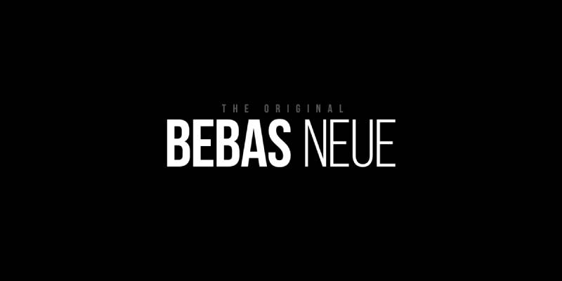
Bebas Neue is a condensed display font designed by Ryoichi Tsunekawa, originally released in 2010 by Dharma Type. It became open-source under SIL OFL in 2018 and is now available on Google Fonts.
It is an all-caps condensed typeface built for maximum visual impact in headline and poster contexts. La La Land used it in promotional materials, and it has become one of the most-used free display fonts worldwide.
What makes Bebas Neue suitable for titles?
Bebas Neue uses tall, condensed all-caps letterforms with near-uniform stroke weight and tight default spacing. These structural properties allow it to fill wide banner and poster areas efficiently – more characters per line than most display fonts. Its monolinear stroke approach means stroke contrast does not interfere with legibility at large sizes.
Key attributes:
| Attribute | Value |
| Classification | Geometric condensed display sans-serif |
| Designer | Ryoichi Tsunekawa, 2010 |
| Weight range | Single weight (Regular only in base version); Bebas Neue Pro adds Thin–Bold in 40 styles |
| Variable font | No (base version) |
| Recommended sizes | 48px+ for titles and posters |
| Letter-spacing default | Tight |
| License | OFL – free for personal and commercial use (base version) |
| Available on | Google Fonts, Font Squirrel, Fontfabric (extended family) |
| Price | Free (base); Bebas Neue Pro is commercial via Dharma Type |
How does Bebas Neue perform at title sizes?
Bebas Neue delivers strong visual impact from 48px upward. Its condensed proportions and all-caps structure create maximum density, which reads clearly from distance – useful for poster and billboard title use. Below 32px the tight spacing starts to compromise letter separation, particularly at screen resolutions under 200 DPI.
What are the best pairings for Bebas Neue in titles?
Bebas Neue pairs with Roboto for high-impact web layouts where the body text needs to stay neutral, and with Lato when a warmer tone is needed for supporting copy. Both are standard industry pairings given Bebas Neue’s position as a headline-only font.
What are the limitations of Bebas Neue for titles?
The base version ships in a single weight with no italic and no lowercase, making it unsuitable for any title context requiring mixed-case text. Font licensing for Bebas Neue Pro, which adds lowercase and italics, requires a paid commercial license from Dharma Type.
Bebas Neue – Recommended Use Cases Within Title Typography
- Best for: Poster titles, film and event promotional headings, banner ads at large sizes
- Avoid for: Mixed-case titles, subheadings, any context requiring lowercase
- Optimal weight: Regular (only option in free version)
- Optimal size range: 48px–200px for display title use
Oswald
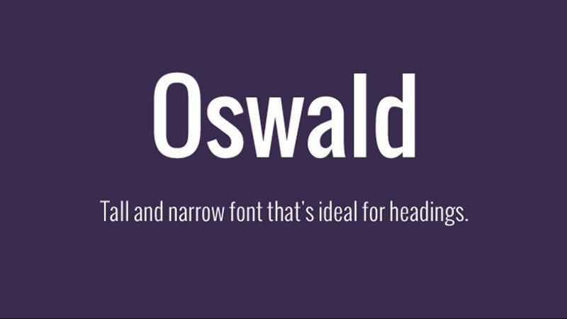
Oswald is a condensed gothic sans-serif designed by Vernon Adams in 2011, updated by Kalapi Gajjar and Alexei Vanyashin, and available free through Google Fonts under the SIL Open Font License.
It reworks the classic “Alternate Gothic” style for digital screens, with characters redrawn for LCD rendering. Oswald appears on nearly 5 million websites globally.
What makes Oswald suitable for titles?
Oswald’s condensed letterforms pack more characters per line than standard-width fonts, making it efficient for headline text in narrow containers like mobile viewports and sidebar headers. It ships in 6 weights from ExtraLight 200 to Bold 700, with no italics – a deliberate design choice that reinforces its identity as a headline typeface. A variable weight axis was added in 2019, enabling smooth weight transitions in CSS.
Key attributes:
| Attribute | Value |
| Classification | Condensed gothic sans-serif |
| Designer | Vernon Adams, 2011; updated by Kalapi Gajjar and Alexei Vanyashin |
| Weight range | ExtraLight 200 to Bold 700 (6 weights, no italics) |
| Variable font | Yes (weight axis added 2019) |
| Recommended sizes | 24px+ for titles; Bold 700 at 36px+ for primary headings |
| Letter-spacing default | Tight (condensed proportions) |
| License | OFL – free for personal and commercial use |
| Available on | Google Fonts, Adobe Fonts |
| Price | Free |
How does Oswald perform at title sizes?
At Bold 700, Oswald renders with strong vertical emphasis and industrial authority – effective for news, sports, and editorial contexts. Its condensed structure holds well from 24px to 120px. Setting it below 18px collapses readability because condensed spacing reduces the visual separation between letters at small sizes on standard-DPI screens.
What are the best pairings for Oswald in titles?
Oswald pairs with Lora for a classic editorial feel – the condensed gothic headline against a calligraphic serif body is a pairing seen in digital journalism. It also works well with Merriweather and Open Sans when a neutral, high-readability body is needed. Subsetting Oswald’s file to uppercase Latin characters only can reduce WOFF2 file size by up to 40%.
What are the limitations of Oswald for titles?
Oswald has no italic styles, which limits its use in contexts that require emphasis or variation through slant. Its condensed form also performs poorly at body text sizes – it is a headline-only typeface and should not be used for continuous reading below 20px.
Oswald – Recommended Use Cases Within Title Typography
- Best for: News site headlines, sports and editorial title treatment, navigation in condensed UI layouts
- Avoid for: Body text, any context requiring italic emphasis, luxury brand headings
- Optimal weight: Medium 500 for subheadings; Bold 700 for primary titles
- Optimal size range: 24px–96px
Abril Fatface
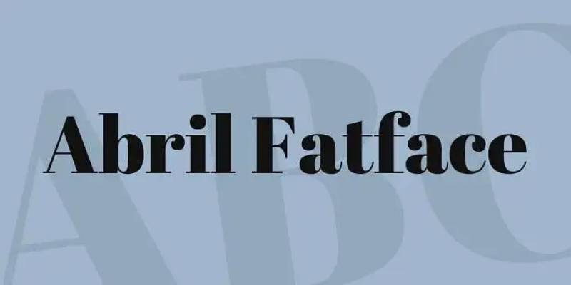
Abril Fatface is a modern display serif designed by Veronika Burian and José Scaglione at TypeTogether, released in 2011. It is available free through Google Fonts under the SIL Open Font License.
It is part of a larger 18-style Abril family, but only the Fatface display weight is available for free. The design revives classic Didone fatface models used in 19th-century advertising and editorial typography.
What makes Abril Fatface suitable for titles?
Abril Fatface has extreme stroke contrast – the thick strokes are among the heaviest of any free display serif, while the hairline thin strokes are razor fine. This contrast ratio produces immediate visual hierarchy at large heading sizes without needing bold weight or all-caps formatting. Its design was built for editorial use in newspapers, annual reports, and magazine covers.
Key attributes:
| Attribute | Value |
| Classification | Modern display serif (Didone) |
| Designer | Veronika Burian and José Scaglione (TypeTogether), 2011 |
| Weight range | Single weight (Regular only in the free Fatface cut) |
| Variable font | No |
| Recommended sizes | 64px+ for primary titles; 150px for large display headings |
| Letter-spacing default | -0.01em at large sizes |
| License | OFL – free for personal and commercial use |
| Available on | Google Fonts, Adobe Fonts |
| Price | Free (Fatface weight only) |
How does Abril Fatface perform at title sizes?
At 64px and above, Abril Fatface’s thick-to-thin contrast is its defining performance characteristic – the heavy strokes command attention while the thin hairlines add refinement. Below 32px, the hairline strokes deteriorate significantly on screens under 200 DPI, making it unreliable for anything smaller than large display use.
What are the best pairings for Abril Fatface in titles?
Abril Fatface pairs with Montserrat for a modern editorial combination where geometric sans-serif body copy offsets the high drama of the display serif title. It also works with Lato when a warmer, more approachable body tone is needed. Both pairings are standard in magazine and portfolio design.
What are the limitations of Abril Fatface for titles?
The free version is a single weight with no italic, which limits typographic variation in systems that require multiple levels of heading hierarchy. Its extreme display weight also makes it unsuitable for any use below 32px – the thin strokes become illegible.
Abril Fatface – Recommended Use Cases Within Title Typography
- Best for: Magazine cover titles, editorial hero headings, advertising display at 64px+
- Avoid for: Subheadings, UI labels, any context requiring multiple heading levels or italic emphasis
- Optimal weight: Regular (only option)
- Optimal size range: 64px–200px
Raleway
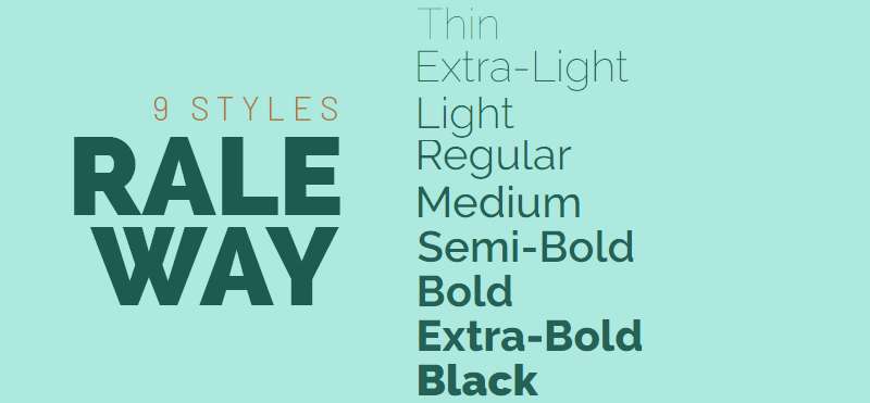
Raleway is a neo-grotesque sans-serif initially designed by Matt McInerney as a single Thin weight in 2010, then expanded to 9 weights by Pablo Impallari and Rodrigo Fuenzalida in 2012. It is available free through Google Fonts under the SIL Open Font License.
Raleway works best for elegant, fashion-forward title headings because its geometric base and thin-to-black weight range give it strong visual range without the rigidity of purely geometric typefaces.
What makes Raleway suitable for titles?
Raleway supports 9 weights from Thin 100 to Black 900, with 18 total styles including italics. Its neo-grotesque classification means it balances geometric precision with subtle humanist corrections, keeping letterforms readable at large display sizes. The wide weight range allows a single typeface to handle both delicate editorial titles (Light 300) and bold impact headings (Black 900).
Key attributes:
| Attribute | Value |
| Classification | Neo-grotesque sans-serif (display) |
| Designer | Matt McInerney (2010); Pablo Impallari and Rodrigo Fuenzalida (expanded 2012) |
| Weight range | Thin 100 to Black 900 (18 styles with italics) |
| Variable font | No |
| Recommended sizes | Thin/Light weights at 48px+; Bold/Black weights at 24px+ |
| Letter-spacing default | Wide (especially at thin weights) |
| License | OFL – free for personal and commercial use |
| Available on | Google Fonts, Adobe Fonts, Font Squirrel |
| Price | Free |
How does Raleway perform at title sizes?
At thin and light weights (100–300), Raleway requires a minimum of 48px to keep strokes visible and legible – the fine stroke weight deteriorates on low-contrast backgrounds below that threshold. At SemiBold 600 through Black 900, it renders well from 24px upward and holds strong on both screen and print. The wide natural letter-spacing at lighter weights means tight kerning adjustments are often needed in display use.
What are the best pairings for Raleway in titles?
Raleway font pairing works well with Lora when a literary, fashion-adjacent tone is needed – Raleway’s geometric elegance against Lora’s calligraphic serif creates a refined contrast. It also pairs with Cormorant Garamond for high-end editorial and luxury brand titles. Both combinations are standard in fashion and art design contexts.
What are the limitations of Raleway for titles?
Thin and ExtraLight weights require large sizes (48px+) and sufficient background contrast, making them impractical for many web heading contexts. Raleway also lacks a variable font format, meaning multiple static weight files must be loaded – increasing page font payload when using several weights simultaneously.
Raleway – Recommended Use Cases Within Title Typography
- Best for: Fashion editorial headings, portfolio page titles, luxury brand H1 headings at 48px+
- Avoid for: Thin/Light weights below 48px, reversed-out text on medium-contrast backgrounds
- Optimal weight: Light 300 or SemiBold 600 for editorial titles; Bold 700–Black 900 for strong display headings
- Optimal size range: 36px–120px depending on weight
Bodoni

Bodoni is a Didone serif font originally designed by Giambattista Bodoni in 1798, with the widely used ATF revival produced by Morris Fuller Benton in 1909. Modern digital versions are published by Linotype and available commercially through Adobe Fonts and MyFonts.
Bodoni is the typeface standard for fashion and luxury title typography – used by Vogue, Harper’s Bazaar, and major fashion houses for editorial title treatment.
What makes Bodoni suitable for titles?
Bodoni has extreme thick-to-thin stroke contrast – the highest of any widely used serif classification. Its unbracketed serifs and vertical stress axis create a formal, high-contrast appearance that reads as luxury and precision. The condensed uppercase letterforms hold well in tight headline spaces on magazine covers and print layouts. This structural characteristic made it the dominant fashion editorial font for over a century.
Key attributes:
| Attribute | Value |
| Classification | Didone serif (Modern serif) |
| Designer | Giambattista Bodoni, 1798; Morris Fuller Benton revival, 1909 |
| Weight range | Varies by version; Linotype Bodoni: 7 styles |
| Variable font | No (most commercial versions) |
| Recommended sizes | 36px+ for screen titles; 14pt+ for print |
| Letter-spacing default | Tight to 0 |
| License | Commercial – varies by foundry and version |
| Available on | Adobe Fonts (subscription), MyFonts (purchase), Linotype |
| Price | Subscription (Adobe Fonts) or one-time purchase (MyFonts) |
How does Bodoni perform at title sizes?
At print sizes and large screen display (36px+), Bodoni’s extreme contrast delivers unmatched visual authority. The thin hairline strokes suffer significant degradation on screen at sizes below 24px, especially on standard-DPI displays where sub-pixel rendering thins the strokes to near-invisibility. Print and high-DPI screens are where Bodoni performs best.
What are the best pairings for Bodoni in titles?
Bodoni font pairing works with Futura for the classic high-fashion typographic system – the contrast between Bodoni’s maximum-stroke-contrast serif and Futura’s geometric monolinear sans-serif is a pairing used by fashion brands including Dolce & Gabbana. It also pairs with Gill Sans for a softer, more editorial combination.
What are the limitations of Bodoni for titles?
Bodoni’s extreme thin strokes perform poorly below 24px on standard screen resolutions, restricting its use to large display applications. Commercial licensing costs – no free version with the quality of the original design exists – add a cost barrier compared to OFL alternatives like Playfair Display.
Bodoni – Recommended Use Cases Within Title Typography
- Best for: Fashion and luxury brand title treatment, high-DPI screen titles, print editorial covers at 36pt+
- Avoid for: Digital titles below 24px, low-contrast backgrounds, standard-DPI web headings
- Optimal weight: Regular or Bold depending on version; avoid light weights for screen use
- Optimal size range: 36px–200px for screen; 14pt–72pt for print
Lora
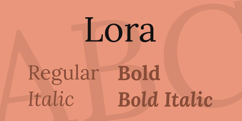
Lora is a transitional serif designed by Olga Karpushina and Alexei Vanyashin at Cyreal, available free through Google Fonts under the SIL Open Font License. It supports Latin and Cyrillic scripts and is optimized for screen rendering.
While Lora is commonly used for body text, its Bold 700 weight at larger sizes performs well for editorial and blog title headings where warmth and readability need to coexist.
What makes Lora suitable for titles?
Lora has a generous x-height, open counters, and moderate stroke contrast – the combination that makes it reliable at sizes from 16px body text up to 72px display headings. Its calligraphic italic cuts are particularly expressive, adding genuine elegance to pull quotes and styled title headings. The font ships in 4 weights (Regular 400 to Bold 700) and is also available as a variable font on Google Fonts.
Key attributes:
| Attribute | Value |
| Classification | Transitional serif (calligraphic influence) |
| Designer | Olga Karpushina and Alexei Vanyashin (Cyreal) |
| Weight range | Regular 400 to Bold 700 (4 weights with italics) |
| Variable font | Yes |
| Recommended sizes | 16px–20px for body; 32px+ for title headings |
| Letter-spacing default | 0 |
| License | OFL – free for personal and commercial use |
| Available on | Google Fonts, Adobe Fonts |
| Price | Free |
How does Lora perform at title sizes?
At Bold 700, Lora renders cleanly at heading sizes from 32px to 72px on both standard and high-DPI screens. Its moderate stroke contrast avoids the hairline degradation that affects Bodoni and Playfair Display at mid-screen sizes. The calligraphic italic adds styling options unavailable in most transitional serifs at this price point (free).
What are the best pairings for Lora in titles?
Lora pairs well with Oswald for editorial title systems where the heading needs authority and the body needs warmth. It also pairs with Montserrat and Raleway for fashion and lifestyle contexts. For an all-serif system, pairing Lora titles with Source Serif body text creates consistent typographic texture across a publication.
What are the limitations of Lora for titles?
Lora’s weight range caps at Bold 700 – there is no ExtraBold or Black weight, which limits visual impact for large-scale poster or banner title use where heavier weight is needed to dominate the composition. It is a text-first font that works at title sizes but was not optimized exclusively for display use.
Lora – Recommended Use Cases Within Title Typography
- Best for: Blog post titles, editorial article headings, literary and academic page titles
- Avoid for: Poster headings requiring Black weight, large-scale advertising display titles
- Optimal weight: SemiBold 600 or Bold 700 for titles
- Optimal size range: 28px–72px for heading use
Garamond
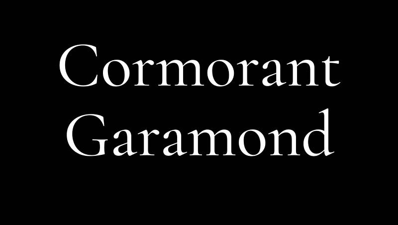
Garamond is an old-style humanist serif with origins in the work of Claude Garamond in 16th-century France. Modern digital versions include Adobe Garamond Pro (1989, Robert Slimbach), EB Garamond (free, OFL), and Cormorant Garamond (free, OFL).
Garamond works for formal, academic, and literary title typography because its old-style proportions and low stroke contrast make it readable across both print and high-DPI screen applications.
What makes Garamond suitable for titles?
Garamond’s letterforms have relatively low stroke contrast compared to Didone serifs, which means thin strokes remain visible at smaller heading sizes and in print at standard resolutions. Its angled stress axis – a characteristic of old-style classification – distributes visual weight more naturally than vertical-stress serifs. The long ascenders and classical proportions make it a natural fit for formal title contexts in publishing and academia.
Key attributes:
| Attribute | Value |
| Classification | Old-style humanist serif |
| Designer | Claude Garamond (original, c.1540); Robert Slimbach (Adobe version, 1989) |
| Weight range | Varies by version; Adobe Garamond Pro: Light to Bold; EB Garamond: Regular to ExtraBold |
| Variable font | Yes (EB Garamond variable version available) |
| Recommended sizes | 14pt+ for print titles; 24px+ for screen headings |
| Letter-spacing default | 0 to slightly loose |
| License | OFL (EB Garamond, Cormorant Garamond); Commercial (Adobe Garamond Pro) |
| Available on | Google Fonts (EB Garamond), Adobe Fonts (Adobe Garamond Pro) |
| Price | Free (EB Garamond); Subscription (Adobe Garamond Pro via Adobe Fonts) |
How does Garamond perform at title sizes?
Garamond’s low stroke contrast keeps letterforms stable across print and screen at heading sizes from 24px upward. It is not a high-impact display font – it communicates authority through restraint rather than visual weight. Adobe Garamond Pro is a reliable choice for book and publication titles where elegance and historical credibility matter more than visual dominance.
What are the best pairings for Garamond in titles?
Garamond font pairing works well with Futura for the classic contrast between an old-style serif and a geometric sans-serif – a standard in high-end book design. It also pairs with Source Sans Pro for academic and professional document contexts where the body needs screen-readable neutrality alongside formal serif headings.
What are the limitations of Garamond for titles?
Garamond’s old-style proportions and modest stroke contrast produce limited visual impact at screen sizes below 24px and in low-contrast color combinations. It is a conservative typeface – effective in formal contexts, but not suited for high-energy, attention-demanding title treatment in digital advertising or poster design.
Garamond – Recommended Use Cases Within Title Typography
- Best for: Book covers, academic publication titles, formal report headings, literary editorial design
- Avoid for: Digital advertising titles, poster design, high-energy brand headings
- Optimal weight: Regular or SemiBold for print titles; Bold for screen headings
- Optimal size range: 24px–72px for screen; 12pt–48pt for print
Gotham Bold
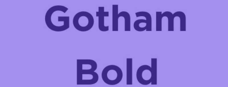
Gotham is a geometric sans-serif designed by Tobias Frere-Jones with Jesse Ragan, released through Hoefler & Co. in 2002. It is a commercial typeface available via license from Hoefler & Co.
Gotham Bold is one of the most recognized title typefaces in contemporary brand design. Barack Obama’s 2008 presidential campaign used it across all communications – a real-world example of its authority and mass legibility at scale.
What makes Gotham Bold suitable for titles?
Gotham was designed from mid-20th-century architectural signage, giving its letterforms consistent stroke weight, even spacing, and open geometry that holds legibility from small UI labels up to large outdoor display. The Bold 700 weight has sufficient stroke mass to anchor page hierarchy without becoming aggressive. Its geometric classification means it scales predictably – no optical adjustments needed between sizes.
Key attributes:
| Attribute | Value |
| Classification | Geometric sans-serif |
| Designer | Tobias Frere-Jones and Jesse Ragan, 2000; released 2002 |
| Weight range | Thin to Ultra (multiple variants including Condensed, Narrow, Rounded) |
| Variable font | No |
| Recommended sizes | 16px+ for UI headings; Bold at 24px+ for page titles |
| Letter-spacing default | 0 to slightly wide |
| License | Commercial – Hoefler & Co. license required |
| Available on | Hoefler & Co. (Cloud.typography) |
| Price | Paid (Subscription or perpetual license) |
How does Gotham Bold perform at title sizes?
Gotham Bold renders consistently at sizes from 16px UI headings up to large-format outdoor display. Its even stroke weight means no hairline deterioration at any standard screen size. The font’s urban confidence – blocky, geometric, and neutral – makes it equally functional against minimal backgrounds and busy layouts, which is why it’s a default choice in brand and UI heading design.
What are the best pairings for Gotham Bold in titles?
Gotham font pairing works with Archer (also Hoefler & Co.) for a system that keeps type within a single foundry’s family – a reliable approach for brand typography. It also pairs with Georgia for a geometric sans-serif title against a web-safe serif body, which keeps page font loading minimal.
What are the limitations of Gotham Bold for titles?
Gotham requires a paid subscription through Hoefler & Co. – there is no free or OFL version. Open-source alternatives like Montserrat are frequently used as substitutes, though they differ in proportions and letter spacing. The commercial licensing cost makes it a barrier for independent designers and small projects.
Gotham Bold – Recommended Use Cases Within Title Typography
- Best for: Brand campaign titles, UI page headings, government and institutional heading typography
- Avoid for: Projects with no font budget, luxury editorial contexts that require serif authority
- Optimal weight: Bold 700 for primary titles; Medium 500 for subheadings
- Optimal size range: 20px–120px for UI and display heading use
What Makes a Font Suitable for Titles?
Not every font is built for title use. Three structural attributes determine whether a typeface holds up at heading sizes: x-height, stroke contrast, and weight range.
X-height controls how tall lowercase letters appear relative to capitals. A generous x-height keeps text optically balanced at 48px and above, so headings don’t feel top-heavy or compressed.
Stroke contrast is the ratio between thick and thin strokes within a single letterform. High-contrast serifs like Bodoni deliver strong visual impact at display sizes but degrade at anything below 24px on standard-DPI screens.
Weight range determines flexibility. A font with only one or two weights forces designers into narrow choices. Montserrat, for instance, supports 9 weights from Thin 100 to Black 900, which means a single typeface family can cover every level of heading hierarchy.
Letter-spacing defaults also matter. Tight spacing works at large display sizes but collapses character separation below 32px. Wide-spaced fonts like Raleway at thin weights need a minimum of 48px to remain legible.
76% of designers prioritize readability and accessibility when selecting fonts, according to Monotype’s 2024 Font Use and Forecasting Survey. That number reflects how functional criteria, not aesthetics, drive professional type selection.
One more thing worth understanding: display fonts and text fonts are not interchangeable. Display-optimized typefaces like Abril Fatface use refined details and extreme proportions that only read clearly at large sizes. Text-optimized fonts like Lora perform at both body and heading sizes. Choosing the wrong category for a title context is the most common structural mistake in heading typography.
How Does Font Classification Affect Title Typography?
Font classification is not an academic label. It directly predicts how a typeface behaves at title sizes, on screen vs. print, and at different weight settings.
| Classification | Stroke Contrast | Best Title Context | Minimum Safe Size |
| Transitional serif | High | Editorial, luxury, print | 32px screen |
| Didone serif | Extreme | Fashion, magazine covers | 36px screen, 14pt print |
| Geometric sans-serif | Low (monolinear) | Web headers, branding | 20px screen |
| Condensed gothic | Low to moderate | News, sports, editorial | 24px screen |
| Old-style humanist serif | Low | Academic, publishing, books | 24px screen |
The five classifications represented in this article each behave differently under the same conditions.
Transitional serifs (Playfair Display, Lora) sit between old-style and modern. They have moderate-to-high stroke contrast that reads cleanly at editorial heading sizes. Vogue uses Playfair Display’s structural family for this reason.
Didone serifs (Bodoni, Abril Fatface) carry the most extreme stroke contrast of any classification. The hairline strokes add elegance at 64px and above but become nearly invisible at standard screen resolutions below 32px.
Geometric sans-serifs (Montserrat, Gotham) use near-uniform stroke weight throughout every letterform. This consistency means no degradation at any standard screen size. Montserrat is used on over 19 million websites, a figure that reflects the reliability of this classification for web title use.
Condensed gothic (Oswald, Bebas Neue) packs more characters per horizontal line than any other classification. This makes them efficient for banner and poster titles where width is constrained. Oswald appears on nearly 5 million websites, largely because its condensed proportions handle mobile viewport headings better than wide-set fonts.
Old-style humanist serifs (Garamond) have angled stress axes and low stroke contrast. Their thin strokes hold up better at smaller print sizes than Didone serifs because the contrast ratio is lower. Approximately 80% of academic journals use traditional serif fonts (Linearity), which reflects Garamond’s dominance in formal publishing contexts.
Neo-grotesque sans-serifs like Raleway fall between geometric and humanist. Their subtle optical corrections prevent the mechanical rigidity of pure geometry while maintaining clean lines at display sizes.
Which Title Fonts Work Best for Specific Design Contexts?
The right font for a title depends on the design context as much as the font’s structural properties. Editorial design, digital UI, print publishing, and advertising each impose different constraints on type selection.
Marketers report a 30% increase in consumer engagement when using brand-consistent fonts, according to Linearity’s font statistics analysis. Choosing a typeface that fits the context is a direct factor in that consistency.
Editorial and magazine title fonts
Playfair Display, Bodoni, and Abril Fatface dominate editorial and magazine title contexts for the same reason: high stroke contrast signals authority and sophistication at large heading sizes.
- Vogue has used Bodoni or closely related Didone cuts on its covers for decades
- Playfair Display’s transitional structure works across both digital editorial and print
- Abril Fatface is optimized for newspaper and annual report headings, per its TypeTogether designers
The serif + high contrast combination reads as established, credible, and premium, which is exactly what editorial title typography needs to communicate.
Web and UI hero heading fonts
Variable font adoption on websites reached 33% of all desktop pages in 2024, up from 29% in 2023, according to the HTTP Archive Web Almanac. Montserrat appeared on 9-10% of all variable font deployments tracked that year.
Montserrat, Oswald, and Gotham Bold are the standard choices for web hero and landing page headings.
- Montserrat’s variable font format allows a single file to cover all 9 weight levels
- Oswald’s condensed width handles mobile viewport headings without forced line breaks
- Gotham Bold renders consistently from 20px UI headings to 120px hero display text
The Government of Mexico adopted Montserrat as its official typeface for documentation and presentations in 2018, citing its cross-platform legibility as the primary reason.
Poster, event, and film title fonts
Single purpose. Bebas Neue exists to fill wide horizontal spaces at large sizes with maximum visual weight.
Its all-caps condensed structure was used in promotional materials for La La Land (2016) and has since become the default choice for film festival posters, event headings, and sport promotion across both print and digital formats.
The base version ships with one weight and no lowercase. That’s a deliberate constraint, not a limitation. It reinforces its role as a title-only typeface.
Fashion and portfolio heading fonts
Raleway at Thin 100 to Light 300 weights and Bodoni dominate fashion editorial and portfolio heading contexts because both communicate precision and restraint through structural delicacy rather than weight.
Raleway’s neo-grotesque base gives it clean geometric lines while its wide natural letter-spacing at thin weights reads as luxury at 64px and above. Bodoni’s unbracketed serifs and extreme stroke contrast have made it the default typeface across Dolce and Gabbana, Nieman Marcus, and several other fashion house communications.
Academic and literary title fonts
Garamond and Lora work for academic and literary title contexts because they communicate formal credibility without the visual aggression of high-contrast display serifs.
About 80% of academic journals use traditional serif fonts (Linearity). Garamond’s old-style proportions match that context precisely. Lora’s calligraphic italic cuts make it a practical choice for blog and longform article titles where warmth matters alongside structure.
How Do Title Fonts Perform at Different Sizes and Resolutions?
Size and resolution are where font selection decisions either hold or fail. A typeface that looks correct in a design tool at 48px may become unusable at 24px on a standard-DPI screen.
Optimizing letter-spacing can make characters up to 20% easier to read compared to default settings, according to research published in the International Journal of Research and Innovation in Social Science. That margin becomes even more significant at heading sizes above 48px, where default spacing often needs tightening.
| Font | Min. Safe Screen Size | Min. Safe Print Size | DPI Sensitivity |
| Montserrat Bold | 20px | 10pt | Low |
| Oswald Bold | 24px | 10pt | Low |
| Gotham Bold | 20px | 10pt | Low |
| Lora Bold | 24px | 12pt | Low to moderate |
| Playfair Display | 32px | 14pt | Moderate |
| Raleway Light | 48px | 18pt | High |
| Bodoni | 36px | 14pt | High |
| Abril Fatface | 64px | 20pt | Very high |
Safe from 20-24px: Montserrat, Oswald, Gotham Bold, and Lora all use open apertures and moderate stroke contrast. These characteristics keep letterforms legible at subheading and smaller heading sizes on standard 96 DPI screens.
Requiring 32-48px minimum: Playfair Display and Raleway at light weights both have fine strokes that deteriorate on standard-DPI displays below their minimum threshold. On Retina (200+ DPI) screens, both perform well at smaller sizes. Bodoni sits in this range depending on the version, with the Linotype cut requiring careful size management.
Abril Fatface’s extreme thick-to-thin contrast means it requires a minimum of 64px on screen to keep hairline strokes visible. Below that threshold, the thin strokes become pixel-thin or disappear depending on sub-pixel rendering settings.
The practical takeaway: geometric and condensed sans-serifs are the lowest-risk choices for heading systems that need to scale across size ranges. High-contrast serifs require large display contexts to remain structurally intact.
What Are the Best Font Pairings for Title Typography?
A title font without the right body companion creates hierarchy problems. The pairing needs to produce clear visual separation between heading and body levels, not just aesthetic contrast.
The serif + sans-serif pairing remains the most reliable approach for this reason. It creates structural contrast through the presence or absence of terminal strokes, which is the clearest visual signal between heading and body text that typography has to offer. Learning how to pair fonts correctly applies this principle consistently across all heading levels.
| Title Font | Body Pairing | Pairing Logic |
| Playfair Display | Montserrat or Open Sans | High-contrast serif title vs. monolinear sans body |
| Bodoni | Futura or Gill Sans | Classic Didone-to-geometric contrast (used in fashion houses) |
| Bebas Neue | Roboto or Lato | All-caps display title needs neutral, open body to avoid visual competition |
| Oswald | Lora or Merriweather | Condensed gothic title vs. calligraphic serif body (editorial standard) |
| Montserrat | Lora or Georgia | Geometric sans title vs. warm serif body |
Serif title with sans-serif body
Playfair Display + Montserrat is the most used serif-to-sans pairing in web editorial design. The transitional serif title commands attention through stroke contrast; Montserrat’s geometric uniformity keeps body text clean without competing.
The Playfair Display font pairing guide documents this combination across portfolio, fashion, and editorial contexts where the heading-to-body contrast needs to be immediate and unambiguous.
Bodoni + Futura is the fashion house version of the same principle. Dolce and Gabbana has used this combination in print materials. The extreme contrast of Bodoni’s Didone strokes against Futura’s monolinear geometry produces the widest possible visual gap between heading and body text.
Sans-serif title with serif body
This pattern is less common but effective when the body text needs to carry more visual weight than the heading. Gotham Bold titles with Georgia body copy work well in institutional contexts, institutional brands, and government communications.
Montserrat + Lora is the standard implementation for lifestyle and content-heavy websites where the heading needs to feel contemporary and the body text needs warmth. The geometric precision of Montserrat against Lora’s calligraphic curves creates intentional visual tension that holds reader attention across long articles.
All-caps display title with neutral sans body
Bebas Neue requires a neutral body typeface because its condensed all-caps structure already dominates the page. Pairing it with another decorative or high-personality font creates visual competition, not hierarchy.
Roboto is the default pairing choice because it provides maximum neutrality, wide language support, and strong rendering on Android and web. Lato works when a slightly warmer tone is needed in the body text.
A font combinations tool can help test these pairings at actual heading and body sizes before committing to a system. What looks correct in a design file at 48px often reads differently at live web rendering sizes.
What Are the Licensing and Availability Differences Between These Title Fonts?
License type is a selection factor that gets ignored until it creates a legal or budget problem. Eight of the ten fonts in this article are free under the SIL Open Font License. Two require paid commercial licenses.
Consistent font use can increase brand recognition by up to 80%, according to Linearity’s font statistics. That figure only holds when the same font can be legally deployed across web, print, and application contexts simultaneously, which requires checking license scope before committing to a typeface system.
| Font | License | Google Fonts | Adobe Fonts | Commercial Use |
| Playfair Display | OFL | Yes | Yes | Free |
| Montserrat | OFL | Yes | Yes | Free |
| Bebas Neue | OFL | Yes | Yes | Free |
| Oswald | OFL | Yes | Yes | Free |
| Abril Fatface | OFL | Yes | Yes | Free |
| Raleway | OFL | Yes | Yes | Free |
| Lora | OFL | Yes | Yes | Free |
| Garamond (EB) | OFL | Yes | No | Free |
| Bodoni (Linotype) | Commercial | No | Yes (subscription) | Paid |
| Gotham Bold | Commercial | No | No | Hoefler & Co. subscription |
OFL fonts (8 of 10 in this list) allow free use in personal projects, commercial projects, web embedding, app embedding, and modification, with one restriction: they cannot be sold as standalone font files. That covers virtually every standard design use case without cost.
Bodoni is available through Adobe Fonts under a Creative Cloud subscription, which covers desktop and web use within Adobe’s licensing terms. The Linotype version is the most structurally accurate digital revival. Free Bodoni alternatives exist (BioRhyme Expanded, Libre Bodoni) but none match the Linotype cut’s quality at display sizes.
Gotham Bold requires a Hoefler and Co. subscription through cloud.typography.com. The subscription covers web, desktop, and app use within defined pageview and seat limits. Montserrat is widely used as a free alternative, though the two differ in letter proportions and spacing behavior.
70% of creatives turn to popular marketplaces for font purchases, according to Monotype’s 2024 survey. For the commercial fonts in this list, Adobe Fonts and Hoefler and Co.’s own platform are the legitimate acquisition channels. Third-party download sites offering Gotham or Bodoni for free are distributing fonts in violation of their font licensing terms.
For projects requiring a free alternative to Gotham, the Google Fonts vs Adobe Fonts comparison covers which platform hosts the closest structural substitutes, including Montserrat and Nunito, both available without cost under OFL. A broader list of options is available in the best free Google Fonts guide.
FAQ on The Best Fonts For Titles
What is the best font for titles?
There’s no single answer. Playfair Display works for editorial and luxury contexts. Montserrat suits web headings. Bebas Neue dominates posters. The best title font depends on your design context, stroke contrast needs, and minimum display size.
What font classification works best for large display headings?
Display fonts and condensed sans-serifs perform best at large sizes. Geometric sans-serifs like Montserrat scale cleanly from 24px to 120px. High-contrast serifs like Bodoni and Abril Fatface require 64px or above to keep their hairline strokes visible on screen.
Are serif or sans-serif fonts better for titles?
Neither is universally better. Serif vs sans-serif fonts each serve different contexts. Serifs signal authority and tradition. Sans-serifs read more cleanly on screens at smaller heading sizes. The choice depends on brand tone and where the title appears.
What font size should I use for titles?
It depends on the font. Geometric sans-serifs like Montserrat are safe from 24px. High-contrast serifs like Playfair Display need 32px minimum on screen. Abril Fatface requires 64px. For print, most title fonts work from 14pt upward, with display cuts performing best at 20pt or larger.
Can I use a script font for titles?
Yes, but carefully. A script font works for decorative or invitation-style titles, not for news or UI headings. Legibility drops at smaller sizes. Limit script fonts to short titles at 48px or above, and always pair them with a neutral sans-serif for supporting text.
What is the best free font for titles?
Montserrat, Oswald, Playfair Display, and Bebas Neue are all free under the SIL Open Font License. All four are on Google Fonts. For editorial titles specifically, Playfair Display delivers the strongest combination of visual hierarchy and typographic quality at no cost.
How do I pair a title font with body text?
The most reliable method is contrasting classification. Pair a serif title with a sans-serif body, or vice versa. Oswald headlines work well with Lora body text. Montserrat titles pair cleanly with Georgia. Use a font pairing generator to test combinations at real sizes before committing.
What fonts do major brands use for their titles?
Vogue uses Bodoni. The Obama 2008 campaign used Gotham Bold. La La Land promotional materials used Bebas Neue. The Government of Mexico adopted Montserrat as its official typeface in 2018. Most fashion brands favor Didone serifs or geometric sans-serifs for heading and title treatment.
Are variable fonts a good choice for titles?
Variable fonts are an efficient choice. Montserrat and Playfair Display both offer variable versions. A single variable font file covers every weight from Thin to Black, reducing page load while maintaining full weight range for heading hierarchy. Variable font use reached 33% of all websites in 2024 (HTTP Archive).
Does font licensing matter when using title fonts commercially?
Yes. Eight of the ten fonts in this article are free under the SIL Open Font License, covering web, print, and app use. Gotham Bold requires a Hoefler and Co. subscription. Bodoni needs an Adobe Fonts or Linotype license. Always verify font licensing terms before deploying commercially.
Conclusion
This conclusion is for an article presenting the best fonts for titles, and the core takeaway is simple: font selection at heading level is a structural decision, not a stylistic one.
Classification, weight range, and minimum safe size determine whether a typeface works for your specific context, whether that’s a magazine cover, a landing page hero, or a poster.
Playfair Display and Bodoni serve editorial and luxury title treatment. Montserrat and Oswald handle web heading typography and UI hierarchy. Bebas Neue owns the poster and display space.
Pay attention to font spacing defaults at large sizes, and always verify your pairing logic produces clear contrast between heading and body text levels.
Get those decisions right, and the typography does its job without anyone noticing it.

Renowned for his expertise in logo design and visual branding, Bogdan has developed a multitude of logos for various clients.
His skills extend to creating posters, vector illustrations, business cards, and brochures. Additionally, Bogdan's UI kits were featured on marketplaces like Visual Hierarchy and UI8.
He also wrote in the past years on sites like Design Your Way, WebDesignerDepot, WPDean, Designmodo, Speckyboy, Slider Revolution, and more.
- The Windsurf Logo History, Colors, Font, And Meaning - 10 October 2026
- How to Remove Background From Product Photos (No Photoshop) - 10 October 2026
- How Designers can Build a Stronger Online Creative Identity - 9 October 2026

Bogdan Sandu is a seasoned designer who has been designing websites since 2008. Renowned for his expertise in logo design and visual branding, Bogdan has developed a multitude of logos for various clients. His skills extend to creating posters, vector illustrations, business cards, and brochures. Additionally, Bogdan's UI kits were featured on marketplaces like Visual Hierarchy and UI8. He also wrote in the past years on sites like Design Your Way, WebDesignerDepot, WPDean, Designmodo, Speckyboy, Slider Revolution, and more.
You Might Also Like