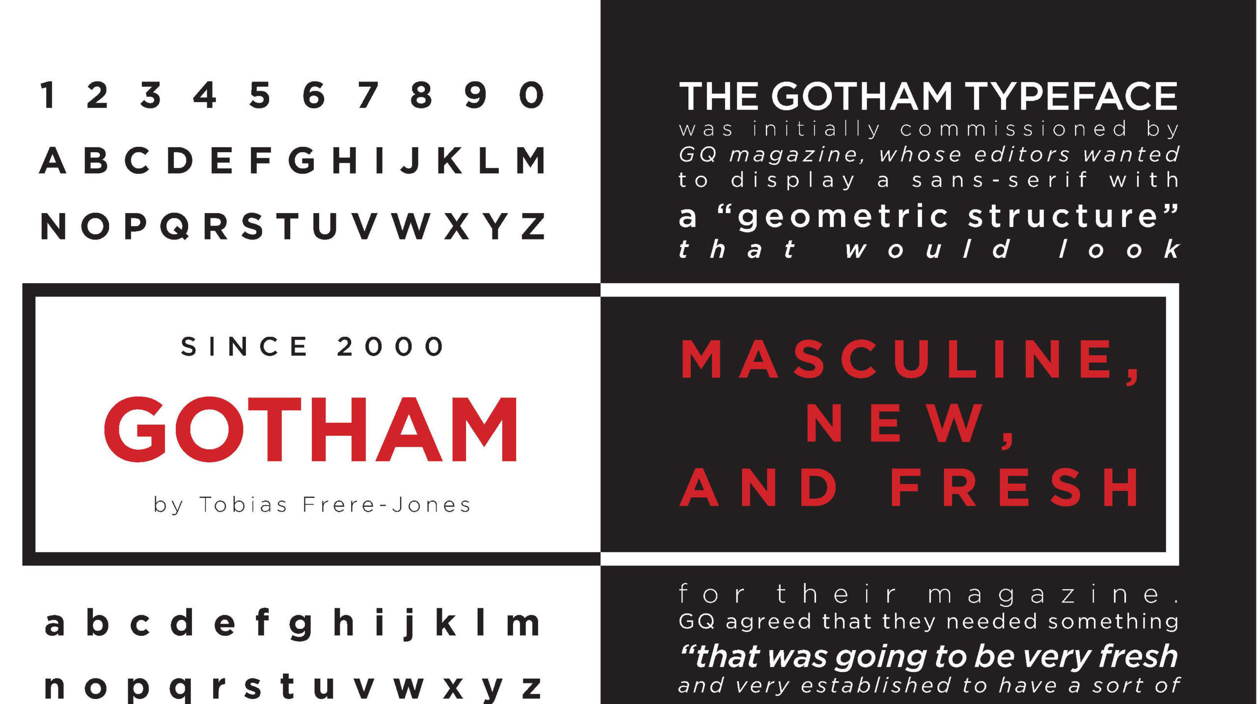
Gotham font pairing trips up even experienced designers. You grab this geometric powerhouse for headlines, then spend twenty minutes scrolling through your font library wondering what actually works alongside it.
The problem isn’t Gotham. It’s knowing which typefaces complement its architectural precision without clashing or creating visual monotony.
This guide covers 24 proven font combinations that work with Gotham across print, web, and branding projects. You’ll see specific pairings for editorial layouts, tech interfaces, luxury brands, and corporate materials.
Each pairing includes weight specifications, readability considerations, and real-world applications. Whether you need a classic serif counterpoint or another geometric sans with subtle differences, these combinations deliver professional results without the guesswork.
Gotham Font Pairing
| Font Pairing | Primary Use Context | Visual Characteristics | Best Application |
|---|---|---|---|
| Gotham + Mercury | Editorial and luxury branding | Geometric sans-serif paired with refined serif | Magazine layouts, premium content |
| Gotham + Antenna | Modern corporate communication | Sans-serif pairing with varied weights | Business presentations, interfaces |
| Gotham + Chronicle | News and editorial content | Clean geometric with traditional text serif | News websites, long-form articles |
| Gotham + Roboto | Digital-first platforms | Two geometric sans-serifs with distinct personality | Web applications, mobile interfaces |
| Gotham + Larken | High-end branding and marketing | Strong sans with elegant display serif | Luxury brands, upscale marketing |
| Gotham + Domaine | Contemporary editorial design | Modern geometric with sophisticated serif | Fashion publications, lifestyle brands |
| Gotham + Klinik Slab | Bold marketing and advertising | Geometric sans paired with sturdy slab serif | Posters, promotional materials |
| Gotham + Futura | Minimalist modern design | Two iconic geometric sans-serifs | Architecture sites, minimal branding |
| Gotham + Archer | Friendly professional content | Clean sans with warm slab serif | Corporate blogs, approachable brands |
| Gotham + Times New Roman | Traditional and accessible content | Modern sans with classic transitional serif | Academic content, formal documents |
| Gotham + Proxima Nova | Versatile digital design | Two highly legible sans-serifs | Websites, digital marketing |
| Gotham + Open Sans | Accessible web content | Geometric paired with humanist sans-serif | Educational sites, open platforms |
| Gotham + Whitney | Museum and cultural institutions | Related geometric sans-serifs with nuanced differences | Cultural content, exhibition materials |
| Gotham + Sentinel | Reading-focused applications | Geometric sans with optimized text serif | E-readers, text-heavy websites |
| Gotham + Lucida Grande | System-level interfaces | Contemporary sans with humanist sans | Desktop applications, software UI |
| Gotham + Grifo | Art direction and editorial | Strong geometric with expressive display serif | Creative portfolios, art publications |
| Gotham + Orpheus | Classical and scholarly content | Modern sans with old-style serif | Academic journals, literary works |
| Gotham + Knockout | Sports and action-oriented design | Geometric sans with condensed grotesque family | Sports brands, athletic marketing |
| Gotham + GT Sectra | Contemporary luxury content | Geometric sans with refined modern serif | Fashion brands, design agencies |
| Gotham + Quarto | Books and publishing | Modern sans with book-optimized serif | Digital books, publishing platforms |
| Gotham + Tungsten | Headlines and display content | Geometric sans with ultra-condensed sans | Headlines, compact layouts |
| Gotham + Monotype Baskerville | Classic editorial content | Contemporary sans with transitional serif | Journals, professional publications |
| Gotham + Rockwell Nova | Retro-modern branding | Geometric sans with updated geometric slab | Brand identity, vintage-inspired design |
| Gotham + Nimrod | Newspaper and news content | Modern sans with newspaper-optimized serif | News publications, dense text layouts |
Mercury
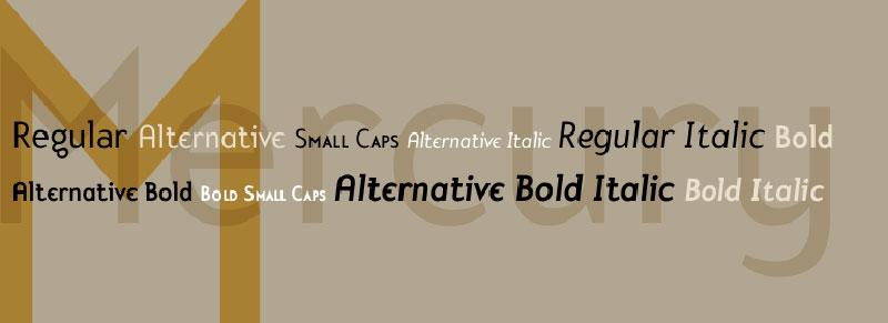
Mercury brings newspaper-grade reliability to Gotham’s geometric precision. This serif was built specifically for challenging print conditions but transitions beautifully to digital formats.
Classification/Type
Serif text face paired with geometric sans-serif. Classic editorial combination designed for high-volume publication work.
Visual Characteristics
Strong weight differentiation between the two creates natural typographic hierarchy. Mercury’s traditional serifs provide warmth against Gotham’s architectural coldness.
The pairing maintains exceptional contrast without competing for attention.
Use Cases
Editorial design remains the primary strength here. Magazines, newspapers, and long-form articles benefit from this combination.
Corporate reports requiring both authority and readability work well with this duo.
Technical Implementation
Headers: Gotham Bold at 28-36px Subheads: Gotham Medium at 18-24px Body: Mercury Text Regular at 14-16px with 1.5-1.6 line height
Mercury offers four optical grades for different printing conditions. Digital projects typically use Grade 1 or 2.
Readability & Accessibility
Mercury was designed to maintain legibility under adverse printing conditions, making it highly readable at small sizes.
Gotham’s wide apertures complement Mercury’s generous x-height.
Both maintain excellent performance across screens and print.
Design Examples/Applications
Mount Vernon museum website uses this pairing for historical content. Polygon magazine employs it for gaming articles.
Resume templates frequently pair these for professional presentation with clear visual hierarchy.
Antenna
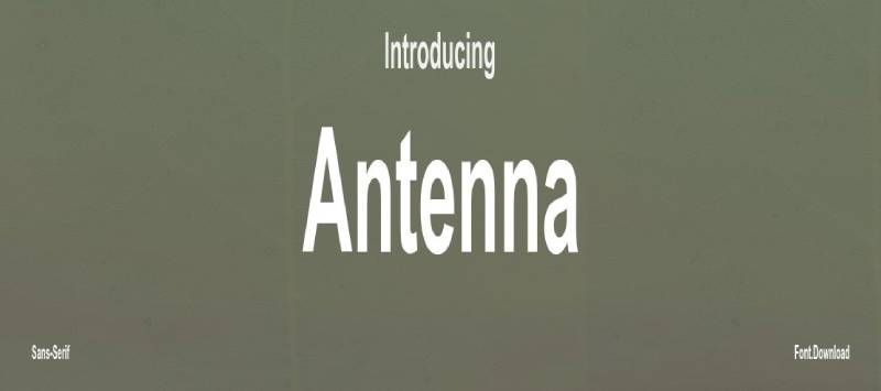
Antenna’s wide spacing creates breathing room alongside Gotham’s compact structure. Both share industrial roots but express them differently.
Classification/Type
Sans-serif duo with complementary proportions. Humanist meets geometric in a tech-forward combination.
Visual Characteristics
Antenna brings softer curves to balance Gotham’s angular geometry. The wider letter spacing creates distinct textural contrast.
Seven weights across four widths give Antenna serious flexibility for complex hierarchies.
Use Cases
Tech startups and food service brands gravitate toward this pairing. Works particularly well for interfaces requiring multiple information layers.
Ecommerce platforms benefit from Antenna’s readability at smaller sizes while Gotham handles headlines.
Technical Implementation
Primary Headlines: Gotham Bold at 32-48px Secondary Headers: Antenna Regular at 20-28px Body Text: Antenna Light at 15-17px with generous tracking
Antenna needs extra font spacing to perform optimally. Add 0.02em minimum.
Readability & Accessibility
Antenna’s generous proportions make it accessible for users with reading difficulties. The wide spacing reduces character crowding.
Gotham maintains clarity even when reversed out of backgrounds.
Design Examples/Applications
Munchery used this combination across their food delivery platform. Agency portfolios favor this pairing for its modern yet approachable feel.
Chronicle
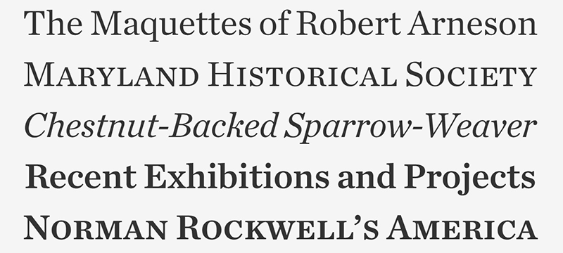
Chronicle injects old-world sophistication into Gotham’s modernist framework. The pairing feels simultaneously classic and contemporary.
Classification/Type
Traditional serif font meets geometric sans. Newspaper heritage paired with architectural lettering.
Visual Characteristics
Chronicle’s high contrast strokes create dramatic visual tension against Gotham’s even-weighted letters. Sharp serifs bite into Gotham’s softened corners.
The combination establishes clear rhythm through its contrasting textures.
Use Cases
Print formats showcase this pairing’s strengths. Books, magazines, and annual reports leverage the sophisticated contrast.
The Obama Foundation website demonstrates this pairing’s effectiveness for institutional branding.
Technical Implementation
Display Headlines: Gotham Black at 36-72px Body Text: Chronicle Text Regular at 14-16px Captions: Gotham Book at 11-13px
Chronicle Display works for larger sizes while Chronicle Text handles extended reading.
Readability & Accessibility
Chronicle maintains readability across challenging printing conditions. Its 18th-century Scottish roots mean it was designed for less-than-perfect paper.
Gotham’s clarity provides scannable headers that guide readers through Chronicle’s denser text blocks.
Design Examples/Applications
Editorial projects love this combination. Museum websites, cultural institutions, and journalism platforms frequently employ it.
Squarespace templates feature this pairing for portfolio sites requiring both elegance and modernity.
Roboto

Roboto brings Google’s mechanical precision to Gotham’s architectural aesthetic. Two geometric typefaces that somehow don’t compete.
Classification/Type
Dual geometric sans-serif pairing. Neo-grotesque meets American geometric in a digital-first combination.
Visual Characteristics
Subtle curves in Roboto soften the pairing while maintaining Gotham’s structural clarity. Both share geometric frameworks but differ in humanist touches.
Roboto’s slightly condensed proportions create natural hierarchy when paired with Gotham’s wider stance.
Use Cases
Web and mobile interfaces are this pairing’s natural habitat. Material Design projects obviously favor Roboto, but adding Gotham for marketing pages creates cohesion.
Apps requiring extensive text benefit from Roboto’s readability while Gotham handles branding elements.
Technical Implementation
Hero Text: Gotham Bold at 40-56px Interface Headers: Roboto Medium at 24-32px Body Text: Roboto Regular at 16px with 1.5 line-height UI Elements: Roboto Light at 14px
Roboto’s 12 weights provide granular control over text hierarchy.
Readability & Accessibility
Both fonts were designed with screen rendering in mind. Roboto optimizes specifically for mobile displays.
The mechanical letterforms reduce character ambiguity, improving accessibility for users with dyslexia.
Design Examples/Applications
Android apps frequently combine these. Marketing sites for tech companies use Gotham for headlines while Roboto handles descriptions.
Larken
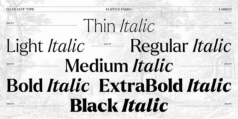
Larken’s display qualities add theatrical flair to Gotham’s restraint. This combination leans heavily into contrast for maximum impact.
Classification/Type
Display font meets workhorse sans. Fashion-forward serif paired with utilitarian geometric.
Visual Characteristics
Larken’s dramatic strokes and elegant details create a luxury feel. Gotham grounds the combination with its no-nonsense structure.
The weight contrast is substantial. Larken pulls focus while Gotham supports.
Use Cases
Fashion brands, luxury goods, and lifestyle publications favor this sophisticated pairing. Works beautifully for cosmetics and high-end retail.
Editorial spreads benefit from Larken’s display presence with Gotham handling support text.
Technical Implementation
Main Headers: Larken Bold at 48-84px (display sizes only) Subheads: Gotham Medium at 20-28px Body: Gotham Book at 14-16px
Never use Larken below 24px. It’s a display face that loses detail at text sizes.
Readability & Accessibility
This pairing prioritizes visual impact over extended reading. Keep Larken strictly for headlines.
Gotham carries the accessibility load, providing clear, readable support text.
Design Examples/Applications
Boutique hotel websites use this combination for elegance. Fashion lookbooks and campaign materials leverage the high-contrast aesthetic.
Domaine
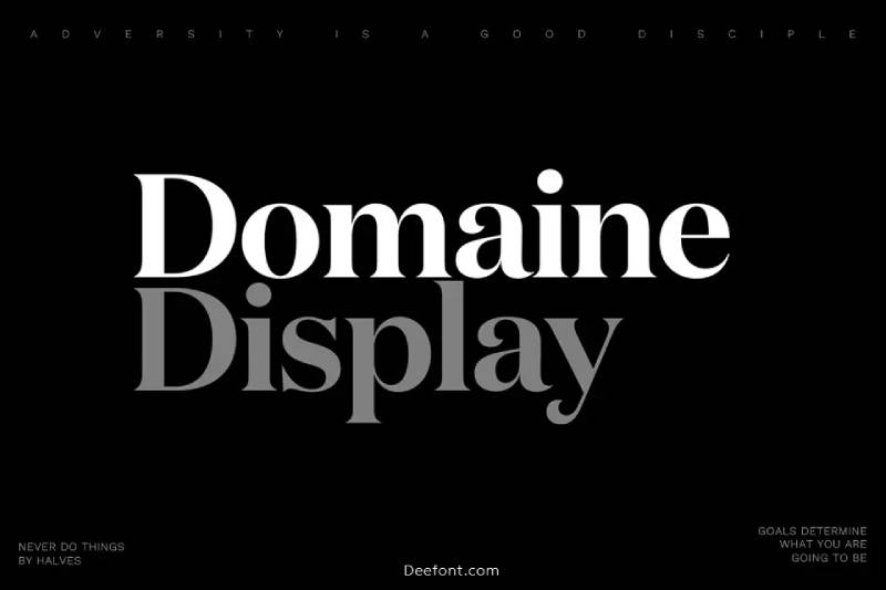
Domaine’s contemporary serif design brings European sophistication to Gotham’s American directness.
Classification/Type
Modern serif meets geometric sans. Rational design principles unite both typefaces despite their structural differences.
Visual Characteristics
Domaine features optical sizes optimized for different contexts. Its sharp details provide refined contrast against Gotham’s blunt geometry.
Both fonts share a certain precision that creates visual harmony despite their category differences.
Use Cases
Cultural institutions and design studios gravitate toward this pairing. Architecture firms appreciate the structural clarity both fonts exhibit.
Editorial design for design-focused publications works exceptionally well.
Technical Implementation
Large Headlines: Domaine Display Bold at 36-60px Body Text: Domaine Text Regular at 14-16px UI Elements: Gotham Book at 12-16px
Match the optical size of Domaine to your actual usage. Display for headers, Text for body copy.
Readability & Accessibility
Domaine’s optical sizing ensures optimal readability at any scale. The Text variant includes features specifically for extended reading.
Gotham provides crisp navigation and UI text that won’t fatigue readers.
Design Examples/Applications
Design agency websites showcase this combination. Museum catalogs and art publications use it for its refined, intellectual quality.
Klinik Slab
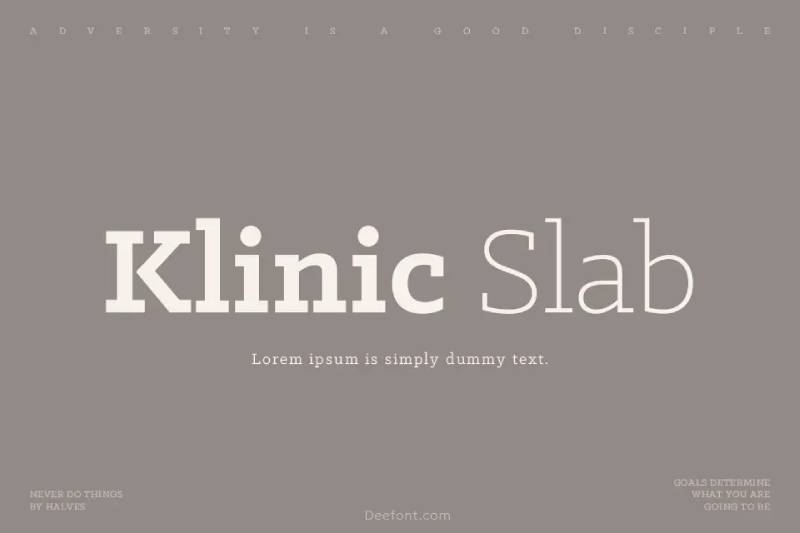
Klinik Slab adds mechanical precision to Gotham’s architectural foundation. Both fonts share industrial DNA but express it through different structures.
Classification/Type
Slab serif font meets geometric sans. Mechanical meets architectural in a utilitarian combination.
Visual Characteristics
Heavy, even-weighted serifs create strong horizontals that ground Gotham’s vertical terminals. The industrial aesthetic remains consistent across both faces.
Both fonts feel engineered rather than drawn, creating natural stylistic unity.
Use Cases
Tech companies with hardware products use this pairing. Industrial design firms and engineering companies appreciate the mechanical aesthetic.
Construction and manufacturing brands find this combination appropriately robust.
Technical Implementation
Headers: Klinik Slab Bold at 28-42px Subheads: Gotham Medium at 18-24px Body: Either font at 14-16px depending on tone
The slab serifs need slightly more leading than sans alternatives. Add 2-4px.
Readability & Accessibility
Slab serifs can feel heavy in dense text blocks. Use Klinik Slab strategically for emphasis.
Gotham handles extended text more comfortably while Klinik Slab provides impact points.
Design Examples/Applications
Startup pitch decks use this combination for technical products. Industrial equipment manufacturers favor the utilitarian aesthetic.
Futura

Pairing Gotham with Futura feels almost redundant until you notice the subtle differences. Both are geometric titans with distinct personalities.
Classification/Type
Dual geometric sans-serif combination. Bauhaus meets mid-century American architectural lettering.
Visual Characteristics
Futura’s perfectly circular bowls contrast with Gotham’s slightly squared geometry. The subtle differences create interesting textural variety without disrupting visual consistency.
Futura skews more European while Gotham feels distinctly American.
Use Cases
This pairing works when you need geometric consistency with subtle hierarchical separation. Fashion brands frequently use this combination.
Works well for projects requiring multiple sans weights across various contexts.
Technical Implementation
Primary Headers: Gotham Bold at 32-48px Secondary Headers: Futura Medium at 20-28px Body Text: Futura Book at 14-16px
Both fonts share similar kerning needs. Standard tracking works for both.
Readability & Accessibility
Futura’s geometric purity can feel cold in extended text. Mix strategically with Gotham’s warmer proportions.
Both maintain excellent clarity at small sizes and on screens.
Design Examples/Applications
Volkswagen has used Futura for decades. Pairing it with Gotham for secondary materials maintains brand guidelines while adding flexibility.
Archer
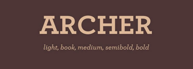
Archer brings warmth and personality to Gotham’s cool professionalism. Slab serifs meet geometric sans in an unexpectedly friendly combination.
Classification/Type
Geometric slab serif paired with geometric sans. Both share structural similarities but diverge in tone.
Visual Characteristics
Archer’s rounded terminals soften the pairing considerably. The slab serifs feel approachable rather than industrial.
Both fonts share geometric foundations, creating natural structural harmony despite their surface differences.
Use Cases
Lifestyle brands love this combination. Martha Stewart Living originally commissioned Archer, and it pairs naturally with Gotham for aspirational content.
Food, hospitality, and lifestyle publications benefit from Archer’s warmth with Gotham’s clarity.
Technical Implementation
Display Headers: Archer Bold at 36-54px Subheads: Gotham Medium at 20-26px Body: Archer Book at 14-16px with 1.6 line-height
Archer includes ball terminals that need space. Increase tracking slightly at smaller sizes.
Readability & Accessibility
Archer’s friendly personality makes dense content feel approachable. The rounded serifs reduce visual harshness.
Gotham provides clear wayfinding that helps readers navigate longer pieces.
Design Examples/Applications
Magazine layouts for home and lifestyle content. Recipe websites and cooking blogs frequently employ this warm, inviting combination.
Times New Roman
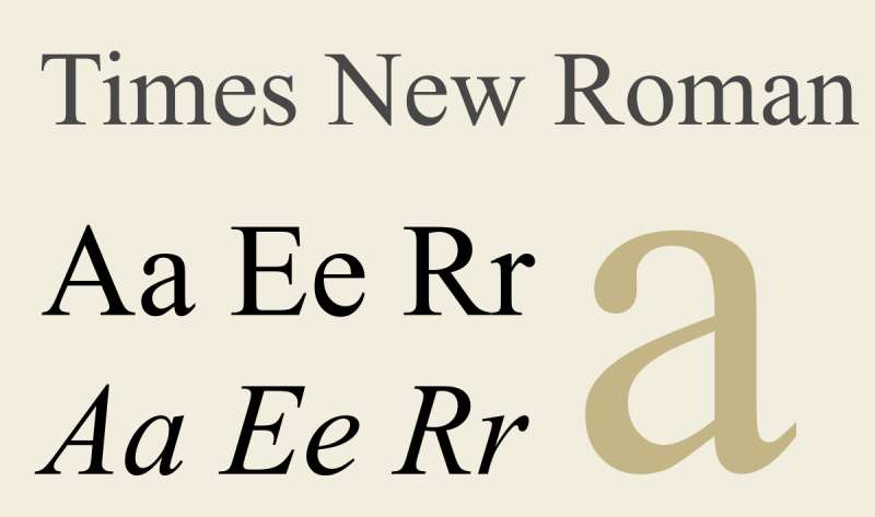
Pairing Gotham with Times New Roman sounds like a design crime until you see it work. Traditional meets modern with surprising effectiveness.
Classification/Type
Classic transitional serif meets geometric sans. The ultimate old-versus-new typography combination.
Visual Characteristics
Maximum contrast creates clear hierarchy. Times’ traditional proportions feel distinctly different from Gotham’s architectural regularity.
The pairing works because both fonts are supremely neutral in their respective categories.
Use Cases
Academic papers and professional documents where tradition matters but clarity is needed. Legal documents benefit from Times’ authority with Gotham’s modern headers.
Corporate communications requiring both gravitas and accessibility.
Technical Implementation
Headers: Gotham Bold at 24-32px Body Text: Times New Roman Regular at 12pt (print) or 16px (web) Captions: Gotham Book at 10-12px
Times was designed for newsprint at small sizes. On screens, bump sizes up from traditional print values.
Readability & Accessibility
Times New Roman remains one of the most readable fonts ever designed. Its newspaper heritage ensures performance under challenging conditions.
Gotham provides clear navigational elements that guide readers through traditional text blocks.
Design Examples/Applications
Corporate annual reports mix these fonts. Academic presentations use Gotham for slides with Times for research citations.
Proxima Nova
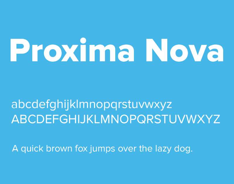
Proxima Nova shares Gotham’s geometric DNA but adds humanist proportions. The similarity creates cohesion while subtle differences establish hierarchy.
Classification/Type
Geometric-humanist hybrid meets pure geometric. Two modern sans-serifs with complementary design philosophies.
Visual Characteristics
Proxima Nova’s slightly wider proportions create visual breathing room. Both fonts share geometric foundations but Proxima feels more open.
The similar aesthetic means this pairing works through subtle weight and proportion differences rather than stark contrast.
Use Cases
Digital products love this combination. The similarity maintains visual consistency across complex interfaces.
Tech companies use both for different brand touchpoints while maintaining cohesive visual identity.
Technical Implementation
Hero Headlines: Gotham Bold at 36-56px Section Headers: Proxima Nova Semibold at 24-32px Body Text: Proxima Nova Regular at 16-18px UI Text: Proxima Nova Regular at 14-16px
Both fonts have extensive weight ranges. Use weight to create hierarchy rather than relying on size alone.
Readability & Accessibility
Proxima Nova’s humanist touches make it slightly more readable in extended text. Its wider apertures improve character recognition.
Gotham excels in headlines where its architectural qualities create strong impact.
Design Examples/Applications
Tech company websites frequently combine these. Airbnb-style interfaces benefit from the clean, modern aesthetic both fonts provide.
Open Sans

Open Sans brings Google’s accessible design philosophy to Gotham’s professional aesthetic. Free meets premium in a surprisingly effective combination.
Classification/Type
Humanist sans meets geometric sans. Open-source accessibility paired with commercial refinement.
Visual Characteristics
Open Sans has a slightly taller x-height and wider proportions than Gotham. The vertical stress differs, creating subtle textural variety.
Both maintain neutral personalities that don’t compete for attention.
Use Cases
Budget-conscious projects where Gotham licensing makes sense for branding but Open Sans handles heavy-lifting body text.
International projects benefit from Open Sans’s extensive character set (897 glyphs across multiple scripts).
Technical Implementation
Branding/Headers: Gotham Bold at 32-48px Subheads: Open Sans Semibold at 20-28px Body Text: Open Sans Regular at 16-18px
Open Sans needs slightly less tracking than Gotham. Adjust letterspacing independently for each face.
Readability & Accessibility
Open Sans was designed specifically for screen readability. Its humanist proportions reduce eye strain during extended reading.
Together they provide accessible design that works across devices and for users with various reading abilities.
Design Examples/Applications
Government websites pair these when accessibility standards require free fonts but branding deserves premium treatment. Educational platforms use this combination extensively.
Whitney
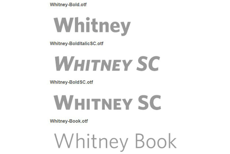
Whitney shares Gotham’s institutional quality while adding humanist warmth. Both were commissioned for specific institutions, creating natural synergy.
Classification/Type
Two institutional sans-serifs with different personalities. Humanist meets geometric in a professionally focused pairing.
Visual Characteristics
Whitney’s slightly condensed proportions contrast with Gotham’s wider stance. Both feel professional without being corporate.
The curved terminals in Whitney soften against Gotham’s geometric precision.
Use Cases
Museums, cultural institutions, and educational organizations favor this combination. Both fonts carry institutional authority without stuffiness.
Nonprofit organizations and foundations use this pairing for its approachable professionalism.
Technical Implementation
Primary Headers: Gotham Bold at 28-42px Body Text: Whitney Book at 14-16px Captions: Whitney Light at 12-14px
Whitney’s narrow proportions allow more text per line without compromising readability. Adjust column widths accordingly.
Readability & Accessibility
Whitney was designed specifically for museum labels and wayfinding. Its clarity at small sizes complements Gotham’s bold headers.
Both maintain legibility under challenging lighting conditions common in galleries and public spaces.
Design Examples/Applications
The Whitney Museum obviously uses its namesake font. Pairing it with Gotham for signage and print materials creates cohesive institutional identity.
Sentinel

Sentinel refreshes classic slab serif design with contemporary proportions. Paired with Gotham, it creates a balanced, versatile system.
Classification/Type
Contemporary slab serif meets geometric sans. Modern interpretations of traditional categories.
Visual Characteristics
Sentinel’s humanist proportions add warmth to slab serif structure. Against Gotham’s cool geometry, the contrast feels approachable.
Six weights with italics give Sentinel serious range for complex layouts alongside Gotham’s eight weights.
Use Cases
Editorial design for both print and digital. News websites and magazine layouts benefit from Sentinel’s readability with Gotham’s clarity.
Corporate communications requiring both authority and warmth.
Technical Implementation
Headlines: Gotham Bold at 32-48px Body Text: Sentinel Book at 14-16px with 1.5-1.6 leading Pull Quotes: Sentinel Semibold Italic at 18-22px
Sentinel includes true italics designed for emphasis within text. Use them for semantic emphasis rather than visual variety.
Readability & Accessibility
Sentinel modernizes the Clarendon tradition for contemporary reading conditions. Both print and screen performance is excellent.
Gotham’s wide apertures ensure clarity in navigation while Sentinel handles extended reading comfortably.
Design Examples/Applications
Financial publications use this combination for its authoritative yet accessible tone. Annual reports and investor materials frequently employ this pairing.
Lucida Grande
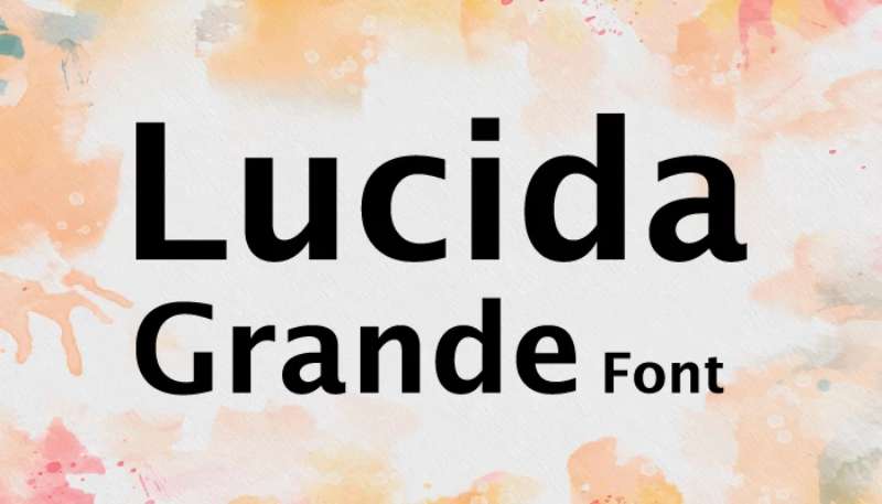
Lucida Grande brings digital interface expertise to Gotham’s architectural precision. System font meets commercial typeface in a practical combination.
Classification/Type
Humanist sans system font paired with geometric commercial typeface. Digital utility meets branding refinement.
Visual Characteristics
Lucida Grande’s humanist proportions create warmth against Gotham’s geometric structure. The wide apertures in both fonts ensure clarity.
Both were designed for specific functional needs, creating natural compatibility.
Use Cases
Web design where system fonts reduce page weight but branding requires Gotham. Interface design benefits from Lucida’s screen-optimized proportions.
Cross-platform applications where font consistency matters but file size is constrained.
Technical Implementation
Marketing Headers: Gotham Bold at 32-48px Interface Text: Lucida Grande Regular at 14-16px System UI: Lucida Grande at 12-14px
Lucida Grande was macOS’s default system font. On non-Mac systems, specify Lucida Sans Unicode as fallback.
Readability & Accessibility
Lucida Grande’s design prioritizes screen rendering at small sizes. Years as a system font proved its accessibility credentials.
Together they create efficient, accessible interfaces that don’t sacrifice visual quality.
Design Examples/Applications
Mac applications traditionally used Lucida Grande for interface text. Web apps can pair it with Gotham for marketing while maintaining lightweight interfaces.
Grifo
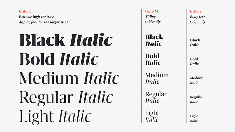
Grifo injects Portuguese personality into Gotham’s American architectural aesthetic. Sharp details meet geometric precision.
Classification/Type
Contemporary serif with distinctive details paired with geometric sans. Refined meets utilitarian.
Visual Characteristics
Grifo’s claw-like serifs create dramatic visual interest. The sharp details provide strong contrast against Gotham’s softened corners.
Three optical sizes with five weights give Grifo serious flexibility alongside Gotham’s range.
Use Cases
Design-forward brands wanting personality without sacrificing professionalism. Cultural institutions and creative agencies favor this distinctive pairing.
Editorial design for design and culture publications.
Technical Implementation
Display Headlines: Grifo Display Bold at 36-72px Body Text: Grifo Text Regular at 14-16px UI Elements: Gotham Book at 12-16px
Match Grifo’s optical size to actual usage. Display for large, Text for reading, Micro for small sizes.
Readability & Accessibility
Grifo’s sharp details can feel intense in long text blocks. Use strategically for emphasis and headlines.
Gotham provides neutral support text that doesn’t compete with Grifo’s personality.
Design Examples/Applications
Portuguese design studios showcase Grifo naturally. International brands use this combination when they want European sophistication with American clarity.
Orpheus

Orpheus brings classical refinement to Gotham’s modernist framework. Renaissance proportions meet 20th-century geometry.
Classification/Type
Classical serif meets geometric sans. Historical elegance paired with contemporary utility.
Visual Characteristics
Orpheus features elegant proportions rooted in Renaissance design. The classical details provide sophisticated contrast against Gotham’s stark geometry.
Both fonts project authority but from entirely different historical perspectives.
Use Cases
Luxury brands requiring timeless elegance with modern clarity. Fine art galleries and high-end cultural institutions favor this sophisticated pairing.
Wine labels, premium packaging, and upscale hospitality materials.
Technical Implementation
Primary Headlines: Gotham Bold at 28-42px Body Text: Orpheus Regular at 14-16px with generous leading Subheads: Orpheus Italic at 18-22px
Orpheus’s classical proportions need more vertical space than modern typefaces. Add 4-6px to standard leading.
Readability & Accessibility
Orpheus maintains readability through its refined proportions. The classical design feels familiar rather than ornate.
Gotham grounds the pairing with its straightforward clarity and excellent legibility.
Design Examples/Applications
Museum exhibition catalogs use this combination for its cultured aesthetic. Wine industry publications leverage the classical refinement.
Knockout

Knockout’s condensed proportions create dynamic tension alongside Gotham’s standard width. Both share architectural roots but express them differently.
Classification/Type
Condensed sans-serif paired with standard geometric sans. Vertical meets horizontal in a space-efficient combination.
Visual Characteristics
Knockout’s extreme condensation creates strong vertical rhythm against Gotham’s balanced proportions. The width contrast is dramatic.
Multiple widths in both families allow nuanced hierarchical control.
Use Cases
Space-constrained layouts where information density matters. Sports graphics and data visualization benefit from Knockout’s condensed efficiency.
Editorial design for magazines requiring maximum text in minimum space.
Technical Implementation
Impact Headers: Knockout Bold Condensed at 48-72px Standard Headers: Gotham Bold at 24-32px Body Text: Gotham Book at 14-16px
Knockout’s condensed proportions pack more characters per line. Adjust column widths to prevent overly long lines.
Readability & Accessibility
Extreme condensation can hamper readability in extended text. Reserve Knockout for headlines and short bursts.
Gotham handles body text and navigation where clarity trumps impact.
Design Examples/Applications
Sports publications love Knockout’s condensed punch. Fashion magazines use this combination for edgy, modern layouts.
GT Sectra
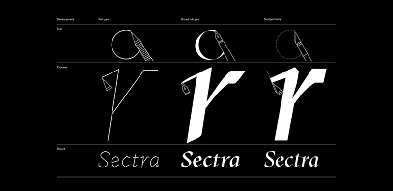
GT Sectra brings contemporary serif elegance to Gotham’s geometric foundation. Sharp details meet architectural precision.
Classification/Type
Contemporary serif display face paired with geometric sans. Modern refinement meets utilitarian clarity.
Visual Characteristics
GT Sectra’s sharp serifs and high contrast create dramatic visual presence. The elegant details provide sophisticated counterpoint to Gotham’s even strokes.
Both fonts project confidence but through entirely different mechanisms.
Use Cases
Fashion brands and lifestyle publications requiring contemporary elegance. Design studios showcase this pairing for its refined aesthetic.
Editorial spreads where visual impact matters as much as readability.
Technical Implementation
Display Headlines: GT Sectra Display Bold at 48-84px Subheads: Gotham Medium at 20-28px Body: Gotham Book at 14-16px
GT Sectra is purely a display face. Never use below 24px where its details collapse.
Readability & Accessibility
This pairing prioritizes visual sophistication over extended reading comfort. Gotham carries the readability requirements.
GT Sectra provides impact and memorability in headlines and key messages.
Design Examples/Applications
Fashion editorial and luxury brand campaigns. Design conference materials showcase this contemporary pairing.
Quarto
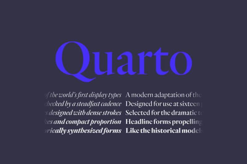
Quarto brings refined slab serif design to Gotham’s architectural foundation. Both fonts share geometric discipline with different expressions.
Classification/Type
Refined slab serif meets geometric sans. Structured elegance paired with utilitarian precision.
Visual Characteristics
Quarto’s refined serifs feel engineered rather than decorative. The geometric foundation creates natural harmony with Gotham.
Both fonts project professionalism and precision through careful construction.
Use Cases
Financial services and professional firms requiring both authority and approachability. Corporate communications benefit from this balanced combination.
Architecture firms and engineering companies appreciate the structural clarity both fonts exhibit.
Technical Implementation
Headers: Quarto Bold at 32-48px Body Text: Quarto Regular at 14-16px UI Elements: Gotham Medium at 12-16px
Quarto’s slab serifs need slightly more line spacing than sans alternatives. Add 2-4px to standard leading.
Readability & Accessibility
Quarto balances slab serif presence with refined proportions that maintain readability. The structured design reduces visual noise.
Gotham provides crisp UI text and navigation that complements Quarto’s authority.
Design Examples/Applications
Annual reports for financial institutions. Professional services firms use this combination for its credible, refined aesthetic.
Tungsten
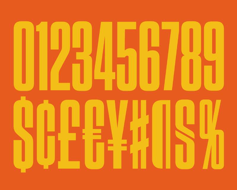
Tungsten’s extreme condensation creates maximum impact alongside Gotham’s standard proportions. Both share industrial strength with different spatial strategies.
Classification/Type
Ultra-condensed display sans paired with standard geometric sans. Vertical intensity meets balanced utility.
Visual Characteristics
Tungsten’s extreme condensation creates powerful vertical emphasis. The dramatic width contrast with Gotham establishes clear hierarchy.
Both fonts feel industrial and engineered, creating stylistic consistency despite proportion differences.
Use Cases
Sports branding and athletic materials where impact matters. Entertainment posters and event marketing benefit from Tungsten’s commanding presence.
Editorial design requiring attention-grabbing headlines with clear, readable support text.
Technical Implementation
Impact Headlines: Tungsten Bold at 60-120px Secondary Headers: Gotham Bold at 28-36px Body Text: Gotham Book at 14-16px
Tungsten demands large sizes to work effectively. Below 36px, its details become illegible.
Readability & Accessibility
Tungsten sacrifices readability for visual impact. Use exclusively for headlines and short phrases.
Gotham carries all readability requirements, providing clear navigation and body text.
Design Examples/Applications
Stadium signage and sports branding. Music festival posters and entertainment marketing leverage Tungsten’s commanding presence.
Monotype Baskerville

Monotype Baskerville brings 18th-century elegance to Gotham’s 20th-century utility. Traditional serif meets modernist sans in a timeless combination.
Classification/Type
Classical transitional serif paired with geometric sans. Historical refinement meets contemporary clarity.
Visual Characteristics
Baskerville’s elegant proportions and refined details create sophisticated contrast against Gotham’s utilitarian geometry.
The traditional serif structure provides warmth and accessibility while Gotham maintains modern clarity.
Use Cases
Publishing houses and literary magazines favor this classic combination. Academic publications requiring both tradition and readability.
Corporate communications where timelessness matters more than trendiness.
Technical Implementation
Headers: Gotham Bold at 28-38px Body Text: Monotype Baskerville Regular at 11-12pt (print) or 16-18px (web) Subheads: Baskerville Semibold at 14-16pt
Baskerville was designed for letterpress printing. On screens, increase sizes from traditional print specifications.
Readability & Accessibility
Baskerville’s refined proportions maintain readability across challenging conditions. Centuries of use prove its effectiveness.
Gotham provides modern navigation that guides readers through traditional text without disrupting the classical aesthetic.
Design Examples/Applications
Book publishing and literary journals. University press materials and academic publications leverage this scholarly combination.
Rockwell Nova
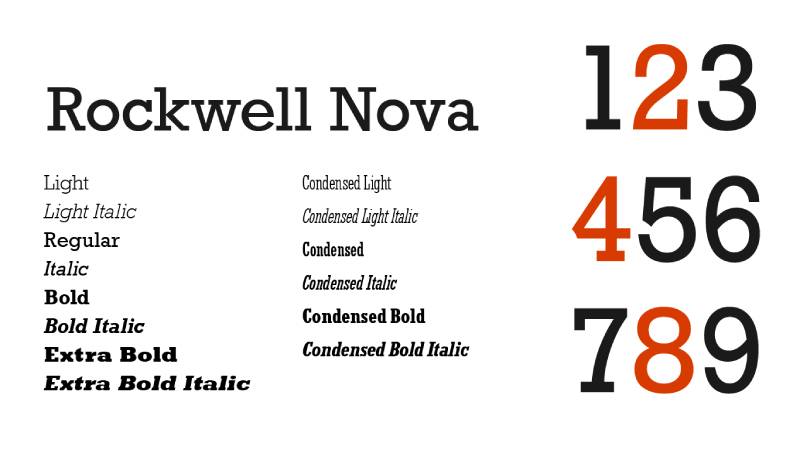
Rockwell Nova modernizes the classic slab serif while maintaining its geometric foundation. Paired with Gotham, both fonts speak the same geometric language.
Classification/Type
Geometric slab serif meets geometric sans. Modernized classic paired with contemporary utility.
Visual Characteristics
Rockwell Nova’s even-weighted serifs echo Gotham’s balanced strokes. Both fonts share geometric discipline creating natural structural unity.
The addition of serifs provides textural variety without disrupting the geometric consistency.
Use Cases
Retro-modern branding where geometric aesthetics matter. Design studios and creative agencies appreciate the cohesive geometric language.
Editorial design for design publications and architectural magazines.
Technical Implementation
Headlines: Rockwell Nova Bold at 32-48px Body Text: Rockwell Nova Regular at 14-16px with 1.6 line-height UI Text: Gotham Book at 12-16px
Slab serifs create denser texture than sans serifs. Increase leading and letter spacing slightly.
Readability & Accessibility
Rockwell Nova’s modernized proportions improve upon the original’s readability challenges. The updated metrics suit contemporary reading patterns.
Gotham provides clear wayfinding and UI text that complements Rockwell’s presence without competing.
Design Examples/Applications
Design agency portfolios and architectural firm materials. Retro-styled brands requiring geometric consistency with textural variety.
Nimrod
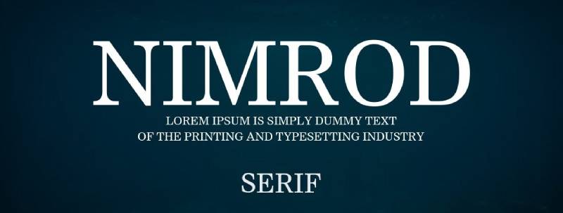
Nimrod brings humanist warmth to geometric slab serif structure. Paired with Gotham, it softens the industrial aesthetic both fonts share.
Classification/Type
Humanist slab serif meets geometric sans. Approachable meets utilitarian in a balanced combination.
Visual Characteristics
Nimrod’s subtle humanist characteristics soften its slab serif structure. Against Gotham’s pure geometry, the humanist touches add warmth.
Both fonts maintain professional aesthetics while remaining approachable and readable.
Use Cases
Corporate communications requiring both authority and accessibility. News websites and information-dense layouts benefit from Nimrod’s readability.
Professional documents where slab serif presence adds gravity without intimidating readers.
Technical Implementation
Headers: Gotham Bold at 28-42px Body Text: Nimrod Regular at 14-16px with 1.5 line-height Captions: Nimrod Light at 12-14px
Nimrod’s subtle variations across weights allow nuanced typographic hierarchy without dramatic size changes.
Readability & Accessibility
Nimrod was designed specifically for newspaper typography, ensuring performance under challenging conditions and at small sizes.
The humanist proportions make extended reading comfortable while Gotham handles clear navigation and UI elements.
Design Examples/Applications
Financial newspapers and business publications. Corporate intranets and professional documentation systems favor this readable, authoritative combination.
FAQ on Gotham Font Pairing
What fonts pair best with Gotham?
Mercury, Chronicle, and Sentinel work excellently for editorial layouts. Proxima Nova and Open Sans suit digital interfaces. Archer and Orpheus add warmth for lifestyle brands. The best choice depends on your project’s tone and medium.
Can you pair Gotham with another sans-serif?
Absolutely. Pairing Gotham with Proxima Nova, Futura, or Open Sans creates subtle hierarchy through weight and proportion differences. Both fonts maintain geometric consistency while their nuanced characteristics establish clear typographic hierarchy without visual conflict.
What serif fonts complement Gotham?
Chronicle, Mercury, and Baskerville provide classic contrast. GT Sectra and Orpheus add contemporary elegance. Slab serifs like Archer, Sentinel, and Rockwell Nova balance Gotham’s geometry with structured warmth for versatile professional applications.
Is Gotham good for body text?
Yes. Gotham Book at 14-16px works well for body copy in both print and digital formats. Its wide apertures and consistent spacing maintain readability. However, pair it with serifs like Mercury for extended reading comfort.
How do you create hierarchy with Gotham pairings?
Use Gotham Bold for primary headlines at 32-48px, your paired font for body text at 14-16px, and Gotham Medium for UI elements. Weight contrast between fonts establishes clear visual hierarchy without size manipulation.
What’s the best Gotham pairing for websites?
Gotham with Open Sans provides accessible, fast-loading combinations. Gotham with Roboto suits Material Design projects. For premium sites, pair Gotham headers with Proxima Nova body text for polished web design that balances brand identity with performance.
Can Gotham work with display fonts?
Yes, when used strategically. Pair Gotham’s utility with display faces like Larken or GT Sectra for headlines. Gotham handles subheads and body text while the display font creates visual impact. Never use both at large sizes simultaneously.
What free alternatives pair with Gotham?
Open Sans from Google Fonts works well. Roboto provides similar geometric qualities. Montserrat offers comparable architectural aesthetics. While not identical to premium pairings, these combinations maintain professional quality for budget-conscious projects requiring effective typography.
How much spacing do Gotham pairings need?
Use 1.5-1.6 line-height for body text. Add 2-4px extra leading when pairing with slab serifs. Increase letter-spacing by 0.02em for Antenna. Each pairing has unique spacing requirements based on the fonts’ inherent characteristics.
What industries use Gotham pairings most?
Tech companies favor Gotham with Roboto or Proxima Nova. Publishing uses Gotham with Mercury or Chronicle. Fashion brands pair Gotham with Larken or GT Sectra. Financial services choose Gotham with Sentinel for authoritative yet accessible branding.
Conclusion
Effective Gotham font pairing relies on understanding contrast and purpose. Serif companions like Chronicle and Mercury bring editorial warmth, while geometric alternatives like Proxima Nova maintain modern consistency across digital platforms.
Your medium matters. Print projects benefit from high-contrast combinations with traditional serifs. Websites perform better with screen-optimized pairs like Gotham and Roboto.
Don’t overcomplicate the process. Start with one pairing that matches your project’s tone, test it at your actual sizes, and adjust font weights until hierarchy feels natural.
The combinations in this guide give you starting points backed by real-world applications. Whether you’re designing a corporate identity or a magazine layout, these typeface selections deliver professional results without endless experimentation.

Renowned for his expertise in logo design and visual branding, Bogdan has developed a multitude of logos for various clients.
His skills extend to creating posters, vector illustrations, business cards, and brochures. Additionally, Bogdan's UI kits were featured on marketplaces like Visual Hierarchy and UI8.
He also wrote in the past years on sites like Design Your Way, WebDesignerDepot, WPDean, Designmodo, Speckyboy, Slider Revolution, and more.
- The Windsurf Logo History, Colors, Font, And Meaning - 10 October 2026
- How to Remove Background From Product Photos (No Photoshop) - 10 October 2026
- How Designers can Build a Stronger Online Creative Identity - 9 October 2026

Bogdan Sandu is a seasoned designer who has been designing websites since 2008. Renowned for his expertise in logo design and visual branding, Bogdan has developed a multitude of logos for various clients. His skills extend to creating posters, vector illustrations, business cards, and brochures. Additionally, Bogdan's UI kits were featured on marketplaces like Visual Hierarchy and UI8. He also wrote in the past years on sites like Design Your Way, WebDesignerDepot, WPDean, Designmodo, Speckyboy, Slider Revolution, and more.
You Might Also Like