Your font choice is a brand decision, not a design preference.
Before a customer reads a single word, your typeface has already communicated something. Trust or doubt. Heritage or modernity. Premium or generic. The best fonts for branding do this work automatically, and the wrong ones undo it just as fast.
Brand typography shapes how people perceive your visual identity across every touchpoint — logo, packaging, website, signage. It affects recognition, recall, and how much someone trusts what they’re reading.
This article covers 10 typefaces that consistently deliver across brand identity systems. For each one, you’ll find the designer, the structural attributes that make it work, real brand examples, pairing recommendations, and licensing details.
No filler. Just what you need to make a confident, informed choice.
The Best Fonts For Branding
The font you pick for a brand does a lot of the work before anyone reads a single word. It sets tone, signals industry, and communicates values at a glance. Below are 10 typefaces that consistently deliver across brand identity systems, from startups to global corporations.
—
Helvetica

Helvetica is a neo-grotesque sans-serif font designed by Max Miedinger and Eduard Hoffmann in 1957, released by the Haas Type Foundry in Switzerland. It delivers neutral, structured letterforms that communicate reliability without personality bias.
Helvetica suits corporate branding because its even stroke widths, high x-height, and tight letter-spacing create a dense, legible appearance across all sizes. BMW, Lufthansa, Nestlé, and the New York City subway system all use it as a primary brand typeface.
—
What makes Helvetica suitable for branding?
Helvetica has near-uniform stroke weight with minimal contrast between thick and thin strokes. Its x-height is relatively tall, improving legibility at small sizes and at distance. The horizontal and vertical stroke terminals prevent directional ambiguity in letterforms.
Key attributes:
| Attribute | Value |
| Classification | Neo-grotesque sans-serif |
| Designer | Max Miedinger & Eduard Hoffmann, 1957 |
| Weight range | Thin through Black (Helvetica Neue: 51 styles) |
| Variable font | Yes (Helvetica Now Variable) |
| Optical sizes | Yes — Micro, Text, Display (Helvetica Now) |
| Recommended sizes | 10px+ for body; 18px+ for brand headlines |
| Letter-spacing default | Tight |
| License | Commercial (Monotype) |
| Available on | Adobe Fonts, MyFonts, Monotype direct |
| Price | Subscription (Adobe) or one-time purchase |
—
How does Helvetica perform in branding contexts?
Helvetica renders consistently across print and digital at sizes from 10px to billboard scale. Its tight letter-spacing maintains visual density in logotype settings, which supports brand mark recognition at small sizes (business cards, app icons).
At very small sizes on low-DPI screens, the narrow apertures in characters like ‘a’, ‘e’, and ‘c’ can reduce legibility. Helvetica Now addresses this with optical size variants tuned for screen use.
—
What are the best pairings for Helvetica in branding?
Helvetica pairs with Garamond for high-contrast hierarchy in brand materials that need both editorial authority and modern clarity. It also works with Playfair Display when a brand system needs a serif headline option with a distinct personality contrast.
—
What are the limitations of Helvetica for branding?
Helvetica requires a commercial license with no free version available, making it costly for small brand projects. Its widespread use across major corporations makes brand differentiation harder — this is the typeface Bruno Maag of Dalton Maag called “the lazy choice” in design circles.
—
Helvetica — Recommended Use Cases Within Branding
- Best for: Corporate identity systems, signage, financial sector branding, logotypes requiring neutral authority
- Avoid for: Brands needing distinctive personality or premium luxury positioning
- Optimal weight: Regular 400 for body; Medium 500 or Bold 700 for brand marks
- Optimal size range: 12px+ for UI labels; 24px+ for brand headlines
—
Garamond

Garamond is an old-style serif font originating from designs by French punchcutter Claude Garamont around 1540, with notable digital versions by Robert Slimbach (Adobe Garamond Pro, 1989) and Georg Duffner (EB Garamond, open-source). It delivers classical proportions and open counters optimized for long-form readability.
Garamond suits heritage and editorial brand identity because its moderate stroke contrast, balanced letter proportions, and old-style figures communicate tradition and scholarly authority. Brands in law, finance, publishing, and luxury goods consistently use Garamond variants to signal longevity and credibility.
—
What makes Garamond suitable for branding?
Garamond has moderate contrast between thick and thin strokes, which maintains legibility across print sizes from 8pt body text to large display headings. Its open counters prevent letter confusion in extended reading. Adobe Garamond Pro includes optical size variants that adjust stroke weight and spacing automatically based on output size.
Key attributes:
| Attribute | Value |
| Classification | Old-style serif |
| Designer | Claude Garamont (~1540); Robert Slimbach, 1989 (Adobe version) |
| Weight range | Regular, Italic, Semibold, Bold (Adobe Garamond Pro) |
| Variable font | No (Adobe Garamond Pro); Yes (some digital revivals) |
| Optical sizes | Yes — Caption, Regular, Subhead, Display (Adobe version) |
| Recommended sizes | 9pt–12pt for body; 18pt+ for display |
| Letter-spacing default | 0 (balanced) |
| License | Commercial (Adobe); OFL (EB Garamond) |
| Available on | Adobe Fonts; Google Fonts (EB Garamond) |
| Price | Free (EB Garamond); Subscription (Adobe Garamond Pro) |
—
How does Garamond perform in branding contexts?
In print brand materials (annual reports, stationery, book publishing), Garamond performs with high legibility from 8pt upward due to its open apertures. On screen, fine hairline strokes in the Adobe version can thin out below 14px on low-resolution displays. EB Garamond, being optimized for Google Fonts delivery, renders better at screen body sizes.
—
What are the best pairings for Garamond in branding?
Garamond pairs with Futura for a structural contrast that has been a staple of editorial and brand design for nearly a century. It also works with Montserrat as a free alternative pairing that replicates a similar old-style/geometric dynamic for digital-first brand systems.
—
What are the limitations of Garamond for branding?
Adobe Garamond Pro has a limited weight range (4 styles) compared to sans-serif brand fonts with 8–9 weights, restricting hierarchy depth in complex brand systems. Fine stroke details make it unsuitable for reversed-out text on textured or low-contrast backgrounds.
—
Garamond — Recommended Use Cases Within Branding
- Best for: Heritage brand identities, law firms, financial institutions, book publishers, luxury goods with traditional positioning
- Avoid for: Tech branding, reversed-out text applications, body copy below 12px on screen
- Optimal weight: Regular 400 for body; Semibold or Bold for headlines
- Optimal size range: 9pt–12pt for print body; 18px+ for digital display
—
Futura

Futura is a geometric sans-serif typeface designed by Paul Renner between 1924 and 1927, released by the Bauer Type Foundry in Frankfurt, Germany. It structures letterforms from circles, triangles, and straight lines, making it one of the most structurally consistent typefaces in print and digital branding.
Futura suits brand identity work requiring geometric precision because its low x-height and uniform stroke weight produce clean negative space that reads clearly at both headline and display scales. Brands including Volkswagen, Calvin Klein, Nike, Dolce & Gabbana, and Supreme have used Futura as a primary brand typeface.
—
What makes Futura suitable for branding?
Futura has uniform stroke weight across all letterforms with near-zero stroke contrast. Its lowercase has a deliberately low x-height, which reduces visual noise in display settings and gives logotypes a geometric, considered quality. The family spans Light through ExtraBold across condensed and standard widths.
Key attributes:
| Attribute | Value |
| Classification | Geometric sans-serif |
| Designer | Paul Renner, 1927 |
| Weight range | Light through ExtraBold (Futura Now: 102 styles) |
| Variable font | Yes (Futura Now) |
| Recommended sizes | 14px+ for body; 24px+ for brand headlines |
| Letter-spacing default | 0 to slightly open |
| License | Commercial (Bauer Types / Monotype) |
| Available on | Adobe Fonts, MyFonts, Bauer Types direct |
| Price | Subscription (Adobe) or one-time purchase |
—
How does Futura perform in branding contexts?
At large display sizes, Futura’s geometric construction produces strong visual impact with high stroke uniformity. Its low x-height makes it less suited to body text at small screen sizes compared to fonts with taller x-heights like Proxima Nova or Montserrat. Free alternatives Jost and Spartan replicate its proportions for web use with better screen rendering.
—
What are the best pairings for Futura in branding?
Futura pairs with Garamond for a classic geometric/old-style contrast used in luxury and editorial brand systems. It also works with Bodoni when a brand system needs two high-contrast, structurally bold display options with different character profiles.
—
What are the limitations of Futura for branding?
Futura’s low x-height reduces legibility in body copy below 14px on screen. The original Futura lacks a variable font format, so responsive brand systems requiring fine weight control need Futura Now or a free alternative.
—
Futura — Recommended Use Cases Within Branding
- Best for: Logotypes, packaging, fashion brand headlines, architectural signage, brand marks that require geometric clarity
- Avoid for: Body copy below 14px, extended digital reading environments
- Optimal weight: Book or Medium for brand marks; Bold or ExtraBold for display
- Optimal size range: 24px+ for headlines; 36px+ for logotype display
—
Proxima Nova
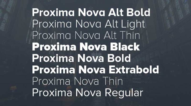
Proxima Nova is a geometric sans-serif typeface designed by Mark Simonson, first released as Proxima Sans in 1994 and substantially expanded in 2005. It bridges geometric sans-serif structure (similar to Futura) with humanist warmth, producing a typeface that performs across digital interfaces and brand print systems.
Proxima Nova suits digital-first brand identity because it has a large x-height, minimal stroke contrast, and wide apertures in characters like ‘a’, ‘c’, and ‘e’ that prevent misread characters on low-DPI screens. Spotify, BuzzFeed, Mashable, and NBC News use it as a core brand typeface.
—
What makes Proxima Nova suitable for branding?
Proxima Nova supports 7 weights across 3 widths (standard, condensed, extra-condensed) with matching italics, totaling 48 styles. Its large x-height improves legibility at body text sizes on screen. The wide apertures reduce character confusion at small sizes on mobile displays, which is where most digital brand touchpoints now operate.
Key attributes:
| Attribute | Value |
| Classification | Geometric sans-serif with humanist qualities |
| Designer | Mark Simonson, 2005 (expanded from 1994) |
| Weight range | Thin through Black — 7 weights, 3 widths, 48 styles |
| Variable font | Yes (Proxima Vara) |
| Recommended sizes | 13px+ for UI body; 20px+ for brand headlines |
| Letter-spacing default | 0 |
| License | Commercial (no free version) |
| Available on | Adobe Fonts, MyFonts, Mark Simonson Studio |
| Price | Subscription (Adobe) or per-style purchase from ~$29 |
—
How does Proxima Nova perform in branding contexts?
Proxima Nova renders clearly on screen at 13px and above due to its large x-height and open apertures. Its 48-style family gives brand designers full hierarchy control from subhead labels to primary wordmarks without switching typefaces. Brands like Spotify demonstrated this by using Proxima Nova across interface, marketing, and editorial contexts from a single family.
—
What are the best pairings for Proxima Nova in branding?
Proxima Nova pairs with Playfair Display for contrast between a neutral sans body and a high-contrast editorial serif headline. It also works with Garamond in brand systems that need humanist warmth in long-form copy while keeping Proxima Nova for navigation and UI labels.
—
What are the limitations of Proxima Nova for branding?
Proxima Nova has no free version. Commercial licensing starts at ~$29 per style and scales significantly for web use via Adobe Fonts subscription. Brands on tight budgets typically use Montserrat (Google Fonts) as a structurally similar free alternative.
—
Proxima Nova — Recommended Use Cases Within Branding
- Best for: Digital brand systems, app UI typography, tech startup identities, media and publishing brands
- Avoid for: Projects where budget prohibits licensing; heritage or luxury brand contexts where geometric neutrality reads as too casual
- Optimal weight: Regular 400 for body; Semibold 600 for subheads; Bold 700 for brand headlines
- Optimal size range: 13px–18px for body; 24px+ for headings
—
Montserrat

Montserrat is a geometric sans-serif typeface designed by Julieta Ulanovsky in 2011, inspired by street signage in the Montserrat neighborhood of Buenos Aires. It is available through Google Fonts under an Open Font License and is the most widely cited free alternative to Proxima Nova and Gotham.
Montserrat suits brand identity work on constrained budgets because it delivers 9 weights (Thin through Black) with italics, supports Latin, Cyrillic, and Vietnamese scripts, and is free for commercial use. Looka’s 2024 logo data identified it as one of the top fonts used across branding projects on their platform.
—
What makes Montserrat suitable for branding?
Montserrat has a large x-height with rounded terminals that soften its geometric construction, producing letterforms that are warmer than Futura but more structured than humanist typefaces like Gill Sans. Its 9-weight range with italics enables full typographic hierarchy from captions to brand display without additional font families.
Key attributes:
| Attribute | Value |
| Classification | Geometric sans-serif |
| Designer | Julieta Ulanovsky, 2011 |
| Weight range | Thin 100 through Black 900 — 18 styles (with italics) |
| Variable font | Yes |
| Recommended sizes | 14px+ for body; 20px+ for brand headlines |
| Letter-spacing default | 0 |
| License | OFL — free for commercial use |
| Available on | Google Fonts |
| Price | Free |
—
How does Montserrat perform in branding contexts?
Montserrat renders well on screen across devices due to its Google Fonts optimization. Its wide proportions and even stroke weights give brand marks visual stability at icon sizes (16px–48px). One limitation is that its geometric construction is slightly sharper than Proxima Nova, which can read as less polished at very small sizes on mobile.
—
What are the best pairings for Montserrat in branding?
Montserrat pairs with Cormorant Garamond for a geometric/classical contrast that works in lifestyle and premium brand systems. It also works with Merriweather when the brand system needs a warm, readable serif for long-form content alongside a neutral sans-serif for UI and navigation.
—
What are the limitations of Montserrat for branding?
Montserrat’s widespread free availability reduces brand differentiation — it appears across millions of websites. Its distinctive uppercase G and J are recognizable enough that experienced designers will identify the typeface immediately, which can undermine “unique” brand positioning.
—
Montserrat — Recommended Use Cases Within Branding
- Best for: Startup brand identities, SMB logos, digital-first brands, branding projects with no font budget
- Avoid for: Premium luxury brands needing type exclusivity; identity systems where Montserrat’s ubiquity creates recognition issues
- Optimal weight: Regular 400 for body; SemiBold 600 for subheads; Bold 700 for brand marks
- Optimal size range: 14px–18px for body; 28px+ for headings
—
Didot
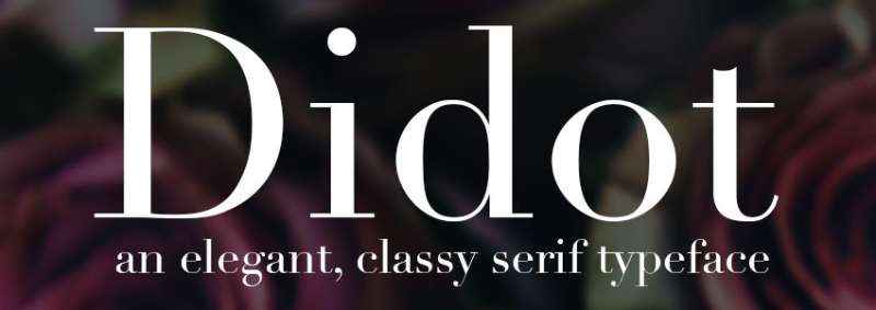
Didot is a Didone (modern) serif typeface originating from designs by Firmin and Pierre Didot in the late 18th and early 19th centuries. Digital versions include HTF Didot by Jonathan Hoefler (1991). It produces extreme contrast between thick vertical strokes and hairline horizontal serifs, creating a high-impact display aesthetic.
Didot suits luxury and fashion brand identity because its hairline serifs and vertical stroke emphasis create visual drama at headline sizes that signals exclusivity. Vogue magazine adopted Didot for its cover masthead in 1955 and has maintained it as a primary brand element for over 70 years.
—
What makes Didot suitable for branding?
Didot’s stroke contrast ratio is among the highest of any commonly used typeface. Thick vertical strokes are approximately 8–10x heavier than hairline horizontals, producing a “typographic veil” effect where the thin strokes become near-invisible against photography, allowing the typeface to overlay imagery without obscuring it. This characteristic is standard practice in fashion editorial layouts.
Key attributes:
| Attribute | Value |
| Classification | Didone (modern) serif |
| Designer | Firmin & Pierre Didot (18th–19th c.); Jonathan Hoefler, 1991 (HTF version) |
| Weight range | Regular, Bold, Italic (HTF Didot); varies by version |
| Variable font | No |
| Recommended sizes | 24pt+ for display; 36pt+ for brand headlines |
| Letter-spacing default | Slightly wide (tracking applied in fashion use) |
| License | Commercial (Hoefler & Co.) |
| Available on | Hoefler & Co. direct |
| Price | Subscription or one-time purchase |
—
How does Didot perform in branding contexts?
At 36pt and above in print, Didot produces strong visual hierarchy with high brand recall due to its distinctive stroke contrast. Below 18px on screen, hairline strokes thin to near-invisibility on standard displays, making it unsuitable for digital body copy or UI text.
—
What are the best pairings for Didot in branding?
Didot pairs with Futura as a classic contrast between neoclassical serif elegance and modernist geometric structure, common in luxury brand systems. For digital brand materials, Didot as a headline typeface works alongside Proxima Nova or Gill Sans for body copy where hairline strokes would otherwise be unreadable.
—
What are the limitations of Didot for branding?
Didot is not suitable for digital body text at standard screen sizes. Its narrow weight range in most commercial versions (typically 2–4 styles) restricts typographic hierarchy depth compared to sans-serif brand fonts with 7–9 weights.
—
Didot — Recommended Use Cases Within Branding
- Best for: Fashion brand mastheads, luxury product packaging, editorial brand identities, print-first brand systems
- Avoid for: Digital body copy, reversed-out text, brand applications below 18px
- Optimal weight: Regular for headlines; Bold for brand marks
- Optimal size range: 24pt+ in print; 36px+ in digital display
—
Bodoni

Bodoni is a Didone serif typeface based on the work of Giambattista Bodoni (1740–1813), an Italian punchcutter and director of the Duke of Parma’s printing house. Digital versions include Bauer Bodoni (ITC) and Poster Bodoni. It shares Didot’s extreme stroke contrast but features flat, unbracketed hairline serifs and more geometric letter construction.
Bodoni suits premium brand identity and editorial design because its strong vertical strokes and geometric precision communicate authority with a warmer, more masculine character than Didot. Calvin Klein, the V&A museum, and Nirvana have used Bodoni as a primary brand typeface.
—
What makes Bodoni suitable for branding?
Bodoni’s strong vertical stress and flat unbracketed serifs create a more geometric, structured appearance than Didot’s subtle bracketing. This produces a “sparkling” visual effect on the page at headline sizes — a result of the extreme weight contrast between thick verticals and hairline horizontals. Its geometric construction gives it slightly more presence than Didot in all-caps brand mark settings.
Key attributes:
| Attribute | Value |
| Classification | Didone (modern) serif |
| Designer | Giambattista Bodoni (18th–19th c.); various digital revivals |
| Weight range | Regular through Black; condensed/decorative styles added 1993–97 |
| Variable font | No (most versions) |
| Recommended sizes | 24pt+ for display; 36pt+ for brand headlines |
| Letter-spacing default | 0 to slightly wide |
| License | Commercial (ITC, Adobe); some free versions available |
| Available on | Adobe Fonts, MyFonts |
| Price | Subscription (Adobe) or one-time purchase |
—
How does Bodoni perform in branding contexts?
Bodoni delivers high-impact visual weight at headline sizes in print. Its hairline serifs disappear below 14px on screen, limiting its use to display applications in digital brand systems. In packaging and poster contexts, its extreme contrast reads legibly even from a distance when set in Bold or Black weights.
—
What are the best pairings for Bodoni in branding?
Bodoni pairs with Gotham as a contrast between neoclassical serif drama and American geometric sans-serif clarity, a pairing common in fashion and luxury brand systems. It also works with Gill Sans when a brand needs a slightly warmer sans-serif for secondary text that complements Bodoni’s structured character.
—
What are the limitations of Bodoni for branding?
Bodoni’s hairline strokes disappear on low-resolution screens and in reversed-out print applications on uncoated stock. Most commercial versions have a limited weight range, restricting typographic hierarchy in complex brand systems.
—
Bodoni — Recommended Use Cases Within Branding
- Best for: Fashion brand mastheads, luxury packaging, all-caps brand marks, poster and print-first brand systems
- Avoid for: Digital body text, brand applications below 18px, reversed-out printing on uncoated stock
- Optimal weight: Regular for headlines; Bold or Black for brand display
- Optimal size range: 24pt+ in print; 36px+ in digital display
—
Playfair Display

Playfair Display is a transitional serif typeface designed by Claus Eggers Sørensen in 2011, available through Google Fonts under an Open Font License. It interprets 18th-century transitional letterforms with a large x-height and high stroke contrast optimized for digital screen display at headline sizes.
Playfair Display suits editorial and lifestyle brand identity because its high contrast, sharp serifs, and tall x-height produce dramatic headlines that remain legible on screen at 28px and above. Fashion blogs, lifestyle publications, and luxury e-commerce brands use it as a primary display typeface due to its free availability and editorial character.
—
What makes Playfair Display suitable for branding?
Playfair Display has a relatively large x-height compared to historical Didone serifs like Didot or Bodoni, which makes it more effective at smaller display sizes on screen. Its stroke contrast is high but less extreme than Bodoni, allowing hairline strokes to survive at 22px–28px on standard displays. True italic styles include distinct calligraphic letterforms rather than slanted romans, adding visual variety to brand headline systems.
Key attributes:
| Attribute | Value |
| Classification | Transitional serif (Didone-influenced) |
| Designer | Claus Eggers Sørensen, 2011 |
| Weight range | Regular through Black — 6 styles (with italics) |
| Variable font | Yes |
| Recommended sizes | 22px+ for display headlines; 28px+ for brand marks |
| Letter-spacing default | 0 |
| License | OFL — free for commercial use |
| Available on | Google Fonts |
| Price | Free |
—
How does Playfair Display perform in branding contexts?
Playfair Display renders well at headline sizes on screen where Didot and Bodoni struggle, making it a practical option for digital brand systems that need serif drama without a commercial license. Its variable font format enables precise weight adjustment for responsive brand systems across device sizes.
—
What are the best pairings for Playfair Display in branding?
Playfair Display pairs with Montserrat for a high-contrast serif/geometric sans combination that works in lifestyle and fashion digital brand systems — both are free on Google Fonts. It also works with DM Sans when a brand system needs a neutral, modern body typeface to contrast against Playfair’s editorial headline presence.
—
What are the limitations of Playfair Display for branding?
Playfair Display is a display typeface and is not suitable for body text — its name makes this explicit. Below 18px, stroke contrast reduces legibility significantly. Its high x-height and screen optimization make it feel less authentic in print-first brand systems compared to optically-sized serifs like Adobe Garamond Pro.
—
Playfair Display — Recommended Use Cases Within Branding
- Best for: Lifestyle and editorial brand headlines, e-commerce luxury product names, blog mastheads, brand systems with no font budget needing serif drama
- Avoid for: Body copy at any size, print-first premium brand systems, reversed-out text on low-contrast backgrounds
- Optimal weight: Regular for primary headlines; Bold or Black for brand display
- Optimal size range: 22px–48px for digital headlines; 18pt+ in print
—
Gill Sans
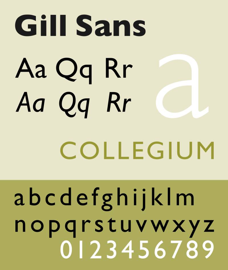
Gill Sans is a humanist sans-serif typeface designed by Eric Gill in 1926 and released by the Monotype Corporation in 1928. It combines sans-serif structure with letterform proportions drawn from Roman inscriptions and humanist calligraphic tradition, producing a typeface that is warmer and less mechanical than geometric sans-serifs like Futura or Helvetica.
Gill Sans suits institutional and heritage brand identity because its humanist proportions communicate approachability while maintaining professional structure. The BBC, Penguin Books, and British Railways have all used Gill Sans as a primary brand typeface, giving it strong associations with British institutional credibility.
—
What makes Gill Sans suitable for branding?
Gill Sans has moderate stroke contrast with subtle calligraphic modulation that differentiates it from purely geometric sans-serifs. Its letterforms have open counters and clear apertures in characters like ‘a’, ‘g’, and ‘e’, which improve legibility in body text applications. The family spans Light through ExtraBold in both condensed and standard widths.
Key attributes:
| Attribute | Value |
| Classification | Humanist sans-serif |
| Designer | Eric Gill, 1926–1928 |
| Weight range | Light through ExtraBold — multiple widths |
| Variable font | No |
| Recommended sizes | 10px+ for body; 18px+ for brand headlines |
| Letter-spacing default | 0 |
| License | Commercial (Monotype) |
| Available on | Adobe Fonts, MyFonts, Monotype direct |
| Price | Subscription (Adobe) or one-time purchase |
—
How does Gill Sans perform in branding contexts?
Gill Sans renders clearly in print and at standard screen sizes due to its open apertures and moderate x-height. Its humanist character differentiates it visually from more common geometric sans-serifs, which helps brands avoid the “Helvetica or Futura” look. At very small sizes on screen, its subtle calligraphic stroke modulation is less effective than fonts optimized specifically for low-DPI rendering.
—
What are the best pairings for Gill Sans in branding?
Gill Sans pairs with Garamond for a humanist sans/old-style serif combination that reads as warm and editorially credible. It also works with Bodoni when a brand needs strong headline drama contrasted against a softer, approachable body typeface.
—
What are the limitations of Gill Sans for branding?
Gill Sans requires a commercial license with no free version. Its strong associations with British institutional design can make it feel regionally specific, which may not suit global brand positioning. The typeface also lacks a variable font version, limiting its use in responsive digital brand systems.
—
Gill Sans — Recommended Use Cases Within Branding
- Best for: Institutional brand identities (education, publishing, government), editorial brands, heritage brand systems needing humanist warmth
- Avoid for: Tech branding, global brands where British institutional associations conflict with positioning
- Optimal weight: Regular for body; Bold for headlines and brand marks
- Optimal size range: 10px–16px for body; 20px+ for brand headlines
—
Gotham
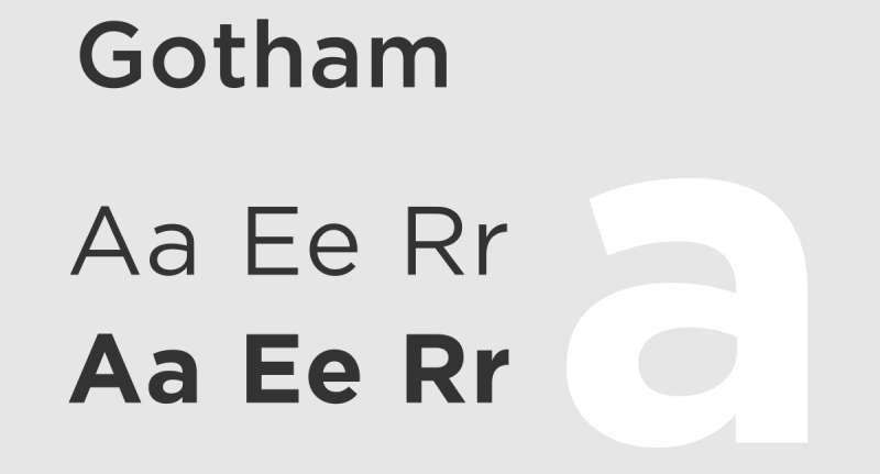
Gotham is a geometric sans-serif typeface designed by Tobias Frere-Jones in 2000, released through Hoefler & Frere-Jones (now Hoefler & Co.) in 2002. It is inspired by mid-century American architectural lettering, particularly signage on the Port Authority Bus Terminal in New York City, and is in the permanent collection of the Museum of Modern Art.
Gotham suits American corporate and political brand identity because its broad letterforms, high x-height, and wide apertures produce a confident, neutral character. Barack Obama’s 2008 presidential campaign, NYU, GQ, Netflix (until 2018), and Saturday Night Live have used it as a primary brand typeface.
—
What makes Gotham suitable for branding?
Gotham has a taller x-height and wider apertures than Futura, which improves legibility on screen and at mid-range sizes. The family spans 4 widths (standard, narrow, extra-narrow, condensed) and 8 weights with matching italics, totaling 216 styles — one of the largest commercial type families available. Its wide apertures reduce character ambiguity at small sizes in brand collateral applications.
Key attributes:
| Attribute | Value |
| Classification | Geometric sans-serif |
| Designer | Tobias Frere-Jones, 2000 |
| Weight range | Thin through Ultra — 8 weights, 4 widths, 216 styles |
| Variable font | No |
| Recommended sizes | 12px+ for body; 20px+ for brand headlines |
| Letter-spacing default | 0 to slightly open |
| License | Commercial (Hoefler & Co.) |
| Available on | Hoefler & Co. direct (typography.com) |
| Price | Subscription (Cloud.typography for web) or one-time desktop purchase |
—
How does Gotham perform in branding contexts?
Gotham’s broad proportions and large x-height give it strong legibility at body text sizes on screen (12px and above) and at display sizes in print and outdoor advertising. Netflix used it as its primary typeface until 2018, when the licensing cost justified creating a custom typeface (Netflix Sans) based on Gotham’s structural principles. This is a useful reference point: Gotham’s licensing cost scales significantly for high-traffic digital brand use.
—
What are the best pairings for Gotham in branding?
Gotham pairs with Mercury (also from Hoefler & Co.) for editorial brand systems — both typefaces share complementary proportions and were designed with each other in mind. It also works with Sentinel, a slab serif from the same foundry, when a brand needs a warmer, American-feeling serif for body copy alongside Gotham’s clean headlines. For Gotham font pairing options, the foundry’s own typefaces are the most structurally compatible choices.
—
What are the limitations of Gotham for branding?
Gotham does not offer a variable font format, which limits fine weight control in responsive digital brand systems. Web licensing through Cloud.typography uses subscription pricing based on monthly pageviews, making costs unpredictable for high-traffic brands. No free version exists; Netflix’s decision to commission Netflix Sans rather than continue licensing Gotham illustrates the cost implications at scale.
—
Gotham — Recommended Use Cases Within Branding
- Best for: Corporate American brand identity, political and institutional campaigns, university branding, magazine editorial systems
- Avoid for: High-traffic digital brands where per-pageview licensing becomes cost-prohibitive; brands needing variable font technology for responsive systems
- Optimal weight: Book or Medium for body; Bold or Black for brand headlines and marks
- Optimal size range: 12px–18px for body; 24px+ for headlines; 36px+ for logotype display
Why Typography Matters in Brand Identity
Typography is one of the first things a person processes when they see a brand. Before they read a word, the typeface signals tone, intent, and credibility.
55% of brand first impressions are based on visual elements, according to the US Chamber of Commerce. Your font is a core part of that visual signal.
Consistent brand presentation across all platforms can increase revenue by up to 23%, per Lucidpress research. Typography consistency is part of that equation, not just color or logo.
How font choice shapes brand perception
Font psychology operates quickly. Research shows people assign personality traits to typefaces within milliseconds, much like they do with human faces (Dool Creative Agency).
- Serif typefaces signal tradition, authority, and credibility
- Sans-serif typefaces communicate modernity, clarity, and approachability
- Script fonts read as personal, artistic, and warm
- Display fonts project individuality and creative positioning
Studies from Wichita State University found serif fonts convey tradition, respectability, and reliability. Sans-serif fonts like Helvetica signal modernity and approachability.
The business case for getting typography right
Typefaces alone can boost positive consumer response by up to 13%, improving perceived quality, relevance, and trustworthiness (POWR research, 2025).
68% of companies report that brand consistency has contributed 10% or more to revenue growth, according to the Lucidpress Brand Consistency Report. Typography is a direct component of that consistency.
The gap between brands that treat typography seriously and those that don’t shows up in recognition metrics. Conflicting brand usage, including font inconsistency, leads to a 56% decrease in brand recognition (Energy and Matter, 2024).
Custom fonts vs. licensed typefaces
The biggest brands eventually build their own. Netflix commissioned Netflix Sans to replace Gotham specifically to avoid escalating web licensing fees at scale.
Custom route: Exclusive typeface, maximum differentiation, zero licensing risk. Cost: $50,000–$500,000+ depending on scope.
Licensed route: Established typeface with proven track record, available immediately, but used by thousands of other brands. Cost: $29–$300+ per style, or Adobe Fonts subscription.
Most brands at early and mid-stage start with a licensed typeface and invest in custom work only after the brand identity has matured.
How to Choose the Best Font for Your Brand
Font selection should start with brand personality, not aesthetics. The question is not “does this look good?” but “does this communicate who we are?”
Monotype Type Director Steve Matteson puts it directly: the process begins and ends with one overarching question. Who are you?
Define your brand personality first
Typography is a visual extension of brand voice. A mismatch between font and positioning creates instant distrust. A luxury jewelry brand using Comic Sans communicates “casual and careless” before a product description is read.
Map your brand against these axes before selecting a typeface:
- Traditional vs. modern: Garamond vs. Proxima Nova
- Formal vs. approachable: Didot vs. Gill Sans
- Bold vs. refined: Gotham Black vs. Bodoni Regular
- Global vs. local: Helvetica vs. a region-specific custom face
Evaluate typefaces on structural attributes
Once brand personality is defined, filter candidates on measurable criteria. Avoid selecting based on first visual impression alone.
| Attribute | Why It Matters | What to Check |
| X-height | Affects legibility at small sizes | Tall x-height for digital; lower for display |
| Weight range | Determines hierarchy depth | Minimum 5 weights for brand systems |
| License type | Governs commercial use rights | OFL, commercial, or freemium |
| Script support | Required for global brands | Latin, Cyrillic, Arabic, CJK as needed |
Legibility at small sizes (10–12pt for print, 14–16px for web) is a baseline requirement for any brand typeface, per brand typography standards from Celerart.
Test across all brand touchpoints before committing
A typeface that looks right in a presentation may fail on a packaging label or mobile app icon. Test every candidate across the full list of applications before finalizing.
Minimum testing environments:
- Business card (small print, high detail)
- Mobile screen at 12px–14px
- Outdoor signage at distance
- Social media profile avatar and post header
Spotify uses a consistent type system across its mobile app, Wrapped campaigns, and billboard advertising. Each environment requires the same font to perform differently, and Spotify tests all three.
Factor in font licensing from the start
Licensing is where brand typography decisions get complicated. Free fonts are tempting but often lack character support, weight range, and the exclusivity needed for strong brand differentiation.
Fontfabric notes that free fonts “often lack uniqueness and other valuable characteristics like language support, and complete sets of symbols or punctuation.”
Three licensing scenarios to plan for:
- Desktop use for print and design files
- Web use, often charged per monthly pageview or domain
- App embedding, frequently a separate license category
Many brands discover mid-growth that their chosen font requires separate licenses for web and app — and that the combined cost exceeds budget. Audit all future use cases before purchasing a license.
Font Types for Branding: Which Category Fits Your Brand
Each typeface classification carries distinct psychological signals. Choosing the wrong category undermines brand positioning regardless of how well-designed the specific font is.
Looka’s 2024 logo data showed that 80% of the top 10 fonts used across branding projects were sans-serif. That does not mean sans-serif is always correct. It reflects where most brands currently sit on the modern-to-traditional axis.
Serif fonts in branding
A Journal of Marketing Communications study found serif fonts are perceived as more trustworthy than other categories. This explains their dominance in law, finance, media, and luxury.
Best brand contexts:
- Financial services and legal firms
- Heritage and luxury goods brands
- Publishing and editorial identity
- Academic and institutional identity
The New York Times, Vogue, and Louis Vuitton all anchor their brand typography in serif typefaces to signal authority and tradition. A serif vs sans-serif comparison matters because the category choice comes before the specific font choice.
Sans-serif fonts in branding
Sans-serif fonts dominate tech, startup, and consumer product branding. Simulated data from a 2023 typographic preference study found 63.3% preference for sans-serif typefaces, especially in digital and academic reading contexts (ResearchGate).
Apple (San Francisco), Google (Google Sans), Airbnb (Cereal), and Spotify (Circular) all use custom or near-custom sans-serif fonts as primary brand typefaces.
The reason is consistent: sans-serif renders more clearly on screen, communicates innovation, and scales across device sizes without the hairline stroke fragility that high-contrast serifs carry.
Display and script fonts in branding
Display fonts work as brand marks, not body systems. Used in isolation for a logo or headline, a display font builds immediate visual character. Used in body copy or secondary text, it creates readability problems.
Display: LEGO, Supreme, Coca-Cola’s script wordmark. Strong at logo scale. Pair with a neutral sans for all secondary text.
Script: A script font works for boutique brands, wedding businesses, and personal services where the handwritten quality signals craft and individuality. Avoid at small sizes or in long-form copy.
Slab serif fonts in branding
A slab serif font sits between the authority of a traditional serif and the visual weight of a bold sans-serif. The unbracketed slab serifs add mass without hairline fragility, making them more durable across large format and screen use than Didot or Bodoni.
Slab serifs read as confident, direct, and slightly unconventional. Good fit for brands in construction, food and beverage, outdoor retail, and independent publishing.
| Font Category | Brand Signal | Best For | Avoid For |
| Serif | Trust, tradition, authority | Finance, law, luxury | Tech startups, youth brands |
| Sans-serif | Modern, clean, approachable | Tech, SaaS, consumer apps | Heritage, formal institutions |
| Script | Personal, warm, artisanal | Boutique, beauty, events | Large body text, B2B |
| Slab serif | Bold, direct, durable | Outdoor, food, editorial | Fine luxury, high-fashion |
| Display | Character, distinctiveness | Logos, headlines only | Body copy, small sizes |
Font Pairing for Brand Identity Systems
Most brand typography systems use two typefaces: a primary font for brand marks, headings, and navigation, and a secondary font for body copy and supporting text.
The goal in pairing fonts is contrast with harmony. Two typefaces that are too similar create visual confusion. Two that are too different create visual chaos.
The contrast principle
Pairing fonts from opposite classifications creates the clearest hierarchy. Garamond and Futura is one of the most enduring pairings in brand and editorial design, used for nearly a century because the old-style serif and geometric sans create maximum structural contrast.
High-contrast pairings that work:
- Playfair Display (display serif) + Montserrat (geometric sans)
- Gotham (geometric sans) + Mercury (robust serif)
- Helvetica (neo-grotesque) + Garamond (old-style serif)
Use a font pairing generator to test combinations visually before committing. Seeing fonts at intended sizes and weights reveals problems that swatch comparisons miss.
Weight contrast within a single family
Some brand systems use a single typeface family across all hierarchy levels rather than pairing two different typefaces. This approach, common in tech brands, relies on weight and size contrast instead of classification contrast.
Proxima Nova’s 48 styles and Gotham’s 216 styles were built specifically to support this approach. The risk is monotony. The benefit is perfect visual cohesion.
IBM’s brand system uses IBM Plex Sans, Serif, and Mono as a single interconnected superfamily. All three share identical proportions, allowing seamless mixing while maintaining a unified visual identity across products, documentation, and marketing.
Typographic hierarchy in brand systems
A brand typography system needs at least four defined levels to function consistently across touchpoints.
| Level | Role | Typical Spec |
| Display | Campaign headlines, hero text | 48px+, Bold or Black |
| Heading | Section titles, product names | 24px–48px, SemiBold |
| Body | Long-form content, descriptions | 14px–18px, Regular |
| Label | UI navigation, captions, tags | 10px–13px, Medium |
Font spacing adjustments, including tracking and leading, should be specified for each hierarchy level. Tracking in headlines typically ranges from -20 to +10 units; body text usually requires 0 or slightly positive tracking for readability.
Font Licensing for Branding: What to Know Before You Commit
Font licensing is where many brand projects create legal and financial risk without realizing it. Most designers know they need a license. Fewer know that a single license rarely covers all uses.
The main license types explained
Desktop license: Covers design files, print materials, and presentations. Does not cover website embedding or app use. This is the license most one-time font purchases include.
Web license: Required for @font-face embedding on websites. Often charged per domain or per monthly page view tier. Gotham’s web license through Hoefler’s Cloud.typography uses per-pageview pricing.
App/ePub license: A separate category for fonts embedded in mobile apps, software, or digital publications. Often the most expensive category for high-traffic brands.
OFL (Open Font License): Permits free use, modification, and redistribution including commercial use. Montserrat, Playfair Display, and EB Garamond are OFL. No cost, no restrictions on use context. For full detail, see our guide to font licensing.
Common licensing mistakes in brand projects
These are the errors that typically surface 12–18 months into a brand rollout when legal or finance teams review vendor contracts:
- Using a desktop license to embed fonts on a website
- Buying a single-user license for a multi-person design team
- Launching an app with a font licensed only for print
- Assuming “free to use” fonts found via search are commercially licensed
Netflix’s decision to commission Netflix Sans was driven partly by this exact problem. Gotham’s per-pageview web licensing became cost-prohibitive at Netflix’s traffic scale. Building a custom typeface was cheaper long-term than ongoing licensing.
Free vs. paid fonts for brand use
The free-versus-paid debate in brand typography is not really about cost. It is about exclusivity and feature depth.
Free (OFL) strengths: Zero cost, no licensing complexity, typically well-hinted for screen rendering, community-maintained updates.
Free (OFL) weaknesses: Used by thousands of brands, limited character sets in some cases, may lack optical sizing or variable font support.
Paid commercial strengths: Wider weight and width ranges, optical size variants, exclusive licensing tiers, professional hinting and kerning tables.
Paid commercial weaknesses: Cost scales with usage, multi-license requirements, risk of discontinued support if foundry closes.
For early-stage brands, Montserrat or Playfair Display from Google Fonts are legitimate starting points. Neither will embarrass a brand. Both will eventually feel limiting as the brand scales and differentiation becomes a priority.
How Variable Fonts Are Changing Brand Typography
Variable fonts allow a single font file to contain an entire weight range as a continuous axis rather than separate files for each weight. A single variable font file replaces what previously required 8–10 individual font files.
What variable fonts mean for brand systems
For brand designers, variable fonts offer fine weight control that static fonts cannot match. Instead of choosing between Regular 400 and Medium 500, a designer can specify any intermediate value.
Practical brand benefits:
- Responsive type that adjusts weight at different screen sizes
- Smaller total file size for web use (one file vs. many)
- Precise weight matching across brand touchpoints
- Animation possibilities for motion brand identity work
Helvetica Now Variable and Futura Now both offer variable font formats. For free options, Montserrat and Playfair Display include variable versions on Google Fonts.
When variable fonts are overkill
Variable fonts add complexity. Most static brand systems do not need them.
If a brand uses 2–3 fixed weights consistently and has no responsive typography needs, a variable font file adds download overhead and implementation complexity without a material improvement in brand output.
Variable fonts become valuable when: the brand operates across devices with different screen densities, the design system uses more than 5 distinct font weights, or the brand has a motion and digital-first identity that needs animated typography.
Brand Font Statistics: What the Data Shows
Typography is one of the less-measured components of brand strategy, but the data that exists is consistent: font choice affects trust, conversion, and recognition at measurable rates.
Typography and conversion
Appropriate font choices can increase conversion rates by 35%, according to typography and consumer behavior studies cited by Dot2Shape (2025). The mechanism is trust: readable, brand-aligned type reduces cognitive friction in purchase decisions.
Font readability alone can increase trust by up to 40%. Harder-to-read fonts create subconscious discomfort that transfers to brand perception (Dot2Shape, 2025).
Brand recognition and visual consistency
3–4x stronger brand visibility for brands that present consistently across platforms, per Energy and Matter research (2024).
It takes 5–7 brand impressions for a consumer to recall a brand. Typography is one of the visual cues that builds recall with each impression. An inconsistent typeface breaks that accumulation.
75% of consumers remember a brand by its logo, according to branding statistics compiled by GaggleAMP. The typeface used in a logo is inseparable from that recognition memory.
Font statistics across brand categories
Looka data from 2024 found geometric sans-serif fonts are used by 70% of brands in the beauty sector, with Futura and Proxima Nova the most common choices.
Broader industry patterns from font statistics and research:
- 80% of top 10 branding fonts in logo design were sans-serif (Looka, 2024)
- Serif logos are perceived as more “active” but less “potent” than sans-serif logos (ResearchGate, 2022)
- Sans-serif preference reached 63.3% in digital reading contexts across a 1,000-participant simulation (ResearchGate, 2024)
These numbers do not prescribe a category. They describe where the market currently sits. Brands that choose serif typefaces in predominantly sans-serif industries stand out precisely because the category contrast creates differentiation.
Conclusion: Choosing the Best Font for Your Brand
The fonts in this guide cover the core of what most brand systems need. Each has a documented history, known brand uses, and measurable structural attributes that explain why it works in specific contexts.
Helvetica and Gotham are safe choices because they are proven. Garamond and Didot earn their place through longevity and clear psychological signaling. Montserrat and Playfair Display earn their place because they deliver professional results without licensing cost.
The right brand font is not the most popular one or the most distinctive one. It is the one whose structural attributes match your brand’s positioning and that can perform across every touchpoint your brand operates in.
Start with brand personality. Filter by structural attributes. Test across contexts. Audit the license before you commit.
Then pick one and build your system around it consistently. Typography’s power in branding is cumulative. Every impression matters.
FAQ on The Best Fonts For Branding
What is the best font for branding?
There is no single best font. It depends on brand personality, industry, and use context. Helvetica suits corporate identity. Garamond suits heritage brands. Gotham suits modern American positioning. The right choice aligns typeface structure with brand values.
Should I use a serif or sans-serif font for my brand?
Serif fonts signal trust, tradition, and authority. Sans-serif fonts communicate modernity and clarity. Finance and law firms lean serif. Tech and startup brands lean sans-serif. Match the category to your positioning, not your personal preference.
How many fonts should a brand use?
Two is the standard. One primary typeface for headlines and brand marks, one secondary for body copy. Some brands use a single family across all hierarchy levels. Three or more fonts usually creates visual inconsistency rather than adding brand personality.
What fonts do big brands use?
Helvetica: BMW, Lufthansa, Nestlé. Gotham: Obama 2008 campaign, NYU, GQ. Futura: Volkswagen, Nike, Supreme. Didot: Vogue. Proxima Nova: Spotify, BuzzFeed. Most major brands eventually commission iconic custom typefaces to avoid sharing a font with competitors.
Are free fonts good enough for branding?
Yes, for early-stage brands. Montserrat and Playfair Display are OFL-licensed, professionally designed, and free on Google Fonts. The real limitation is exclusivity. Free fonts are used by millions of brands, which makes visual differentiation harder as your brand scales.
What is font psychology in branding?
Font psychology is the study of how typefaces trigger emotional and behavioral responses. Serif fonts read as trustworthy. Geometric sans-serifs read as modern. Script fonts read as personal. These associations form within milliseconds, before a word is consciously read.
How do I pair fonts for a brand identity?
Pair typefaces from contrasting classifications: a geometric sans-serif with an old-style serif, for example. Avoid pairing two fonts that are too similar. Use a font combination that creates clear hierarchy without visual conflict. Contrast with harmony is the goal.
What font license do I need for branding?
Desktop licenses cover print and design files. Web use requires a separate web license, often charged per domain or pageview. App embedding is typically a third license category. OFL fonts like Montserrat cover all uses at no cost. Check every use case before committing. See our font licensing guide for details.
Can I use the same font for my logo and body text?
Yes. Single-family brand systems work well when the typeface has a wide weight range. Proxima Nova’s 48 styles and Gotham’s 216 styles are built for this. Weight and size contrast replace classification contrast to create typographic hierarchy within one family.
How do variable fonts affect brand typography?
Variable fonts allow a single file to span an entire weight axis. One file replaces 8–10 static files, reducing web load and enabling responsive weight adjustments. Useful for digital-first brands. Less necessary for brands with fixed, print-heavy identities.
Conclusion
This conclusion is for an article presenting the best fonts for branding, and the core takeaway is straightforward: typeface selection is a structural decision with measurable consequences for brand recognition, trust, and consistency.
Serif typefaces like Garamond and Bodoni carry authority. Geometric sans-serifs like Futura and Proxima Nova signal modernity. The category matters as much as the specific font.
Get the weight range, licensing, and cross-platform rendering right before committing. A typeface that fails at 12px on mobile or breaks under a web license will cost more to fix later than it cost to choose correctly now.
Font pairing, typographic hierarchy, and brand consistency compound over time. Every touchpoint either builds recognition or dilutes it.
Pick deliberately. Apply consistently. Then let the typography do its job.

Renowned for his expertise in logo design and visual branding, Bogdan has developed a multitude of logos for various clients.
His skills extend to creating posters, vector illustrations, business cards, and brochures. Additionally, Bogdan's UI kits were featured on marketplaces like Visual Hierarchy and UI8.
He also wrote in the past years on sites like Design Your Way, WebDesignerDepot, WPDean, Designmodo, Speckyboy, Slider Revolution, and more.
- Why Final Rendering Becomes a Bottleneck in 3D Design Projects - 17 October 2026
- Stussy Font Generator - 16 October 2026
- What B2B Buyers Check on a Website Before They Ever Talk to Sales - 16 October 2026

Bogdan Sandu is a seasoned designer who has been designing websites since 2008. Renowned for his expertise in logo design and visual branding, Bogdan has developed a multitude of logos for various clients. His skills extend to creating posters, vector illustrations, business cards, and brochures. Additionally, Bogdan's UI kits were featured on marketplaces like Visual Hierarchy and UI8. He also wrote in the past years on sites like Design Your Way, WebDesignerDepot, WPDean, Designmodo, Speckyboy, Slider Revolution, and more.
You Might Also Like