The font on your real estate website is making a first impression before a single property photo loads.
Buyers and sellers form opinions fast. The wrong real estate typography reads as unprofessional, untrustworthy, or just forgettable. The right one builds credibility instantly.
Choosing the best fonts for real estate means finding typefaces that balance legibility, brand personality, and performance across both print and digital. That means your website, your listings, your business cards, and your signage all need to work together.
This guide covers the top 10 fonts used by real estate professionals, from clean sans-serif fonts built for property website readability to elegant serif fonts designed for luxury property branding.
You will know exactly which font pairing fits your brand by the end.
The Best Fonts for Real Estate
Typography in real estate is not just decoration. The font you pick shapes how buyers and sellers perceive your brand before they ever read a single word. Get it wrong, and your listings feel generic. Get it right, and your brand feels trustworthy, professional, and worth calling.
Choosing the right typeface for real estate comes down to a few things: legibility, tone, and how well it holds up across print and digital. A font that looks sharp on a business card needs to stay readable on a mobile property listing too.
Below are the ten best fonts for real estate, each broken down so you can decide which one fits your brand.
Playfair Display

A transitional serif font built for luxury real estate headlines and high-end property branding.
Font Type
Transitional serif. Designed by Claus Eggers Sorensen, released in 2011.
Why It Works for Real Estate
Playfair Display carries the kind of visual weight that signals premium property. Its high contrast strokes and open counters look confident on a luxury listing page or a high-end agency website. It reads as polished without being cold, which is exactly what upscale residential and commercial real estate brands need.
Sotheby’s International Realty territory, not starter-home flyers.
Best Use Cases
- Luxury property website headlines
- Agency logos and brand identity
- Real estate brochures and print marketing materials
- Social media graphics for premium listings
Readability and Legibility
Strong at large sizes. The thin stroke details break down at small sizes, so avoid using it for body text or fine print. Stick to headlines and display use only.
Font Pairing
Pairs well with Lato or Montserrat for body text. The contrast between Playfair’s high-drama serifs and a clean sans-serif font creates clear visual hierarchy across your layout.
Availability and Licensing
Free on Google Fonts under the SIL Open Font License. Also available via Adobe Fonts. Free for personal and commercial use.
Montserrat

A geometric sans-serif with a clean, modern structure that works across almost every real estate brand type.
Font Type
Geometric sans-serif. Designed by Julieta Ulanovsky, released in 2011. Fiverr named it Font of the Year 2024.
Why It Works for Real Estate
Montserrat is used on over 19 million websites, and there’s a reason for that. It’s bold, legible, and hits the right balance between professional and approachable. For real estate agents who want a modern look without going cold or corporate, Montserrat delivers. It works just as well for a boutique residential agency as it does for a commercial property firm.
Best Use Cases
- Property website navigation and headers
- Real estate logo design
- Email signatures and digital ads
- Flyers, banners, and signage
Readability and Legibility
Excellent across sizes. Its large x-height, short descenders, and wide apertures keep it sharp on mobile screens and readable at small sizes. One of the most screen-friendly choices on this list.
Font Pairing
Works well with Cormorant Garamond for a luxury feel, or with Open Sans for a clean utilitarian layout. Use the font pairing to establish clear typographic hierarchy between headlines and listing descriptions.
Availability and Licensing
Free on Google Fonts. Open-source under SIL Open Font License. Free for commercial use.
Proxima Nova
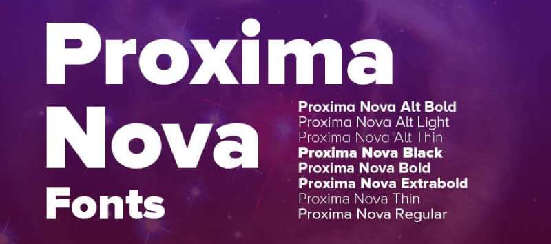
A geometric sans-serif that gives real estate brands a sharp, modern, high-end feel without looking trendy.
Font Type
Geometric sans-serif. Designed by Mark Simonson, originally created in 1994 and relaunched in 2005.
Why It Works for Real Estate
Proxima Nova sits at the intersection of geometric precision and humanist warmth. It’s the font that made The Verge and Wired look credible and modern. For real estate, that same quality translates to agencies that want to signal sophistication and trustworthiness, especially in the commercial and luxury residential segments. It has a futuristic edge without feeling cold.
Best Use Cases
- Agency websites and property portals
- Real estate logos and business cards
- Print brochures and marketing materials
- Digital ads and listing headers
Readability and Legibility
Very strong at both large and small sizes. Its large x-height and wide proportions make it readable on screens and in print. Works well for headers and body text alike.
Font Pairing
Pairs cleanly with Georgia for body text or with a refined serif like Garamond for a more editorial real estate look. Leading and tracking adjustments help it breathe well in longer property descriptions.
Availability and Licensing
Paid license. Available via Adobe Fonts, Fonts.com, Fontspring, and MyFonts. Not free, but worth the investment for agencies building a serious brand.
Lato

A humanist sans-serif designed for corporate use that feels both professional and approachable for real estate branding.
Font Type
Humanist sans-serif. Designed by Lukasz Dziedzic, released in 2010. “Lato” means “Summer” in Polish.
Why It Works for Real Estate
Lato was originally built as a corporate font, which makes it a natural fit for real estate. It reads as trustworthy and stable without feeling stiff. The semi-rounded letterforms add just enough warmth to connect with buyers emotionally, while the clear uppercase structure keeps logos and headers sharp. It’s one of the most balanced choices for residential real estate agents who want to look polished without being intimidating.
Best Use Cases
- Real estate agent websites and bios
- Property listing body text
- Business cards and email signatures
- Residential real estate logos
Readability and Legibility
Excellent at all sizes. Semi-rounded details show at larger sizes while classical proportions keep it stable and serious in small text. Works well across both desktop and mobile devices.
Font Pairing
Pairs naturally with Playfair Display for a luxury residential feel. The contrast between Lato’s clean simplicity and Playfair’s elegant weight creates a strong emphasis structure for property pages.
Availability and Licensing
Free on Google Fonts under the SIL Open Font License. Also available at latofonts.com. Free for commercial use.
Cormorant Garamond
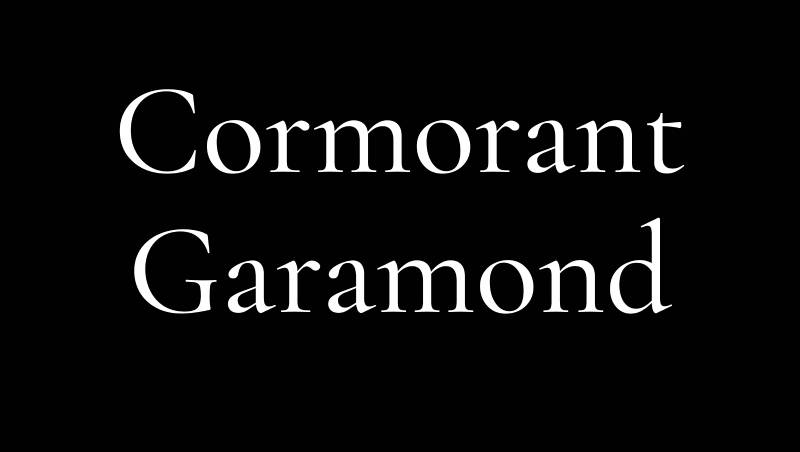
A high-contrast display serif rooted in 16th-century letterforms, built for luxury real estate branding that needs to feel timeless.
Font Type
Display serif. Designed by Christian Thalmann of Catharsis Fonts, released in 2015. Based on Claude Garamond’s classical proportions.
Why It Works for Real Estate
Cormorant Garamond is the kind of font that makes a luxury property feel like a statement. The high-contrast strokes and refined letterforms carry an editorial quality that’s hard to fake with generic fonts. It’s a strong choice for luxury real estate agencies and high-end brokerages, particularly ones positioned against brands like Compass or Sotheby’s. The serif structure signals heritage and credibility.
That said, it’s purely a display font. Don’t use it for body copy.
Best Use Cases
- Luxury real estate agency logos
- Premium property brochure headlines
- Brand identity for high-end brokerages
- Website hero sections and property name displays
Readability and Legibility
Excellent at large display sizes. At smaller sizes, the thin strokes break down quickly. Use it only for headlines, logos, and display text. Pair with a legible sans-serif for everything else.
Font Pairing
Montserrat and Lato are the strongest pairing options. Both provide enough neutral contrast to let Cormorant Garamond lead visually. Good font spacing and generous leading help the combination breathe.
Availability and Licensing
Free on Google Fonts and Adobe Fonts under the SIL Open Font License. Free for commercial use.
Open Sans

A neutral, highly readable sans-serif that works quietly in the background across real estate digital platforms and print materials.
Font Type
Humanist sans-serif. Designed by Steve Matteson, released in 2011. One of the most-used fonts on the web globally.
Why It Works for Real Estate
Open Sans does not try to stand out. That’s the point. For real estate websites carrying dozens of property listings, you need a font that gets out of the way and lets the content do the work. Open Sans is clean, neutral, and loads fast. It’s widely used by real estate portals and agency sites precisely because it causes zero readability friction. Buyers can scan listings without the font slowing them down.
Best Use Cases
- Property listing body text
- Real estate website interfaces
- Email newsletters and drip campaigns
- Agent profile pages and bios
Readability and Legibility
Outstanding at all sizes. Consistently one of the top performers for screen legibility. Works well across all browsers and devices without rendering issues.
Font Pairing
Pairs with almost anything. Use Playfair Display or Cormorant Garamond for headlines to add character, while Open Sans handles body text. The combination keeps alignment and layout clean.
Availability and Licensing
Free on Google Fonts under the Apache License. Free for commercial use.
Josefin Sans

A geometric sans-serif with a vintage 1920s character that gives real estate brands a distinctive, elegant edge.
Font Type
Geometric sans-serif. Designed by Santiago Orozco, inspired by Rudolf Koch’s Kabel and 1920s geometric sans-serifs. Available on Google Fonts.
Why It Works for Real Estate
Josefin Sans has a low x-height and tall ascenders that give it an unusually refined presence. It reads as elegant without being formal, which makes it a good fit for boutique real estate agencies and agents building a personal brand. The vintage geometric quality sets it apart from more generic sans-serifs on the market. It’s the kind of font that makes a business card feel considered rather than default.
Best Use Cases
- Boutique agency logos and wordmarks
- Real estate agent personal branding
- Property website headers and navigation
- Upscale print collateral
Readability and Legibility
Better at larger sizes due to its low x-height. Works best in headers and display roles. Not the strongest choice for dense body text on listing pages.
Font Pairing
Pairs well with Lato or Raleway. Both share geometric roots while offering better body text legibility, creating consistent typographic hierarchy across property pages.
Availability and Licensing
Free on Google Fonts under the SIL Open Font License. Free for commercial use.
Garamond (Sabon Pro)
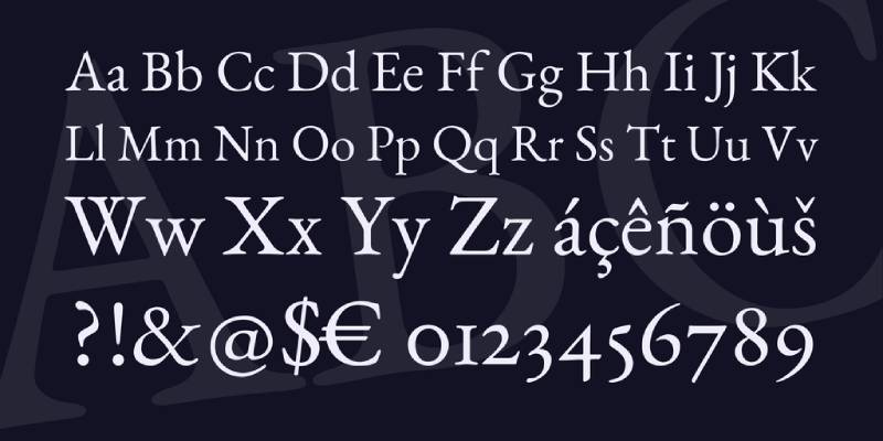
A classic old-style serif with centuries of credibility behind it, particularly effective for traditional and heritage-focused real estate brands.
Font Type
Old-style serif. Based on the designs of Claude Garamond (16th century). Sabon is a modernized version created by Jan Tschichold in the 1960s for the German Master Printers’ Association.
Why It Works for Real Estate
Garamond communicates heritage, stability, and trust. For established real estate firms with long histories, or agencies positioning themselves in the traditional luxury market, this is a hard font to beat. The letterforms have a quiet authority that pairs well with conservative color palettes and formal brand identities. It’s the kind of font that never looks cheap.
Best Use Cases
- Traditional real estate agency branding
- High-end property brochures and catalogues
- Print advertising in premium publications
- Formal real estate correspondence and letterheads
Readability and Legibility
Very strong in print. Works well for body text in brochures and formal documents. Screen performance varies by version. EB Garamond (the free Google Fonts version) renders reasonably well digitally.
Font Pairing
Pairs cleanly with Helvetica or a neutral grotesque sans-serif for a classic contrast. The combination creates strong balance between tradition and accessibility in print design.
Availability and Licensing
EB Garamond is free on Google Fonts. Sabon Pro is a paid font available via Adobe Fonts and MyFonts. Worth paying for if print quality matters to your brand.
Avenir
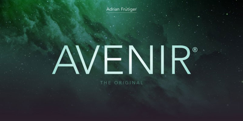
A geometric sans-serif with a humanist edge that works well for modern real estate agencies aiming for a refined, future-facing identity.
Font Type
Geometric sans-serif. Designed by Adrian Frutiger, released in 1988 by Linotype. “Avenir” means “future” in French.
Why It Works for Real Estate
Avenir is more nuanced than most geometric sans-serifs. The slightly oval “o” and shortened ascenders give it a humanist quality that makes it feel less mechanical than Futura. For real estate brands targeting both high-end residential and commercial buyers, Avenir signals sophistication and forward-thinking positioning. It holds up well in all-caps logo treatments and in body text alike.
Best Use Cases
- Modern real estate agency logos
- Commercial real estate branding
- Property website headers and body copy
- High-end signage and outdoor advertising
Readability and Legibility
Excellent across print and screen. Performs well in both small and large sizes. A reliable workhorse for property branding that needs to look sharp everywhere.
Font Pairing
Pairs well with Garamond or Cormorant Garamond for print pieces. The contrast between Avenir’s geometric clarity and a classical serif creates a strong emphasis structure in brochure design.
Availability and Licensing
Paid font. Available via Adobe Fonts and Linotype. Not free, but it’s a premium option for brands that want a typeface with genuine typographic heritage.
Cinzel
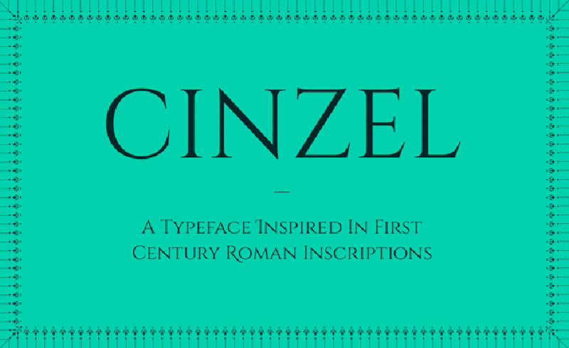
An all-caps serif inspired by first-century Roman inscriptions, built for real estate logos and brand marks that need to project strength and permanence.
Font Type
Classical display serif. Designed by Natanael Gama. Based on classical Roman proportions with a contemporary finish. Available on Google Fonts.
Why It Works for Real Estate
Cinzel is purely uppercase, which is actually a strength in logo design. It carries an architectural quality that feels appropriate for real estate. The letters have straight, strong forms with no decorative flourishes, which projects authority and permanence. It’s a niche choice compared to the others on this list, but for agencies that want a distinctive logo font with real presence, it delivers.
Works best as a single-use brand font, not a full typography system.
Best Use Cases
- Real estate agency logo and wordmarks
- Property development brand marks
- Premium signage and building names
- Luxury property marketing headers
Readability and Legibility
Strong at large display sizes. The all-caps format limits its use to short headline and logo applications only. Do not use for body text or extended reading.
Font Pairing
Pair with Lato or Open Sans for body text. Cinzel handles the brand identity layer while a clean humanist sans-serif handles everything else. Good kerning is important here since the all-caps structure requires careful spacing to avoid feeling cramped.
Availability and Licensing
Free on Google Fonts under the SIL Open Font License. Free for commercial use.
What Makes a Font Work for Real Estate?
Typography in real estate does a specific job. It signals trust, sets expectations for the price bracket of a property, and keeps a potential buyer reading instead of bouncing.
Research from MIT’s AgeLab and the Software Usability Research Laboratory found that typeface choice directly affects perceived credibility and reading comprehension. That’s a lot riding on a font decision most agents make in five minutes.
Serif Fonts vs. Sans-Serif Fonts in Real Estate Design
The serif vs. sans-serif debate doesn’t have a clean winner. A 2022 study published in PeerJ Computer Science tested 246 users on e-commerce websites and found no statistically significant difference in reading speed or usability between the two types.
What does differ is perception. Monotype’s 2023 neuroscience research found that serif typefaces specifically convey honesty and quality across multiple countries. For real estate, where trust is the product, that matters.
| Font Style | Perception Signal | Best Use Case |
|---|---|---|
| Serif | Heritage, authority, trust | Luxury listings, established brokerages |
| Sans-serif | Modern, approachable, clean | Mid-market agencies, tech-forward agents |
| Slab serif | Bold, grounded, confident | Signage, flyer headlines |
Font psychology research consistently shows that buyers form a first impression of a brand before reading a single word. The typeface is already doing that work.
How Font Weight Affects Buyer Perception
Light weights (300, 400) tend to read as sophisticated and premium, especially in luxury property contexts.
Medium and bold weights (600, 700) improve scan-ability on listing pages where buyers skim price, beds, baths, and location fast.
The Nielsen Norman Group (2023) notes that geometric sans-serifs project a modern, structured sensibility, while script typefaces feel traditional or classic. Neither is wrong. They just serve different audiences.
A good rule: use one weight for headlines, one for body, and don’t go beyond three total weights across a site. More than that starts reading as inconsistent branding.
The Best Fonts for Real Estate Websites
Best Serif Fonts for Real Estate Websites
Playfair Display is probably the most-used serif on property websites right now. High contrast between thick and thin strokes, strong editorial feel, and it pairs well with almost anything. Works best at headline sizes (36px and up) because the thin strokes break down at body copy sizes.
Merriweather holds up better at small sizes. It was designed specifically for screen reading, with large x-heights and open letterforms. Good for long property descriptions where readability at 16px actually matters.
Garamond brings classical authority. Older established brokerages tend to reach for it. It reads as serious without being cold.
Best Sans-Serif Fonts for Real Estate Websites
Lato is the reliable workhorse. Huge character set, neutral tone, performs cleanly across IDX listing platforms, WordPress, and Squarespace without rendering surprises.
Montserrat has become the default for mid-market real estate agencies. Geometric structure, clean headers, and it has enough personality to feel intentional without being distracting. Available free via Google Fonts.
Raleway suits boutique and upscale agencies, especially at lighter weights. Thin strokes and tall letterforms create an airy, premium feel. Worth knowing: Raleway can look weak at small sizes on low-resolution screens, so test it on mobile before committing.
Open Sans is the safe pick. Nothing remarkable about it, but it never fails. 87% of real estate agents cite digital visibility as their primary marketing goal (REsimpli, 2024), and a font for websites that loads fast and renders cleanly everywhere contributes to that.
The HTTP Archive’s 2024 Web Almanac found that 79% of websites use either self-hosted or Google web fonts. For real estate agents on WordPress or Squarespace, that means Lato, Montserrat, and Open Sans are accessible at zero cost and zero performance penalty.
The Best Fonts for Real Estate Logos and Branding
Strong logo typography outlasts every other brand decision. Agents who get this right in year one don’t have to rebrand in year three.
Compass uses a clean modern sans-serif, Sotheby’s International Realty leans on a classic serif communicating heritage, and Douglas Elliman pairs an elegant serif with generous letter spacing. Three very different choices, all intentional, all matched to their target market.
Fonts for Luxury Real Estate Branding
Proxima Nova is the premium mid-luxury choice. Geometric-humanist hybrid, unusually clean at large sizes, widely used by national brand identities outside real estate too. It’s a paid font (available through Adobe Fonts), but the licensing covers web embedding, print, and signage in most tiers.
Garamond variants and Cormorant Garamond appear regularly in the ultra-luxury segment. High contrast, classical proportions, and the kind of refinement that says the properties listed here are not starter homes.
Sotheby’s International Realty uses typography that hasn’t changed drastically in decades. Their serif, restrained color palette, and disciplined layout signal permanence. The logo doesn’t sell the property. It sells certainty.
For real estate agencies targeting high-net-worth clients, the right fonts for luxury brands share two traits: restraint and consistency. No decorative extras, just clean execution across every touchpoint.
Fonts for Real Estate Business Cards and Signage
Signage lives at a distance. Legibility from 10 to 20 feet requires fonts with high x-heights, clear letter differentiation, and enough weight to read against outdoor glare.
- Helvetica: the original signage standard, still unbeatable for yard signs and directional boards
- Montserrat Bold: good street-level readability, slightly more distinctive than Helvetica
- Futura: geometric, strong at large scales, common in premium open-house materials
Business cards compress a lot of information into a small space. Fonts for business cards in real estate should have a minimum point size of 8pt for contact details and enough weight contrast to distinguish name from title from contact info.
Font licensing is a real issue here. Some agents download a premium font, use it in their logo, then print 500 business cards without a commercial print license. Always check the license tier before sending anything to a printer.
Font Pairing for Real Estate: Which Combinations Work?
Most real estate sites that look polished use two fonts. Rarely three. Never four.
The goal when pairing fonts is contrast without conflict. A serif headline paired with a sans-serif body is the most reliable structure, and it works because the two styles are different enough to create hierarchy without fighting each other.
Playfair Display + Lato is the most common combination on property sites. Editorial header energy meets neutral, highly readable body copy. It’s everywhere because it works.
Montserrat + Merriweather flips the structure: geometric sans-serif header, screen-optimized serif body. Slightly more distinctive, good for agents who want to stand out from the Playfair crowd.
Raleway + Open Sans suits boutique agencies going for a light, premium aesthetic. Both fonts are thin-natured, so the pairing requires careful size and weight management to maintain hierarchy.
| Pairing | Style | Best For |
|---|---|---|
| Playfair Display + Lato | Editorial + neutral | General real estate sites |
| Montserrat + Merriweather | Geometric + readable | Mid-market agencies |
| Raleway + Open Sans | Airy + clean | Boutique, upscale agents |
| Garamond + Proxima Nova | Classical + modern | Luxury branding |
Playfair Display font pairing resources go deep on weight and size combinations. Worth reviewing before locking in a final choice.
For anyone who wants to test combinations fast without committing, a font pairing generator cuts the trial-and-error time significantly.
The Best Fonts for Real Estate Flyers, Brochures, and Print Materials
Print is different from screen. Higher resolution, physical reading distance, ink behavior on coated stock. Fonts that look clean on a monitor can break down in print, especially at small sizes on glossy paper.
Garamond and its variants hold fine detail well in print, which is why editorial magazines have used them for decades. For property description text in a brochure, it’s a solid call.
Display Fonts for Property Headlines
A display font in a brochure headline does one job: stop the reader long enough to read the subhead.
Cormorant Garamond at large sizes in a property brochure headline reads as expensive before the buyer processes a single word. It’s a free Google Font with excellent print behavior.
Freight Display (paid, via Adobe Fonts) is a common choice in higher-end print work. Strong contrast, good for large format prints like open-house boards.
The Unbounce 2024 Conversion Benchmark Report found that simpler copy converts 56% better than complex writing. The same logic applies to print layout: clean, legible typography with clear hierarchy moves readers through the piece faster than layered design choices.
Font Spacing and Print Layout
Font spacing behaves differently in print than on screen. Tracking (letter spacing) usually needs to be tighter in print headlines and slightly looser in small body text.
For real estate brochures and flyer design, standard recommendations:
- Body text: 10-12pt, 130-150% line height
- Subheads: 14-18pt, medium weight
- Headlines: 28-48pt depending on format size
- Minimum margin: 0.25 inches for professional printing
Adobe InDesign handles font spacing controls more precisely than Canva, but Canva’s real estate templates work well for agents without a design background. Canva’s free font library includes Playfair Display, Lato, and Montserrat, covering most of what’s needed.
Free vs. Paid Fonts for Real Estate: What Are the Actual Differences?
The short answer: for most real estate agents, free Google Fonts cover everything.
Google Fonts had 1,826 font families as of May 2025 (Photutorial), with roughly 468 supporting variable font technology. The HTTP Archive 2024 Web Almanac found Google Fonts on 54% of desktop sites and 47% of mobile sites. This isn’t a niche resource. It’s the default infrastructure for web typography.
What Google Fonts Covers Well
For real estate, these Google Fonts handle the full range of use cases:
- Playfair Display: luxury and editorial headers
- Merriweather: body copy, long listing descriptions
- Montserrat: mid-market brand identity, headers
- Lato: body text, general-purpose layouts
- Raleway: boutique and upscale agency branding
- Cormorant Garamond: high-end print materials
All free. All commercially licensed. All available via Google Fonts for websites with no additional configuration needed on WordPress, Squarespace, or Wix.
When Paid Fonts Justify the Cost
Proxima Nova: no direct free equivalent. Fonts similar to it exist (Montserrat comes closest), but the humanist-geometric hybrid quality of Proxima Nova is harder to replicate.
Gotham: strong mid-century American feel, widely used in political and institutional branding. Gotham font pairing is well-documented for professional brand systems.
Canela: a contemporary serif with a soft, editorial quality. Used by newer luxury brands looking to signal modern prestige rather than heritage.
Paid fonts from Adobe Fonts (included in Creative Cloud) or licensed directly through Typekit make sense when the brand identity requires something distinctive and the agency has the marketing budget to use it consistently across all print and digital channels.
Adobe Fonts appeared on roughly 4.1% of websites in 2024 (HTTP Archive), up from 3.7% in 2022. That’s a fraction of Google’s reach, but the audience is different. These tend to be design-led agencies or brokerages where typography is a deliberate brand investment.
Variable Fonts as a Practical Option
Variable fonts are a single font file that contains multiple weights and styles. For real estate websites, this matters for one reason: performance.
One variable font file replaces four or five separate weight files. Smaller total file size, fewer HTTP requests, faster rendering. Google’s own research found that pages meeting Core Web Vitals thresholds see users 24% less likely to abandon mid-load.
For a real estate website where the main conversion event is a form inquiry or a showing request, page load speed is not a minor detail.
| Source | Font Count | Cost | Best For |
|---|---|---|---|
| Google Fonts | 1,826 families | Free | Most real estate websites and branding |
| Adobe Fonts | Thousands | Paid (Creative Cloud) | Design-led agencies, advanced brand systems |
| Typekit / MyFonts | Thousands | Per-font licensing | Specific premium typefaces like Gotham, Proxima Nova |
A quick note on font licensing for print specifically: web licensing and print licensing are often separate tiers. An agent who uses a premium font on their website under a web license may need a separate commercial print license before sending materials to a printer. Google Fonts carry the SIL Open Font License, which covers both.
FAQ on The Best Fonts For Real Estate
What is the best font for a real estate website?
Montserrat and Lato are the strongest choices for real estate websites. Both are clean, highly legible sans-serif fonts that perform well on mobile and desktop. They signal professionalism without feeling cold or generic.
What font does Zillow use?
Zillow uses a custom typeface built around clean, modern sans-serif principles. It prioritizes readability across property listings and mobile interfaces, keeping the focus on content rather than decorative typography.
Should real estate agents use serif or sans-serif fonts?
It depends on your brand. Serif fonts like Garamond or Playfair Display work well for luxury and traditional agencies. Sans-serif fonts like Proxima Nova suit modern, tech-forward real estate brands. Many agents use both through smart font pairing.
What fonts are used for luxury real estate branding?
Playfair Display, Cormorant Garamond, and Cinzel are the top picks for luxury property branding. Their high-contrast letterforms and refined structures communicate exclusivity. Pair them with a neutral sans-serif for body text to keep listings readable.
What is the most readable font for real estate listings?
Open Sans and Lato are the most legible options for property listing body text. Both maintain strong readability at small sizes across all screen types. They reduce eye strain during extended browsing, which matters on listing-heavy pages.
How many fonts should a real estate brand use?
Two, maximum three. One font for headlines, one for body text, and an optional accent font for details. More than that creates visual noise. A consistent brand style guide keeps your real estate typography cohesive across print and digital.
Are Google Fonts good enough for real estate websites?
Yes. Montserrat, Lato, Cormorant Garamond, Josefin Sans, and Cinzel are all free on Google Fonts and work well for real estate. They load fast, render cleanly, and cover every brand tone from modern to luxury.
What font works best for real estate logos?
Proxima Nova, Cinzel, and Montserrat are strong choices for real estate logo design. Each holds up well at small sizes and in single-color print. Font weight and kerning adjustments matter significantly at the logo level.
What font is best for real estate print materials?
Garamond (Sabon Pro) and Avenir perform best in real estate print design. Both hold up well in brochures, flyers, and property catalogues. Garamond suits traditional agencies. Avenir fits modern ones. Both handle small print sizes without losing clarity.
Does font choice affect real estate brand trust?
Yes, directly. Font psychology research shows that typeface choices influence how trustworthy and professional a brand appears. Clean, legible fonts build confidence. Overly decorative or mismatched fonts create doubt, especially during a high-stakes decision like buying property.
Conclusion
This conclusion is for an article presenting the best fonts for real estate, and the core takeaway is simple: property branding typography is not a detail you can skip.
The right typeface shapes how buyers perceive your listings, your agency, and your credibility before any conversation starts.
For modern residential agents, Montserrat and Proxima Nova deliver clean, professional web design fonts that hold up across every screen size.
For luxury real estate positioning, Cormorant Garamond and Playfair Display carry the visual weight that premium property marketing demands.
Get your typographic hierarchy right, limit yourself to two or three typefaces, and apply them consistently across print and digital.
Realtor website typography done well is quiet, consistent, and impossible to ignore.

Renowned for his expertise in logo design and visual branding, Bogdan has developed a multitude of logos for various clients.
His skills extend to creating posters, vector illustrations, business cards, and brochures. Additionally, Bogdan's UI kits were featured on marketplaces like Visual Hierarchy and UI8.
He also wrote in the past years on sites like Design Your Way, WebDesignerDepot, WPDean, Designmodo, Speckyboy, Slider Revolution, and more.
- The Windsurf Logo History, Colors, Font, And Meaning - 10 October 2026
- How to Remove Background From Product Photos (No Photoshop) - 10 October 2026
- How Designers can Build a Stronger Online Creative Identity - 9 October 2026

Bogdan Sandu is a seasoned designer who has been designing websites since 2008. Renowned for his expertise in logo design and visual branding, Bogdan has developed a multitude of logos for various clients. His skills extend to creating posters, vector illustrations, business cards, and brochures. Additionally, Bogdan's UI kits were featured on marketplaces like Visual Hierarchy and UI8. He also wrote in the past years on sites like Design Your Way, WebDesignerDepot, WPDean, Designmodo, Speckyboy, Slider Revolution, and more.
You Might Also Like