The Zillow font: What font does Zillow use?
Picture this – you’re browsing through a sea of properties and your eyes lock onto a listing. But it’s not just the curb appeal that reels you in; it’s the clarity, the vibe.
The Zillow font. It’s like the silent realtor that shapes your digital journey, whispering, “Welcome home.”
In the nexus of real estate web fonts and digital design aesthetics, typography is unsung yet pivotal – it can elevate a brand from mere noise to symphony in the mindscape of an online marketplace.
Here’s the scoop – by the wrap of this read, you’ll have decoded the DNA of the Zillow brand identity. We’ll dive into the sans-serif love affair, the craft of UI fonts, and the why behind web font accessibility.
A look under the hood to appreciate how a clever typeface makes real estate listings pop and why the visual identity of our digital storefront matters just as much as curb appeal.
So, let’s unfold this tapestry of pixels and points that make Zillow’s typographic tale so darn compelling.
What Font Does Zillow Use
Get this: the Zillow font is more elusive than you think. The specifics? Well, they’re kept hush-hush, tucked away in the creative corners of the Zillow branding team.
Zillow’s primary product typeface is Open Sans.
Zillow’s Typeface and its Impact
Zillow’s choice of a sans-serif font does more than just look good. It feels good. It’s like that welcoming nod from a friendly neighbor, or that soft, reassuring voice guiding you through an unfamiliar place.
It’s a user-friendly, approachable font that makes digital navigation a breeze. No fuss, no confusion, just clarity.
The Magic Behind Sans-serif
The simplicity of sans-serif fonts is their magic. There’s a certain elegance that comes with a lack of adornment. In a way, it mirrors Zillow’s brand message: making complex things, like buying a house, simpler.
Alternatives to the Zillow Font
Can’t get your hands on the elusive Zillow font? No worries! There’s a whole world of sans-serif typefaces that echo the same clean, contemporary feel. Here are a few top picks:
Avenir
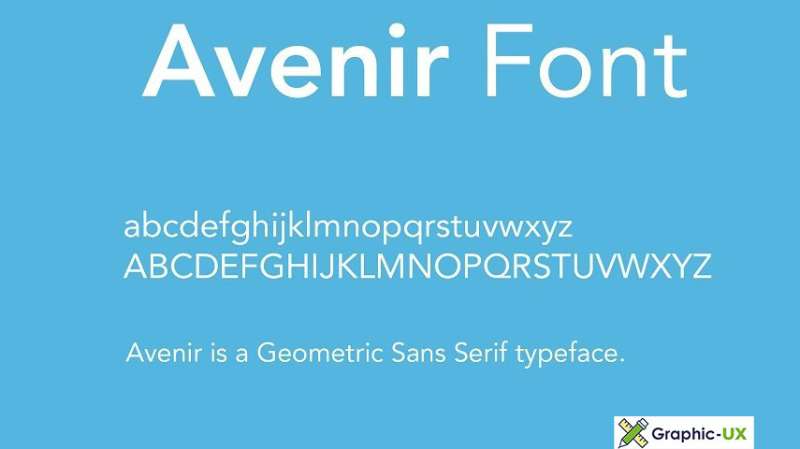
Avenir is like a friendly handshake. It’s warm, inviting, yet utterly professional. Its clean lines and balanced weight distribution make it an excellent contender for a modern, clean look similar to Zillow’s.
Futura
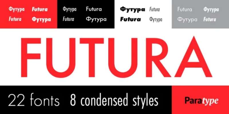
If you’re after something a bit more geometric, then meet Futura. Its crisp edges and bold presence make it a great choice for standing out while maintaining that clean, modern feel.
Proxima Nova
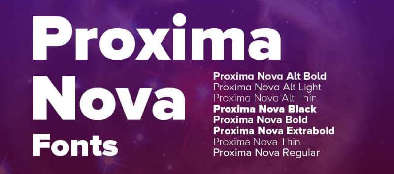
Meet the chameleon of fonts, Proxima Nova. It’s versatile, sleek, and beautifully readable. Whether you’re working on a logo or typing up an article, Proxima Nova molds to fit your needs perfectly.
The Power of Font Selection
Think about it. The font you choose carries a message. It sets the tone. It’s your brand’s voice, minus the sound. With Zillow, their choice of font is a whisper in the ear of their users, saying, “Trust us. We’ve got you.”
Fonts and First Impressions
You know how they say first impressions count? Well, your font is the outfit your words wear when they meet the world. It can either turn heads or fade into the crowd. Zillow’s font? It definitely makes an impression.
Designing With The User in Mind
At the end of the day, the user is king. The font Zillow uses speaks directly to its users. It’s straightforward, honest, and uncomplicated—just like the perfect home-finding experience should be.
Navigating The Digital Space
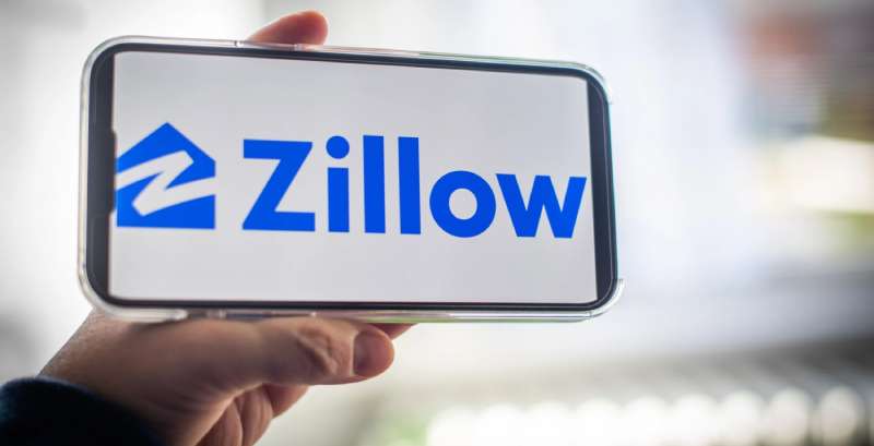
Fonts can be the compass that guides users through your website or app. Zillow’s font, with its clear, legible style, directs users smoothly from point A to B. It’s a key player in creating a seamless user experience.
Building Trust With Typography
Fonts do more than just display words. They build trust. Zillow’s font, with its clean, simple design, creates an atmosphere of transparency and reliability. It’s an integral part of their brand, whispering to users, “You’re in safe hands.”
FAQ On The Zillow Font
What exact font does Zillow use?
Oh, I get this one a lot. Zillow actually rolls with a custom font – yep, it’s proprietary and designed exclusively for their brand.
Think of it as a unique blend, like their own secret sauce in the brand identity design world. No grabbing it off the shelf for your own gig, though. It’s all theirs.
Can I download the Zillow font for personal use?
Here’s the snag – because it’s a custom web font, Zillow’s font isn’t up for grabs. It’s part of their visual mojo, their trademark look. Your personal projects will need to find another muse. Copyright law’s a stickler like that.
How important is font choice to a brand like Zillow?
It’s massive, trust me. Font choice is like a brand’s suit for the Oscars; it’s gotta be on point. For Zillow, their sans-serif web fonts don’t just boost readability, they echo a digital design aesthetic that’s clean, modern, and invites trust. It’s branding gold.
Is the Zillow font effective for mobile app design?
Absolutely. Looks sleek on screens of all sizes. The Zillow font’s legibility is a champ on the mobile app interface, which is crucial since a huge chunk of users are scrolling on their phones. Clearly, they’ve nailed the user interface fonts game.
What’s the role of typography in real estate platforms like Zillow?
Typography? It’s the unsung hero here. Sets the stage for user experience, you know? A robust real estate platform UI/UX is vital for keeping things intuitive and the typography, like Zillow’s, guides you subtly through the jungle of listings and filters.
How does the Zillow font contribute to its brand identity?
It’s a cornerstone. Every letter, every curve contributes to Zillow’s identity. It’s the visual whisper of the brand, giving it a distinct typography in web development. Zillow’s font supports its brand consistency, speaking volumes without shouting.
How does Zillow’s typography strategy affect user engagement?
Well, good font choice is like a good handshake – it’s one of the first things you notice. Zillow’s typography strategy nails that first impression, inviting engagement.
Seamless readability means users stick around longer, dive deeper, and hey, possibly even hit that contact button.
What would change if Zillow decided to modify its font?
Imagine your favorite coffee shop changing its signature brew. If Zillow tweaked its font, it would ripple through its visual communication in real estate.
It’d need to mesh with the Zillow visual identity while keeping that same balance of personality and functionality. Users would need convincing it’s for the better.
How do typography and UX design intersect on Zillow’s platform?
They’re like PB&J – better together. Zillow’s typography is a key player in its UX design for property search. Crisp fonts lead to cleaner navigation, and that means users find what they’re after with fewer headaches. Good UX design leans heavily on smart typography choices.
How does Zillow ensure their font is accessible to all users?
Inclusivity is front and center for platforms like Zillow. Ensuring their font is accessible to folks with visual impairments, means rolling with sizes and contrasts that don’t strain the eyes. Web font accessibility isn’t just nice – it’s essential. Zillow’s aware and acts accordingly.
Conclusion
So, we’ve been deep-diving into the Zillow font, turning it over, looking under the hood, unwrapping its influence step by step. What a journey, right? Through the pixels and points, it all crystallizes – this isn’t just a set of characters; it’s an architect of experience, enrolled in the brand identity design and baked into every user interface choice Zillow makes.
The takeaway? Typography is silent yet eloquent, and what Zillow’s got here is no run-of-the-mill font. It’s a crafted beacon of their brand, engineered to resonate within the cluttered digital design aesthetics and to tap into the user’s subconscious. A true testament to the impact of smart design.
And in the tapestry of online marketplaces, it stands out, like… well, like a well-staged home in a sea of fixer-uppers. A reflection of consistency and clarity, the Zillow font is more than letters on a page – it’s a handshake, a first impression, and indeed, a lasting one.
If you liked this article about the Zillow font, you should check out this article about the Dropbox font.
There are also similar articles discussing the Instacart font, the Quora font, the SoundCloud font, and the Grammarly font.
And let’s not forget about articles on the Asana font, the Trello font, the Microsoft Office font, and the Evernote font.
- Think Pink: Soft and Strong Pink Color Palettes - 14 May 2024
- Fashion Typography: What Font Does Vogue Use? - 14 May 2024
- The Kirin Logo History, Colors, Font, And Meaning - 13 May 2024


