Microsoft Office uses Aptos, a neo-grotesque sans-serif font commissioned by Microsoft and designed by type designer Steve Matteson.
Microsoft adopted Aptos in 2023 as the new default font across Word, Excel, PowerPoint, and Outlook, replacing Calibri after 17 years as the Office standard.
What Type of Font Is Aptos?
Aptos is a neo-grotesque sans-serif typeface. It draws from mid-20th-century Swiss typography, similar in structure to Helvetica, but with deliberate humanist touches built in.
Steve Matteson added subtle irregularities to prevent the font from feeling too mechanical. The uppercase “R” has a slight swing to its leg. The lowercase “g” uses a double-story form.
Visually, Aptos has:
- Horizontal and vertical stroke endings (not angled like Arial)
- A lowercase “l” with a small tail to prevent confusion with capital “I”
- Balanced proportions built for high-resolution screens
- 12 styles, from Light to Black, plus oblique variations
The x-height is generous, which keeps the font readable at small sizes. That was a deliberate call given how much Office content gets read on 4K and ultra-HD displays.
Who Designed Aptos?
Steve Matteson designed Aptos for Microsoft. He is the same designer responsible for Segoe (the Windows system font since Vista) and the original Windows TrueType core fonts, including Arial, Courier New, and Times New Roman.
Microsoft originally called the font Bierstadt, one of 5 candidate fonts introduced in 2021 for user testing alongside Grandview, Seaford, Skeena, and Tenorite.
After gathering feedback, Microsoft selected Bierstadt as the winner. Matteson then renamed it Aptos after a small unincorporated town in Santa Cruz, California. The font officially became the default for Microsoft 365 in July 2023 and rolled out broadly in January 2024.
Aptos is a proprietary Microsoft font. It was created specifically for the Office suite and is not associated with any independent type foundry.
Is Aptos Free to Use?
Availability depends on how you access it. Aptos is included by default in Microsoft 365 and Office 2024, delivered as a cloud font inside those apps.
For anyone who wants to install it independently, Microsoft offers a free official download at microsoft.com/en-us/download/details.aspx?id=106087. The ZIP file is 2.8MB and works on both Windows 10/11 and macOS.
That covers personal and internal use. For commercial redistribution, web embedding, or use in mobile apps, a paid license is required through MyFonts or directly from Microsoft’s typography licensing program.
The font is not available on Google Fonts or Adobe Fonts. If you need Aptos for a non-Office environment, the official Microsoft download is the right place to start.
What Font Did Microsoft Office Use Before?
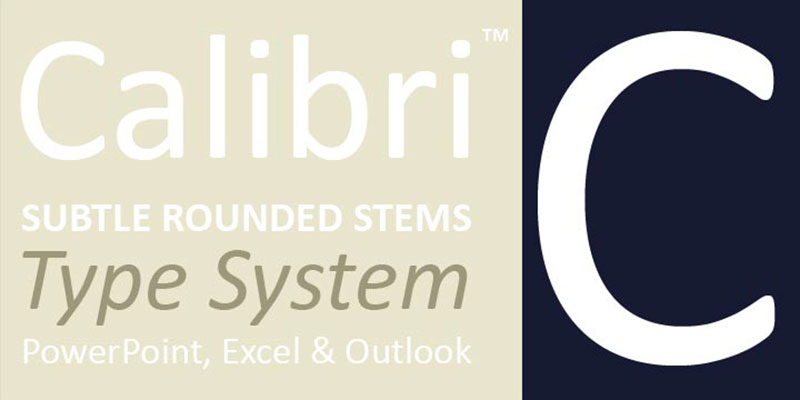
Before Aptos, the default font in Microsoft Office was Calibri, a humanist sans-serif designed by Lucas de Groot between 2002 and 2004.
Calibri became the Office default in 2007 with the release of Office 2007, replacing Times New Roman in Word and Arial in PowerPoint, Excel, and Outlook. It was part of Microsoft’s ClearType Font Collection, a set of typefaces optimized for ClearType font rendering on LCD screens.
Before Calibri, the defaults varied by application:
- Word: Times New Roman (pre-2007)
- PowerPoint and Excel: Arial (pre-2007)
- Calibri Light: introduced as the heading font in Office 2013
The switch from Calibri to Aptos was driven by screen technology. Calibri was designed for 1024×768 and early LCD displays. By the early 2020s, with 4K monitors and high-DPI laptop screens becoming standard, Microsoft decided it needed a font built for that environment from the ground up.
Calibri still ships with every version of Office and remains widely used. It holds an unusual place in legal history too. Because Calibri only became publicly available in January 2007, it has been used multiple times to expose forged documents that claimed to predate that release.
What Are the Best Free Alternatives to Aptos?
Aptos is not available through open-source channels, so if you want something close for non-Office work, these are worth considering.
| Font | Style | Why It’s Similar | License | Source |
| Inter | Neo-Grotesque sans-serif | Screen-first design, high legibility, neutral tone | Free (OFL) | Google Fonts |
| IBM Plex Sans | Grotesque sans-serif | Corporate neutrality, similar functional feel | Free (OFL) | Google Fonts |
| Source Sans Pro | Humanist sans-serif | Professional tone, clean document readability | Free (OFL) | Google Fonts / Adobe Fonts |
| Open Sans | Humanist sans-serif | Designed by Steve Matteson, same designer as Aptos | Free (Apache) | Google Fonts |
Open Sans is worth a specific mention. It was also designed by Steve Matteson, originally for Google in 2011. You can see shared design sensibilities: the emphasis on readability, the clean terminals, the comfortable leading.
Inter is probably the most practical substitute if you are working in Figma, web design, or any interface context. It was built specifically for screen use and holds up well at small sizes.
If you want to explore fonts similar to Calibri (the previous Office default) rather than Aptos specifically, Carlito is a metric-compatible open-source alternative released by Google in 2013 for ChromeOS users.
How to Use Aptos (or an Alternative) Outside of Office
Installing Aptos system-wide
Download the official ZIP file from Microsoft’s Download Center. Extract it and install the font files through Windows Font Manager or macOS Font Book.
Once installed, Aptos appears in the font list of any app on your system, including Figma, Adobe apps, LibreOffice, and design tools that don’t have access to Microsoft’s cloud font service.
Using alternatives in design tools
Figma and web projects: Inter and IBM Plex Sans are available directly through Google Fonts. Both integrate cleanly with CSS font stacks.
Word documents: If you need to change the default font in Word, go to Home, click the font dialog launcher, choose your font, then click “Set As Default” and apply it to all new documents based on the Normal template (Normal.dotm).
For anyone learning how to add fonts to Figma or wanting to add fonts to Google Docs, the process is straightforward and covered in dedicated guides.
CSS font stack for web use
If you want to approximate the Aptos look on the web without loading a custom font, a reasonable system font stack would be:
“ font-family: "Aptos", "Inter", "Segoe UI", system-ui, sans-serif; `
This falls back gracefully across Windows, macOS, and Linux.
Why Did Microsoft Choose Aptos?
The short answer: screen resolution changed, and Calibri did not keep up.
Calibri was designed in the early 2000s for ClearType rendering on low-DPI displays. By 2021, Microsoft’s own design team acknowledged that the font was showing its age on modern high-resolution screens.
The project started publicly in April 2021. Microsoft released 5 candidate fonts for user testing, each targeting different design directions. Bierstadt (later Aptos) was specifically positioned as the most neutral and universally readable option.
Steve Matteson described his goal as giving Aptos “the universal appeal” needed across hundreds of millions of documents daily. He referenced the clarity required in corporate reports, academic submissions, and email chains. The font had to work for all of them without calling attention to itself.
Microsoft’s design team also noted that Aptos needed to handle typographic hierarchy across all Office apps. The condensed weights (Aptos Narrow) give Excel users more column space. The Display weights work for PowerPoint headings. The regular weight handles Word body text and Outlook email copy.
That versatility across use cases was a deliberate requirement. Calibri served one context reasonably well. Aptos was built to serve all of them.
For more on how font psychology influences document perception, or how to think about typographic hierarchy in professional documents, those are worth reading alongside this.
FAQ on What Font Does Microsoft Office Use
What is the current default font in Microsoft Office?
Microsoft Office currently uses Aptos as its default font across Word, Excel, PowerPoint, and Outlook.
It replaced Calibri in 2023 and rolled out broadly to Microsoft 365 users in January 2024.
What font did Microsoft Office use before Aptos?
Calibri was the default Office font from 2007 to 2023, a 17-year run.
Before Calibri, Word defaulted to Times New Roman, while PowerPoint and Excel used Arial.
Is Aptos a serif or sans-serif font?
Aptos is a sans-serif font, specifically in the neo-grotesque style.
It draws from mid-20th-century Swiss typography, sharing structural roots with Helvetica but with added humanist details.
Who designed the Aptos font?
Steve Matteson designed Aptos for Microsoft. He also created Segoe, the Windows system font, and the original Windows TrueType core fonts including Arial and Times New Roman.
Can I download Aptos for free?
Yes. Microsoft offers a free official download at their Download Center (ID: 106087). The ZIP file is 2.8MB and installs on both Windows and macOS.
Commercial redistribution or web embedding requires a paid font license.
What font size does Microsoft Word use by default?
Microsoft Word defaults to 11pt Aptos for body text in new documents.
Heading styles use larger sizes within the same Aptos family, maintaining visual consistency across the document.
What are the best free alternatives to Aptos?
Inter and IBM Plex Sans are the closest free alternatives, both available on Google Fonts.
Open Sans is another strong option. It was also designed by Steve Matteson, so the underlying design sensibility is similar.
Does Microsoft Office use the same font across all apps?
Yes. Aptos is the default across Word, Excel, PowerPoint, and Outlook as part of the unified Office theme update.
Aptos Narrow is used in Excel contexts where column space matters. Font variants are chosen per application need.
Why did Microsoft replace Calibri with Aptos?
Calibri was designed for low-DPI screens in the early 2000s. Modern 4K and high-resolution displays needed a font built specifically for that environment.
Aptos was chosen after Microsoft tested 5 candidate fonts with real users starting in 2021.
What font does Microsoft Office use for headings?
Headings in Word use Aptos Display, a variant with slightly adjusted proportions suited for larger text sizes.
Previously, Calibri Light served as the default heading font from Office 2013 onward.
Conclusion
If you’ve been wondering what font does Microsoft Office use, the answer is Aptos, a neo-grotesque sans-serif typeface designed by Steve Matteson and rolled out as the Microsoft 365 default in 2024.
It replaced Calibri after 17 years, built specifically for high-resolution screens and modern document typography settings.
For most users, the switch is seamless. For those working outside the Office suite, free alternatives like Inter and IBM Plex Sans cover the same functional ground.
The font size defaults to 11pt, the Word Normal style applies it automatically, and Aptos Narrow handles tighter Excel layouts. Everything is consistent across the Office theme.

Renowned for his expertise in logo design and visual branding, Bogdan has developed a multitude of logos for various clients.
His skills extend to creating posters, vector illustrations, business cards, and brochures. Additionally, Bogdan's UI kits were featured on marketplaces like Visual Hierarchy and UI8.
He also wrote in the past years on sites like Design Your Way, WebDesignerDepot, WPDean, Designmodo, Speckyboy, Slider Revolution, and more.
- The Windsurf Logo History, Colors, Font, And Meaning - 10 October 2026
- How to Remove Background From Product Photos (No Photoshop) - 10 October 2026
- How Designers can Build a Stronger Online Creative Identity - 9 October 2026

Bogdan Sandu is a seasoned designer who has been designing websites since 2008. Renowned for his expertise in logo design and visual branding, Bogdan has developed a multitude of logos for various clients. His skills extend to creating posters, vector illustrations, business cards, and brochures. Additionally, Bogdan's UI kits were featured on marketplaces like Visual Hierarchy and UI8. He also wrote in the past years on sites like Design Your Way, WebDesignerDepot, WPDean, Designmodo, Speckyboy, Slider Revolution, and more.
You Might Also Like