Evernote uses Inter as its default UI font, a neo-grotesque sans-serif font designed by Rasmus Andersson.
Evernote adopted Inter in January 2024 as part of a full interface redesign, replacing the previous default font, Source Sans Pro. For its logo wordmark, Evernote uses Publico Headline, a serif typeface from Commercial Type.
What Type of Font Is Inter?
Inter is classified as a geometric neo-grotesque sans-serif. It sits in the same category as Roboto and Apple San Francisco.
A few things stand out about it technically:
- Tall x-height that improves readability of lowercase text at small sizes
- Open apertures designed specifically for screen rendering
- Ink traps and optical bridges that sharpen legibility at small point sizes
- Available as a variable font with 9 weights (Thin to Black) plus matching italics
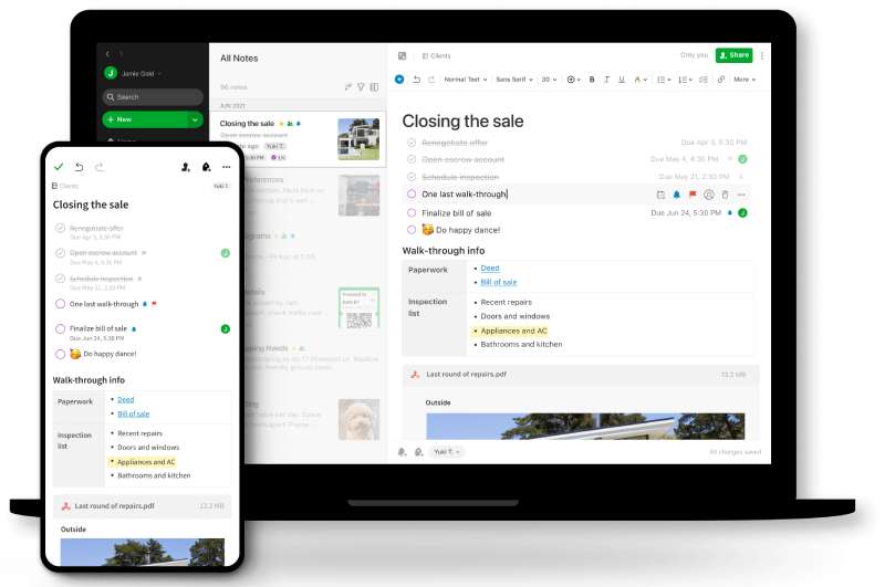
The x-height is particularly important for a note-taking app. You’re reading body text for long stretches, not just glancing at headlines.
The tracking and leading behavior of Inter at default sizes helps the eye move across lines without fatigue, which is exactly what Evernote’s design team said they were after.
Who Designed Inter?
Rasmus Andersson, a Swedish designer and programmer, created Inter in 2016 while working at Figma.
He released it publicly in 2017. The initial versions were named “Interface” and “Inter UI” before settling on the current name.
Inter is not a custom or commissioned font. It’s an open-source project that Andersson continues to maintain. Evernote licensed and adopted it off the shelf, the same way thousands of other products have.
The typeface now supports over 140 languages and is one of the most widely used UI fonts on the internet. For the 12 months ending May 2025, Inter was accessed 414 billion times on Google Fonts alone.
Is Inter Free to Use?
Yes, completely free. Inter is licensed under the SIL Open Font License 1.1 (OFL), which allows personal, commercial, and modified use at no cost.
| License Type | Commercial Use | Modification | Selling the Font Itself |
| SIL OFL 1.1 | Allowed | Allowed | Not allowed |
You can download Inter directly from Google Fonts, from the official site at rsms.me/inter, or from GitHub.
The one restriction worth knowing: you cannot sell Inter itself or a derivative of it as a standalone font product. Everything else is fair game.
What Font Did Evernote Use Before?
Before January 2024, Evernote’s interface used Source Sans Pro as the default note font.
On older Windows versions (pre-v10), the default note text was Tahoma 10, with note titles in Segoe UI 10. These were system-level defaults rather than deliberate design choices.
The font timeline across Evernote’s history looks like this:
| Period | UI / Note Font | Logo / Brand Font |
| Pre-2018 | Tahoma / Segoe UI (Windows) | Caecilia LTStd-Bold |
| 2018 rebrand | Source Sans Pro | Publico Headline + Soleil |
| 2024 redesign | Inter | Publico Headline |
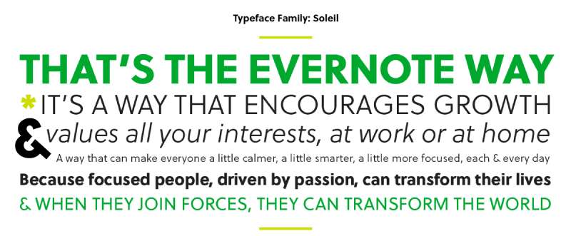
The 2018 rebrand was a full identity overhaul done in partnership with DesignStudio. That’s when Evernote introduced Soleil (a geometric sans-serif by Wolfgang Homola from TypeTogether) as the primary display typeface for marketing and communications.
Publico Headline, the current logo font from Commercial Type, was introduced at the same time and has stayed in place since.
What Are the Best Free Alternatives to Inter?
Inter is free, so you can just use it directly. But if you want something close in feel, here are 4 solid alternatives:
| Font | Similarity to Inter | License | Source |
| Roboto | Neo-grotesque, same x-height range | Free (Apache 2.0) | Google Fonts |
| DM Sans | Geometric, clean, screen-optimized | Free (OFL) | Google Fonts |
| Work Sans | Similar weight range, UI-friendly | Free (OFL) | Google Fonts |
| Space Grotesk | Grotesque structure, more character | Free (OFL) | Google Fonts |
Roboto is the closest in structure. DM Sans is a good pick if you want something slightly warmer. Space Grotesk adds a bit more personality, which can work well for branding use cases.
How to Use Inter in Your Design Tools
In Figma
Inter comes pre-installed in Figma. Just type “Inter” in the font picker and it’s there.
No download or setup needed. Figma actually used Inter as its own UI font before switching to its custom typeface.
In Canva
Inter is available in Canva’s font library by default. Search “Inter” in the text panel.
If you need a specific weight not showing up, you can upload fonts to Canva manually using a downloaded .ttf or .otf file.
In Photoshop
Download the Inter font files from Google Fonts or rsms.me/inter, then follow the standard process to add fonts to Photoshop by installing them system-wide.
For Web Use (CSS)
Embed Inter via Google Fonts with one line in your HTML:
“ <link href="https://fonts.googleapis.com/css2?family=Inter:wght@400;600;700&display=swap" rel="stylesheet"> `
Then apply it in your CSS:
` body { font-family: 'Inter', sans-serif; } `
If you want to self-host (better for performance), download the variable font file from rsms.me/inter and serve it directly. This avoids the Google Fonts network request entirely.
Why Did Evernote Choose Inter?
Evernote’s design team stated clearly that Inter was chosen because it “significantly improves note readability without compromising information density.”
Specifically, they noted Inter is more readable than Source Sans Pro while taking up almost the same pixel space. That’s not a trivial distinction for a note-taking app where you might have dense text across long notes.
There’s also a practical reason: Inter was built specifically for UI text on screens. It wasn’t designed for print or editorial use and then adapted. Readability at 13–16px was the original goal, which lines up exactly with how body text appears in Evernote notes.
The 2024 redesign under Bending Spoons (who acquired Evernote in 2022) was about cutting visual noise and putting the content first. Inter supports that. It’s neutral enough to disappear, and readable enough to stay comfortable through a long writing session.
Compared to apps that rely on system system fonts (which vary across platforms), choosing Inter gives Evernote a consistent cross-platform text rendering experience, whether you’re on Mac, Windows, or the web.
Other productivity apps have made similar calls. The Notion font uses Inter as well, and so does Linear, Vercel, and a handful of other tools that prioritize interface clarity. At this point, Inter has become something of a default for developer and productivity tools.
That’s either a strength or a limitation depending on how you look at it. If you want your app to feel familiar and readable, Inter does the job reliably. If you’re aiming for a more distinct visual identity, you’d probably go a different route, maybe something like the custom typeface Notion explored or the more opinionated Slack font choices.
For Evernote, the choice makes sense. The app’s job is to hold your thinking. The font’s job is to stay out of the way.
FAQ on What Font Does Evernote Use
What is the default font in Evernote?
Evernote’s default UI font is Inter, a neo-grotesque sans-serif adopted in January 2024.
It replaced Source Sans Pro as part of a full interface redesign focused on readability and reduced visual noise.
Did Evernote change its font recently?
Yes. Evernote switched to Inter in early 2024 when Bending Spoons rolled out a redesigned interface across desktop and web.
The change was intentional: Inter occupies nearly the same pixel space as Source Sans Pro but renders more clearly at small sizes.
What font does Evernote use for its logo?
The Evernote wordmark uses Publico Headline, a serif typeface from Commercial Type.
It was introduced during the 2018 rebrand in partnership with DesignStudio and has remained in place since.
Who designed the Inter font used in Evernote?
Inter was designed by Rasmus Andersson, a Swedish designer who built it while working at Figma.
He released it publicly in 2017. It was built specifically for screen-based UI text, not adapted from a print typeface.
Is the Evernote font free to download?
Inter is completely free. It is licensed under the SIL Open Font License 1.1, which covers personal and commercial use.
You can download it from Google Fonts, Font Squirrel, or directly from rsms.me/inter.
Can I change the font inside Evernote notes?
Yes, but only per note. Evernote does not currently offer a global default font setting in its modern editor.
You can change the font style, size, and color for individual notes using the formatting toolbar.
What font did Evernote use before Inter?
Before 2024, the default note editor font was Source Sans Pro. Older Windows versions defaulted to Tahoma 10 for note body text.
The 2018 rebrand also introduced Soleil by Wolfgang Homola for marketing and communications.
What type of font is Inter?
Inter is a geometric neo-grotesque sans-serif, similar in classification to Roboto and Apple San Francisco.
It features a tall x-height, open apertures, and ink traps that sharpen rendering at small point sizes.
What are the best free alternatives to the Evernote font?
The closest free alternatives to Inter are Roboto, DM Sans, Work Sans, and Space Grotesk, all available on Google Fonts.
Roboto matches Inter’s proportions most closely. DM Sans is a good pick if you want something with slightly more warmth.
Does Evernote use the same font as Notion?
Yes. Both Evernote and Notion use Inter as their primary UI font.
It has become a common choice across productivity tools, including Linear and Vercel, largely because of its screen readability and neutral character.
Conclusion
If you’ve been wondering what font does Evernote use, the answer is Inter, a geometric neo-grotesque sans-serif built for screen readability and adopted across the app’s interface in 2024.
The logo wordmark is a separate story, using Publico Headline from Commercial Type.
Inter is free, open-source, and available on Google Fonts, so using it in your own projects costs nothing.
For cross-platform font consistency and clean note editor typography, it’s a practical, well-reasoned choice that holds up across desktop, web, and mobile.
Renowned for his expertise in logo design and visual branding, Bogdan has developed a multitude of logos for various clients.
His skills extend to creating posters, vector illustrations, business cards, and brochures. Additionally, Bogdan's UI kits were featured on marketplaces like Visual Hierarchy and UI8.
He also wrote in the past years on sites like Design Your Way, WebDesignerDepot, WPDean, Designmodo, Speckyboy, Slider Revolution, and more.
- The Airtable Logo History, Colors, Font, And Meaning - 12 July 2026
- How to Blur Background in Canva: A Quick Tutorial - 11 July 2026
- Typography Trends - 10 July 2026
Bogdan Sandu is a seasoned designer who has been designing websites since 2008. Renowned for his expertise in logo design and visual branding, Bogdan has developed a multitude of logos for various clients. His skills extend to creating posters, vector illustrations, business cards, and brochures. Additionally, Bogdan's UI kits were featured on marketplaces like Visual Hierarchy and UI8. He also wrote in the past years on sites like Design Your Way, WebDesignerDepot, WPDean, Designmodo, Speckyboy, Slider Revolution, and more.
You Might Also Like