Grammarly uses Proxima Nova as its primary brand and marketing typeface, a geometric sans-serif font designed by Mark Simonson.
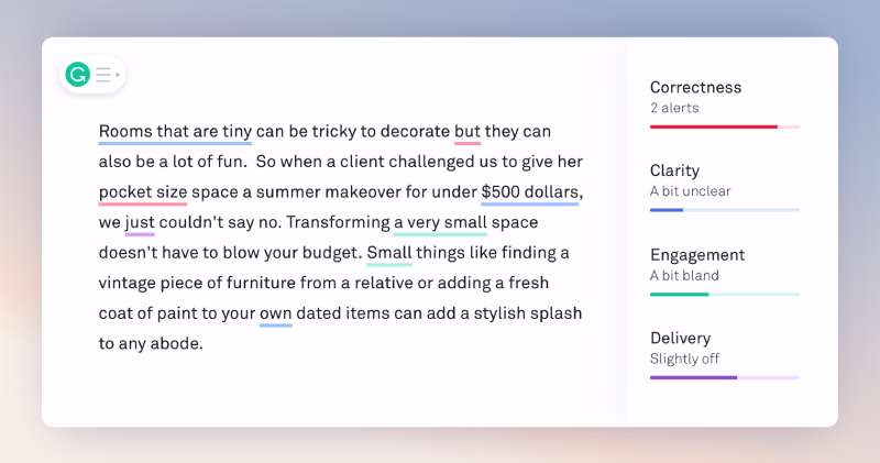
For its editor interface and UI, Grammarly relies on Inter, a screen-optimized humanist sans-serif created by Rasmus Andersson. The logo wordmark currently uses a custom geometric sans-serif introduced in the 2024 rebrand, with letterforms close to URW Geometric or DIN Neuzeitreg Grotesk.
What Type of Font Is Proxima Nova?
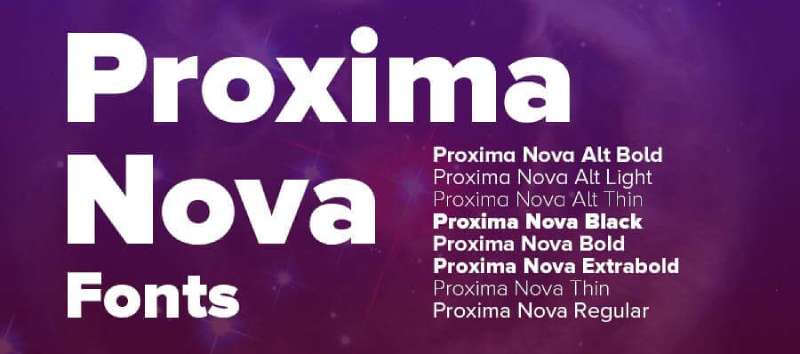
Proxima Nova is a geometric grotesque sans-serif. It bridges two typographic traditions: the strict geometry of Futura and the neutral, workhorse proportions of Akzidenz Grotesk.
Key visual traits:
- Low crossbars on “A,” “R,” and “P” give it a slightly stocky, grounded feel
- Large x-height improves legibility at small sizes on screen
- 7 weights (Thin through Black), each with matching italics
- Condensed and extra-condensed widths available
That large x-height is probably why Grammarly latched onto it. The tool is designed for long writing sessions, and small, cramped type would kill the experience fast.
What Type of Font Is Inter?
Inter is a humanist sans-serif built specifically for digital screens. Rasmus Andersson released it as open-source in 2017, and it has since become one of the most widely used UI fonts on the web.
Why it works for Grammarly’s editor:
- Optimized letter spacing for on-screen reading at small sizes
- Available as a variable font, giving precise control over weight
- Neutral enough that it never competes with the actual text being edited
That last point matters more than most people realize. When you’re reading grammar suggestions, the font carrying those suggestions needs to disappear. Inter does that well.
Who Designed These Fonts?
Proxima Nova was designed by American type designer Mark Simonson. The project started in the 1980s under the name Proxima Sans, with the first release in 1994. The full Proxima Nova family, the version Grammarly uses, was released in 2005.
By 2010 it had become the most widely used commercial font on the internet. Simonson licensed it through Adobe Fonts, where it remains available today.
Inter was designed by Rasmus Andersson, a Swedish designer and software engineer. He built it for his own use in UI work at Figma and released it publicly in 2017 under the SIL Open Font License. Neither font was created specifically for Grammarly. Both are commercially licensed or open-source typefaces that Grammarly adopted for their existing qualities.
Is Proxima Nova Free to Use?
No. Proxima Nova is a commercial font licensed through Adobe Fonts. It is not available for free download.
| License Type | Source | Cost (2026 Est.) | Strategic Value |
| Desktop License | Mark Simonson Studio | Paid (Perpetual) | Essential for permanent brand assets and offline use. |
| Adobe Fonts | Adobe Creative Cloud | Included | Best for rapid prototyping and high-volume web traffic. |
| Web Font | Adobe Fonts | Included | Simplest integration for personal or medium-scale sites. |
If you have an active Adobe Creative Cloud subscription, Proxima Nova is accessible without a separate purchase. Outside of that, a full-family license runs into the hundreds of dollars.
Inter is completely free. It is distributed under the SIL Open Font License and is available on Google Fonts for both personal and commercial use.
What Font Did Grammarly Use Before?
Grammarly has changed its logo font three times since launching in 2009.
| Year | Font Used | Notes |
| 2009 | Myriad SemiBold | Title case, gradient gray lettering |
| 2015 | Gotham Rounded Bold | Lowercase switch, solid green icon added |
| 2024 | Custom geometric sans-serif | Angular letterforms, dark green pin icon |
The 2015 move to Gotham Rounded Bold was a significant step toward the softer, more accessible image Grammarly wanted. Gotham Rounded is a variant of Gotham, the geometric sans-serif designed by Tobias Frere-Jones at Hoefler & Co., introduced via a commission for Print magazine in 2007.
The 2024 rebrand dropped the rounded feel entirely. The new wordmark uses sharper, more angular cuts, a direct stylistic contrast to the earlier soft letterforms. Some designers called it a step backward, and honestly, that criticism has some weight.
What Are the Best Free Alternatives to Proxima Nova?
Since Proxima Nova is a paid font, most people want a free substitute. Here are 5 solid options:
| Font | What Makes It Similar | License | Source |
| Montserrat | Geometric structure, low crossbars, wide weight range | Free | Google Fonts |
| Nunito Sans | Similar proportions, screen-optimized, friendly tone | Free | Google Fonts |
| Inter | Humanist grotesque, excellent UI legibility | Free (OFL) | Google Fonts |
| Metropolis | Closest visual match, nearly identical letterforms | Free | GitHub |
| Raleway | Geometric sans, works well with OpenType alternates enabled | Free | Google Fonts |
Inter font pairing is worth exploring if you want to replicate Grammarly’s editor feel specifically. For the marketing side of things, Montserrat font pairing gets you closer to the Proxima Nova aesthetic without any licensing costs.
Metropolis is the least-known option on this list but arguably the most accurate match. It was designed explicitly as a Proxima Nova alternative and shares nearly identical proportions. The catch: it is only available on GitHub, not Google Fonts.
How to Use These Fonts in Your Projects
On the Web
To load Inter via Google Fonts, add this to your HTML:
“ <link href="https://fonts.googleapis.com/css2?family=Inter:wght@400;600;700&display=swap" rel="stylesheet"> `
Then in your CSS:
` body { font-family: 'Inter', sans-serif; } `
For Montserrat as a Proxima Nova replacement, swap the family name in both lines. Both load fast and render cleanly across Chrome, Safari, and Firefox.
In Figma or Canva
Inter is pre-installed in Figma. Montserrat and Nunito Sans are both available through the Canva font library at no extra cost.
If you hold an Adobe Creative Cloud subscription, Proxima Nova itself is accessible directly inside Photoshop. Check out how to add fonts to Photoshop if you haven’t set that up yet. Same applies to Adobe Illustrator.
Why Did Grammarly Choose These Fonts?
Proxima Nova sits in a very specific spot in the type world. It reads as modern and clean without feeling cold. That matters for a writing assistant, where the product needs to feel helpful and approachable rather than clinical.
It is also one of the most recognizable commercial fonts in SaaS design. Brands like Spotify, BuzzFeed, and Airbnb used it through much of the 2010s. For Grammarly, adopting it signaled that the product was playing in the same league.
Inter for the editor is a more practical choice. It was designed from the ground up for screens, with specific attention to letter spacing and rendering at small sizes. When you’re reading grammar suggestions inside the Grammarly editor, Inter keeps the text clear without drawing attention to itself.
The typography across Grammarly’s interface reflects a straightforward decision: use the best available tool for each job. Proxima Nova for brand-level communication, Inter for product-level legibility. The visual hierarchy holds because the two fonts serve different roles and never directly compete.
The 2024 logo shift toward a sharper geometric sans signals something else. Grammarly is no longer just a grammar checker. It is positioning itself as an AI communication platform, and the harder angles reflect that shift in identity. Whether the new wordmark succeeds at that is a different question. But the intent is clear.
If you’re curious how other productivity tools handle typography, it’s worth checking the Notion font and Zoom font choices for comparison. Both take different approaches to the same challenge of reading comfort in long-session software.
FAQ on What Font Does Grammarly Use
What is the main font Grammarly uses?
Grammarly uses Proxima Nova for its brand and marketing materials. The editor interface runs on Inter. Both are geometric sans-serif typefaces chosen for screen readability and a clean, professional appearance.
Does Grammarly use a custom font?
No. Grammarly does not use a proprietary typeface. Proxima Nova is a commercial font licensed through Adobe Fonts, and Inter is open-source. The 2024 logo wordmark uses a custom geometric sans-serif, but that applies only to the logotype.
What font does the Grammarly editor use?
Inter is the primary UI font inside the Grammarly editor. Rasmus Andersson designed it specifically for digital interfaces. It renders clearly at small sizes, which makes it well suited for reading grammar suggestions on screen.
What font does the Grammarly logo use?
Since the 2024 rebrand, the Grammarly wordmark uses a custom geometric sans-serif with angular letterforms. Before that, the logo used Gotham Rounded Bold from 2015, and Myriad SemiBold from the original 2009 launch.
Is the Grammarly font free to download?
Inter is free under the SIL Open Font License and available on Google Fonts. Proxima Nova is not free. It requires an Adobe Creative Cloud subscription or a separate purchase from Mark Simonson Studio.
What font is similar to the one Grammarly uses?
Montserrat and Nunito Sans are the closest free alternatives to Proxima Nova on Google Fonts. For replicating the Grammarly editor specifically, Inter is the direct match since Grammarly actually uses it in the UI.
Why does Grammarly use a sans-serif font?
Sans-serif typefaces render more cleanly on screens than serif fonts at small sizes. For a writing tool used in long sessions, that legibility difference matters. Proxima Nova and Inter both have large x-heights, which helps further.
What font does Grammarly use on its website?
Grammarly’s website uses Proxima Nova for headings and marketing copy. The font family includes multiple weights, from light to black, giving the design team flexibility across different page elements and screen sizes.
Has Grammarly always used the same font?
No. The font has changed alongside each major rebrand. Myriad SemiBold came first in 2009, then Gotham Rounded Bold in 2015, and a custom geometric sans-serif in 2024. The UI font Inter is a more recent choice tied to modern interface design standards.
What font pairing does Grammarly use?
Grammarly pairs Proxima Nova for brand-level communication with Inter for product UI. This is a common approach in SaaS design. The two fonts share a similar grotesque structure, so they work together without visual conflict across typographic hierarchy levels.
Conclusion
If you came here asking what font does Grammarly use, the short answer is Proxima Nova for branding and Inter for the editor UI.
Neither was commissioned specifically for Grammarly. Both were adopted because they solve real problems: screen legibility, weight flexibility, and a neutral tone that keeps focus on the writing.
The Grammarly font family has shifted three times since 2009, and the 2024 rebrand signals another deliberate move in brand identity. The font psychology behind each choice reflects where the company positioned itself at that moment.
For anyone looking to replicate the look, Montserrat and Inter are both free, both available on Google Fonts, and both closer to Grammarly’s UI typography than most people expect.
Renowned for his expertise in logo design and visual branding, Bogdan has developed a multitude of logos for various clients.
His skills extend to creating posters, vector illustrations, business cards, and brochures. Additionally, Bogdan's UI kits were featured on marketplaces like Visual Hierarchy and UI8.
He also wrote in the past years on sites like Design Your Way, WebDesignerDepot, WPDean, Designmodo, Speckyboy, Slider Revolution, and more.
- The Airtable Logo History, Colors, Font, And Meaning - 12 July 2026
- How to Blur Background in Canva: A Quick Tutorial - 11 July 2026
- Typography Trends - 10 July 2026
Bogdan Sandu is a seasoned designer who has been designing websites since 2008. Renowned for his expertise in logo design and visual branding, Bogdan has developed a multitude of logos for various clients. His skills extend to creating posters, vector illustrations, business cards, and brochures. Additionally, Bogdan's UI kits were featured on marketplaces like Visual Hierarchy and UI8. He also wrote in the past years on sites like Design Your Way, WebDesignerDepot, WPDean, Designmodo, Speckyboy, Slider Revolution, and more.
You Might Also Like