Quora uses Tiempos Text as its primary body font, a transitional serif typeface designed by Kris Sowersby and published by Klim Type Foundry. The platform adopted Tiempos Text for its UI around 2016, first on mobile, then rolling it out across the desktop site as well. In Quora’s CSS, it appears obfuscated as Q-Serif.
For its interface elements and supplementary text, Quora pairs Tiempos Text with Neutral, a sans-serif typeface referenced in the CSS as Q-Sans. The desktop site previously relied on Helvetica and Arial before the broader typography update.
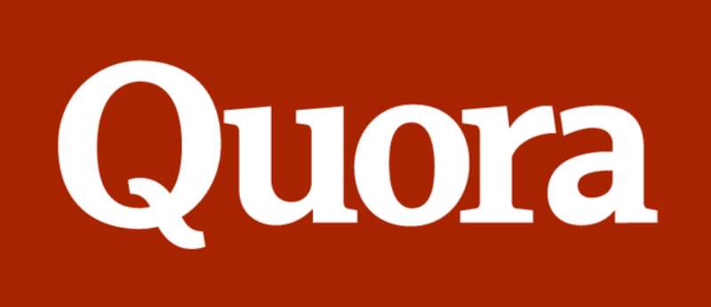
The Quora logo is a separate story. It started as a heavily modified version of Le Monde Courrier Bold, then got redrawn entirely in 2015 by Commercial Type into a custom Baskerville-based wordmark.
—
What Type of Font Is Tiempos Text?
Tiempos Text is a transitional serif typeface. It draws from the proportions and structure of classic print faces like Plantin and Times New Roman, but updates them for contemporary digital use.
The design prioritizes legibility at small sizes. It has a generous x-height, moderate stroke contrast, and slightly bracketed serifs that hold up well on screen without feeling heavy.
It comes in 9 weights, from Light (300) to Black (900), each with matching italics. That range gives Quora enough flexibility to build a full typographic hierarchy without needing a second serif family.
What makes it work for a Q&A platform specifically: it’s comfortable for long-form reading. You can scroll through a 2,000-word answer and the text doesn’t tire your eyes. That’s not an accident in a serif font designed with editorial use in mind.
—
Who Designed Tiempos Text?
Kris Sowersby designed Tiempos Text and released it in 2010 through his New Zealand-based Klim Type Foundry. Sowersby is one of the more respected type designers working today, and Tiempos is probably his most widely used family.
The Tiempos collection grew over time. Tiempos Fine was added in August 2018, co-designed with Noe Blanco. The full collection now includes Tiempos Text (optimized for body copy), Tiempos Headline (for larger display sizes), and Tiempos Fine (the most refined, high-contrast cut).
It was never a custom or exclusive commission for Quora. It’s a commercial retail typeface that Quora licensed from Klim. Other publications and editorial sites use it too.
—
What About Quora’s Logo Font?
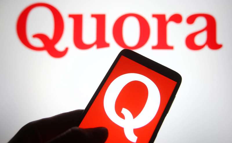
The Quora logo has gone through 2 distinct versions, both serif-based.
2010 version: Cuban Council designed the original wordmark in collaboration with Quora’s in-house team. They based it on Le Monde Courrier Bold, a slab serif published by Typofonderie and designed by Jean François Porchez. The modifications were substantial: the Q was widened, letter-spacing was tightened, the ‘a’ counter was closed, soft corners were sharpened, and a custom tail was added to the Q.
2015 version: Commercial Type redrew the wordmark from scratch. Designer Christian Schwartz and Miguel Reyes developed concepts around Century Schoolbook, Baskerville, and Caslon. The final version is Baskerville-based, with a broken loop on the Q that deliberately references the earlier logo while visually cleaning it up. The result is a custom proprietary mark, not available for licensing.
| Version | Year | Base Typeface | Status | Strategic Note |
| Original Logo | 2010 | Le Monde Courrier | Commercial | Used for the word “Instagram” on the very first camera icon. |
| Script Logo | 2013 | Billabong (Customized) | Commercial | The iconic “cursive” look that defined the app’s rise. |
| Redesigned Logo | 2015 | Baskerville (Modified) | Custom | A refined, high-contrast serif used for the wordmark. |
| Global Brand | 2022 | Instagram Sans | Proprietary | A custom family based on the “squircle” geometry. |
—
Is Tiempos Text Free to Use?
No. Tiempos Text is a commercial typeface, licensed exclusively through Klim Type Foundry at klim.co.nz.
Klim offers test fonts for free download, which is useful for prototyping. But production use, including web embedding, app use, or desktop installation for commercial work, requires a paid license.
Licensing is priced by use case:
- Desktop: Based on number of users
- Web: Based on monthly page views
- App: Based on monthly active users or downloads
- Broadcasting / Advertising: Separate license tiers
Klim uses a one-time fee model with no recurring costs, though you’re expected to upgrade if usage grows. There’s no open-source or Google Fonts version. If you want to know more about how font licensing works in general, the rules around web embedding and commercial use can get surprisingly nuanced.
—
What Are the Best Free Alternatives to Tiempos Text?
Tiempos Text is a premium font. If you’re building something that needs a similar feel without the licensing cost, here are 4 solid options.
| Font | Similarity | License | Source |
| Merriweather | Designed for screen readability, high x-height, similar weight range | Free (OFL) | Google Fonts |
| Source Serif 4 | Transitional serif, editorial feel, multiple weights | Free (OFL) | Google Fonts |
| Libre Baskerville | Baskerville-based, clear at body sizes, good contrast | Free (OFL) | Google Fonts |
| Lora | Contemporary serif with moderate stroke contrast, comfortable for long reads | Free (OFL) | Google Fonts |
Of these, Merriweather is probably the closest match for a content-heavy platform. It was literally designed to be read on screens. Source Serif 4 is the more refined option if you want something that feels closer to editorial print typography.
—
How to Use a Tiempos Text Alternative on Your Website
If you’re going with Merriweather or another Google Fonts option, setup takes about 2 minutes.
Via Google Fonts embed (HTML):
“ <link href="https://fonts.googleapis.com/css2?family=Merriweather:wght@300;400;700;900&display=swap" rel="stylesheet"> `
Via CSS @import:
` @import url('https://fonts.googleapis.com/css2?family=Merriweather:wght@300;400;700;900&display=swap'); `
Then apply it in your stylesheet:
` body { font-family: 'Merriweather', Georgia, serif; font-size: 16px; line-height: 1.75; } `
That line-height of 1.75 is worth keeping. Quora runs generous leading on its body text, which is part of what makes long answers actually readable. A lot of developers set 1.5 and stop there. For a reading-heavy interface, 1.6 to 1.8 is usually better.
If you’re working in Figma and want to experiment with font pairings before committing, check out a font pairing generator to see how your body serif works next to a complementary sans-serif for UI elements.
—
Why Did Quora Choose Tiempos Text?
Quora’s core product is reading. People come to read answers, sometimes very long ones written by people with real expertise. The font has to carry that weight without getting in the way.
Transitional serifs like Tiempos Text were designed for exactly this use case. They originate from print editorial traditions where type had to be legible at small sizes across large volumes of text. Moving that logic to a screen makes sense.
The 2015 redesign made Quora’s intent explicit. Their design lead at the time stated the goal was “great readability, typography, and visual design.” Switching the interface from system fonts like Helvetica and Arial to a purpose-built editorial serif was a clear commitment to content-first font selection.
There’s also a subtle trust signal in choosing a serif for a knowledge platform. Font psychology research consistently shows serifs are associated with authority, tradition, and expertise. That’s useful when your platform’s value proposition is access to credible, in-depth answers.
Compare that to platforms like Reddit (which uses a sans-serif font) or Twitter, which prioritize quick scanning over sustained reading. Different use cases, different typographic logic. Quora’s serif choice reflects what it wants users to do: sit down and actually read.
—
Similar Platforms and Their Font Choices
It’s worth knowing how Quora’s typography stacks up against other content platforms, because the differences are intentional.
- Reddit: Uses IBM Plex Sans, a geometric sans-serif. Built for quick browsing, not sustained reading.
- Medium: Uses Charter (serif) for body text, which is a close cousin to the editorial serif strategy Quora follows.
- Notion: Defaults to a system font stack with UI-first priorities, more tool than reading platform.
- Twitter/X: Uses a custom sans-serif called Chirp, optimized for short-form content and fast scanning.
Medium and Quora are the two major reading platforms that both landed on transitional serifs for body text. That’s not a coincidence. When your primary content type is long-form prose written by humans, a well-spaced serif with a solid x-height is genuinely the right call.
Curious about other platform fonts? You might also want to check the Grammarly font, the Evernote font, or the Dropbox font to see how productivity and writing tools approach typography differently.
FAQ on the What Font Does Quora Use
What font does Quora use for body text?
Quora uses Tiempos Text, a transitional serif designed by Kris Sowersby at Klim Type Foundry.
It appears in Quora’s CSS as Q-Serif. The platform adopted it around 2016 for its clean screen readability and editorial feel.
What font does Quora use for its logo?
The current Quora logo is a custom Baskerville-based wordmark redrawn in 2015 by Commercial Type.
The original 2010 logo was built on Le Monde Courrier Bold by Cuban Council, with heavy modifications to the letterforms.
Is the Quora font free to download?
No. Tiempos Text is a commercial typeface sold exclusively through Klim Type Foundry. There is no free version on Google Fonts or Adobe Fonts.
Klim offers test fonts at no cost, but those are for personal prototyping only, not production use.
What sans-serif font does Quora use?
Quora pairs Tiempos Text with Neutral, a sans-serif referenced in its CSS as Q-Sans.
Before the typography overhaul, the desktop site defaulted to Helvetica and Arial as its primary web safe fonts.
Why does Quora use a serif font instead of a sans-serif?
Quora is a long-form reading platform. Transitional serifs like Tiempos Text handle sustained reading better than most sans-serif fonts at body sizes.
There’s also a trust dimension. Serifs carry associations with authority and expertise, which fits a knowledge platform well.
What is the Quora font size for body text?
Quora renders body text at approximately 15–16px with a line height around 1.7 to 1.8.
That generous leading is intentional. It reduces eye strain across long answers and keeps the reading experience comfortable on both desktop and mobile.
How do I identify the font Quora uses on my browser?
Open Chrome DevTools, inspect any text element, and check the Computed styles panel under font-family.
You’ll see Q-Serif listed, which is Quora’s internal alias for Tiempos Text. Browser extensions like WhatFont also work for quick identification without touching DevTools.
What are good free alternatives to the Quora font?
Merriweather is the closest free match. Source Serif 4 and Libre Baskerville are also strong options, all available on Google Fonts under the Open Font License.
For something with a bit more personality, Lora works well for content-heavy sites with a similar editorial tone.
Does Quora use the same font on mobile and desktop?
Yes, now it does. Tiempos Text was rolled out on mobile first, around 2016. The desktop site caught up shortly after.
Both surfaces now use the same Q-Serif / Q-Sans pairing, giving the platform consistent Quora brand identity across devices.
Who designed the typeface Quora uses?
Kris Sowersby designed Tiempos Text and released it in 2010 through Klim Type Foundry, based in New Zealand.
The font was influenced by Plantin and Times New Roman, updated for contemporary digital typography use. It’s also used by several other editorial and publishing platforms.
Conclusion
So, what font does Quora use? Tiempos Text for body copy, Neutral for UI elements, and a custom Baskerville-based wordmark for its logo.
None of these choices were accidental. A platform built around long-form reading needs a typeface that holds up across thousands of words, and Tiempos Text does exactly that.
If you’re building something similar, Merriweather or Libre Baskerville gets you close without the licensing cost. Pair either with a clean grotesque for UI text and you’ve got a solid web typography system.

Renowned for his expertise in logo design and visual branding, Bogdan has developed a multitude of logos for various clients.
His skills extend to creating posters, vector illustrations, business cards, and brochures. Additionally, Bogdan's UI kits were featured on marketplaces like Visual Hierarchy and UI8.
He also wrote in the past years on sites like Design Your Way, WebDesignerDepot, WPDean, Designmodo, Speckyboy, Slider Revolution, and more.
- The Windsurf Logo History, Colors, Font, And Meaning - 10 October 2026
- How to Remove Background From Product Photos (No Photoshop) - 10 October 2026
- How Designers can Build a Stronger Online Creative Identity - 9 October 2026

Bogdan Sandu is a seasoned designer who has been designing websites since 2008. Renowned for his expertise in logo design and visual branding, Bogdan has developed a multitude of logos for various clients. His skills extend to creating posters, vector illustrations, business cards, and brochures. Additionally, Bogdan's UI kits were featured on marketplaces like Visual Hierarchy and UI8. He also wrote in the past years on sites like Design Your Way, WebDesignerDepot, WPDean, Designmodo, Speckyboy, Slider Revolution, and more.
You Might Also Like