Asana uses Proxima Nova as its primary UI and product font, a geometric sans-serif font designed by Mark Simonson of Mark Simonson Studio.
Asana confirmed this directly via its official Twitter/X account. The logo wordmark uses a separate custom typeface developed collaboratively by Moving Brands and Asana’s internal design team during the 2015 rebrand.
Asana’s marketing website currently uses a different pairing: Ghost by Sharp Type for headlines and TWK Lausanne by Weltkern for body text.
What Type of Font Is Proxima Nova?
Proxima Nova is a geometric sans-serif typeface. It sits between two distinct typographic traditions: the strict geometry of Futura and the proportional realism of Akzidenz Grotesk.
That balance is what makes it work so well across both display and body sizes. It doesn’t feel cold like a pure geometric font, and it doesn’t feel as dated as a traditional grotesque.
Key typographic characteristics:
- Large x-height for strong legibility at small sizes
- Near-monolinear strokes with subtle optical corrections
- Two-story lowercase “a” in most weights
- Available in 8 weights (Thin through Black), 5 widths, plus matching italics
The font’s typographic clarity is a big reason why SaaS companies reach for it. It reads cleanly at 12px in a task list and still looks sharp at 48px in a dashboard header.
Who Designed Proxima Nova?
Mark Simonson designed Proxima Nova, publishing it through his studio, Mark Simonson Studio, in 2005.
The font’s origins go back further. Simonson first sketched what would become Proxima Nova under the name “Zanzibar” in 1981, then released an early version called Proxima Sans in 1994 through FontHaus, with just 6 styles.
The 2005 revision expanded the family significantly. Today the full Proxima Nova family includes 80 font files across multiple widths, weights, and scripts, including Arabic, Thai, Devanagari, and Cyrillic.
Proxima Nova is not a custom font created for Asana. It is a commercial typeface that Asana licensed, just like hundreds of thousands of other companies and websites worldwide.
The logo wordmark is a different story. That custom typeface was built specifically for Asana through a collaboration with Moving Brands during the 2015 identity overhaul. It is not publicly available.
Is Proxima Nova Free to Use?
No. Proxima Nova is a paid, commercial font. It is not available on Google Fonts or any free font platform.
There are 3 main ways to access it legally:
- Adobe Fonts – included with any Adobe Creative Cloud subscription; covers desktop sync and web use via embed code (not self-hosting)
- Mark Simonson Studio directly – desktop licenses start at $35.99 per style; web licenses are priced by monthly page views
- Fontspring – offers demo fonts for testing only; a full license is required for any commercial project
One thing worth knowing: if you access Proxima Nova through Adobe Fonts and then self-host the files on your server, that violates both Adobe’s terms and Mark Simonson Studio’s licensing agreement. The studio actively tracks this.
For web use, the safest and most affordable route is an active Adobe Creative Cloud subscription with the font loaded via Adobe’s embed code.
What Font Did Asana Use Before?
Before the 2015 rebrand, Asana’s product used a single-font system with limited typographic hierarchy.
Asana’s own design team described this as a problem: building clear information hierarchy with just one font was difficult, and the interface felt cluttered and drab. The “rainy day theme” (their words) of blue and grey wasn’t doing the product any favors.
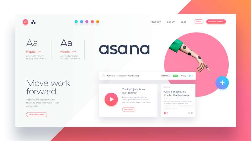
The rebrand process involved Moving Brands, an independent design studio. They developed a full typography and color system alongside Asana’s internal team.
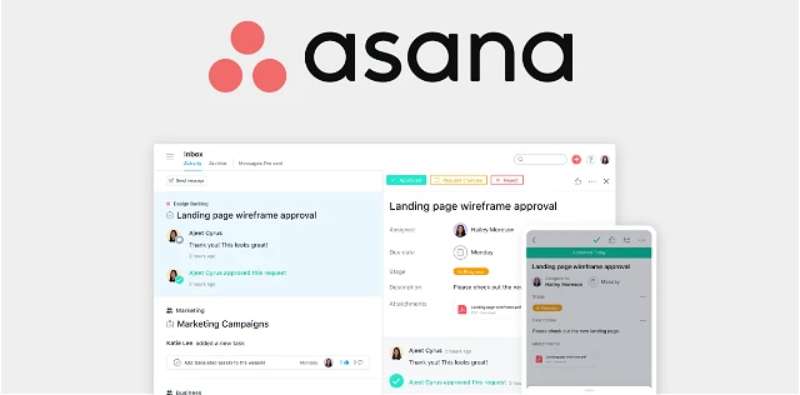
The result was a multi-weight Proxima Nova implementation across the product UI, giving the design team control over typographic hierarchy for the first time. The website has since evolved to use Ghost and TWK Lausanne, while the app UI has retained Proxima Nova as its core font.
What Are the Best Free Alternatives to Proxima Nova?
If you’re trying to match Asana’s UI feel without paying for Proxima Nova, these are the closest free options:
| Font | Similarity | License | Source |
| Montserrat | Geometric warmth, large x-height, similar weight range | OFL (free) | Google Fonts |
| Nunito Sans | Clean terminals, friendly proportions, works well in UI | OFL (free) | Google Fonts |
| Manrope | Closest in UI/screen contexts; restrained, highly legible | OFL (free) | Google Fonts |
| Lato | Similar proportions and neutrality; great for body text | OFL (free) | Google Fonts |
Montserrat is probably the most popular substitute and the one most designers reach for first. But honestly, if your use case is a product UI, Manrope is the better call. It was built with screens in mind, and it shows.
You can also try a font pairing generator to find complementary typefaces once you’ve locked in your primary pick. If you want to go deeper, check out the full list of fonts similar to Proxima Nova for more options across different use cases.
How to Use Proxima Nova (or an Alternative) in Your Project
In Figma or Adobe XD
If you have an active Adobe Creative Cloud subscription, Proxima Nova syncs directly to your desktop and appears in Figma’s font picker automatically.
For a free alternative, add Montserrat or Manrope from Google Fonts. In Figma, go to the text tool, type the font name, and it will pull from Google Fonts automatically.
On a Website (CSS)
For Proxima Nova via Adobe Fonts: Use the Adobe Fonts embed code in your <head> tag. Never self-host the files.
For Montserrat via Google Fonts:
“ <link href="https://fonts.googleapis.com/css2?family=Montserrat:wght@400;500;600;700&display=swap" rel="stylesheet"> `
Then in your CSS:
` body { font-family: 'Montserrat', sans-serif; } `
If you’re working in Photoshop, the process is similar: sync Proxima Nova through Adobe Fonts and it shows up directly in the character panel. Need to add fonts to Photoshop from another source? That guide covers third-party fonts too.
Why Did Asana Choose Proxima Nova?
The 2015 rebrand had a clear brief: the product needed to feel less cluttered and more energetic, without becoming chaotic.
Proxima Nova solved a specific problem. The previous single-font system made it hard to build readable hierarchy across task lists, headers, and sidebar labels. Proxima Nova’s wide weight range (eight weights, three widths) gave Asana’s design team the flexibility to create that hierarchy without switching between different typefaces.
The geometric-grotesque character of Proxima Nova also aligns with what Asana wanted to project. It’s clean and structured without feeling clinical. It has enough warmth to feel approachable, which matters in a productivity tool that people use for hours every day.
There’s also a practical side. By the mid-2010s, Proxima Nova had become the most widely used commercial font on the web. The infrastructure for loading it reliably across browsers was mature, it rendered well at small sizes on Retina displays, and the licensing was straightforward through Adobe Fonts.
The font choices across similar SaaS platforms tell a similar story. Compare Asana’s approach to the Notion font system, the Salesforce font, or the Trello font choices. Most productivity platforms land on geometric sans-serifs for exactly the same reasons: legibility, weight flexibility, and a professional-but-approachable tone.
The psychology behind font choices like Proxima Nova isn’t accidental. Geometric sans-serifs consistently score higher in readability studies for digital interfaces, and they tend to communicate efficiency and clarity rather than creativity or playfulness. That maps directly to what a task management tool needs to signal.
Asana’s website typography has since moved in a slightly different direction, pairing Ghost (a serif) with TWK Lausanne (a refined grotesque). But the app itself still runs on Proxima Nova, which tells you something: when you need a typeface that actually works at 13px in a task row, you don’t change it.
FAQ on What Font Does Asana Use
What font does Asana use in its app?
Asana uses Proxima Nova as its primary UI font.
It’s a geometric sans-serif font designed by Mark Simonson, confirmed directly by Asana’s official account. The font runs across task lists, headers, and interface labels throughout the product.
What font does Asana use on its website?
Asana’s marketing site uses a different pairing from the app.
Ghost by Sharp Type handles headlines, and TWK Lausanne by Weltkern covers body text. This is a more editorial combination compared to the UI-focused Proxima Nova used inside the product itself.
What font is used in the Asana logo?
The Asana logo wordmark uses a custom typeface built specifically for the brand.
It was developed collaboratively by Moving Brands and Asana’s internal design team during the 2015 rebrand. It is not publicly available and cannot be downloaded or licensed separately.
Is the Asana font free to download?
No. Proxima Nova is a commercial font and is not free.
It’s available through Adobe Fonts with an active Creative Cloud subscription, or via direct license from Mark Simonson Studio. There is no free version on Google Fonts or any open-source platform.
Who designed Proxima Nova?
Mark Simonson designed Proxima Nova and published it through Mark Simonson Studio in 2005.
The design traces back to a 1981 sketch. It was first released commercially as Proxima Sans in 1994, then fully revised and expanded into the Proxima Nova family a decade later.
What are the best free alternatives to the Asana font?
The closest free alternatives are Montserrat, Manrope, Nunito Sans, and Lato, all available on Google Fonts.
For UI work specifically, Manrope is the most practical substitute. You can also explore the best free Google Fonts or use a font combinations tool to build a full type system around your chosen alternative.
What type of font classification is Proxima Nova?
Proxima Nova is classified as a geometric grotesque sans-serif.
It blends the structured geometry of Futura with the humanist proportions of Akzidenz Grotesk. If you want to understand the broader classification system, this guide on grotesque fonts covers the category in detail.
How does Asana’s font compare to similar SaaS platforms?
Most productivity tools land on geometric sans-serifs for the same reasons Asana did: legibility, weight flexibility, and a clean interface feel.
The Notion font system, the Dropbox font, and the Zoom font all follow a similar design logic, prioritizing screen readability over stylistic personality.
Can I use Proxima Nova in Figma or Canva?
Yes, with the right access. In Figma, syncing Proxima Nova through Adobe Fonts makes it available automatically in the font picker.
For Canva, you would need to upload the font to Canva using a valid desktop license. Using it without a proper license is a terms violation.
Why did Asana choose Proxima Nova over other fonts?
Proxima Nova solved a real problem: the old single-font system made building clear visual hierarchy difficult.
Its wide weight range gave designers the control they needed across task rows, navigation labels, and headers, all without switching typefaces. The font psychology behind geometric sans-serifs also aligns with productivity software: structured, clear, and easy to scan.
Conclusion
If you’ve been wondering what font does Asana use, the answer is Proxima Nova for its product UI, Ghost for website headlines, and a custom wordmark typeface for the logo.
Each serves a distinct role in Asana’s design system. The font stack reflects real decisions around app typography, brand identity, and screen legibility.
Can’t access Proxima Nova? Montserrat and Manrope are solid free alternatives with comparable leading and tracking behavior at UI sizes.
The typeface selection behind a platform like Asana isn’t accidental. It’s a direct reflection of how the brand wants users to feel while working.
Renowned for his expertise in logo design and visual branding, Bogdan has developed a multitude of logos for various clients.
His skills extend to creating posters, vector illustrations, business cards, and brochures. Additionally, Bogdan's UI kits were featured on marketplaces like Visual Hierarchy and UI8.
He also wrote in the past years on sites like Design Your Way, WebDesignerDepot, WPDean, Designmodo, Speckyboy, Slider Revolution, and more.
- The Best Fonts for Real Estate Branding and Marketing - 15 July 2026
- Hosting in the USA: How to Choose Dedicated Servers for the North American Market - 15 July 2026
- NHL Team Color Codes - 14 July 2026
Bogdan Sandu is a seasoned designer who has been designing websites since 2008. Renowned for his expertise in logo design and visual branding, Bogdan has developed a multitude of logos for various clients. His skills extend to creating posters, vector illustrations, business cards, and brochures. Additionally, Bogdan's UI kits were featured on marketplaces like Visual Hierarchy and UI8. He also wrote in the past years on sites like Design Your Way, WebDesignerDepot, WPDean, Designmodo, Speckyboy, Slider Revolution, and more.
You Might Also Like