The Havaianas logo represents one of the most recognizable symbols in global footwear. This Brazilian flip-flop brand has built an identity that screams summer, simplicity, and casual living.
Founded in 1962 by Alpargatas S.A. in Sao Paulo, the company drew inspiration from Japanese Zori sandals. The logo has gone through several iterations since then. Maybe four or five major versions, depending on how you count them.
What makes this logo interesting is how it balances heritage with modern appeal. The current wordmark feels both nostalgic and fresh. That’s tricky to pull off.
The brand sits alongside other major shoe brand logos in terms of global recognition, though its approach differs completely from athletic footwear competitors.
What is the Havaianas Logo?
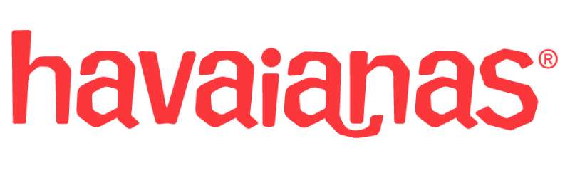
The Havaianas logo is a custom wordmark featuring stylized lowercase lettering with a distinctive wave-like flow. Introduced in its current form during the early 2000s brand refresh, this design represents Brazilian beach culture and the relaxed lifestyle associated with the product.
Design Type: Wordmark (logotype)
Primary Elements: Custom hand-drawn lettering with curved, flowing letterforms that suggest movement and fluidity
Official Introduction Date: Current version solidified around 2000-2003 during major brand repositioning
Designer/Agency: Developed internally by Alpargatas brand team with various agency collaborations over the years
Trademark Status: Registered trademark of Alpargatas S.A., protected internationally across multiple classes
Color Palette: Primary red (#E4002B), white, and various seasonal color applications
Usage Context: Product straps, sole imprints, retail displays, packaging design, digital platforms, and global marketing campaigns
How Has the Havaianas Logo Evolved Over Time?
The Havaianas logo has transformed from simple product labeling to a globally recognized fashion symbol.
Early versions focused purely on identification. Later iterations embraced lifestyle branding.
The evolution mirrors the brand’s journey from basic rubber sandals to premium fashion accessories.
Original Havaianas Logo (1962-1970s)
Years Active: 1962 to late 1970s
Design Description: Basic typographic treatment with straightforward lettering. Nothing fancy. The focus was on the product itself, particularly the signature rice grain sole pattern that prevented slipping.
Color Scheme: Simple blue and white combinations, occasionally green
Context: Brazil needed affordable, durable footwear. The logo served functional purposes rather than aspirational ones. Working-class Brazilians were the primary audience.
Cultural Significance: Represented accessible Brazilian manufacturing during a period of industrial growth
Transitional Havaianas Logo (1980s-1990s)
Years Active: Early 1980s through late 1990s
Design Description: Slightly refined letterforms with more consistent styling. The company started paying attention to how the name looked, not just what it said.
Color Scheme: Introduction of the Brazilian flag colors for special editions
Key Changes from Previous: Cleaner execution, more intentional typography choices
Context: Sales were declining. The brand was seen as cheap, not cool. Something had to change.
Modern Havaianas Logo (2000s-Present)
Years Active: 2000 to present
Design Description: The current wordmark features flowing, almost cursive-style lowercase letters. There’s a wave-like quality that runs through the entire word. Friendly. Approachable. Beach-ready.
Color Scheme: Signature red became dominant, with white as secondary. Seasonal collections play with the full spectrum.
Designer: Multiple agencies contributed during the repositioning effort
Key Changes from Previous: Complete transformation from utilitarian to lifestyle brand identity
Cultural Significance: Elevated flip-flops from basic footwear to fashion statement. Celebrities started wearing them. Oscar gift bags included them. Everything changed.
What Do the Design Elements of the Havaianas Logo Mean?
Every curve in the Havaianas wordmark suggests movement and relaxation.
The flowing letterforms mimic ocean waves and the easy Brazilian lifestyle.
Nothing about this logo feels rigid or corporate. That’s entirely intentional.
Why Did Havaianas Choose These Specific Colors?
Primary Red:
- Hex: #E4002B
- Symbolic meaning: Energy, passion, warmth
- Psychological impact: Creates excitement and draws attention at retail
- Brand connection: Stands out against beach environments and summer settings
The red logos approach works particularly well for brands targeting younger, energetic audiences.
White:
- Hex: #FFFFFF
- Symbolic meaning: Cleanliness, simplicity, freshness
- Psychological impact: Creates breathing room, suggests purity
- Brand connection: Evokes beach sand and summer clouds
Understanding color theory helps explain why this combination resonates so strongly with consumers seeking summer vibes.
What Typography Style Is Used in the Havaianas Logo?
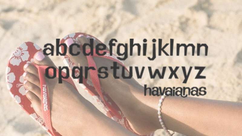
The typeface is custom-designed. You won’t find it in any font library.
It features rounded terminals and consistent stroke width throughout. The letters connect visually even though they don’t physically touch.
Readability stays high despite the decorative qualities. That balance took work to achieve.
The typography elements here prioritize friendliness over formality.
What Are the Hidden Meanings in the Havaianas Logo?
Look closely at the letterforms. They undulate like waves rolling onto shore.
The lowercase treatment removes hierarchy and formality. Everyone’s equal at the beach, right?
Some see the connected visual flow as representing the continuous Brazilian coastline. Others think that’s a stretch. I’m somewhere in the middle on that interpretation.
The designers intended casual warmth. They achieved it.
How Does the Havaianas Logo Compare to Competitor Logos?
Most footwear brands go bold and athletic. Havaianas went soft and approachable.
Compare it to the Adidas logo with its sharp geometric stripes. Completely different energy.
Or look at the Crocs logo, another casual footwear brand. Crocs uses a friendly crocodile mascot. Havaianas relies purely on wordmark appeal.
The Vans logo targets skateboard culture with its iconic stripe. The Converse logo leans into athletic heritage.
Havaianas carved out unique territory. Beach lifestyle. Pure and simple.
Brands like Teva compete in outdoor sandals but target adventure seekers rather than beach-goers.
What Are the Technical Specifications of the Havaianas Logo?
Official Color Codes:
Primary Red:
- Hex: #E4002B
- RGB: (228, 0, 43)
- CMYK: (0, 100, 81, 11)
- Pantone: 185 C
White:
Dimensions and Proportions:
- Aspect ratio: Approximately 5:1 (width to height)
- Minimum size: 25mm width for print applications
- Clear space: Minimum padding equal to the height of the letter “a” on all sides
- The logo works as vector graphics for infinite scaling without quality loss
What Cultural Impact Has the Havaianas Logo Had?
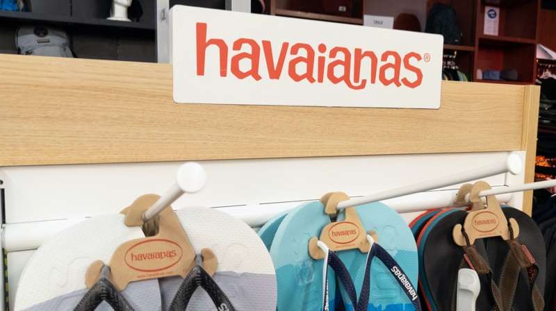
This logo helped transform flip-flops from cheap footwear into fashion accessories.
Before Havaianas repositioned itself, rubber sandals were what you wore when you couldn’t afford real shoes. At least in many markets.
The brand identity shift made it acceptable (even desirable) for celebrities to wear them on red carpets.
That’s a remarkable turnaround. The logo carried much of that perception change.
How Does the Havaianas Logo Fit Into the Overall Brand Identity?
The logo anchors everything Havaianas does. Product design. Brand style guides. Marketing materials. Store environments.
It connects to the rice grain sole pattern that’s been there since 1962. Both elements work together.
The brand guidelines ensure consistency across global markets while allowing regional adaptations.
Color collaborations extend the logo into seasonal collections. Limited editions partner with artists and other brands.
How Should the Havaianas Logo Be Used?
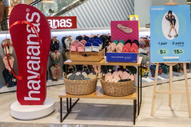
Official Usage Guidelines:
- Never stretch or distort the wordmark
- Maintain clear space requirements at all times
- Use only approved color combinations
- Don’t place the logo on busy backgrounds that reduce legibility
- Avoid rotating or tilting the logo
Where to Access Official Logos:
- Authorized retailers receive assets through official distributor channels
- Press materials available through Alpargatas media relations
- Licensed partners receive comprehensive brand toolkits
Trademark Protection:
- The Havaianas name and logo are registered trademarks
- Unauthorized use constitutes infringement
- The company actively pursues counterfeit products
- Spotting fakes often comes down to logo quality and placement details
FAQ on The Havaianas Logo
What Does the Havaianas Logo Look Like?
The Havaianas logo features a custom wordmark design with flowing lowercase letters.
The lettering has a wave-like quality that suggests movement. Red and white dominate the color palette.
The style feels relaxed and beach-ready. Exactly what you’d expect from Brazilian flip flops.
When Was the Havaianas Logo Created?
The original brand identity launched in 1962 when Alpargatas S.A. founded the company in Sao Paulo.
The current modern wordmark emerged around 2000 during a major repositioning effort.
That refresh transformed Havaianas from basic rubber footwear into a global fashion brand.
Who Designed the Havaianas Logo?
The Alpargatas internal brand team developed the logo with various agency collaborations.
No single designer gets credit. Multiple creative professionals contributed across different eras.
The current version resulted from strategic brand identity work during the early 2000s transformation.
What Colors Are Used in the Havaianas Logo?
Primary red (#E4002B) serves as the signature color. White provides contrast and clarity.
Understanding color psychology explains why this works. Red signals energy and passion.
Seasonal collections introduce additional colors. But red remains the core identifier.
How Can You Spot a Fake Havaianas Logo?
Authentic Havaianas sandals display crisp, clear logo printing on the strap.
Fakes often show blurry edges or incorrect font spacing. The letterforms look off.
Check the rice pattern on the sole too. Counterfeits rarely replicate the texture properly.
What Is the Meaning Behind the Havaianas Logo?
The flowing letters represent the relaxed Brazilian beach lifestyle.
Lowercase lettering removes formality. Everyone’s equal in thong sandals, right?
The wave-like curves suggest ocean movement. Summer footwear needs summer energy in its visual hierarchy.
Has the Havaianas Logo Changed Over Time?
Yes. The brand has gone through roughly four major logo iterations since 1962.
Early versions looked basic and functional. The modern wordmark embraces lifestyle branding.
Each evolution reflected changing market positioning. From working-class essential to fashion accessory.
Where Is the Logo Placed on Havaianas Sandals?
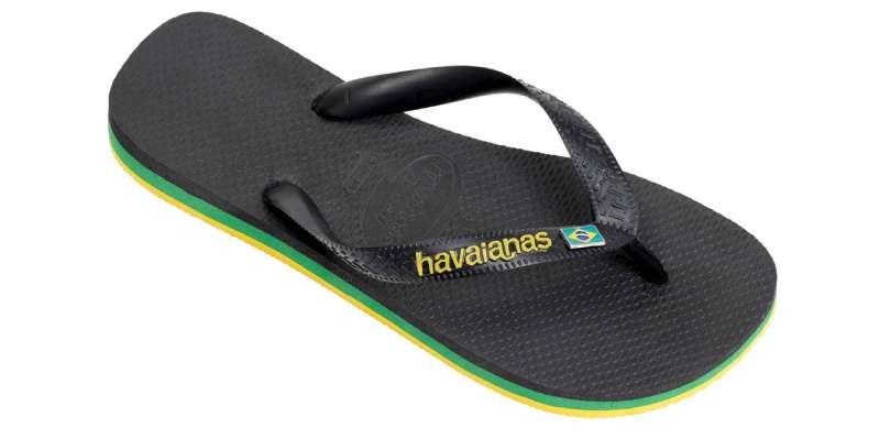
You’ll find the logo embossed on the rubber strap. That’s the primary focal point.
The Brazilian flag icon often appears on the strap too.
Some collections feature logo placement on the sole or footbed. Limited editions get creative.
Can I Use the Havaianas Logo for My Own Purposes?
No. The Havaianas logo is a registered trademark protected internationally.
Unauthorized use constitutes infringement. Alpargatas actively pursues counterfeiters.
Licensed partners receive official assets. Everyone else needs to request permission through proper channels.
Why Is the Havaianas Logo So Recognizable?
Consistency matters. The brand maintains strict logo design principles across all markets.
The distinctive flowing letterforms stand out among casual footwear competitors.
Decades of brand recognition building helped too. Celebrity endorsements and Oscar gift bags didn’t hurt.
Conclusion
The Havaianas logo tells a story of transformation. From humble Brazilian sandals to global fashion icon, this wordmark carried the brand’s evolution.
What started in 1962 as basic product labeling became a symbol of beach lifestyle and summer culture.
The flowing letterforms, signature red color scheme, and consistent visual identity built serious brand recognition over six decades.
Few footwear companies achieve this level of storytelling through design alone.
Alpargatas proved that even flip flops deserve thoughtful branding. The iconic brand identity now competes alongside premium fashion labels worldwide.

Renowned for his expertise in logo design and visual branding, Bogdan has developed a multitude of logos for various clients.
His skills extend to creating posters, vector illustrations, business cards, and brochures. Additionally, Bogdan's UI kits were featured on marketplaces like Visual Hierarchy and UI8.
He also wrote in the past years on sites like Design Your Way, WebDesignerDepot, WPDean, Designmodo, Speckyboy, Slider Revolution, and more.
- Jujutsu Kaisen Font Generator - 12 October 2026
- The Windsurf Logo History, Colors, Font, And Meaning - 10 October 2026
- How to Remove Background From Product Photos (No Photoshop) - 10 October 2026

Bogdan Sandu is a seasoned designer who has been designing websites since 2008. Renowned for his expertise in logo design and visual branding, Bogdan has developed a multitude of logos for various clients. His skills extend to creating posters, vector illustrations, business cards, and brochures. Additionally, Bogdan's UI kits were featured on marketplaces like Visual Hierarchy and UI8. He also wrote in the past years on sites like Design Your Way, WebDesignerDepot, WPDean, Designmodo, Speckyboy, Slider Revolution, and more.
You Might Also Like