


The Cole Haan Logo History, Colors, Font, and Meaning

Every touchpoint brands carve in the public eye holds power—the Cole Haan logo is more than a symbol. It’s a storyteller, a silent ambassador, a tether to craftsmanship prestige honed over decades in the footwear industry.
Walk into a room, and your eyes don’t just see a design; your mind perceives heritage, luxury, identity.
This article unfolds the narrative woven into the threads of that iconic emblem.
Exploring the logo’s evolution is a journey through a landscape rich with design finesse in an American lifestyle brand’s collective, a nod to visual identity design trickling down from high-end leather goods to a single, resonant image.
By the trail’s end, you’ll have unraveled the seams of Coleman Haan’s corporate identity strategy, appreciating the finesse behind the fashion, the weight carried by a designer label’s mark—far beyond aesthetics.
Get ready to unveil a designer shoe symbol that steps beyond its sole into the realm of emblematic storytelling.
The Meaning Behind the Cole Haan Logo
![]()
Dive deep, folks, because logos aren’t just fancy images, they’re stories. They’re identities. So let’s unwrap the essence, the spirit, the vibe of the Cole Haan logo.
Unearthing the Symbol
At a glance, it seems plain vanilla, right? Just the company’s name, no shiny graphics. Well, think again. Simplicity is the ultimate sophistication. That’s what Da Vinci said. And he knew a thing or two about design.
The logo’s simplicity is its strength. It embodies the brand’s minimalist aesthetic. A nod to timeless elegance, a wink to classic style.
Reading Between the Letters
There’s an artistic subtlety in play here. Notice the balance. The letters, the spacing, it’s all meticulously calibrated. This isn’t just about looking nice, it’s about communicating consistency, reliability, and harmony. A bit poetic, don’t you think?
The History of the Cole Haan Logo
Next stop, is the time machine. Hold tight as we wind the clock back and trace the evolution of the logo.
The Genesis
Born in the 1920s, Cole Haan was initially all about men’s footwear. And guess what? The logo was simply their name. No frills. No fuss. Just ‘Cole Haan’. Why? Because a brand’s reputation comes from quality, not gimmicks.
Through The Decades
The logo hasn’t seen drastic changes. And that speaks volumes about the brand. Their commitment to enduring quality, their belief in timeless design. It’s all etched in their unchanging logo.
The Colors of the Cole Haan Logo
Alright, color fanatics, this is your gig. We’re diving into the hues of the Cole Haan logo.
Black and White
Black text. White background. Simple? Yes. Effective? Absolutely! The contrast is bold, the impact immediate. Black, the color of sophistication and elegance. White, the color of purity and simplicity.
It’s a perfect combo for a brand that’s all about classic, timeless style.
The Font Used in the Cole Haan Logo
Typeface geeks, rejoice. It’s time to talk about the font.
Anatomy of the Typeface
The font used is clean, unfussy, and modern. It’s sans-serif. Meaning? No little feet, or ‘serifs’, at the end of the strokes. This gives the logo a contemporary, sleek look. Just like the brand’s products.
The Power of the Font
The font screams simplicity, sophistication, and clarity. It’s all about confidence and trustworthiness. It makes the logo, and by extension the brand, easily recognizable. Font is power, folks.
The Impact of the Cole Haan Logo

Let’s switch gears. Let’s talk impact. How does the Cole Haan logo influence us, the consumers?
Unspoken Communication
A logo is a brand’s visual handshake, a silent ambassador. The clean, minimalistic Cole Haan logo speaks to the brand’s upscale target audience. It communicates the promise of high quality, luxury, and timeless style without saying a word.
Brand Recognition
From New York to Tokyo, from Paris to Sydney, that elegant, uncluttered logo is instantly recognizable. It carries the Cole Haan brand identity across borders, transcending languages and cultures.
FAQ On The Cole Haan Logo
What’s the story behind the Cole Haan logo?
It encapsulates a legacy; hints of American heritage, timeless elegance. It’s not just a symbol but a beacon of high-end craftsmanship wrapped in contemporary design cues.
The logo reflects the brand’s ethos: a blend of tradition and modern innovation, in footwear and beyond.
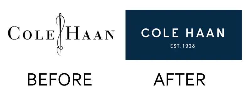
How has the Cole Haan logo evolved over time?
Like fine wine, it’s matured. What started as a mark has transformed, echoing the brand’s evolution. It’s a tale of subtle shifts aligning with the fashion and accessories market demands and symbolic refinements bringing forth luxury footwear branding to new generations.
Can I use the Cole Haan logo for my project?
Handle with care. It’s trademarked; a legal dynamite for unsanctioned use. Only with Cole Haan’s blessing, within their guidelines, can it be used. Else, you risk stirring a hornet’s nest, legally speaking. Always seek permission first, for any branded graphic design elements.
What does the Cole Haan logo represent?
It’s the brand’s heartbeat, stamped on every product. It whispers tales of designer shoe artistry, the pledge of luxury, and a promise of durably stylish lifestyle brand insignia. It stands as a proud flag, signaling brand recognition and a commitment to impeccable style.
Are there different versions of the Cole Haan logo?
Absolutely. It’s not a one-trick pony. You’ve got the full-word-script, its shorter emblem form. Use varies—some products flaunt the extended version; sometimes you’ll see the shorthand. Context is king, with each version tailored for visual identity design.
What color is the Cole Haan logo?
The core? A sophisticated black. It’s all about that sleek, versatile look, branding elements that mirror the visual identity design across all platforms. It pops on anything, be it shoes, bags, or ads, affirming the minimalist, luxe feel Cole Haan champions.
Is the Cole Haan logo an important part of their branding?
Let’s be real—it’s the crown jewels. Without it, the identity slumps. It’s steeped in brand equity, an element vital to marketing strategy. Striding hand-in-hand with every Cole Haan piece, it’s an unwavering icon of brand identity.
Has the Cole Haan logo received any redesigns?
Not drastic makeovers, but tweaks, sure. Keeping up with times yet holding onto the root values—that’s the game. Designer labels must adapt to stay fresh without straying from their branding elements. It’s a design dance of maintaining recognition and staying current.
What kind of imagery is included in the Cole Haan logo?
Stripped to its soul, it’s typographical. You won’t find swirly images or crazy icons. It’s Cole Haan‘s name, refined, straight-up. It’s about the power of the name itself, crafted to encapsulate luxury footwear branding in a wordmark that exudes class.
How do people perceive the Cole Haan logo in the market?
In the gladiator arena of consumer goods, it stands tall. It’s synonymous with style, a signature of affluence—a beacon for shoe connoisseurs. It’s got street cred, holds gravitas in brand recognition, and is cherished by those who hold high-end comfort and style dear.
Conclusion
Let’s circle back. Wrapping this up, we’ve dived into the depths of the Cole Haan logo—a creed etched in elegance and heart-pumping luxury. It’s not just a “look at me” symbol; it’s the DNA of a lifestyle brand, the sum of all parts: history, quality, trademark.
Over the climb — through every paragraph — our trek revealed that this isn’t your garden-variety icon. It’s a crafted representation, the North Star for brand recognition, a silent herald of an iconic American brand. A surge of pride for some, a silent nod to immaculate taste for others.
Beneath the logo’s simplicity lies a cosmos of values that Cole Haan stands unapologetically behind — craftsmanship, innovation, and an unyielding promise of high-end leather goods. It’s this rich narrative that stitches together a logo’s worth in the consumer goods tapestry.
Next time you spot that stamp, remember the saga it sings — elegance woven with intent. And that’s a wrap on the emblem saga of Cole Haan.
If you liked this article about the Cole Haan logo, you should check out this article about the TOMS logo.
There are also similar articles discussing the Steve Madden logo, the Clarks logo, the Havaianas logo, and the Keen logo.
And let’s not forget about articles on the Teva logo, the Merrell logo, the Rockport logo, and the Sperry logo.
Bogdan Sandu, a seasoned designer with 15 years of diverse experience, has been designing websites since 2008.
Renowned for his expertise in logo design and visual branding, Bogdan has developed a multitude of logos for various clients.
His skills extend to creating posters, vector illustrations, business cards, and brochures. Additionally, Bogdan's UI kits were featured on marketplaces like Visual Hierarchy and UI8.
Latest posts by Bogdan Sandu (see all)
- The Tecate Logo History, Colors, Font, And Meaning - 5 May 2024
- REM to PX Converter - 5 May 2024
- The Asahi Logo History, Colors, Font, And Meaning - 4 May 2024