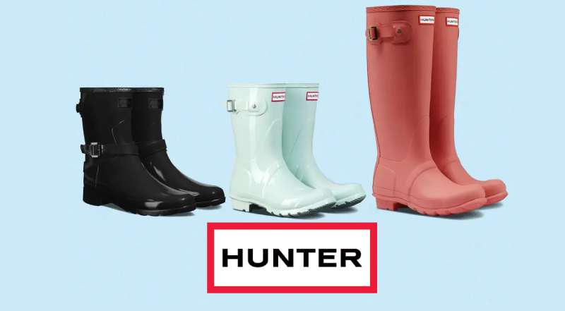
The Hunter logo represents one of Britain’s oldest and most recognized footwear brands. Founded in 1856 by American entrepreneur Henry Lee Norris in Edinburgh, Scotland, Hunter Boot Ltd has become synonymous with premium Wellington boots.
The current wordmark features a clean, uppercase design that communicates heritage and durability. It’s been through several iterations since the company’s founding, but the core identity remains rooted in British craftsmanship.
Hunter holds a Royal Warrant, which adds significant weight to its brand positioning. The logo appears on everything from classic rain boots to contemporary lifestyle products. Most people recognize it instantly, even from a distance.
What is the Hunter Logo?
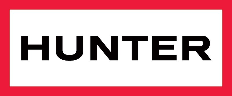
The Hunter logo is a wordmark featuring the brand name in bold, uppercase letters. It was refined to its current form in the 2010s and represents British heritage, outdoor durability, and premium quality in the footwear industry.
Design Type: Wordmark (text-based logo)
Primary Elements:
- Bold uppercase lettering
- Custom sans-serif typography
- Clean, uncluttered presentation
- Occasionally paired with “ORIGINAL” descriptor
Official Introduction Date: The current version emerged around 2013 during a brand refresh
Designer/Agency: Internal brand team with external consultancy support
Trademark Status: Registered trademark of Hunter Boot Ltd
Color Palette:
- Primary: Hunter Green (deep forest green)
- Secondary: Black for versatility
- Accent: White for contrast applications
Usage Context: Product labels, boot shafts, retail signage, e-commerce platforms, social media, packaging, and licensed merchandise
How Has the Hunter Logo Evolved Over Time?
Hunter’s visual identity has shifted from ornate Victorian-era designs to today’s streamlined wordmark.
The brand went through at least four major logo changes since 1856.
Each version reflected the design trends and business needs of its era.
Original Hunter Logo (1856-1950s)
Years Active: 1856 to approximately 1950s
Design Description: Early branding featured elaborate script lettering with decorative flourishes. The company used “North British Rubber Company” as its primary identifier during this period.
Color Scheme: Black ink on product tags, occasionally gold embossing
Context: The Victorian era demanded ornate, detailed branding. Simplicity wasn’t valued the way it is now.
Cultural Significance: Established the foundation for British rubber goods manufacturing
Mid-Century Hunter Logo (1950s-1990s)
Years Active: 1950s through 1990s
Design Description: A transitional period where the “Hunter” name gained prominence. Typography became bolder and less decorative.
Color Scheme: Introduction of the signature green, black remained secondary
Key Changes from Previous: Dropped excessive ornamentation. The name “Hunter” took center stage.
Context: Post-war practicality influenced design choices. Function over decoration.
Modern Hunter Logo (1990s-2013)
Years Active: 1990s to 2013
Design Description: Serif-influenced wordmark with more traditional styling. “Hunter” appeared in sturdy, grounded letterforms.
Color Scheme: Hunter green standardized, white backgrounds common
Key Changes from Previous: More refined execution, consistent application across products
Cultural Significance: Coincided with Hunter’s rise as a fashion brand, not just functional footwear
Current Hunter Logo (2013-Present)
Years Active: 2013 to present
Design Description: Clean sans-serif typography in bold uppercase. Maximum readability, minimum fuss.
Color Scheme: Hunter green primary, black and white variations
Designer: Brand refresh conducted with agency partnership
Key Changes from Previous: Stripped away serifs, increased letter weight, modernized spacing
Cultural Significance: Positioned Hunter for global expansion and digital-first marketing
What Do the Design Elements of the Hunter Logo Mean?
The Hunter wordmark communicates heritage through restraint.
Bold letterforms suggest durability. The lack of decorative elements signals confidence.
Everything about it says: we don’t need gimmicks.
Why Did Hunter Choose These Specific Colors?

Hunter Green
- Hex: Approximately #355E3B
- Symbolic meaning: Nature, countryside, British landscapes
- Psychological impact: Conveys stability and connection to outdoor environments
- Brand connection: Directly references the Wellington boot’s rural heritage
Understanding color psychology explains why this shade works so well for an outdoor brand.
Black
- Hex: #000000
- Symbolic meaning: Sophistication, timelessness
- Usage: Alternative logo applications, formal contexts
White
- Hex: #FFFFFF
- Symbolic meaning: Clarity, purity
- Usage: Reversed applications on dark backgrounds
The combination creates a color palette that feels both premium and approachable.
What Typography Style Is Used in the Hunter Logo?
Hunter uses a custom sans-serif typeface with geometric influences.
The letters are wide-set with generous tracking between characters.
This improves readability at small sizes, which matters when you’re stamping logos onto boot shafts.
The x-height is substantial, making the wordmark feel solid and grounded.
What Are the Hidden Meanings in the Hunter Logo?
There’s no secret arrow or hidden symbol here. And that’s intentional.
The logo’s power comes from what it doesn’t do. No mascots. No abstract shapes. Just the name.
Some interpret the bold weight as representing the durability of the boots themselves. Others see the green as a direct link to British countryside traditions.
The designers likely wanted recognition over cleverness. It works.
How Does the Hunter Logo Compare to Competitor Logos?
Hunter sits in an interesting spot among shoe brand logos.
It’s text-based while many competitors use symbols.
This sets it apart from athletic brands that rely on swooshes and stripes.
Compare it to the Timberland logo with its tree symbol, or the New Balance logo with its “NB” monogram. Hunter feels more traditional, almost understated.
The Lacoste logo uses a crocodile mascot. Puma has its leaping cat. Hunter avoids this entirely.
Against outdoor competitors like Merrell or Keen, Hunter’s wordmark appears more refined. Less “adventure gear,” more “heritage brand.”
This approach aligns with minimalist design principles that have dominated premium branding for the past decade.
What Are the Technical Specifications of the Hunter Logo?
Official Color Codes
Primary Color: Hunter Green
Secondary Color: Black
- Hex: #000000
- RGB: (0, 0, 0)
- CMYK: (0, 0, 0, 100)
Tertiary Color: White
- Hex: #FFFFFF
- RGB: (255, 255, 255)
- CMYK: (0, 0, 0, 0)
Dimensions and Proportions
The logo maintains consistent proportions across applications. Standard aspect ratio sits around 4:1 (width to height).
Minimum size requirements ensure legibility. The brand typically specifies no smaller than 1 inch wide for print applications.
Clear space equals the height of the letter “H” on all sides. This prevents crowding from other design elements.
For digital use, vector graphics formats (SVG, EPS) are standard. This allows scaling without quality loss.
Print materials require high DPI files, typically 300 or higher.
What Cultural Impact Has the Hunter Logo Had?
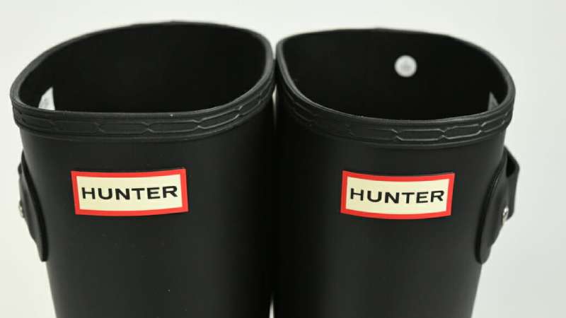
Hunter’s logo gained massive visibility when the boots became festival fashion staples.
Glastonbury Festival footage showing celebrities in Hunter wellies pushed the brand into mainstream consciousness.
Kate Middleton wearing Hunter boots cemented its status as both practical and stylish.
The logo now signals a specific lifestyle: country weekends, outdoor festivals, British tradition with modern sensibility.
How Does the Hunter Logo Fit Into the Overall Brand Identity?
The logo anchors a broader identity system that includes packaging, retail environments, and digital presence.
Hunter’s brand guidelines dictate consistent application across all touchpoints.
Product photography typically features the logo prominently on boot shafts.
Marketing materials maintain the green-and-white palette with occasional black accents.
The brand identity tells a story through design, connecting 19th-century Scottish manufacturing to 21st-century fashion.
How Should the Hunter Logo Be Used?

Official Usage Guidelines
Do:
- Use official logo files from Hunter’s media resources
- Maintain clear space requirements
- Apply on backgrounds with sufficient contrast
- Respect minimum size specifications
Don’t:
- Stretch, distort, or rotate the logo
- Change the official colors
- Add effects like shadows or gradients
- Place on busy backgrounds that reduce readability
Where to Access Official Logos
Hunter provides press kits and brand assets through their official website’s media section. Authorized retailers receive logo files directly from the company.
Licensing Information
The Hunter logo is a registered trademark. Commercial use requires explicit permission from Hunter Boot Ltd.
Editorial use in journalism and educational contexts generally falls under fair use, but verify with legal counsel for specific applications.
Trademark Protection
Hunter actively protects its trademark against counterfeits and unauthorized use. The company pursues legal action against knockoff products bearing similar branding.
If you’re a retailer, only source from authorized distributors to ensure you’re using legitimate branding materials.
FAQ on The Hunter Logo
What Does the Hunter Logo Look Like?
The Hunter logo is a bold wordmark design featuring uppercase letters. Clean. Simple. No mascot or abstract symbol.
The company emblem uses custom typography in Hunter green or black.
You’ll find it stamped on Wellington boots, packaging, and retail signage worldwide.
When Was the Current Hunter Logo Introduced?
The current version emerged around 2013 during a brand refresh. Hunter Boot Ltd wanted something modern that still honored its British heritage.
The logo history stretches back to 1856 when Henry Lee Norris founded the company in Edinburgh, Scotland.
What Colors Are Used in the Hunter Logo?
Hunter green is the primary color. It’s a deep forest shade that connects directly to the brand’s outdoor roots.
Black and white versions exist for different applications.
The green logo approach reinforces the countryside connection that made Hunter famous.
Who Designed the Hunter Logo?
The current wordmark came from internal teams working with external brand consultants. No single designer gets public credit.
This is common with heritage brands. They protect brand identity decisions carefully.
What Font Does Hunter Use in Its Logo?
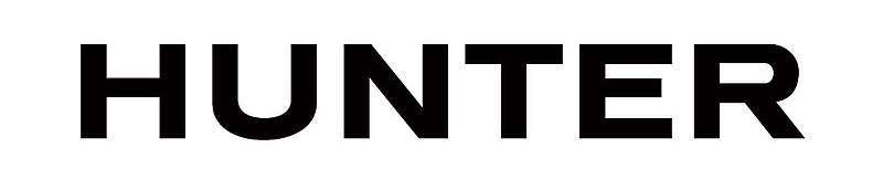
Hunter uses a custom font with geometric influences. It’s not available for public download.
The typography features wide letterforms with substantial weight. Good readability at any size.
Is the Hunter Logo Trademarked?
Yes. The trademark symbol protects Hunter’s visual identity globally.
Hunter Boot Ltd actively pursues counterfeit products. They don’t mess around with brand protection.
Unauthorized commercial use will get you a legal notice.
Can I Download the Official Hunter Logo?
Press and media can access official files through Hunter’s website. They offer logo PNG and vector formats.
High resolution logo files require authorization for commercial use.
Retailers get assets directly from the company.
What Does the Hunter Logo Represent?
The logo represents British craftsmanship and outdoor durability. It signals quality rain boots with over 160 years of heritage.
The Royal Warrant association adds prestige.
Hunter Original products carry this symbol as a mark of authenticity.
Has the Hunter Logo Changed Over Time?
Multiple times. The company started as North British Rubber Company with ornate Victorian branding.
Logo evolution moved toward simplicity. Each decade stripped away decoration.
The current version is the cleanest yet. Just the name, nothing else.
Where Does Hunter Place Its Logo on Products?
The boot logo appears on the shaft of Wellington boots. Hard to miss.
You’ll also see it on buckles, insoles, and packaging.
The official brand logo shows up across outdoor apparel, accessories, and licensed merchandise too.
Conclusion
The Hunter logo proves that simplicity works. A bold wordmark, a signature green, and zero gimmicks.
This heritage brand has maintained recognition for over 160 years without relying on mascots or complex symbols.
The logo evolution from Victorian ornamentation to modern minimalism mirrors broader shifts in logo design principles.
Hunter Boot Ltd understood something important. Strong visual identity comes from consistency, not complexity.
Whether stamped on classic rain boots or appearing across outdoor lifestyle products, the wordmark delivers instant brand recognition.
That’s the mark of effective design.

Renowned for his expertise in logo design and visual branding, Bogdan has developed a multitude of logos for various clients.
His skills extend to creating posters, vector illustrations, business cards, and brochures. Additionally, Bogdan's UI kits were featured on marketplaces like Visual Hierarchy and UI8.
He also wrote in the past years on sites like Design Your Way, WebDesignerDepot, WPDean, Designmodo, Speckyboy, Slider Revolution, and more.
- The Cursor Logo History, Colors, Font, And Meaning - 24 September 2026
- Top 7 Web Design Subscription Services That Replace Full-Time Hires - 24 September 2026
- Canva vs PowerPoint: Which Is Better for Presentations? - 22 September 2026

Bogdan Sandu is a seasoned designer who has been designing websites since 2008. Renowned for his expertise in logo design and visual branding, Bogdan has developed a multitude of logos for various clients. His skills extend to creating posters, vector illustrations, business cards, and brochures. Additionally, Bogdan's UI kits were featured on marketplaces like Visual Hierarchy and UI8. He also wrote in the past years on sites like Design Your Way, WebDesignerDepot, WPDean, Designmodo, Speckyboy, Slider Revolution, and more.
You Might Also Like