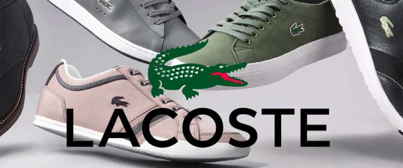
The Lacoste Logo stands as one of the most recognizable brand marks in fashion history. That little green crocodile has been sitting on polo shirts since 1933. It predates most modern sportswear branding by decades.
Rene Lacoste, a French tennis champion, earned the nickname “the Crocodile” during his playing career. His friend Robert George sketched the first version of the emblem. The brand has gone through relatively few changes compared to other fashion houses, which says something about getting it right the first time.
Currently, the logo exists in its refined modern form introduced in 2011. The crocodile faces right, rendered in the signature Lacoste green. Over 90 years and only a handful of real updates. That’s pretty rare in this industry.
What Is the Lacoste Logo?
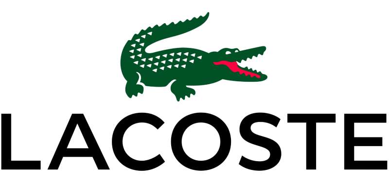
The Lacoste Logo is a green crocodile emblem facing right, first introduced in 1933 and designed by Robert George. It represents Rene Lacoste’s tennis nickname and symbolizes tenacity, elegance, and the brand’s sporting heritage.
Design Type: Mascot-based emblem with accompanying wordmark
Primary Elements:
- Green crocodile figure in profile view
- Open mouth showing teeth
- Detailed scale texture
- Curved tail
- “LACOSTE” wordmark (used separately or together)
Official Introduction Date: 1933
Designer: Robert George (friend of Rene Lacoste)
Trademark Status: Registered trademark globally, actively protected against infringement
Color Palette:
- Lacoste Green: #00693E
- White (background applications)
- Black (wordmark and alternate versions)
Usage Context: Apparel, footwear, fragrances, leather goods, eyewear, watches, retail environments, digital platforms, and advertising campaigns
How Has the Lacoste Logo Evolved Over Time?

The Lacoste Logo has remained surprisingly consistent since 1933. Major refinements occurred in 1984 and 2011.
The crocodile’s basic shape stayed intact while details became cleaner over time. Few fashion brands can claim such design stability across nine decades.
Original Lacoste Logo (1933-1984)
Years Active: 1933-1984
Design Description: Hand-drawn crocodile with a more organic, sketch-like quality. The creature had a rougher texture and slightly different proportions than modern versions.
Color Scheme: Green crocodile, typically embroidered on white or colored fabric
Designer: Robert George
Context: Created after American press nicknamed Rene Lacoste “the Crocodile” following a bet involving a crocodile-skin suitcase. Lacoste liked the name’s association with tenacity on the court.
Cultural Significance: First logo ever displayed on the outside of a garment. This changed fashion branding permanently.
Refined Lacoste Logo (1984-2011)
Years Active: 1984-2011
Design Description: Cleaner lines and more standardized proportions. The crocodile became more polished while retaining its character.
Color Scheme: Consistent green (#00693E) with improved color matching across production
Key Changes from Previous: Sharper details, more uniform appearance across products, better reproduction at various sizes
Context: Updated to meet modern manufacturing and print design requirements. Brand expanding globally needed consistent reproduction.
Modern Lacoste Logo (2011-Present)
Years Active: 2011-present
Design Description: Streamlined crocodile with optimized proportions. Works across digital and physical applications. The scales have cleaner definition.
Color Scheme: Primary green (#00693E), with approved monochrome versions in black and white
Key Changes from Previous: Subtle refinements for digital readability. Improved scalability for small applications like social media icons.
Cultural Significance: Maintains heritage while functioning across modern touchpoints. The crocodile adapts without losing recognition.
What Do the Design Elements of the Lacoste Logo Mean?
The crocodile represents persistence and determination. Rene Lacoste never gave up on opponents during tennis matches.
The open mouth suggests readiness and confidence. The rightward-facing position implies forward movement and progress.
Why Did Lacoste Choose These Specific Colors?
Lacoste Green (#00693E)
This specific green connects to tennis court grass and French sporting tradition. It carries associations of prestige and natural elegance.
Green also suggests growth and vitality. The color psychology works perfectly for a sportswear brand.
Looking at other green logos in fashion, Lacoste’s shade sits in premium territory. Not too bright, not too dark.
White and Black (Secondary)
White provides clean backgrounds for the crocodile. Black offers versatility for formal applications and certain product lines.
What Typography Style Is Used in the Lacoste Logo?
The wordmark uses a custom sans-serif font with clean, modern lines.
Letters have consistent stroke width. The overall feel is sophisticated but approachable.
Earlier versions used slightly different letterforms. The current typography balances heritage with contemporary aesthetics.
What Are the Hidden Meanings in the Lacoste Logo?
The crocodile’s posture suggests pouncing. Ready to strike but controlled. This reflects competitive spirit tempered by elegance.
Some see the tail curve as creating visual movement. It leads the eye and adds dynamism to a static mark.
Robert George designed it to capture Lacoste’s playing style. Tough and relentless, but always stylish.
How Does the Lacoste Logo Compare to Competitor Logos?
Lacoste sits in unique territory among sportswear brands. Most competitors use abstract shapes or text-based marks.
The Puma Logo features a leaping cat. The Adidas Logo relies on geometric stripes. Neither has the same heritage backstory.
Among shoe brand logos, Lacoste’s crocodile stands out for its detail and character. Most athletic brands went minimalist. Lacoste kept personality.
The New Balance Logo and Reebok Logo favor geometric simplicity. Lacoste chose illustration over abstraction.
This mascot approach creates stronger emotional connection. People remember animals better than shapes. And the crocodile has real story behind it.
What Are the Technical Specifications of the Lacoste Logo?

Official Color Codes:
Primary Color: Lacoste Green
Secondary Color: White
- Hex: #FFFFFF
- RGB: (255, 255, 255)
- CMYK: (0, 0, 0, 0)
Tertiary Color: Black
- Hex: #000000
- RGB: (0, 0, 0)
- CMYK: (0, 0, 0, 100)
Dimensions and Proportions:
- Aspect ratio approximately 1.5:1 (width to height)
- Minimum size: 10mm width for print, 50 pixels for digital
- Clear space: Minimum distance equal to the crocodile’s eye diameter on all sides
- The crocodile must always appear complete, never cropped
What Cultural Impact Has the Lacoste Logo Had?
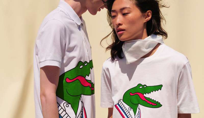
The Lacoste crocodile changed how brands think about visibility. Before 1933, logos stayed hidden inside garments.
Lacoste made the logo a feature, not a secret. Every fashion brand displaying marks on clothing owes something to this decision.
The crocodile became a status symbol across multiple generations. Tennis players, preppy kids, hip-hop artists. It crossed cultural boundaries that most brands cannot.
How Does the Lacoste Logo Fit Into the Overall Brand Identity?
The crocodile anchors everything Lacoste does. Product design, store interiors, advertising campaigns. All reference back to this single mark.
Brand guidelines establish strict rules for crocodile usage. Consistency protects the symbol’s meaning.
The logo connects to broader graphic design principles around simplicity and recognition. One strong element beats multiple weak ones.
Lacoste’s identity system includes specific color applications, typography elements, and photography styles. But the crocodile remains the constant.
How Should the Lacoste Logo Be Used?

Official Usage Guidelines:
Do:
- Use official logo files from Lacoste brand resources
- Maintain required clear space around the mark
- Use approved color versions only
- Respect minimum size requirements
- Keep the crocodile facing right
Don’t:
- Rotate or flip the crocodile
- Change the colors outside approved palette
- Add effects like shadows or gradients
- Stretch or distort proportions
- Place on busy backgrounds that reduce visibility
- Recreate or redraw the logo manually
Accessing Official Logos: Licensed partners receive assets through Lacoste’s brand portal. Unauthorized use faces legal action.
Trademark Protection: The crocodile enjoys protection in virtually every market. Lacoste actively pursues counterfeiters and unauthorized usage. The company maintains one of fashion’s most aggressive trademark defense programs.
FAQ on The Lacoste Logo
Why Is the Lacoste Logo a Crocodile?
The American press nicknamed Rene Lacoste “the Crocodile” during his tennis career. The story involves a bet over a crocodile-skin suitcase.
Lacoste liked how the name suggested tenacity on the court. He never let go of opponents, just like the reptile.
Who Designed the Lacoste Logo?
Robert George, a friend of Rene Lacoste, sketched the original crocodile emblem. This happened in 1927, though the brand launched in 1933.
George was not a professional designer. His hand-drawn artwork became one of fashion’s most enduring symbols anyway.
What Does the Lacoste Crocodile Symbolize?
The crocodile represents determination and elegance combined. It reflects Lacoste’s playing style on tennis courts at Roland Garros and Wimbledon.
The open mouth shows readiness. The overall posture suggests confidence without aggression. Premium sportswear identity captured in one animal.
When Was the Lacoste Logo Created?
The logo debuted in 1933 when Rene Lacoste and Andre Gillier founded Chemise Lacoste. It appeared on the L.12.12 polo shirt.
This made Lacoste the first brand to display a logo externally on clothing. Every visible brand mark today follows this model.
Is the Lacoste Logo an Alligator or Crocodile?
It’s officially a crocodile. The French word is “le crocodile.” Americans sometimes called it an alligator, which created lasting confusion.
The brand partnered with Izod in America for decades. Some called it “Izod Lacoste” with the “alligator shirt.” Still a crocodile though.
How Can You Tell if a Lacoste Logo Is Authentic?
Authentic Lacoste logos have precise embroidery with clean scale details. The crocodile faces right and shows defined teeth.
Counterfeits often have fuzzy edges or incorrect proportions. Check the pique cotton quality too. Real Lacoste fabric has consistent texture throughout.
Why Does the Lacoste Crocodile Face Right?
The rightward orientation suggests forward movement and progress. This follows basic psychology of shapes principles in brand identity design.
Western readers scan left to right. A right-facing figure feels like it’s moving ahead, not retreating. Simple but effective visual choice.
Has the Lacoste Logo Ever Changed?
The crocodile has seen refinements but never radical redesign. Updates in 1984 and 2011 cleaned up details for modern production.
The core shape stayed recognizable across nine decades. This brand style guide consistency is rare in fashion. Most competitors redesign constantly.
What Color Is the Official Lacoste Logo?
The signature shade is Lacoste Green, hex code #00693E. It connects to tennis court grass and French sporting heritage.
Black and white versions exist for specific applications. The green remains primary across luxury sportswear products, fragrances, and leather goods worldwide.
Why Is the Lacoste Logo So Famous?
It was first. Before Nike swooshes or Adidas stripes, Lacoste put a visible trademark on apparel. That changed fashion permanently.
The crocodile also crossed cultural boundaries. Tennis players, preppy culture, hip-hop artists. Each generation discovered it fresh. Real storytelling beats trendy design every time.
Conclusion
The Lacoste Logo proves that authentic brand heritage beats trendy redesigns. Nine decades later, that crocodile emblem still works.
From French tennis courts to global fashion icon status, the journey matters. Rene Lacoste’s nickname became a visual identity recognized across every continent.
The design stays simple. Green crocodile facing right. Open mouth showing determination.
This premium clothing brand changed how the entire fashion industry thinks about visible trademarks. Every polo shirt logo you see today follows the path Lacoste created in 1933.
Sometimes the first idea is the best one.

Renowned for his expertise in logo design and visual branding, Bogdan has developed a multitude of logos for various clients.
His skills extend to creating posters, vector illustrations, business cards, and brochures. Additionally, Bogdan's UI kits were featured on marketplaces like Visual Hierarchy and UI8.
He also wrote in the past years on sites like Design Your Way, WebDesignerDepot, WPDean, Designmodo, Speckyboy, Slider Revolution, and more.
- Versatile Work Sans Font Pairing for Every Project - 16 September 2026
- Organize Digital Files Like a Pro Before Your Next Client Handoff - 16 September 2026
- How to Set Up a Digital Menu Board: Hardware to Layout - 15 September 2026

Bogdan Sandu is a seasoned designer who has been designing websites since 2008. Renowned for his expertise in logo design and visual branding, Bogdan has developed a multitude of logos for various clients. His skills extend to creating posters, vector illustrations, business cards, and brochures. Additionally, Bogdan's UI kits were featured on marketplaces like Visual Hierarchy and UI8. He also wrote in the past years on sites like Design Your Way, WebDesignerDepot, WPDean, Designmodo, Speckyboy, Slider Revolution, and more.
You Might Also Like