The Reebok Logo History, Colors, Font, and Meaning
Dive deep into an icon—a symbol that’s sprinted beyond the confines of mere brand identity to embody an ethos of fitness culture and design prowess: the Reebok logo. It’s both familiar and profound, its evolution painting a picture of reinvention and staying power in the athletic world.
This emblem, sporting history and presto-change-o aesthetics, walks us through brand identity’s pivotal role in the sneaker and apparel universe.
You’re about to unravel the visual and conceptual threads that make up that iconic Reebok Delta, the Union Jack, and the tales they tell. You’ll see the fibers of a logo that’s clad the feet of dedicated athletes and fashion-forward streetwalkers alike.
From the first stitch in Bolton, England, to the strategic shifts in corporate boardrooms, we’ll dissect the emblem’s anatomy and what it takes to stay relevant in a fickle market.
Unlock the secrets to a visual identity that resonates, informed by a detailed mapping of its history, design elements, and brand strategy. Stand by to lace up your knowledge sneakers and stride through the Reebok logo’s transformation from mere sign to powerhouse signifier.
The Meaning Behind the Reebok Logo
Unveiling the Symbol
If you’ve ever glanced at a Reebok shoe, you’ve seen it. The signature, stylized, and sleek symbol. It’s a delta. But it’s not just any old triangle.
This delta is a symbol. It stands for something. It represents the core values of the brand. Three distinct parts, and three distinct meanings – physical, mental, and social.
You see, Reebok‘s vision is to empower individuals. Not just physically, but in every aspect of life. And that’s the beauty of this simple symbol. It tells a story, a story of empowerment, transformation, and change.
A Symbol of Change
The delta, you see, is a symbol of change in mathematics. And this delta? It’s a symbol of change too.
It’s a symbol of the change that comes from pushing your limits, breaking boundaries, and embracing the best version of yourself. It’s about you. It’s about change. It’s about growth. And that’s the power of this simple, unassuming symbol.
The History of the Reebok Logo
The Journey Begins
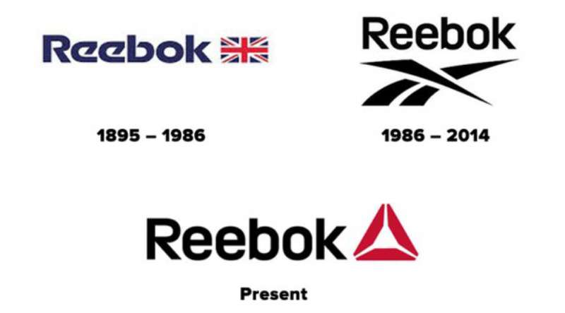
Let’s take a step back in time. It’s 1895, and Reebok is born. But the delta? It wasn’t there yet. The original logo was a simple, classic, and timeless wordmark – the name ‘Reebok’ in an elegant script font.
Transforming With Time
Fast forward a few decades, and the logo evolved. It became a vector – an abstract, stylized representation of a running track. It was bold, it was dynamic, and it perfectly captured the spirit of the time.
But the story doesn’t end there. In 2014, the delta made its appearance. It was a bold move, a radical change. But it was a change that resonated with the brand’s evolving vision.
The Colors of the Reebok Logo
Throughout its history, the Reebok logo has undergone multiple transformations, including shifts in color.
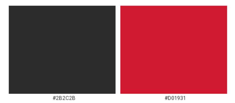
The initial logo was inspired by the hues of the British flag, featuring a blue-and-red color scheme. The contemporary version, however, showcases a palette of Charleston Green (#2B2C2B) and Amaranth Red (#D01931).
The brand’s characteristic color range also spans various shades of blue, from light to dark, as well as gray and black.
The latest logo redesign transitioned its color from the previous bright red and blue to a more subdued light gray.
The Font Used in the Reebok Logo
A Bold Choice
The font. It’s bold. It’s dynamic. It’s distinct. It’s a sans-serif font, with clean, straight lines and sharp angles. It’s a font that screams confidence, determination, and ambition.
A Touch of Elegance
But there’s a subtlety to it. A certain elegance. A nod, perhaps, to the brand’s heritage. It’s a font that perfectly balances the old with the new, the classic with the modern, the bold with the elegant.
The Evolution of the Reebok Logo
A Tale of Transformation
From the classic wordmark to the dynamic vector, from the vector to the powerful delta – the Reebok logo is a tale of transformation. It’s a reflection of the brand’s journey, its evolution, and its vision for the future.
Reflecting the Brand’s Values
Each logo, in its own way, reflected the brand’s values. The elegance and sophistication of the original wordmark. The dynamism and energy of the vector.
The empowerment, transformation, and change of the delta. They’re all pieces of the same puzzle. They all tell the same story. The story of Reebok.
The Impact of the Reebok Logo
Beyond Just a Logo
But it’s not just a logo. It’s not just a symbol. It’s a statement. It’s a promise.
It’s a reflection of the people who wear the brand, and who believe in what it stands for. It’s a logo that carries with it a legacy of empowerment, transformation, and change.
Inspiring Action
Every time you see that delta, it’s a reminder. A reminder to push your limits, to break boundaries, to embrace the best version of yourself. It’s a logo that doesn’t just represent a brand. It inspires action.
The Perception of the Reebok Logo
A Recognizable Symbol
Over the years, the Reebok logo has become more than just a brand identifier. It has become a recognizable symbol worldwide. Its distinctive design elements and the values it embodies have created a strong brand recall among consumers.
Embodying a Lifestyle
The Reebok logo isn’t just about sports or fitness gear. It embodies a lifestyle, a mindset of constant self-improvement and growth.
It’s a mark that resonates with those who are on a continuous journey of self-transformation, perfectly aligning with the brand’s mission of inspiring people everywhere to be their absolute best physically, mentally, and socially.
FAQ On The Reebok Logo
What’s the Meaning Behind the Reebok Logo?
The Delta has got us scratching our heads, right? It’s about change – personal transformation to be exact.
The three segments? They’re like a holy trinity for the fitness faithful: physical, mental, and social achievements. Reebok’s all about growth, and this logo’s shouting it from the rooftops.
How Has the Reebok Logo Evolved Over Time?
Let’s stroll down memory lane. From the Union Jack waving its British heritage, to the classy vector star line-up, then bam – the Reebok Delta. This logo’s been through more wardrobe changes than a pop diva, each reflecting shifts in vision and consumer vibes.
Is the Reebok Logo a Symbol of Quality?
In the sneaker game, that logo’s as good as a royal seal. It’s not just a pretty picture; it’s vouching for quality, comfort, and athletic agility. Strap on a pair with that emblem, and it’s like Reebok’s giving you a nod, saying, “You’ve got this.”
Why Did Reebok Change Their Logo?
Reebok took a leap – from traditional to trendy. It’s all part of staying fresh and keeping pace with how we all live today. The shift was bold, for sure, signaling a renewed commitment to cross-fit junkies and everyday warriors seeking a healthier lifestyle.
What’s the Significance of the Redesigned Reebok Logo?
The new design’s looking to the future – embracing a holistic take on health and wellness. Ditching the old for something more dynamic, it’s a nod to complete personal evolution. Reebok’s rebranding isn’t just cosmetic; it’s about sparking a global convo on fitness as a way of life.
Can You Describe the Reebok Logo Color Scheme?
It’s minimalist magic. We’re talking a simple yet striking contrast, usually rocking a black-and-white ensemble. But hey, they aren’t afraid to throw in some color splashes when the mood strikes – be it bold reds or soothing blues, all dialed in to grab that eyeball attention.
What is the History Behind the Reebok Logo?
Born in a U.K. bedroom, Reebok’s roots stretch back to 1895. The logo’s witnessed the roaring 20s, survived the 80s’ workout craze, and now? It’s symbolizing a modern fitness revolution. Each twist and turn in its design tells the tale of the brand’s relentless hustle.
How Does the Reebok Logo Influence Brand Recognition?
That logo’s like a flag planted on the moon—undeniably Reebok. Across the globe, it’s a beacon for quality athletic gear. From gym rats to casual park joggers, that logo on someone’s kicks speaks of a shared tribe, a collective nod to the pursuit of betterment.
What’s Reebok’s Strategy Behind the Logo’s Visual Elements?
Visual elements in Reebok’s logo are strategic chess moves. Each angle, curve, and contrast is meticulously planned. The aim? To evoke emotions tied to athleticism and aspirations.
To whisper to consumers, “Pssst, your best self starts here.” That’s what those design wizards at Reebok HQ are crafting.
How Do Reebok Logo Updates Align With Current Design Trends?
Okay, so we’ve got minimalism taking the front seat in design town, and Reebok’s right on its tail. The logo’s clean lines and sharp angles are flirting with current aesthetics, while the symbol’s staying power’s just proven—it can tango with the times without losing its original beat.
Conclusion
As our digital dive into the Reebok logo comes to a full circle, it’s clear this isn’t just any run-of-the-mill emblem. It’s a beacon, a storyteller in its own right. We’ve traversed through its evolution, from its humble Union Jack beginnings to its bold Delta declaration, each phase a milestone in forming a globally recognized symbol.
- Delve into the past, present, and the oh-so-bright future, we see how these shifts mirror our own personal transformations.
- It’s more than an athletic brand emblem; it’s a visual shout-out to that fitness and lifestyle culture that so many of us live and breathe.
- The logo whispers classic but screams reinvention, a balancing act few can pull off with such finesse.
So next time that Reebok mark catches your eye, remember, it’s not just threading through fabric. It’s woven into the very fabric of our lives, inspiring each step, leap, and the sprint ahead. Here’s to the stories that will unfold under its watch.
If you liked this article about the Reebok logo, you should check out this article about the Puma logo.
There are also similar articles discussing the Vans logo, the Crocs logo, the Converse logo, and the New Balance logo.
And let’s not forget about articles on the Timberland logo, the Lacoste logo, the Skechers logo, and the Hunter logo.
- The Bungie Logo History, Colors, Font, And Meaning - 27 April 2024
- After Dark: Night Color Palettes for Mysterious Designs - 27 April 2024
- The Capcom Logo History, Colors, Font, And Meaning - 26 April 2024


