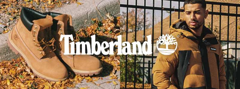
The Timberland Logo stands as one of the most recognizable symbols in outdoor footwear. That tree silhouette? You’ve seen it everywhere. From city sidewalks to hiking trails, this emblem has become shorthand for rugged durability.
Within the broader landscape of footwear brand emblems, Timberland carved out a unique position. The company launched in 1973, though its roots trace back to 1952 when Nathan Swartz bought half of the Abington Shoe Company. The current logo has gone through several refinements, but the core tree imagery has remained consistent since the brand’s official naming.
What makes it work is simplicity. A tree. A wordmark. Nothing fancy, but it communicates everything about the brand’s outdoor DNA.
What is the Timberland Logo?
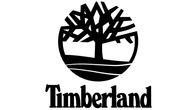
The Timberland Logo features a stylized tree silhouette paired with bold uppercase lettering. Introduced alongside the brand name in 1973, the design was created in-house. It symbolizes nature, strength, and environmental connection, which aligns with the company’s outdoor heritage.
Here’s what defines this logo from a technical standpoint:
- Design Type: Combination mark (symbol plus wordmark)
- Primary Elements: Tree silhouette, sans-serif typography, rectangular framing in some versions
- Official Introduction Date: 1973
- Designer/Agency: In-house design team at the Swartz family company
- Trademark Status: Registered trademark owned by TBL Licensing LLC (VF Corporation subsidiary)
- Color Palette: Wheat/tan (#D2A552), black (#000000), white (#FFFFFF)
- Usage Context: Boot tongues, apparel tags, retail signage, digital platforms, packaging
How Has the Timberland Logo Evolved Over Time?
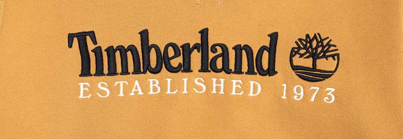
The logo has maintained its tree symbol throughout multiple decades. Changes have been subtle rather than dramatic.
Most updates focused on typography refinements and color applications. The tree shape itself has stayed remarkably consistent since the 1970s.
Original Timberland Logo (1973-1990s)
- Years Active: 1973 to early 1990s
- Design Description: Simple tree outline with the Timberland wordmark beneath
- Color Scheme: Black and white primary, wheat color on boot applications
- Designer: Swartz family in-house team
- Context: Created when the Abington Shoe Company rebranded around its waterproof boot success
- Key Changes from Previous: First official logo (no predecessor under Timberland name)
- Cultural Significance: Established the outdoor-rugged identity that would define the brand
Refined Timberland Logo (1990s-2010s)
- Years Active: Mid-1990s to late 2010s
- Design Description: More polished tree silhouette, bolder typography, often enclosed in rectangular border
- Color Scheme: Wheat tan became more prominent, black remained for contrast
- Designer: Internal brand team with external consultants
- Context: Brand expansion into apparel and accessories required more versatile logo applications
- Key Changes from Previous: Cleaner lines, more defined tree branches, standardized proportions
- Cultural Significance: Coincided with hip-hop culture adoption of the yellow boot as a fashion statement
Modern Timberland Logo (2010s-Present)
- Years Active: Late 2010s to present
- Design Description: Streamlined tree icon, versatile for digital use, sometimes appears without wordmark
- Color Scheme: Flexible application across wheat, black, white, and green variants
- Designer: VF Corporation brand team (post-2011 acquisition)
- Context: Digital-first approach and sustainability messaging influenced updates
- Key Changes from Previous: Optimized for small screens, social media icons, app use
- Cultural Significance: Reflects shift toward environmental responsibility messaging
What Do the Design Elements of the Timberland Logo Mean?
The tree represents more than decoration. It signals environmental awareness, natural materials, and outdoor readiness.
Every branch and curve was chosen to suggest growth and stability. The symbol connects directly to where Timberland boots are meant to go: forests, trails, and wild places.
Why Did Timberland Choose These Specific Colors?
The wheat/tan color mirrors the famous yellow boot leather. That’s not an accident.
When you see that color, you think of the 6-inch premium boot immediately. The psychology behind color choices in branding matters here.
Black provides contrast and suggests durability. White offers versatility for different backgrounds.
- Wheat/Tan (#D2A552): Warmth, earth connection, premium leather association, outdoor readiness
- Black (#000000): Strength, sophistication, timelessness, professional edge
- White (#FFFFFF): Clarity, clean design, versatile applications
What Typography Style Is Used in the Timberland Logo?
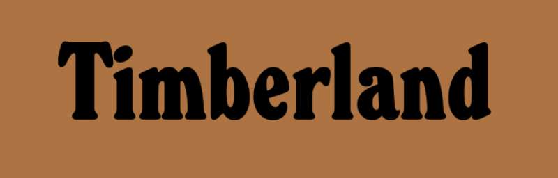
The wordmark uses a custom sans-serif typeface. Bold, uppercase, no frills.
Readability was clearly a priority. You can spot TIMBERLAND from across a store.
The letterforms have slight quirks that prevent them from looking generic. Over the years, the type treatment has been refined for better digital rendering.
Spacing between letters stays tight but readable. Works on boot tongues, works on billboards.
What Are the Hidden Meanings in the Timberland Logo?
The tree branches create a roughly symmetrical shape. This suggests balance and reliability.
Some see the tree’s roots (when shown) as representing heritage and grounding. The Swartz family never confirmed intentional hidden messages.
What’s clear is the environmental statement. A tree for a company that uses natural materials and now pushes sustainability initiatives like GreenStride and ReBOTL.
The simplicity itself carries meaning. No complexity, no pretense. Just solid outdoor gear.
How Does the Timberland Logo Compare to Competitor Logos?
Among outdoor and athletic footwear brands, Timberland takes a nature-forward approach. Most competitors lean toward abstract shapes or motion-based imagery.
Adidas uses its three stripes for athletic performance. The North Face features a mountain dome. New Balance opts for a stylized NB.
Timberland’s tree stands apart because it’s literal. You know exactly what you’re getting.
This directness works. In a crowded market of swooshes and abstract marks, a recognizable tree cuts through.
The logo doesn’t try to suggest speed or athletic performance. It says: outdoors, nature, built to last. Different positioning, different visual language.
What Are the Technical Specifications of the Timberland Logo?
Official Color Codes:
- Primary Color (Wheat): Hex: #D2A552, RGB: (210, 165, 82), CMYK: (16, 32, 72, 0), Pantone: 7510 C
- Secondary Color (Black): Hex: #000000, RGB: (0, 0, 0), CMYK: (0, 0, 0, 100), Pantone: Black C
- Tertiary Color (White): Hex: #FFFFFF, RGB: (255, 255, 255), CMYK: (0, 0, 0, 0)
Dimensions and Proportions:
- Aspect Ratio: Tree icon approximately 1:1, full lockup varies by configuration
- Minimum Size: Tree icon minimum 12mm height for print, 40px for digital
- Clear Space: Minimum clearance equal to the height of the letter “T” in the wordmark
- File Formats: Available in vector formats (AI, EPS, SVG) and raster (PNG, JPG)
What Cultural Impact Has the Timberland Logo Had?
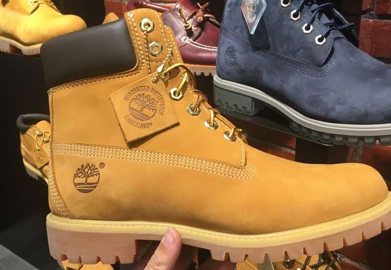
The logo became a hip-hop fashion icon in the 1990s. Artists from New York to London wore yellow boots as status symbols.
That tree emblem showed up in music videos, album covers, and street style photography. Timberland didn’t plan this adoption, but the brand benefited enormously.
Today, the logo signals both outdoor functionality and urban style. Few brands straddle those worlds so naturally.
How Does the Timberland Logo Fit Into the Overall Brand Identity?
The tree connects to everything Timberland does. Product design, marketing, sustainability programs, retail environments.
Their brand guidelines ensure consistent application across all touchpoints. The logo appears on product tags, store signage, packaging, and digital platforms.
Sub-brands like Timberland PRO use modified versions that maintain the tree while adding work-specific messaging. The visual thread stays intact.
Environmental initiatives get tied back to the tree symbol. Planting trees, using recycled materials, reducing carbon. The logo makes these efforts feel authentic rather than tacked on.
How Should the Timberland Logo Be Used?
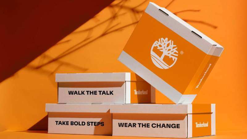
Official Usage Guidelines:
- Do: Maintain clear space around the logo, use approved color combinations, scale proportionally
- Don’t: Stretch or distort, place on busy backgrounds, alter colors outside approved palette, add effects like shadows or gradients
- Access: Official assets available through VF Corporation brand portal for authorized partners
- Licensing: Third-party use requires written approval from TBL Licensing LLC
- Trademark: The tree symbol and Timberland wordmark are registered trademarks protected internationally
Retailers and partners receive specific style guide documentation covering acceptable uses. Unauthorized reproduction or modification can result in legal action.
FAQ on The Timberland Logo
What Does the Timberland Logo Represent?
The tree symbol represents nature, durability, and outdoor lifestyle. It connects directly to the brand’s roots in crafting waterproof boots.
The Timberland brand identity speaks to environmental awareness. That single tree says everything about where their products belong.
Who Designed the Timberland Logo?
The original logo was created in-house by the Swartz family team when they founded Timberland LLC in 1973.
Nathan Swartz and Sidney Swartz built the company from the Abington Shoe Company. No external agency handled the initial brand mark design.
When Was the Timberland Logo First Introduced?
The logo debuted in 1973. That’s when the company officially became Timberland, named after their popular waterproof boot line.
The boot silhouette and tree imagery have remained core elements since that original introduction in Stratham, New Hampshire.
Why Does Timberland Use a Tree in Its Logo?
Trees represent the outdoors where Timberland boots perform best. Simple as that.
The company builds footwear for hiking, work, and rugged conditions. A tree communicates this outdoor heritage instantly through strong visual hierarchy.
What Are the Official Timberland Logo Colors?
The primary color palette includes wheat tan, black, and white. That wheat shade matches the iconic yellow boot leather perfectly.
Hex codes are #D2A552 for wheat, #000000 for black. These colors appear across all brand applications and merchandise.
Has the Timberland Logo Changed Over Time?
Yes, but changes have been subtle. The core tree symbol stayed consistent through every logo evolution since 1973.
VF Corporation refined the mark after acquiring the brand in 2011. Updates focused on digital optimization, not dramatic redesigns.
What Font Is Used in the Timberland Wordmark?
Timberland uses a custom typeface. Bold, uppercase, built for visibility.
The letterforms prioritize readability at any size. You’ll spot that wordmark on boot tongues, retail signage, and product packaging worldwide.
Is the Timberland Logo Trademarked?
Absolutely. TBL Licensing LLC owns the trademark registration internationally. Both the tree symbol and wordmark have legal protection.
Unauthorized use triggers enforcement action. The brand actively monitors and defends its visual identity across all markets.
What Hidden Meanings Exist in the Timberland Logo?
The tree branches create symmetry, suggesting balance and stability. Some interpret the roots as representing company heritage.
No confirmed hidden messages exist. The design works through directness, not clever tricks or subliminal elements.
Where Can I Download the Official Timberland Logo?
Authorized partners access official assets through VF Corporation’s brand portal. Public downloads require licensing approval.
The Timberland trademark restricts unofficial use. Contact TBL Licensing LLC directly for permission requests and proper file formats.
Conclusion
The Timberland Logo proves that simplicity wins. A tree, a wordmark, and a wheat color scheme built one of the most recognized brand symbols in the footwear industry.
VF Corporation now oversees this iconic mark. But the Swartz family vision remains intact.
From the 6-Inch Premium Boot to sustainability initiatives like GreenStride, that tree ties everything together. It connects premium leather boots to environmental responsibility.
The brand emblem works because it never tried to be clever. It just told the truth about what Timberland makes and where those products belong.

Renowned for his expertise in logo design and visual branding, Bogdan has developed a multitude of logos for various clients.
His skills extend to creating posters, vector illustrations, business cards, and brochures. Additionally, Bogdan's UI kits were featured on marketplaces like Visual Hierarchy and UI8.
He also wrote in the past years on sites like Design Your Way, WebDesignerDepot, WPDean, Designmodo, Speckyboy, Slider Revolution, and more.
- The Cursor Logo History, Colors, Font, And Meaning - 24 September 2026
- Top 7 Web Design Subscription Services That Replace Full-Time Hires - 24 September 2026
- Canva vs PowerPoint: Which Is Better for Presentations? - 22 September 2026

Bogdan Sandu is a seasoned designer who has been designing websites since 2008. Renowned for his expertise in logo design and visual branding, Bogdan has developed a multitude of logos for various clients. His skills extend to creating posters, vector illustrations, business cards, and brochures. Additionally, Bogdan's UI kits were featured on marketplaces like Visual Hierarchy and UI8. He also wrote in the past years on sites like Design Your Way, WebDesignerDepot, WPDean, Designmodo, Speckyboy, Slider Revolution, and more.
You Might Also Like