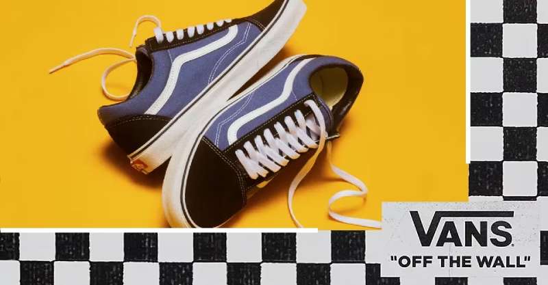
The Vans logo stands as one of the most recognizable marks in action sports and streetwear culture. Since its creation in the 1960s, this California-born brand has built an identity that resonates with skateboarders, surfers, and youth culture worldwide.
Understanding what makes a logo effective helps explain why the Vans mark has endured for decades.
The current Vans logo features the iconic “Off The Wall” tagline paired with bold, custom lettering. Paul Van Doren founded the company in 1966, and the brand has seen roughly four major logo iterations since then.
The design sits comfortably among legendary shoe brand logos that have shaped how we think about athletic and lifestyle footwear branding.
What is the Vans Logo?
The Vans logo is a combination mark featuring custom sans-serif lettering spelling “VANS” alongside the “Off The Wall” slogan, officially refined in its modern form during the 1970s, representing skateboarding rebellion and California youth culture.
Design Attributes
- Design Type: Combination mark (wordmark plus tagline)
- Primary Elements: Custom “VANS” lettering, “Off The Wall” script, occasional flying V symbol
- Official Introduction Date: Original 1966, major refinement 1976
- Designer/Agency: In-house design, evolved organically with brand
- Trademark Status: Registered trademark owned by VF Corporation
- Color Palette: Primary Red (#C3002F), Black (#000000), White (#FFFFFF)
- Usage Context: Footwear, apparel, skate parks, event sponsorships, retail locations
How Has the Vans Logo Evolved Over Time?
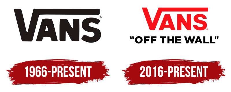
The Vans logo has transformed from a simple shoe store sign to a global streetwear icon across four main versions.
Each redesign reflected shifts in skate culture and the brand’s expanding audience.
The core identity remained rooted in that rebellious California spirit throughout every change.
Original Vans Logo (1966-1976)
- Years Active: 1966-1976
- Design Description: Simple storefront signage style, basic block lettering reading “Van Doren Rubber Company”
- Color Scheme: Black and white, occasionally with brown tones
- Designer: Paul Van Doren (informal design)
- Context: The company started as a small Anaheim shoe manufacturer selling directly to customers
- Key Changes from Previous: First iteration, no predecessor
- Cultural Significance: Represented local manufacturing and direct-to-consumer retail before it was trendy
Skateboard Era Logo (1976-1994)
- Years Active: 1976-1994
- Design Description: Introduction of the “Off The Wall” slogan with stylized script, bolder VANS wordmark
- Color Scheme: Red, black, and white became dominant
- Designer: In-house evolution with skater input
- Context: Z-Boys and Dogtown skaters adopted Vans, transforming the brand’s identity
- Key Changes from Previous: Added the iconic tagline, shifted from rubber company to lifestyle brand
- Cultural Significance: Cemented the connection between Vans and skateboarding permanently
Modernized Logo (1994-2016)
- Years Active: 1994-2016
- Design Description: Cleaner lines, refined typography, more versatile for global marketing
- Color Scheme: Standardized red (#C3002F), maintained black and white options
- Designer: Professional refinement under new corporate ownership
- Context: VF Corporation acquisition brought resources for brand standardization
- Key Changes from Previous: Tightened letterforms, improved scalability for digital use
- Cultural Significance: Helped Vans transition from niche skate brand to mainstream fashion
Current Logo (2016-Present)
- Years Active: 2016-present
- Design Description: Subtle refinements for digital optimization, maintained heritage elements
- Color Scheme: Same red, black, white palette with precise color specifications
- Designer: VF Corporation brand team
- Context: Digital-first approach while honoring 50+ years of brand history
- Key Changes from Previous: Minor proportion adjustments, optimized for social media and mobile
- Cultural Significance: Balances nostalgia with contemporary design needs
What Do the Design Elements of the Vans Logo Mean?
The Vans logo communicates rebellion, authenticity, and creative freedom through its bold letterforms and iconic slogan.
Every element connects back to skateboarding’s DIY ethos and Southern California roots.
Why Did Vans Choose These Specific Colors?
Red dominates because it grabs attention and signals energy. The hex code #C3002F creates that signature Vans red you see on shoe sidewalls and store signage.
Understanding color psychology reveals why this works. Red triggers excitement and passion, perfect for action sports.
Black provides contrast and edge. White offers versatility. Together they create a color palette that works on everything from checkerboard slip-ons to stadium banners.
What Typography Style Is Used in the Vans Logo?
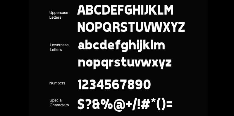
Vans uses a custom sans-serif font for the main wordmark. The letters are bold, slightly condensed, with a hint of hand-drawn character.
The “Off The Wall” tagline uses a looser script style. It feels spontaneous, like someone grabbed a marker and wrote it.
This mix of structured and casual typography elements captures the brand’s personality perfectly.
What Are the Hidden Meanings in the Vans Logo?
The phrase “Off The Wall” originally described a skateboarding trick. Skaters would ride up a wall and come back down. It became slang for anything unconventional or crazy.
The flying V symbol that sometimes appears represents forward motion and victory. Some see skateboard ramp shapes in the letterforms.
Whether intentional or not, these associations strengthen the brand’s connection to its core audience.
How Does the Vans Logo Compare to Competitor Logos?
Vans takes a different approach than most athletic footwear brands. While Nike relies on an abstract swoosh and Adidas uses three stripes, Vans leads with typography.
The Converse logo shares some DNA with Vans. Both have heritage appeal and connect to youth subcultures. But Converse leans more vintage Americana while Vans stays rooted in West Coast skate culture.
Puma and New Balance take completely different directions. They focus on athletic performance. Vans never pretended to be about running faster or jumping higher.
That positioning clarity shows in the logo. No abstract animal, no geometric symbol. Just the name and attitude.
What Are the Technical Specifications of the Vans Logo?
Official Color Codes
- Primary Red: Hex: #C3002F, RGB: (195, 0, 47), CMYK: (0, 100, 76, 24), Pantone: 199 C
- Black: Hex: #000000, RGB: (0, 0, 0), CMYK: (0, 0, 0, 100)
- White: Hex: #FFFFFF, RGB: (255, 255, 255), CMYK: (0, 0, 0, 0)
Dimensions and Proportions
- Aspect Ratio: Approximately 3:1 for wordmark only, varies with tagline inclusion
- Minimum Size: 0.5 inches width for print, 72 pixels for digital
- Clear Space: Height of the letter “V” on all sides minimum
- File Formats: Available in vector graphics (AI, EPS, SVG) and raster formats (JPEG, PNG)
What Cultural Impact Has the Vans Logo Had?
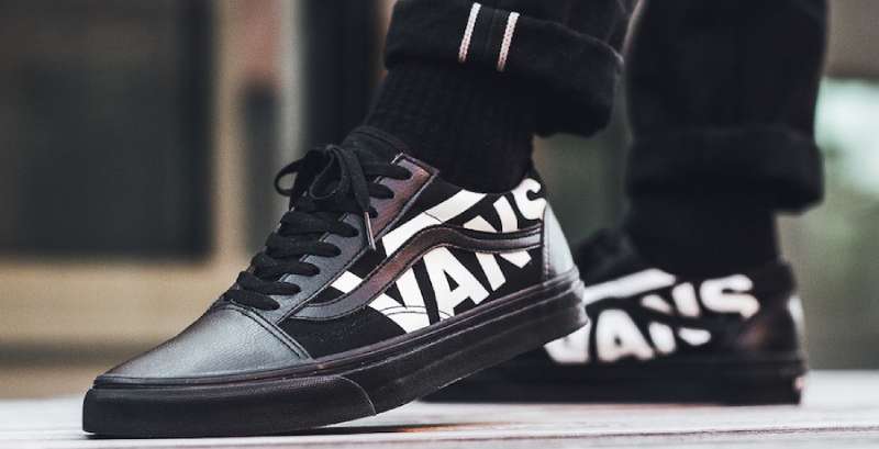
The checkerboard pattern and “Off The Wall” mark became symbols of counterculture identity. Kids who felt like outsiders found belonging in that logo.
When Sean Penn wore checkerboard Vans in “Fast Times at Ridgemont High,” it cemented the brand in pop culture permanently.
The Warped Tour partnership made Vans synonymous with punk rock for an entire generation. That logo on festival stages meant something to millions of teenagers.
Today you see the mark everywhere from high fashion collaborations to suburban malls. The logo bridges underground credibility and mainstream appeal in a way few brands manage.
How Does the Vans Logo Fit Into the Overall Brand Identity?

The logo anchors a complete visual system. Checkerboard patterns, specific photography styles, and that red-black-white palette all flow from core brand decisions.
Every touchpoint connects. Store interiors echo the logo’s bold simplicity. Product design references the same shapes and colors.
House of Vans locations use the mark as architectural inspiration. Skate park ramps mirror the angles in the letterforms. Well-defined brand guidelines ensure this consistency globally.
The result feels cohesive without being rigid. Collaborators from Supreme to museums can interpret the identity while maintaining recognition.
How Should the Vans Logo Be Used?
Official Usage Guidelines
- Do: Maintain minimum clear space around the logo
- Do: Use approved color variations only (full color, black, white, red)
- Do: Keep proportions locked when scaling
- Don’t: Stretch, rotate, or distort the logo
- Don’t: Add effects like shadows, gradients, or outlines
- Don’t: Place on busy backgrounds without proper contrast
Access and Licensing
- Official Assets: Available through VF Corporation brand portal for authorized partners
- Licensing: Required for any commercial use outside official channels
- Trademark Protection: Actively enforced globally by VF Corporation legal team
- Fan Use: Personal, non-commercial use generally tolerated but not officially permitted
FAQ on The Vans Logo
What Does the Vans Logo Look Like?
The Vans logo features bold custom lettering spelling “VANS” with the iconic “Off The Wall” tagline below. It’s a combination mark that works in red, black, or white.
The design uses clean lines without unnecessary decoration. Simple and direct.
What Does “Off The Wall” Mean?
The phrase came from skateboarding. Skaters would ride up vertical ramps and walls, then come back down. That move was called going “off the wall.”
It became slang for anything wild or unconventional. Perfect for a brand built on skate culture rebellion.
Who Designed the Original Vans Logo?
Paul Van Doren created the first version informally when he opened his Anaheim store in 1966. No fancy design agency involved.
The logo evolved organically over decades. Later refinements came from in-house teams after VF Corporation acquired the typeface and brand assets.
When Was the Vans Logo Created?
The original appeared in 1966 when the Van Doren Rubber Company opened. The “Off The Wall” version came around 1976.
That second version changed everything. It marked the shift from shoe manufacturer to lifestyle brand.
What Are the Official Vans Logo Colors?
Primary red (#C3002F) leads the palette. You’ll also see black and white versions everywhere. These choices align with common red logos that want to convey energy and passion.
The red pops against the checkerboard patterns Vans is known for.
Has the Vans Logo Changed Over Time?
Yes. Four major versions exist. The brand started with basic storefront signage, then added the tagline in the seventies.
Modern updates focused on digital optimization. The core identity stayed consistent through every logo evolution since the skateboard era.
What Font Does Vans Use in Its Logo?
Vans uses a custom font designed specifically for the brand. It’s a bold sans-serif with slightly condensed letterforms.
The “Off The Wall” script feels more casual. Hand-drawn energy. Understanding font psychology explains why this combination works so well.
Why Is the Vans Logo So Recognizable?
Consistency matters. The brand kept core design elements intact for decades while competitors constantly rebranded.
Cultural placement helped too. Movies, music festivals, and pro skaters all boosted brand recognition among youth audiences worldwide.
What Is the Flying V Symbol in the Vans Logo?
The flying V appears on some Vans products as a secondary mark. It represents forward motion and connects to the first letter of Vans.
You’ll spot it on shoe tongues and apparel tags. A subtle nod to the brand’s California surf and skate heritage.
Can I Use the Vans Logo for My Own Projects?
Not commercially. VF Corporation actively protects its trademark. Any business use requires official licensing.
Personal fan projects exist in a gray area. The company generally tolerates non-commercial use but doesn’t officially permit it. Check their brand style guide for details.
Conclusion
The Vans Logo represents more than footwear. It carries decades of skateboarding culture, punk rock rebellion, and California streetwear history in every curve and line.
From a small Anaheim rubber company to a global icon owned by VF Corporation, the brand maintained its visual identity with remarkable consistency.
That checkerboard pattern and “Off The Wall” slogan still resonate with youth culture worldwide. Few brands achieve this kind of authenticity.
The logo works because it never tried too hard. It grew organically from the streets, skate parks, and music venues where real fans wore the shoes.
That’s brand heritage you simply cannot manufacture.

Renowned for his expertise in logo design and visual branding, Bogdan has developed a multitude of logos for various clients.
His skills extend to creating posters, vector illustrations, business cards, and brochures. Additionally, Bogdan's UI kits were featured on marketplaces like Visual Hierarchy and UI8.
He also wrote in the past years on sites like Design Your Way, WebDesignerDepot, WPDean, Designmodo, Speckyboy, Slider Revolution, and more.
- Jujutsu Kaisen Font Generator - 12 October 2026
- The Windsurf Logo History, Colors, Font, And Meaning - 10 October 2026
- How to Remove Background From Product Photos (No Photoshop) - 10 October 2026

Bogdan Sandu is a seasoned designer who has been designing websites since 2008. Renowned for his expertise in logo design and visual branding, Bogdan has developed a multitude of logos for various clients. His skills extend to creating posters, vector illustrations, business cards, and brochures. Additionally, Bogdan's UI kits were featured on marketplaces like Visual Hierarchy and UI8. He also wrote in the past years on sites like Design Your Way, WebDesignerDepot, WPDean, Designmodo, Speckyboy, Slider Revolution, and more.
You Might Also Like