
The Converse logo stands as one of the most recognized symbols in footwear history. It has been stamped on millions of sneakers since the early 20th century.
Within the shoe brand logos landscape, few marks carry the same cultural weight. The star chevron design sits alongside giants like the Adidas logo and Puma logo in terms of global recognition.
The current star chevron version was introduced in 1977. Before Nike’s acquisition in 2003, the brand went through roughly ten logo iterations. Converse was founded in 1908 in Malden, Massachusetts, making it one of America’s oldest athletic footwear companies.
What is the Converse Logo?

The Converse logo features a five-pointed star enclosed within a chevron shape. It was officially standardized in 1977 and represents athletic excellence combined with street culture authenticity. The design reflects both basketball heritage and countercultural identity.
Design Type: Combination mark (symbol plus wordmark)
Primary Elements:
- Five-pointed star
- Chevron enclosure
- Converse wordmark
- Chuck Taylor ankle patch (product-specific)
Official Introduction Date: 1977 (star chevron version)
Designer/Agency: In-house Converse design team
Trademark Status: Registered trademark owned by Nike, Inc. since 2003
Color Palette:
- Black (#000000)
- White (#FFFFFF)
- Navy Blue (#1C3F6E) for heritage applications
Usage Context: Product labeling, retail displays, marketing campaigns, digital platforms, merchandise tags, and the famous ankle patch on Chuck Taylor All Stars
How Has the Converse Logo Evolved Over Time?

The Converse logo has changed significantly across its 100+ year history.
Early versions focused on text-based marks. The star element appeared later and became the brand’s defining feature.
Nike’s ownership brought modernization while respecting heritage elements.
Original Converse Rubber Shoe Company Logo (1908-1920s)
Years Active: 1908 to approximately 1920
Design Description: Simple text-based wordmark reading “Converse Rubber Shoe Company.” No star or chevron elements existed yet.
Color Scheme: Black text on product labels
Designer: Unknown, likely company founders
Context: The company initially made winterized rubber footwear. Athletic shoes weren’t the focus yet.
Cultural Significance: Represented early American manufacturing and the rubber industry boom
Chuck Taylor Era Logo (1920s-1960s)
Years Active: 1920s through 1960s
Design Description: Introduction of the circular ankle patch featuring Chuck Taylor’s name and a star. This became the most iconic element.
Color Scheme: Blue, white, and red on the ankle patch
Designer: Credited to Chuck Taylor’s collaboration with Converse
Context: Chuck Taylor, a basketball player and salesman, helped popularize the shoes. His endorsement deal was groundbreaking.
Key Changes: First appearance of the star symbol that would define the brand
Cultural Significance: Established sneakers as both athletic gear and fashion items
Star Chevron Logo (1977-2003)
Years Active: 1977 to 2003
Design Description: The five-pointed star inside a chevron shape became the corporate logo. Clean, modern, and easily reproducible.
Color Scheme: Primarily black and white, with blue variations
Designer: Converse in-house team
Context: The company needed a unified brand mark beyond the ankle patch. Basketball was losing dominance to newer competitors.
Key Changes: First standalone symbol that could work without text
Cultural Significance: Became associated with punk rock, grunge, and counterculture movements
Nike Era Logo (2003-Present)
Years Active: 2003 to present
Design Description: Refined star chevron with updated proportions. Cleaner lines and improved scalability for digital use.
Color Scheme: Black, white, and occasional heritage navy
Designer: Nike brand design teams
Context: Nike purchased Converse out of bankruptcy. The logo needed updating for modern applications while keeping heritage appeal.
Key Changes: Subtle refinements to proportions and spacing. Better digital optimization.
Cultural Significance: Maintained authenticity while reaching new generations
What Do the Design Elements of the Converse Logo Mean?
The star represents athletic achievement and aspiration.
It connects directly to the brand’s basketball origins. The chevron creates forward momentum and frames the star with purpose.
Together, these elements suggest both heritage and progress.
Why Did Converse Choose These Specific Colors?
Black
- Hex: #000000
- Symbolic meaning: Timelessness and versatility
- Psychological impact: Authority and sophistication
- Brand connection: Works on any shoe color
White
- Hex: #FFFFFF
- Symbolic meaning: Simplicity and purity
- Psychological impact: Clean and approachable
- Brand connection: Classic Chuck Taylor canvas
Navy Blue
- Hex: #1C3F6E
- Symbolic meaning: Heritage and trust
- Psychological impact: Reliability
- Brand connection: Original ankle patch coloring
Understanding color psychology helps explain why these choices work so well across different markets and demographics.
What Typography Style Is Used in the Converse Logo?
The Converse wordmark uses a custom sans-serif font with squared letterforms.
The letters have consistent stroke widths. There’s a slightly industrial quality to the shapes.
Readability stays strong at small sizes. The typography has evolved to become sharper over time.
Earlier versions used more rounded letterforms. The current version feels more contemporary while staying true to the original character.
What Are the Hidden Meanings in the Converse Logo?
The chevron pointing upward suggests growth and ambition.
Some see the star as representing the five positions in basketball. Others interpret it as a symbol of stardom itself.
The simplicity allows multiple readings. Designers intended the mark to feel American and athletic.
Unintentionally, it became a symbol of rebellion. Took me a while to notice that the chevron also resembles a stylized letter V, possibly for “victory.”
How Does the Converse Logo Compare to Competitor Logos?

Converse takes a different approach than most athletic brands.
Nike uses a swoosh. Adidas has three stripes. Converse chose a contained symbol rather than an abstract mark.
This reflects its older heritage and product-focused branding.
The Vans logo shares some DNA with Converse. Both emphasize text and heritage over dynamic motion graphics.
Meanwhile, the New Balance logo goes for a more technical feel.
The Reebok logo has changed dramatically over the years, moving from text to abstract symbols. Converse stayed more consistent.
Under Armour’s logo pushes aggression and performance. Converse feels approachable by comparison.
Looking at logos from other industries, there’s interesting overlap with tech company logos that also balance simplicity with recognition.
What Are the Technical Specifications of the Converse Logo?
Official Color Codes:
Primary Color: Black
Secondary Color: White
- Hex: #FFFFFF
- RGB: (255, 255, 255)
- CMYK: (0, 0, 0, 0)
Heritage Color: Navy Blue
- Hex: #1C3F6E
- RGB: (28, 63, 110)
- CMYK: (100, 75, 25, 20)
Dimensions and Proportions:
- Aspect ratio: Approximately 1:1 for the star chevron symbol
- Minimum size: 0.5 inches (12.7mm) for print applications
- Clear space: Equal to the height of the star on all sides
- The logo should appear as vector graphics whenever possible for scalability
What Cultural Impact Has the Converse Logo Had?
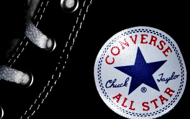
Few sneaker logos carry the same cultural weight as Converse.
The star became a symbol for musicians, artists, and anyone wanting to signal authenticity. Kurt Cobain wore them. The Ramones made them punk uniform.
Basketball players started it all. But the cultural handoff to musicians and artists happened naturally.
The logo appears in countless films, music videos, and photographs. It represents accessible rebellion, if that makes sense.
How Does the Converse Logo Fit Into the Overall Brand Identity?
The logo connects to a broader system of brand elements.
There’s the star chevron for corporate use. The Chuck Taylor ankle patch for product authentication. And various wordmark treatments for different contexts.
Everything ties back to the star. The brand guidelines ensure consistency across all touchpoints, from packaging design to digital advertising.
Product design, retail environments, and marketing all reference the star in some way. Even the rubber toe cap shape echoes the curved elements of the logo system.
How Should the Converse Logo Be Used?
Official Usage Guidelines:
Do:
- Use official logo files from Nike’s brand portal
- Maintain required clear space around the logo
- Use approved color variations only
- Scale proportionally
Don’t:
- Stretch or distort the logo
- Add effects like shadows or gradients
- Change the colors without authorization
- Place on busy backgrounds that reduce visibility
Where to Access Official Logos: Licensed partners receive assets through Nike’s brand management system. Public use requires written permission.
Licensing Information: Converse trademarks are strictly protected under Nike, Inc. Unauthorized commercial use results in legal action.
Trademark Protection: The star chevron, Chuck Taylor signature, and ankle patch design are all registered trademarks. Fan art and personal use exist in a gray area, but commercial reproduction requires licensing.
FAQ on The Converse Logo
What Does the Converse Star Logo Mean?
The star chevron represents athletic achievement and forward momentum.
The five-pointed star connects to basketball heritage. Some believe it symbolizes the five player positions on a court.
The chevron frames the star and suggests upward progress.
When Was the Converse Logo Created?
The original company wordmark appeared in 1908 when Marquis Mills Converse founded the business in Massachusetts.
The famous Chuck Taylor ankle patch came in the 1920s. The current star chevron symbol was standardized in 1977.
Who Designed the Converse Logo?
The in-house Converse design team created the 1977 star chevron mark. No single designer gets credit.
Chuck Taylor himself influenced the ankle patch design. Understanding logo design principles shows why this collaboration worked so well.
Why Does Converse Have a Star?
Stars symbolize excellence and aspiration. Perfect for athletic footwear.
The star first appeared on the Chuck Taylor All Star sneaker in the 1920s. It became so iconic that it defined the entire brand identity going forward.
What Are the Official Converse Logo Colors?
Black (#000000) and white (#FFFFFF) serve as primary colors. Navy blue (#1C3F6E) appears in heritage applications.
This simple color palette works on any shoe color. Smart color theory at play here.
How Has the Converse Logo Changed Over Time?
The brand went through roughly ten logo iterations since 1908.
Early versions used text only. The star emerged in the 1920s. The chevron joined in 1977. Nike refined everything after 2003.
What Is the Chuck Taylor Ankle Patch?
It’s a circular patch sewn onto every Chuck Taylor All Star sneaker. Features the star, Chuck Taylor’s signature, and “All Star” text.
This ankle patch design became one of the most recognized logo elements in sneaker history.
Does Nike Own the Converse Logo?
Yes. Nike Inc. purchased Converse out of bankruptcy in 2003 for $305 million.
All trademark rights transferred to Nike. The parent company maintains the brand separately from its main Nike footwear lines.
Can I Use the Converse Logo for My Project?
Commercial use requires licensing from Nike Inc. The star chevron and ankle patch are registered trademarks.
Fan art exists in gray areas. But selling products with the logo means legal trouble. Always check brand style guide requirements first.
What Font Does Converse Use in Their Logo?
Converse uses a custom font with squared letterforms and consistent stroke widths.
The typeface has industrial qualities. Earlier versions were rounder. Current lettering feels sharper and more contemporary.
Conclusion
The Converse logo has survived over a century of changes in footwear and fashion. That says something.
From the Chuck Taylor ankle patch to the modern star chevron, every version tells a story. The brand moved from basketball courts to punk stages to everyday streetwear culture without losing its identity.
Good graphic design principles and clear visual hierarchy kept the logo recognizable through each iteration.
Few vintage sneaker emblems carry this much cultural weight. The star remains a symbol of authentic self-expression.

Renowned for his expertise in logo design and visual branding, Bogdan has developed a multitude of logos for various clients.
His skills extend to creating posters, vector illustrations, business cards, and brochures. Additionally, Bogdan's UI kits were featured on marketplaces like Visual Hierarchy and UI8.
He also wrote in the past years on sites like Design Your Way, WebDesignerDepot, WPDean, Designmodo, Speckyboy, Slider Revolution, and more.
- Versatile Work Sans Font Pairing for Every Project - 16 September 2026
- How to Set Up a Digital Menu Board: Hardware to Layout - 15 September 2026
- The Arc Browser Logo History, Colors, Font, And Meaning - 14 September 2026

Bogdan Sandu is a seasoned designer who has been designing websites since 2008. Renowned for his expertise in logo design and visual branding, Bogdan has developed a multitude of logos for various clients. His skills extend to creating posters, vector illustrations, business cards, and brochures. Additionally, Bogdan's UI kits were featured on marketplaces like Visual Hierarchy and UI8. He also wrote in the past years on sites like Design Your Way, WebDesignerDepot, WPDean, Designmodo, Speckyboy, Slider Revolution, and more.
You Might Also Like