The New Balance Logo History, Colors, Font, and Meaning
Imagine a world where every step you take echoes your identity—yours, unique and resonant. That’s the power of the New Balance logo—more than a simple emblem on athletic footwear, it’s a symbol etched into the cultural terrain of sports and style.
Steeped in heritage yet continuously innovating, this iconic “N” serves as a beacon, signaling a commitment to comfort, design, and endurance.
In this dive deep, you’ll unravel the threads of New Balance’s branding tapestry. We’ll explore its symbolic significance, unravel its history, and decode its impact on sneakerhead culture across the globe.
By the tail end, you’ll be primed with knowledge: from understanding the subtleties of sneaker design to appreciating how the logo shapes brand identity within the hyper-competitive world of athletic apparel.
You won’t just spot a logo; you’ll see a story, a strategy, a statement. This is your all-access pass to the essence behind the emblem—New Balance Athletics, Inc.: from Boston’s cobblestone streets to the global tracks.
The Meaning Behind the New Balance Logo
The N-Symbol
The New Balance logo, that iconic ‘N’ symbol, it’s more than just a letter on a shoe. It’s a statement, a declaration of intent, a promise. It signifies the company’s continuous journey towards perfection and balance in their craft.
The ‘N’ stands for ‘New Balance,’ but it also stands for ‘New Beginnings,’ as the brand constantly strives to innovate and improve.
The N-symbol is bold, it stands out, and it’s unapologetic. Much like the brand, it doesn’t shy away from making a statement. It’s a loud and proud proclamation of the brand’s commitment to quality and functionality in design.
The Simplicity
Simplicity is key in design, and New Balance takes that to heart. The simplicity of the logo, that ‘N’ symbol, represents the brand’s commitment to pure performance.
No unnecessary frills, no over-the-top elements, just pure functionality and quality. It’s a testament to their belief that the best design is simple, straightforward, and effective.
The History of the New Balance Logo
The Beginning
The journey of the New Balance logo is a story of evolution. Born in 1906, the brand initially began without a logo. It was all about the shoes, their comfort, and their quality. But as the brand grew, so did the need for a distinctive symbol.
The Emergence of the ‘N’
In the 1970s, the ‘N’ symbol made its first appearance. It was a bold move, a departure from the norm. But it was a move that resonated with people.
The ‘N’ quickly became synonymous with the brand, symbolizing its commitment to quality and innovation. It was a symbol of change, of evolution, and of progress.
The Colors of the New Balance Logo
The New Balance logo has seen various changes over its history, yet its color scheme has consistently featured red, black, and white.
The official shade of the logo is crimson, identified by the hex code e21836 and RGB values of (226, 24, 54). Although the color arrangement has been updated with each brand redesign, the foundational palette has remained constant.
The contemporary iteration of the logo offers more variety, incorporating both black and white as well as red and white combinations.
The Font Used in the New Balance Logo
The font used in the New Balance logo is as distinctive as the ‘N’ symbol. It’s bold, it’s confident, and it’s unapologetic. The all-caps representation of the brand name, often seen alongside the logo, resonates with the brand’s strong identity.
The font speaks volumes about the brand’s commitment to quality and innovation. It’s a testament to their belief in standing out, in making a statement, and in being true to their identity. It’s not just a font, it’s an embodiment of the brand’s ethos.
The Impact of the New Balance Logo
Brand Recognition
The ‘N’ symbol of the New Balance logo has become one of the most recognizable logos in the world of sportswear. It’s a testament to the brand’s impact and reach.
The logo, in its simplicity and boldness, has managed to carve a distinctive identity for the brand, making it instantly recognizable.
The Promise
The logo is not just a symbol, it’s a promise. It’s a commitment from the brand to its customers, promising quality, innovation, and continuous improvement. The impact of this promise is profound, instilling trust and loyalty in the hearts of its customers.
The Evolution of the New Balance Logo
The Journey
The journey of the New Balance logo is a testament to the brand’s continuous evolution. From the early days of the brand’s inception to the present day, the logo has evolved alongside the brand, reflecting its growth and progress.
The Future
Looking at the journey of the New Balance logo, one can’t help but wonder about its future. Will it continue to evolve and adapt, reflecting the brand’s commitment to innovation and improvement? Only time will tell, but one thing is for sure, the ‘N’ symbol will continue to be a beacon of quality and functionality in design.
The Symbolism in the New Balance Logo
Balance and Movement
While the ‘N’ symbol of the New Balance logo stands for ‘New Balance’, it also embodies the concept of balance and movement. The brand is all about creating footwear that enables and enhances movement while maintaining a perfect balance of comfort and style.
Innovation and Quality
The New Balance logo symbolizes the brand’s commitment to innovation and quality. The ‘N’ symbol, in its simplicity and boldness, signifies the brand’s relentless pursuit of perfection in design and functionality. It represents the brand’s journey towards creating products that are innovative, high-quality, and that push the boundaries of design and performance.
To sum up, the New Balance logo is more than just a symbol. It’s an embodiment of the brand’s ethos, its commitment to quality, innovation, and continuous improvement. It’s a testament to the brand’s journey, its evolution, and its unwavering commitment to delivering products that are synonymous with comfort, style, and functionality.
FAQ On The New Balance Logo
What does the New Balance logo represent?
The “N” of the New Balance logo? It’s not just style; it’s their stamp. A representation of balance between function and fashion in their sneakers. It’s a pledge, really, of premium quality and an unwavering commitment to craftsmanship in every pair.
How has the New Balance logo evolved over time?
Sure, it’s changed outfits over the years, the logo. Early on, it was simple, text-heavy. Then, bam! The “N” became the star. This evolution showcases New Balance’s growth from a humble Boston-based company to a global icon in the athletic footwear industry.
Is the New Balance logo trademarked?
Bet your bottom dollar it’s protected. The logo is a registered trademark. This gives New Balance exclusive rights to the emblem, keeping it safe from imitators and ensuring that when you see the “N”, it’s the real deal.
What’s the significance of the New Balance logo placement on shoes?
Placement is no random game. On sneakers, the logo holds prime real estate on both sides for max visibility. This strategic spot isn’t just for looks—it’s a badge of high-quality sporting tech and style, screaming “New Balance” with every stride.
Why do some New Balance shoes have different logo colors?
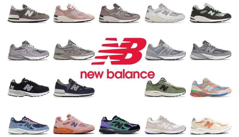
Color variation is their way of spicing things up—matching design with function while staying on-trend. Each hue can signify a different line, special edition, or collab, like vibrant greens for running or muted tones for New Balance Classics. It’s all about choice and identity.
Are there counterfeit New Balance products with a fake logo?
Like any major brand, counterfeits are a pesky issue. Knock-off “N” logos can fool the best of us. That’s why it’s wise to buy from legit sources. Keeping an eye out for logo quality and craftsmanship details can fend off the fakes.
How important is the New Balance logo to the brand’s identity?
Picture this: the “N” is New Balance’s handshake. It’s vital, the core of their visual appeal.
It carries the brand’s legacy—think Boston tracks to streets worldwide—and is central to the New Balance brand’s identity, symbolizing its rich heritage and innovation in athletic apparel.
Do all New Balance products feature the prominent “N” logo?
Almost all, yes. From sneakers to sports gear, that “N” is almost always there. It’s their mark of excellence. On rare occasions, minimalistic designs may downplay the logo, but only to serve a certain style or aesthetic line.
How do collaborations impact the design of the New Balance logo?
Collabs are the jazz in footwear design—unexpected, exciting. Special editions might remix the “N” with unique twists, thanks to external creative inputs. It’s a dance between maintaining brand recognition and embracing the fresh vision of the collaborator. A true creative fusion!
What message does New Balance aim to convey with its logo?
Let’s cut to the chase. It’s about dependability; a promise of defiant quality in the world of sneakerhead culture. New Balance aims to meld tradition with modern looks in their logo, inviting patrons into a world where performance meets lifestyle—every single day.
Conclusion
So, we’ve circled the track, sprinted through the design details, and even leaped over a few counterfeit hurdles.
Wrapping it up, think about the New Balance logo as more than a graphic on the side of your kicks. It’s the heartbeat of a brand that’s stayed true to its roots while evolving to lace up the future of footwear. Whether it’s placed boldly on a pair of running shoes or subtly stitched onto some casual wear, this emblem speaks volumes without shouting.
In the end, we get it now, don’t we? The “N” isn’t just a letter; it’s New Balance’s story stitched into every product, a tale of quality, endurance, and undeniable style. As the lines blur between athletic performance and daily fashion, that logo remains a steadfast friend, a companion on every journey, and a promise in every step.
Carry that spirit onwards. Next time you spot the “N”, give it a nod; you’re in on the secret now.
If you liked this article about the New Balance logo, you should check out this article about the Puma logo.
There are also similar articles discussing the Vans logo, the Crocs logo, the Converse logo, and the Reebok logo.
And let’s not forget about articles on the Timberland logo, the Lacoste logo, the Skechers logo, and the Hunter logo.
Bogdan Sandu, a seasoned designer with 15 years of diverse experience, has been designing websites since 2008.
Renowned for his expertise in logo design and visual branding, Bogdan has developed a multitude of logos for various clients.
His skills extend to creating posters, vector illustrations, business cards, and brochures. Additionally, Bogdan's UI kits were featured on marketplaces like Visual Hierarchy and UI8.
Latest posts by Bogdan Sandu (see all)
- After Dark: Night Color Palettes for Mysterious Designs - 27 April 2024
- The Capcom Logo History, Colors, Font, And Meaning - 26 April 2024
- Earth Color Palettes Grounded in Nature: 40 Examples - 26 April 2024