


The North Face logo stands as one of the most recognized symbols in outdoor apparel. It features a curved quarter-circle design representing Half Dome, the iconic granite rock formation in Yosemite National Park.
Within the outdoor industry, this logo helped establish visual standards that competitors still reference today. The current version dates back to 1971, created by David Alcorn shortly after the company’s founding.
Douglas Tompkins and his wife Susie founded The North Face in 1966 in San Francisco. The logo has seen roughly three iterations since then, though the core Half Dome symbol remained consistent through each version.
What Is The North Face Logo?
The North Face logo is a combination mark featuring a stylized Half Dome silhouette above the brand’s wordmark. Introduced in 1971, designer David Alcorn created it to represent the coldest, most unforgiving side of a mountain. The curved lines suggest both the geological formation and the spirit of exploration.
Design Type: Combination mark (symbol plus wordmark)
Primary Elements:
- Quarter-circle Half Dome symbol with three curved lines
- Bold sans-serif wordmark reading “THE NORTH FACE”
- Horizontal line separating symbol from text
Official Introduction Date: 1971
Designer: David Alcorn
Trademark Status: Registered trademark of VF Corporation (acquired The North Face in 2000)
Color Palette:
- Primary Black: #000000
- Primary White: #FFFFFF
- Accent Red (heritage use): #E42313
Usage Context: Product labels, hang tags, retail signage, digital platforms, marketing campaigns, and collaboration merchandise
How Has The North Face Logo Evolved Over Time?

The North Face logo has gone through three main phases since 1966. Each change refined the visual identity while keeping the Half Dome concept intact.
The transitions were subtle. Most people wouldn’t notice the differences without a side-by-side comparison.
Original The North Face Logo (1966-1968)
Years Active: 1966-1968
Design Description: Simple text-based design without the Half Dome symbol. The original store focused on climbing equipment, and branding wasn’t a priority yet.
Color Scheme: Black and white
Designer: Unknown (likely in-house)
Context: Douglas Tompkins opened the first retail location in San Francisco’s North Beach neighborhood. The name referenced the north face of mountains in the Northern Hemisphere, which receives the least sunlight.
Cultural Significance: Represented the countercultural climbing community of 1960s California
David Alcorn Era Logo (1971-1990s)
Years Active: 1971 to mid-1990s
Design Description: Introduction of the iconic Half Dome quarter-circle. Three curved lines create the mountain silhouette. The wordmark sat below in a straightforward sans-serif font.
Color Scheme: Black, white, and occasional red accents
Designer: David Alcorn
Context: The company had shifted from retail to manufacturing its own products. They needed a stronger visual identity to compete.
Key Changes from Previous: Added the Half Dome symbol that would define the brand
Cultural Significance: Became associated with serious mountaineers and expedition teams
Modern The North Face Logo (1990s-Present)
Years Active: Mid-1990s to present
Design Description: Refined version with cleaner lines and improved typography. The proportions were adjusted for better reproduction across different media.
Color Scheme: Black and white primary, with red remaining for heritage products
Designer: Internal design team refinements
Context: VF Corporation’s acquisition brought more resources. The logo needed to work across global markets and digital platforms.
Key Changes from Previous: Tighter spacing, modernized letterforms, standardized proportions
Cultural Significance: Crossed over from outdoor niche to mainstream fashion and streetwear culture
What Do the Design Elements of The North Face Logo Mean?
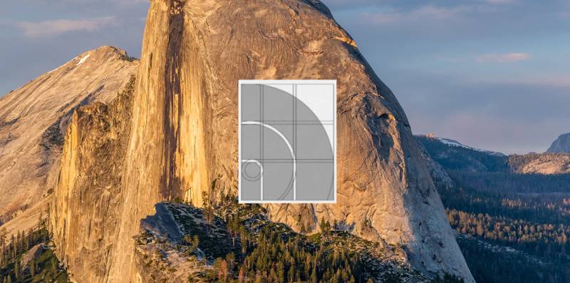
The Half Dome symbol carries deep meaning. It represents the challenging north face of a mountain, which climbers consider the most difficult route.
This wasn’t an arbitrary choice. The founders were climbers themselves.
Why Did The North Face Choose These Specific Colors?
Black (#000000)
Black communicates strength and durability. It works on any background and reproduces well on product labels.
The psychology behind color choices here is straightforward. Black suggests the brand takes outdoor pursuits seriously.
White (#FFFFFF)
White provides contrast and represents snow, ice, and alpine environments. It also gives the logo flexibility across dark-colored products.
Red (#E42313)
The heritage red appears on Summit Series products and vintage-inspired pieces. Red signals danger and excitement. It connects to the adrenaline of extreme sports.
What Typography Style Is Used in The North Face Logo?
The wordmark uses a custom typeface based on Helvetica Bold. The letters are slightly condensed and have been modified for better recognition.
Readability was a priority. The text needs to be legible on small labels and large store signs alike.
The all-caps treatment adds authority. It feels commanding without being aggressive.
What Are the Hidden Meanings in The North Face Logo?
The three curved lines aren’t just aesthetic. They represent the three main ridges of Half Dome as seen from the valley floor.
Some people see an abstract sunrise or sunset in the design. This wasn’t intentional, but it works thematically.
David Alcorn has stated the design was purely geographical. Still, the shape has taken on broader meaning over the decades.
How Does The North Face Logo Compare to Competitor Logos?
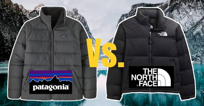
Most outdoor brands lean toward nature imagery. Mountains, trees, animals. The North Face took the same approach but with more abstraction.
Arc’teryx uses a fossil bird (archaeopteryx) that feels scientific and premium. Patagonia chose a mountain range silhouette that’s more literal.
Columbia’s logo is corporate and text-focused. It lacks the iconic symbol that makes The North Face instantly recognizable.
The North Face sits in a sweet spot. Abstract enough to feel sophisticated, literal enough to communicate outdoor heritage. This balance explains why the brand crossed over into streetwear so successfully.
What Are the Technical Specifications of The North Face Logo?
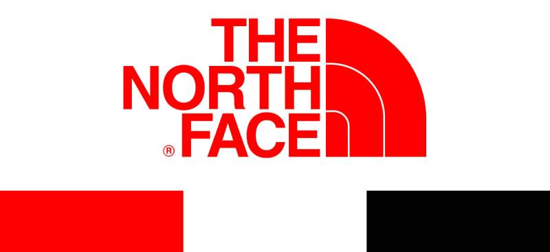
Official Color Codes:
Primary Black
Primary White
- Hex: #FFFFFF
- RGB: (255, 255, 255)
- CMYK: (0, 0, 0, 0)
Heritage Red
- Hex: #E42313
- RGB: (228, 35, 19)
- CMYK: (0, 95, 100, 0)
- Pantone: 485 C
Dimensions and Proportions:
- Aspect ratio: Approximately 1:1.5 (symbol to wordmark combined)
- Minimum size: 0.5 inches wide for print applications
- Clear space: Equal to the height of the “T” in “THE” on all sides
- The symbol should never be separated from the wordmark in official usage
What Cultural Impact Has The North Face Logo Had?
The logo became a status symbol in the 1990s hip-hop scene. Artists wore Nuptse jackets as a flex. The brand didn’t plan this.
By the 2000s, The North Face was everywhere. Suburban kids, urban youth, actual mountaineers. The logo unified them somehow.
Collaborations with Supreme and Gucci cemented its fashion credibility. That Half Dome symbol works on a $200 jacket and a $2,000 one.
How Does The North Face Logo Fit Into the Overall Brand Identity?
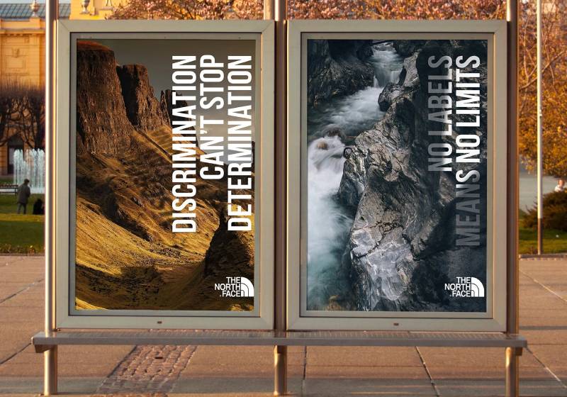
The logo anchors everything. Product design, retail spaces, advertising. It all connects back to that Half Dome shape.
Their tagline “Never Stop Exploring” echoes the logo’s meaning. Both point toward challenge and adventure.
The brand guidelines enforce strict consistency. Colors, spacing, placement. Nothing gets improvised.
This discipline built trust over decades. When you see that logo, you know what you’re getting.
How Should The North Face Logo Be Used?
Official Usage Guidelines:
Do:
- Use official logo files from VF Corporation brand portal
- Maintain required clear space around the logo
- Use only approved color combinations (black on white, white on black, white on red)
- Keep the symbol and wordmark together as one unit
Don’t:
- Stretch, rotate, or distort the logo
- Change the logo colors to non-approved combinations
- Place the logo on busy backgrounds that reduce legibility
- Separate the Half Dome symbol from the wordmark
- Add effects like shadows, outlines, or gradients
Accessing Official Logos: Authorized retailers and partners can access logo files through VF Corporation’s brand asset portal. Media inquiries go through the corporate communications team.
Trademark Protection: The North Face actively protects its trademark. Counterfeiting is a significant issue for the brand. They’ve pursued legal action against knockoff manufacturers globally.
Licensing: Collaboration partners (like Supreme, Gucci, and others) receive specific usage rights for limited collections. These agreements are negotiated individually and don’t set precedent for general use.
FAQ on The North Face Logo
What Does The North Face Logo Represent?
The logo represents Half Dome, a granite rock formation in Yosemite National Park.
The curved lines create an abstract mountain silhouette. It symbolizes the challenging north face of peaks, which receives the least sunlight and poses the greatest difficulty for climbers.
Who Designed The North Face Logo?
David Alcorn designed the iconic Half Dome symbol in 1971.
He created it shortly after the company shifted from retail to manufacturing outdoor apparel. The design has remained largely unchanged for over five decades. Few famous graphic designers can claim such lasting brand recognition.
What Font Is Used in The North Face Wordmark?
The wordmark uses a custom font based on Helvetica Bold.
The letters are slightly condensed for better visual impact. This bold, all-caps treatment creates strong visual hierarchy on product labels and marketing materials.
What Colors Are in The North Face Logo?
The primary color palette is black and white.
A heritage red appears on Summit Series products. This monochrome approach ensures the logo works across any background. Simple. Versatile. Timeless.
When Was The North Face Logo Created?
The current Half Dome logo debuted in 1971.
The company itself started in 1966 in San Francisco. Douglas Tompkins founded the original retail store in the North Beach neighborhood before the iconic symbol existed.
Why Is It Called “The North Face”?
The name references the north face of mountains in the Northern Hemisphere.
This side receives minimal sunlight. It’s colder, icier, and more dangerous. The brand identity connects directly to extreme mountaineering and expedition culture.
Has The North Face Logo Changed Over Time?
The core Half Dome symbol has stayed consistent since 1971.
Minor refinements happened in the 1990s. Tighter font spacing and cleaner lines improved reproduction across digital platforms. The brand maintains strong unity across all visual touchpoints.
Is The North Face Logo Trademarked?
Yes. VF Corporation holds the registered trademark.
They acquired The North Face in 2000. The company actively pursues counterfeiters worldwide. Trademark protection remains a priority for this outdoor apparel giant.
What Makes The North Face Logo So Recognizable?
The abstract mountain silhouette is distinctive yet simple. It follows core logo design principles perfectly.
The design works at any size. Product labels, store signage, digital ads. This flexibility built decades of brand recognition across global markets.
Can I Use The North Face Logo for My Project?
No. Unauthorized use violates trademark law.
Partners and retailers access official vector graphics through VF Corporation’s brand portal. Media requests go through corporate communications. The brand style guide controls every application.
Conclusion
The North Face logo proves that minimalist design works. David Alcorn’s Half Dome symbol has represented adventure and exploration since 1971.
The brand identity stays consistent across every touchpoint. From Summit Series gear to streetwear collaborations with Supreme and Gucci.
Good storytelling matters. That curved mountain silhouette tells you everything about the company’s values before you read a single word.
VF Corporation maintains strict visual standards. This discipline built brand trust across outdoor enthusiasts and fashion consumers alike.
Few outdoor apparel symbols achieve this level of recognition. The Half Dome earned it.

Renowned for his expertise in logo design and visual branding, Bogdan has developed a multitude of logos for various clients.
His skills extend to creating posters, vector illustrations, business cards, and brochures. Additionally, Bogdan's UI kits were featured on marketplaces like Visual Hierarchy and UI8.
He also wrote in the past years on sites like Design Your Way, WebDesignerDepot, WPDean, Designmodo, Speckyboy, Slider Revolution, and more.
- Jujutsu Kaisen Font Generator - 12 October 2026
- The Windsurf Logo History, Colors, Font, And Meaning - 10 October 2026
- How to Remove Background From Product Photos (No Photoshop) - 10 October 2026

Bogdan Sandu is a seasoned designer who has been designing websites since 2008. Renowned for his expertise in logo design and visual branding, Bogdan has developed a multitude of logos for various clients. His skills extend to creating posters, vector illustrations, business cards, and brochures. Additionally, Bogdan's UI kits were featured on marketplaces like Visual Hierarchy and UI8. He also wrote in the past years on sites like Design Your Way, WebDesignerDepot, WPDean, Designmodo, Speckyboy, Slider Revolution, and more.
You Might Also Like


