


The Arc’teryx logo stands as one of the most recognizable symbols in outdoor apparel. It features a skeletal bird fossil that immediately sets the brand apart from competitors using mountain peaks or abstract swooshes.
This Canadian company, founded in 1989 in North Vancouver, British Columbia, chose a 150-million-year-old creature as its visual identity. The Archaeopteryx lithographica fossil represents the evolutionary link between dinosaurs and modern birds.
The current logo version has remained largely unchanged since 1991. Dave Lane, one of the original founders, created the initial design. The brand has used only two major logo iterations throughout its history, showing remarkable consistency in an industry where rebranding happens constantly.
What Is the Arc’teryx Logo?
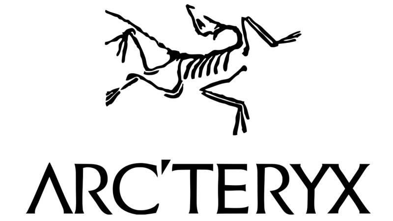
The Arc’teryx logo displays a stylized skeleton of the Archaeopteryx lithographica, a prehistoric bird fossil. Introduced in 1991, this logo was designed by company founders and symbolizes evolution, transition, and the pursuit of technical perfection in outdoor gear.
Logo Attributes
- Design Type: Combination mark (symbol with wordmark)
- Primary Elements: Skeletal bird fossil illustration, custom sans-serif wordmark with apostrophe
- Official Introduction Date: 1991
- Designer: Dave Lane and founding team at Rock Solid Manufacturing
- Trademark Status: Registered trademark owned by Arc’teryx Equipment Inc.
- Color Palette: Primary black (#000000), white (#FFFFFF), with product-specific color variations
- Usage Context: Technical apparel tags, retail signage, digital platforms, equipment, and marketing materials
How Has the Arc’teryx Logo Evolved Over Time?
The Arc’teryx logo has seen minimal changes since its creation. The brand introduced its fossil bird mark in 1991 and has maintained the core design with only subtle refinements.
This consistency reflects the company’s commitment to timeless design over trendy rebranding cycles.
Original Rock Solid Manufacturing Era (1989-1991)
- Years Active: 1989-1991
- Design Description: Simple text-based branding without the iconic bird symbol
- Color Scheme: Basic black and white
- Designer: Founding team
- Context: The company initially focused on climbing harnesses under a different name before rebranding
- Cultural Significance: Represented the brand’s humble beginnings in a small Coast Mountain warehouse
First Arc’teryx Logo (1991-Early 2000s)
- Years Active: 1991 to early 2000s
- Design Description: Detailed Archaeopteryx skeleton with more intricate bone structure, paired with original wordmark
- Color Scheme: Black primary, white secondary
- Designer: Dave Lane
- Context: Introduced when company renamed itself after the prehistoric bird
- Key Changes from Previous: Complete visual identity overhaul from text-only Rock Solid branding
- Cultural Significance: Established the “dead bird” nickname that customers still use today
Refined Arc’teryx Logo (Early 2000s-Present)
- Years Active: Early 2000s to present
- Design Description: Slightly simplified fossil silhouette with cleaner lines and modernized wordmark
- Color Scheme: Black, white, with expanded color applications for different product lines
- Designer: Internal design team
- Context: Refinement coincided with global expansion and acquisition by Amer Sports
- Key Changes from Previous: Streamlined bone details for better reproduction at small sizes
- Cultural Significance: Became a status symbol in both outdoor and urban fashion communities
What Do the Design Elements of the Arc’teryx Logo Mean?

The Archaeopteryx fossil symbolizes evolution and the bridge between old and new. This prehistoric creature represents the brand’s philosophy of pushing boundaries in technical innovation.
The skeletal form suggests transparency in construction methods. It connects to the brand’s willingness to show how their products are made.
Why Did Arc’teryx Choose These Specific Colors?
Black serves as the primary logo color. It communicates sophistication, durability, and timelessness.
The hex code #000000 provides maximum contrast against any background. This choice reflects practical considerations for print design on diverse materials.
White (#FFFFFF) functions as the secondary color for reversed applications. The monochrome approach keeps production costs manageable while maintaining visual impact.
What Typography Style Is Used in the Arc’teryx Logo?
The wordmark uses a custom sans-serif typeface with clean, geometric letterforms. The distinctive apostrophe between “Arc” and “teryx” adds unique character.
Letter spacing remains tight but readable. The typography works effectively across sizes, from small garment labels to large retail displays.
What Are the Hidden Meanings in the Arc’teryx Logo?
The fossil’s wings spread in a forward motion, suggesting progress and forward-thinking design. Some see the skeletal transparency as a nod to the brand’s obsession with examining every construction detail.
The Archaeopteryx was the first creature to take flight. This connects to Arc’teryx’s positioning as a pioneer in technical outdoor apparel innovation.
How Does the Arc’teryx Logo Compare to Competitor Logos?
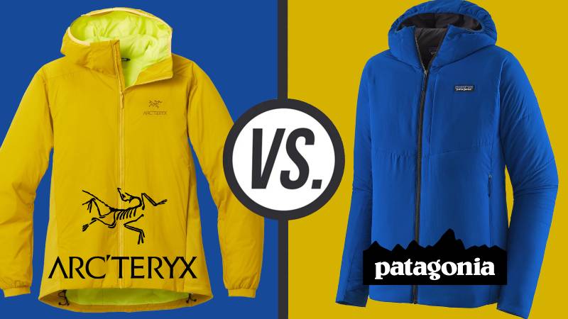
Arc’teryx takes a completely different approach than its competitors. While The North Face logo uses a mountain dome silhouette, Arc’teryx chose biology over geography.
Patagonia uses a mountain range. Columbia features a simple wordmark. Most outdoor brands lean into landscape imagery.
The fossil sets Arc’teryx apart visually. It signals a more intellectual, design-focused brand philosophy. This distinction helps justify premium pricing in a crowded market.
Compared to athletic brands like Under Armour with its interlocking UA, or Lululemon with its stylized omega symbol, Arc’teryx maintains a more narrative-driven visual identity. The logo tells a story about evolution rather than simply displaying initials or abstract shapes.
What Are the Technical Specifications of the Arc’teryx Logo?
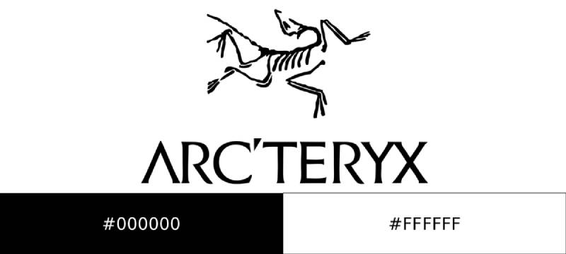
Official Color Codes
- Primary Black: Hex: #000000, RGB: (0, 0, 0), CMYK: (0, 0, 0, 100)
- Primary White: Hex: #FFFFFF, RGB: (255, 255, 255), CMYK: (0, 0, 0, 0)
Dimensions and Proportions
- Aspect Ratio: The bird symbol maintains consistent proportions across all applications
- Minimum Size: The logo requires minimum height specifications to ensure fossil details remain visible
- Clear Space: Mandatory buffer zone around the logo equals the height of the apostrophe in the wordmark
- File Formats: Available in vector formats (AI, EPS, SVG) and raster formats (PNG, JPEG)
What Cultural Impact Has the Arc’teryx Logo Had?
The “dead bird” became a status symbol beyond outdoor communities. Hip-hop artists and urban fashion enthusiasts adopted Arc’teryx gear, transforming the logo into a cultural marker.
The fossil symbol now appears in street style photography worldwide. It represents a blend of technical performance and aesthetic credibility that few outdoor brands achieve.
How Does the Arc’teryx Logo Fit Into the Overall Brand Identity?

The logo anchors a cohesive brand guidelines system built around precision and evolution. Every touchpoint, from hang tags to store architecture, references the fossil’s clean lines.
Minimalist design principles extend throughout packaging and marketing materials. The brand’s storytelling approach consistently returns to themes of innovation and pushing boundaries.
Product names often reference Greek mythology and scientific terminology. This intellectual positioning matches the logo’s paleontological origins perfectly.
How Should the Arc’teryx Logo Be Used?
Official Usage Guidelines
- Do: Maintain minimum clear space around the logo
- Do: Use official color versions only
- Do: Reproduce from official digital files
- Don’t: Stretch, rotate, or distort the logo
- Don’t: Add effects like shadows or gradients
- Don’t: Place the logo on busy backgrounds that reduce legibility
Accessing Official Logos
Authorized retailers and press contacts can request official logo files through Arc’teryx’s brand portal. Unauthorized use of the trademarked fossil symbol may result in legal action.
Trademark Protection
The Archaeopteryx design and Arc’teryx wordmark are registered trademarks. The brand actively monitors and enforces trademark violations, particularly regarding counterfeit products that misuse the iconic dead bird symbol.
FAQ on The Arc’teryx Logo
What Does the Arc’teryx Logo Represent?
The Arc’teryx logo represents the Archaeopteryx lithographica, a prehistoric bird fossil. This creature lived 150 million years ago.
It symbolizes evolution and the transition between eras. The brand chose this symbol to reflect their commitment to pushing technical outdoor apparel forward.
Why Is Arc’teryx Called the Dead Bird?
Customers nicknamed Arc’teryx “the dead bird” because the logo shows a skeletal fossil. It’s become an affectionate term within the outdoor community.
The bird skeleton symbol distinguishes Arc’teryx from competitors using mountain imagery. This Vancouver outdoor brand embraced the nickname over time.
What Bird Is on the Arc’teryx Logo?
The Archaeopteryx lithographica appears on the logo. Scientists discovered this fossil in Germany during the 1860s.
This prehistoric bird represents the evolutionary link between dinosaurs and modern birds. The Berlin specimen remains one of the most famous fossils in paleontology.
Who Designed the Arc’teryx Logo?
Dave Lane created the original logo design. He was part of the founding team at Rock Solid Manufacturing in North Vancouver.
The design emerged when the company rebranded in 1991. Lane drew inspiration from his interest in natural history and evolution.
When Was the Arc’teryx Logo Created?
The logo debuted in 1991 when the company changed its name from Rock Solid Manufacturing. This Canadian outdoor company wanted a fresh visual identity.
The brand has maintained this core design for over three decades. Only minor refinements have occurred since then.
What Colors Are in the Arc’teryx Logo?
Black and white serve as the primary color palette. The brand uses these for maximum versatility across applications.
Product-specific variations exist for different gear lines. But the core identity stays rooted in this simple, high-contrast approach.
Is the Arc’teryx Logo Trademarked?
Yes. Arc’teryx Equipment Inc. holds registered trademark protection for both the fossil symbol and wordmark.
The brand actively pursues counterfeiters who misuse the dead bird logo. Trademark registration covers multiple international markets where Arc’teryx operates.
Why Did Arc’teryx Choose a Fossil for Their Logo?
The founders wanted something that communicated evolution and innovation. A fossil bird represented the transition to something new.
This choice aligned with their technical apparel philosophy. The psychology of shapes here suggests forward movement and transformation.
How Has the Arc’teryx Logo Changed Over Time?
The logo evolution has been minimal. Early versions featured more detailed bone structure in the fossil illustration.
Modern iterations simplified the lines for better reproduction at small sizes. The brand identity remained consistent through their acquisition by Amer Sports.
What Font Does Arc’teryx Use in Their Logo?
Arc’teryx uses a custom typeface with clean geometric letterforms. The distinctive apostrophe between “Arc” and “teryx” adds character.
Good kerning keeps the wordmark tight but readable. This premium outdoor brand prioritized clarity across all sizing applications.
Conclusion
The Arc’teryx logo proves that unconventional choices can define a brand. While most outdoor companies reach for mountain peaks, this dead bird symbol carved out its own space entirely.
That prehistoric fossil tells a story about evolution and technical innovation. It creates instant brand recognition in a crowded market.
The design follows solid logo design principles. Simple. Memorable. Meaningful.
From Coast Mountain warehouses to global fashion circles, the Archaeopteryx skeleton transcended its outdoor apparel origins. Few black logos carry this much cultural weight.
Premium outdoor gear needs a premium identity. Arc’teryx delivered exactly that.

Renowned for his expertise in logo design and visual branding, Bogdan has developed a multitude of logos for various clients.
His skills extend to creating posters, vector illustrations, business cards, and brochures. Additionally, Bogdan's UI kits were featured on marketplaces like Visual Hierarchy and UI8.
He also wrote in the past years on sites like Design Your Way, WebDesignerDepot, WPDean, Designmodo, Speckyboy, Slider Revolution, and more.
- The Windsurf Logo History, Colors, Font, And Meaning - 10 October 2026
- How to Remove Background From Product Photos (No Photoshop) - 10 October 2026
- How Designers can Build a Stronger Online Creative Identity - 9 October 2026

Bogdan Sandu is a seasoned designer who has been designing websites since 2008. Renowned for his expertise in logo design and visual branding, Bogdan has developed a multitude of logos for various clients. His skills extend to creating posters, vector illustrations, business cards, and brochures. Additionally, Bogdan's UI kits were featured on marketplaces like Visual Hierarchy and UI8. He also wrote in the past years on sites like Design Your Way, WebDesignerDepot, WPDean, Designmodo, Speckyboy, Slider Revolution, and more.
You Might Also Like


