


The Vuori logo represents one of the fastest-growing athleisure brands in the United States. Founded in 2015 by Joe Kudla in Encinitas, California, the company has built its visual identity around a clean logo that reflects West Coast lifestyle and performance wear.
The current logo version has remained largely consistent since the brand’s launch. It sits within a crowded market of athletic apparel companies, yet manages to stand apart through its understated approach.
Vuori has gone through minimal logo changes since its founding. The brand prioritizes simplicity, and that shows in their visual identity. Most people recognize it from retail stores, product tags, and their growing e-commerce presence.
What is the Vuori Logo?
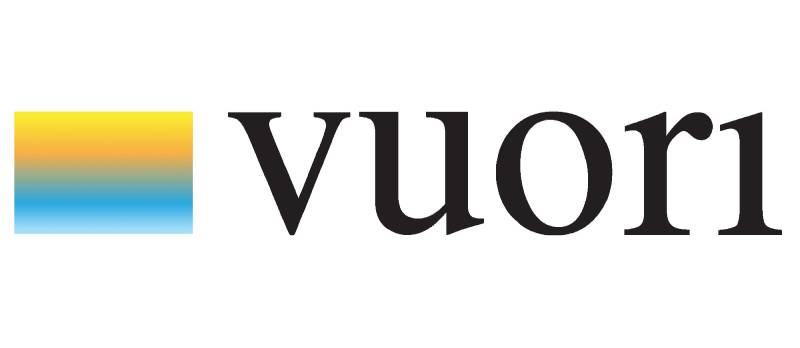
The Vuori logo is a custom design featuring the brand name in a clean, modern sans-serif typeface. Introduced in 2015 alongside the company’s founding, this design reflects California coastal culture and the Finnish word “vuori,” meaning mountain. The logo communicates both performance and relaxed lifestyle.
Key attributes of the Vuori logo:
- Design Type: symbol mark (brandmark)
- Primary Elements: Custom sans-serif typography spelling “VUORI” in uppercase
- Official Introduction Date: 2015
- Designer/Agency: In-house design team (specific designer not publicly credited)
- Trademark Status: Registered trademark in the United States
- Color Palette: Primary black (#000000), with white variants for dark backgrounds
- Usage Context: Product labels, hang tags, retail signage, website, app, marketing materials, and merchandise
How Has the Vuori Logo Evolved Over Time?

The Vuori logo has remained remarkably stable since the brand launched in 2015. Unlike many competitors who undergo frequent redesigns, Vuori kept its original brandmark largely intact.
Minor refinements have occurred. But nothing dramatic.
The consistency makes sense for a brand that values authenticity and timelessness over trend-chasing.
Original Vuori Logo (2015-Present)
- Years Active: 2015 to present
- Color Scheme: Predominantly black on white, with white-on-dark variations
- Designer: Internal team, no public credit given
- Context: Launched with the brand to establish immediate recognition in the athleisure market
- Key Changes from Previous: N/A (original version)
- Cultural Significance: Represented a new wave of premium California activewear brands entering the market
The brand has made subtle weight adjustments over time. Nothing you would notice unless you compared old and new versions side by side.
Some early promotional materials show slightly different letter spacing. But the core design DNA stayed the same.
What Do the Design Elements of the Vuori Logo Mean?

The Vuori logo carries meaning through its simplicity. The uppercase letters project confidence without aggression.
Clean lines suggest quality and attention to detail. The geometric structure mirrors the precision in their clothing construction.
There is nothing accidental here. Every design choice connects back to brand values.
Why Did Vuori Choose These Specific Colors?
Vuori primarily uses black for their logo. It works everywhere and never goes out of style.
Black carries associations with premium quality and sophistication. According to color psychology, it also suggests strength and elegance.
- Primary Black: Hex #000000, conveys timelessness and versatility
- White Variant: Hex #FFFFFF, used on dark backgrounds and colored apparel
- Occasional Navy: Used in some seasonal applications
The neutral color palette lets the logo work across all product lines without clashing.
What Typography Style Is Used in the Vuori Logo?
The logo uses a custom sans-serif typeface. It is geometric but not cold.
Letter shapes have subtle curves that soften the overall feel. The x-height and proportions create excellent readability at any size.
You can read it from across a store or on a tiny clothing tag. That versatility matters for retail brands.
What Are the Hidden Meanings in the Vuori Logo?
The name itself holds the main hidden meaning. “Vuori” means mountain in Finnish.
Joe Kudla chose it during a trip to Finland. Mountains represent aspiration, adventure, and natural environments.
The clean letterforms suggest approachability. No harsh angles or intimidating design choices here.
How Does the Vuori Logo Compare to Competitor Logos?
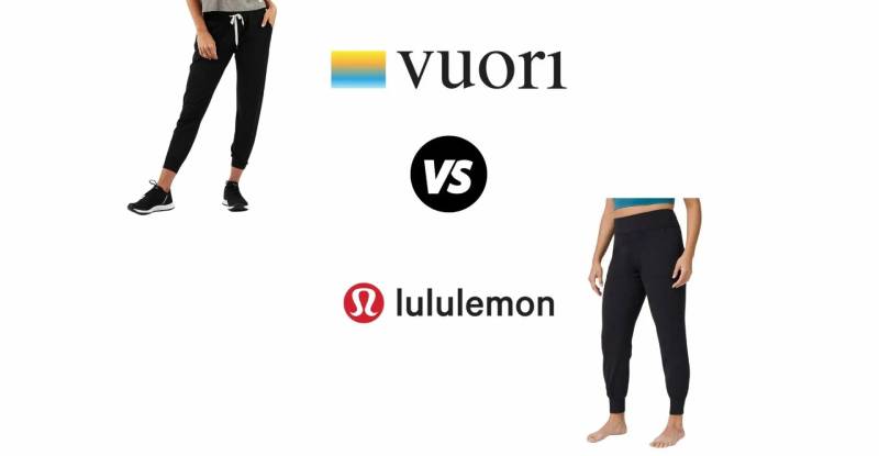
Vuori operates in a crowded space. The Lululemon logo uses a stylized omega symbol with strong brand recognition. Under Armour’s logo features an interlocking UA monogram that projects athleticism.
Vuori takes a different path. No symbol, no icon. Just the name.
This approach aligns with minimalist design principles that many premium brands now favor. It also creates a distinct identity in a market full of abstract symbols and aggressive marks.
Compared to The North Face logo, Vuori feels more relaxed. Less outdoor rugged, more coastal California.
What Are the Technical Specifications of the Vuori Logo?

Official Color Codes:
- Primary Black: Hex #000000, RGB (0, 0, 0), CMYK (0, 0, 0, 100)
- White: Hex #FFFFFF, RGB (255, 255, 255), CMYK (0, 0, 0, 0)
Dimensions and Proportions:
- Aspect Ratio: Approximately 4:1 (horizontal brandmark)
- Minimum Size: Brand guidelines typically specify minimum width for legibility
- Clear Space: Generally requires padding equal to the height of the letter “V” on all sides
- File Formats: Available in vector formats (AI, EPS, SVG) and raster formats (PNG, JPEG)
For print applications, high DPI files ensure crisp reproduction on packaging and marketing materials.
What Cultural Impact Has the Vuori Logo Had?
Vuori helped define a new category of “elevated athleisure” branding. The logo became associated with a lifestyle, not just clothing.
You see it in upscale gyms, coffee shops, and airports. It signals a certain demographic and mindset.
The brand grew from a small Encinitas operation to a company valued at over $4 billion. The logo traveled with that growth, becoming increasingly recognizable.
How Does the Vuori Logo Fit Into the Overall Brand Identity?

The logo anchors a broader visual system. It connects to brand guidelines that cover photography style, copy tone, and retail environments.
Everything feels cohesive. The white space in their marketing mirrors the breathing room in the logo itself.
Product tags, shopping bags, and the website all use consistent typography and color applications. The visual hierarchy stays clean across all touchpoints.
How Should the Vuori Logo Be Used?
Official Usage Guidelines:
- Maintain minimum clear space around the logo
- Do not stretch, rotate, or distort the brandmark
- Use only approved color variations (black on light, white on dark)
- Avoid placing the logo on busy backgrounds that reduce legibility
- Do not add effects like shadows, gradients, or outlines
Where to Access Official Logos:
Press and retail partners can typically request logo files through Vuori’s media relations team. The company maintains strict control over brand assets.
Trademark Protection:
The Vuori name and logo are registered trademarks. Unauthorized commercial use will result in legal action. If you are a retailer or partner, work through official channels to get approved assets.
FAQ on The Vuori Logo
What Does the Vuori Logo Look Like?
The Vuori logo is a clean brandmark. It displays “VUORI” in lowercase letters using a custom font with geometric characteristics.
The design follows core logo design principles with strong balance and readability.
What Does “Vuori” Mean?
Vuori is a Finnish word meaning “mountain.” Founder Joe Kudla discovered it during travels in Finland.
The name connects to outdoor lifestyle and adventure. It reflects the California brand’s connection to nature and active living.
Mountains symbolize aspiration and personal growth.
Who Designed the Vuori Logo?
The Vuori brand identity came from internal design work when the company launched in 2015. No external agency has been publicly credited.
Joe Kudla built the Encinitas-based athleisure company with a clear visual direction from day one.
What Font Is Used in the Vuori Logo?
Vuori uses a custom brandmark, not an off-the-shelf typeface. The letterforms are geometric with subtle softening.
Understanding font psychology shows why this works. Clean lines suggest quality and modern performance wear.
The tracking between letters creates an open, breathable feel.
What Colors Are in the Vuori Logo?
The primary Vuori logo uses black. Simple as that.
White versions exist for dark backgrounds. The brand occasionally applies navy in seasonal contexts.
This monochrome approach gives the athletic apparel logo maximum versatility across products and marketing.
When Was the Vuori Logo Created?
The logo launched with the company in 2015. Joe Kudla started the California clothing brand that year in Encinitas.
The visual identity arrived fully formed. It has served the brand through explosive growth to a multi-billion dollar valuation.
Has the Vuori Logo Changed Over Time?
Barely. The Vuori brand mark has stayed remarkably consistent since 2015.
Some minor refinements to letter weight and font spacing may have occurred. Nothing dramatic enough for most people to notice.
This stability builds strong brand recognition.
Where Can I Download the Vuori Logo?
Official logo files are not publicly available. The company protects its trademark and brand assets.
Press contacts and retail partners can request files through Vuori’s media team. Following proper brand style guide protocols matters here.
Is the Vuori Logo Trademarked?
Yes. The Vuori name and logo are registered trademarks in the United States.
Unauthorized commercial use violates trademark law. The company actively protects its intellectual property like any major activewear label.
How Does the Vuori Logo Compare to Other Athletic Brands?
Most competitors use symbols or icons. Think of the Arc’teryx logo with its bird skeleton, or On Cloud’s logo design.
Vuori went text-only. This creates contrast in the crowded athleisure market.
The approach mirrors premium lifestyle brands more than traditional sportswear companies.
Conclusion
The Vuori logo proves that simplicity works. No complex symbol or elaborate emblem. Just a wordmark that carries the weight of a billion-dollar athleisure brand.
Joe Kudla built something lasting when he launched this Encinitas company in 2015. The visual identity reflects California coastal culture without trying too hard.
Strong alignment and unity in the design create instant recognition.
Performance wear branding does not need to shout. Sometimes the quietest mark in the room gets remembered longest.
Vuori understood this from day one.

Renowned for his expertise in logo design and visual branding, Bogdan has developed a multitude of logos for various clients.
His skills extend to creating posters, vector illustrations, business cards, and brochures. Additionally, Bogdan's UI kits were featured on marketplaces like Visual Hierarchy and UI8.
He also wrote in the past years on sites like Design Your Way, WebDesignerDepot, WPDean, Designmodo, Speckyboy, Slider Revolution, and more.
- Jujutsu Kaisen Font Generator - 12 October 2026
- The Windsurf Logo History, Colors, Font, And Meaning - 10 October 2026
- How to Remove Background From Product Photos (No Photoshop) - 10 October 2026

Bogdan Sandu is a seasoned designer who has been designing websites since 2008. Renowned for his expertise in logo design and visual branding, Bogdan has developed a multitude of logos for various clients. His skills extend to creating posters, vector illustrations, business cards, and brochures. Additionally, Bogdan's UI kits were featured on marketplaces like Visual Hierarchy and UI8. He also wrote in the past years on sites like Design Your Way, WebDesignerDepot, WPDean, Designmodo, Speckyboy, Slider Revolution, and more.
You Might Also Like


