


The Oakley logo stands as one of the most recognized symbols in sports eyewear and athletic apparel. That stretched ellipse shape, often called the “O” icon, has become shorthand for performance and durability.
Within the broader context of athletic branding, Oakley sits alongside giants like Nike and Adidas. The company was founded in 1975 by Jim Jannard in his garage. Since then, the logo has gone through several versions, though the core elliptical shape has remained consistent for decades.
The current iteration dates back to the mid-1990s refinements. It represents over four decades of brand evolution in the competitive sports accessories market.
What is the Oakley Logo?

The Oakley logo is a stylized ellipse resembling the letter “O,” introduced in its recognizable form during the 1980s. Designed in-house under founder Jim Jannard’s direction, it symbolizes precision optics and athletic performance through its clean, aerodynamic shape.
Design Specifications
- Design Type: Abstract icon (standalone symbol) with optional wordmark combination
- Primary Elements: Elongated horizontal ellipse with pointed ends, sometimes paired with “OAKLEY” text
- Official Introduction Date: Early 1980s (refined throughout the decade)
- Designer/Agency: In-house design under Jim Jannard
- Trademark Status: Registered trademark owned by Oakley, Inc. (now part of EssilorLuxottica)
- Color Palette: Primary black (#000000), with white (#FFFFFF) and red (#FF0000) variants
- Usage Context: Sunglasses temples, apparel labels, retail signage, helmets, goggles, digital platforms, and promotional materials
How Has the Oakley Logo Evolved Over Time?
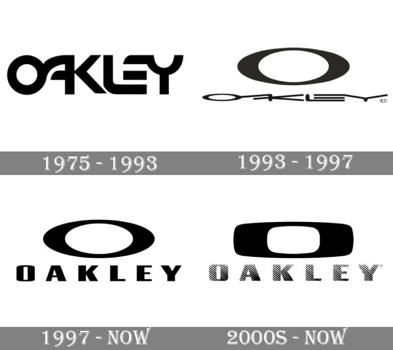
The Oakley logo started as a simple wordmark in 1975 before the iconic ellipse appeared in the early 1980s.
Throughout the following decades, the brand refined proportions and experimented with different presentations.
The core “O” shape has remained stable since the late 1980s, with only minor adjustments to weight and spacing.
Original Oakley Wordmark (1975-1980)
- Years Active: 1975-1980
- Design Description: Simple text-based logo spelling “Oakley” without the distinctive ellipse
- Color Scheme: Black on white backgrounds
- Designer: Jim Jannard
- Context: Jannard was selling motorcycle grips from his garage. The brand needed basic identification, nothing fancy.
- Cultural Significance: Represented the humble beginnings of what would become a billion-dollar brand
Introduction of the Ellipse Icon (1980-1990)
- Years Active: 1980-1990
- Design Description: The stretched “O” ellipse appeared, featuring sharp pointed ends and a wider horizontal profile
- Color Scheme: Primarily black, with white used for contrast on dark products
- Designer: In-house team
- Context: Oakley was transitioning from motorcycle accessories into eyewear. The new symbol needed to convey speed and precision.
- Key Changes from Previous: Complete shift from wordmark-only to iconic symbol
- Cultural Significance: Established visual identity that would define the brand for decades
Refined Modern Logo (1990-Present)
- Years Active: 1990-present
- Design Description: Cleaner lines, more consistent proportions, standardized across all product lines
- Color Scheme: Black, white, and occasional red accents for special editions
- Designer: Internal brand team with periodic refinements
- Context: Oakley became a publicly traded company in 1995. Brand consistency became more important.
- Key Changes from Previous: Subtle refinements to proportions and curve smoothness
- Cultural Significance: Became synonymous with extreme sports culture and professional athletics
What Do the Design Elements of the Oakley Logo Mean?
The ellipse represents forward motion and aerodynamic performance.
Its horizontal stretch suggests speed, while the pointed ends give it an aggressive, athletic character.
The shape also mimics the lens silhouette found in many Oakley sunglasses designs.
Why Did Oakley Choose These Specific Colors?
Black serves as the primary color. It communicates authority and sophistication.
White provides contrast and works on dark product surfaces.
Red appears in limited editions, adding energy and urgency. Understanding color psychology explains why these choices resonate with athletic consumers.
- Black: Hex #000000. Conveys power, professionalism, and premium quality. Works on virtually any background.
- White: Hex #FFFFFF. Used for visibility on dark products. Suggests purity and precision.
- Red: Hex #FF0000. Reserved for special editions. Adds excitement and competitive energy.
What Typography Style Is Used in the Oakley Logo?
When the wordmark appears alongside the ellipse, Oakley uses a custom sans-serif font with geometric characteristics.
The letterforms are bold and condensed. They share the angular quality of the ellipse symbol.
Over the years, the typography has become slightly more refined, with cleaner edges and improved legibility at small sizes.
What Are the Hidden Meanings in the Oakley Logo?
The ellipse resembles an eye when viewed from certain angles. This connects directly to the eyewear product line.
Some see it as a stretched zero, representing Oakley’s commitment to zero defects in optical clarity.
Jim Jannard never officially confirmed these interpretations. The shape primarily evolved from aesthetic and functional considerations rather than hidden symbolism.
How Does the Oakley Logo Compare to Competitor Logos?

Unlike Nike’s swoosh or Adidas’s three stripes, Oakley went with a contained geometric shape.
This gives it a different personality. More technical, less fluid.
When placed next to other shoe brand logos and athletic wear symbols, the Oakley ellipse stands out for its precision-engineered appearance.
Competitors like Under Armour use interlocking letters. The North Face relies on a mountain silhouette. Oakley’s abstract approach remains distinctive in the crowded sports apparel market.
What Are the Technical Specifications of the Oakley Logo?

Official Color Codes
- Primary Black: Hex #000000, RGB (0, 0, 0), CMYK (0, 0, 0, 100)
- Standard White: Hex #FFFFFF, RGB (255, 255, 255), CMYK (0, 0, 0, 0)
- Accent Red: Hex #FF0000, RGB (255, 0, 0), CMYK (0, 100, 100, 0)
Dimensions and Proportions
- Aspect Ratio: Approximately 3:1 (width to height)
- Minimum Size: 0.5 inches width for print applications
- Clear Space: Minimum padding equal to 25% of logo height on all sides
- File Formats: Available in vector graphics formats (AI, EPS, SVG) and raster formats (PNG, JPEG)
What Cultural Impact Has the Oakley Logo Had?

The Oakley logo became a status symbol in the 1990s and 2000s. Professional athletes, military personnel, and action sports enthusiasts wore it as a badge of credibility.
It showed up everywhere. From Tour de France cyclists to Navy SEALs.
The brand’s association with both extreme sports and tactical applications gave the logo a dual identity. Cool and functional at the same time.
Counterfeiting became a major issue precisely because the logo carried so much cultural weight.
How Does the Oakley Logo Fit Into the Overall Brand Identity?

The ellipse anchors everything Oakley does visually. It appears on product temples, hang tags, storefronts, and digital assets.
Following proper brand guidelines ensures consistency across touchpoints.
The logo connects to sub-brands like Oakley Standard Issue (military line) and Oakley Vault (outlet stores).
Each maintains the core ellipse while adapting supporting elements for specific audiences.
How Should the Oakley Logo Be Used?
Official Usage Guidelines
- Do: Maintain clear space around the logo, use approved color variations, scale proportionally
- Don’t: Stretch or distort the ellipse, add effects like shadows or gradients, place on busy backgrounds without contrast
- Access: Official logo assets available through Luxottica brand portal for authorized partners
- Licensing: Required for any commercial use outside of Oakley-owned properties
- Trademark Protection: Actively enforced globally, with dedicated anti-counterfeiting programs
For retailers and partners, maintaining logo integrity matters. Oakley regularly audits usage to protect brand value.
FAQ on The Oakley Logo
What Does the Oakley Logo Represent?
The Oakley logo represents precision engineering and athletic performance. The stretched ellipse symbolizes speed and aerodynamic design.
It connects directly to the brand’s High Definition Optics technology. Jim Jannard built the entire visual identity around this concept of optical excellence.
Who Designed the Oakley Logo?
Jim Jannard created the original Oakley logo in-house during the early 1980s. No external agency was involved.
He developed it while transitioning from motorcycle grips to sports eyewear. The psychology of shapes played a role in choosing the ellipse form.
When Was the Oakley Logo Created?
The company launched in 1975 with a basic wordmark. The iconic ellipse appeared around 1980.
By the mid-1980s, it became the primary brand identifier. The Foothill Ranch, California company has refined it periodically since then.
What Is the Oakley O Symbol Called?
Most people call it the “Oakley O” or simply the “ellipse icon.” Internally, it’s referenced as the brand symbol.
There’s no fancy official name. It functions as a focal point across all Oakley products and marketing materials.
What Colors Are Used in the Oakley Logo?
Black serves as the primary color. White and red appear as secondary options.
The brand uses monochrome colors for most applications. Special editions sometimes feature metallic or custom hue variations. Many black logos share this approach.
Is the Oakley Logo Trademarked?
Yes. EssilorLuxottica owns the trademark through its Oakley, Inc. subsidiary.
The registration covers the ellipse symbol and wordmark globally. Counterfeit detection programs actively protect against unauthorized logo usage on fake merchandise.
How Can I Verify an Authentic Oakley Logo?
Check the logo placement and quality. Authentic products show precise etching on Plutonite lenses.
Look for holographic authenticity tags on packaging. The O Matter frame material should display clean, consistent branding without smudges or uneven edges.
Why Is the Oakley Logo So Recognizable?
Simplicity and repetition made it memorable. The shape is distinctive enough to identify at a glance.
Decades of athlete sponsorships helped. Tour de France cyclists, NFL players, and Olympic competitors wore it constantly, building massive brand recognition.
Has the Oakley Logo Changed Over Time?
The core ellipse has stayed remarkably consistent since the 1980s. Minor refinements adjusted proportions and line weights.
Unlike brands that chase trends, Oakley values unity in their visual identity. The logo evolution has been subtle rather than dramatic.
Where Is the Oakley Logo Placed on Products?
Sunglasses feature it on temples and sometimes etched into lenses. Apparel displays the symbol on chest areas, sleeves, and tags.
Goggles, helmets, and accessories follow similar placement patterns. Proper scale and proportion guidelines ensure consistent visibility across product lines.
Conclusion
The Oakley logo proves that simplicity works. That ellipse has survived decades of design trends without losing its edge.
Jim Jannard built something lasting. The stretched O icon connects Prizm lens technology, Unobtainium grips, and premium sports eyewear under one visual identity.
Good logo design principles show here. Clean lines. Strong contrast. Instant recognition.
From professional cycling teams to Oakley Standard Issue military gear, the symbol carries weight. It tells a story about performance and precision without saying a word.
Few athletic brands achieve that level of visual consistency.

Renowned for his expertise in logo design and visual branding, Bogdan has developed a multitude of logos for various clients.
His skills extend to creating posters, vector illustrations, business cards, and brochures. Additionally, Bogdan's UI kits were featured on marketplaces like Visual Hierarchy and UI8.
He also wrote in the past years on sites like Design Your Way, WebDesignerDepot, WPDean, Designmodo, Speckyboy, Slider Revolution, and more.
- Jujutsu Kaisen Font Generator - 12 October 2026
- The Windsurf Logo History, Colors, Font, And Meaning - 10 October 2026
- How to Remove Background From Product Photos (No Photoshop) - 10 October 2026

Bogdan Sandu is a seasoned designer who has been designing websites since 2008. Renowned for his expertise in logo design and visual branding, Bogdan has developed a multitude of logos for various clients. His skills extend to creating posters, vector illustrations, business cards, and brochures. Additionally, Bogdan's UI kits were featured on marketplaces like Visual Hierarchy and UI8. He also wrote in the past years on sites like Design Your Way, WebDesignerDepot, WPDean, Designmodo, Speckyboy, Slider Revolution, and more.
You Might Also Like


