


The Old Navy logo stands as one of the most recognized retail brand marks in American fashion. Since the company launched in 1994 as a Gap Inc. subsidiary, its visual identity has gone through several changes that mirror shifts in retail branding and consumer expectations.
The current version, introduced in 2020, represents the brand’s fourth major logo redesign. Old Navy positions itself in the budget-friendly family apparel market, competing directly with Target, Kohl’s, and other value-oriented retailers.
What makes this logo interesting is how it balances accessibility with a sense of fun. The design team clearly wanted something that would appeal to families without looking cheap.
What is the Old Navy Logo?
The Old Navy logo is a custom wordmark featuring bold, rounded sans-serif letterforms in navy blue. Introduced in its current form in 2020, the logo was created as part of a company-wide brand refresh. It communicates approachability, value, and American casual style.
Key Attributes:
- Design Type: Wordmark (text-based logo without separate icon)
- Primary Elements: Custom typography spelling “OLD NAVY” in capital letters
- Official Introduction Date: 2020 (current version)
- Designer/Agency: In-house Gap Inc. design team
- Trademark Status: Registered trademark of Gap Inc.
- Color Palette: Navy Blue (#003366), White (#FFFFFF)
- Usage Context: Retail storefronts, clothing tags, shopping bags, website, mobile app, advertising campaigns
How Has the Old Navy Logo Evolved Over Time?
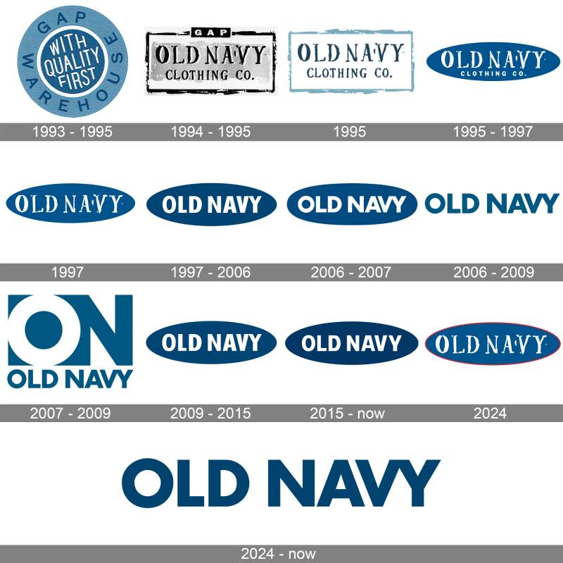
Old Navy has updated its logo four times since 1994. Each version reflected changing retail trends and the company’s growth from discount offshoot to standalone brand powerhouse.
The evolution shows a clear path from playful and quirky toward clean and modern.
Original Old Navy Logo (1994-2000)
- Years Active: 1994-2000
- Design Description: A playful, slightly condensed sans-serif font with a vintage Americana feel. The lettering had a retro quality that referenced mid-century American signage.
- Color Scheme: Navy blue with white backgrounds
- Designer: Gap Inc. creative team
- Context: Launched with the brand itself. Old Navy needed to differentiate from parent company Gap while maintaining a family connection.
- Cultural Significance: Established the fun, value-oriented personality that would define the brand for decades.
Second Old Navy Logo (2000-2011)
- Years Active: 2000-2011
- Design Description: Refined version with cleaner letterforms. The type became more uniform and slightly bolder.
- Color Scheme: Continued navy blue dominance
- Key Changes from Previous: Smoother curves, improved legibility at smaller sizes, more professional appearance
- Context: Old Navy had grown into a billion-dollar brand. The logo needed to reflect that success without losing its friendly character.
Third Old Navy Logo (2011-2020)
- Years Active: 2011-2020
- Design Description: A significant modernization featuring rounder, friendlier letterforms. The type became more geometric and contemporary.
- Color Scheme: Navy blue remained primary, with expanded secondary color palette for marketing
- Key Changes from Previous: Softer edges, more open letterforms, improved digital readability
- Cultural Significance: Aligned with the flat design trend taking over retail branding during this period.
Current Old Navy Logo (2020-Present)
- Years Active: 2020-present
- Design Description: The most refined version yet. Bold, confident letterforms with excellent balance between each character.
- Color Scheme: Classic navy blue (#003366) on white
- Key Changes from Previous: Slightly heavier weight, tighter kerning, more confident stance
- Context: Introduced during Gap Inc.’s consideration of spinning off Old Navy as a separate company. The refresh signaled independence and maturity.
What Do the Design Elements of the Old Navy Logo Mean?
The Old Navy logo communicates accessibility and American casual style through its design choices.
Every element, from hue selection to letter spacing, reinforces the brand’s position as the friendly, affordable option for family clothing.
Why Did Old Navy Choose These Specific Colors?
Bright blue dominates the Old Navy brand. Not the dark navy you’d expect from the name.
Their actual color palette leans vibrant and energetic. Think red, white, and blue working together in a distinctly American way.
The psychology behind this makes sense for a family-focused value retailer. Bright, cheerful colors feel approachable and fun. Parents shopping with kids respond to that energy.
- Bright Blue: Primary brand color. Creates an upbeat, accessible feel. More energetic than traditional corporate navy.
- Red: Secondary accent color. Adds energy and excitement. Plays into the patriotic color scheme.
- White: Background and spacing color. Keeps the layout clean and prevents visual chaos.
The color strategy here is pretty clear. Vibrant blues and reds signal fun and value. White provides breathing room so the brand doesn’t feel overwhelming.
What Typography Style Is Used in the Old Navy Logo?
The logo uses a custom typeface designed specifically for the brand.
It’s a geometric sans-serif with rounded terminals. The letters have generous x-height and open counters for maximum readability.
The font walks a line between friendly and professional. It needs to look good on a massive storefront sign and a tiny clothing tag.
The tracking is tight but not cramped, giving the wordmark a unified, confident appearance.
What Are the Hidden Meanings in the Old Navy Logo?
Honestly, there’s not much hidden meaning here. And that’s probably intentional.
Old Navy sells affordable clothes to regular families. The logo doesn’t need to be clever or mysterious.
The rounded letterforms suggest approachability. The bold weight communicates confidence and value. The navy color ties everything to American heritage.
Sometimes the best logos just say what they mean and get out of the way.
How Does the Old Navy Logo Compare to Competitor Logos?

In the budget retail space, Old Navy’s logo stands out for its simplicity. Target uses a bold red bullseye icon. Kohl’s has its distinctive apostrophe. Walmart leans into the sunburst spark.
Old Navy chose a different path. Just the name. No symbol. No gimmick.
This approach has tradeoffs. The logo is less immediately recognizable from a distance than Target’s bullseye. But it’s also more flexible and ages better than trendy icons.
Compared to parent company Gap’s minimalist wordmark, Old Navy feels warmer and more inviting. The rounded letters add personality that Gap’s stark Helvetica-style type lacks.
Against American Eagle’s logo, Old Navy appears more mature and less youth-focused. That fits the family positioning.
What Are the Technical Specifications of the Old Navy Logo?
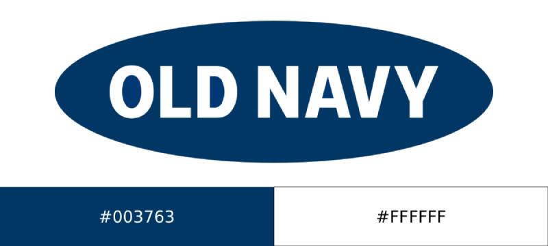
Official Color Codes:
- Bright Blue: The primary brand color. Much lighter and more vibrant than traditional navy. Think energetic and approachable rather than corporate.
- Red: Secondary accent color. Used prominently in signage and promotional materials. Creates that classic American flag combination with the blue and white.
- White: Background color. Provides contrast and keeps the overall look clean and uncluttered.
Dimensions and Proportions:
- Aspect Ratio: Approximately 3.5:1 (width to height)
- Minimum Size: 0.75 inches wide for print, 100 pixels wide for digital
- Clear Space: Minimum padding equal to the height of the letter “O” on all sides
- File Formats: Available in vector graphics (AI, EPS, SVG) and raster formats (JPEG, PNG)
What Cultural Impact Has the Old Navy Logo Had?
Old Navy’s branding helped define budget retail in the 1990s and 2000s. The logo appeared in countless TV commercials featuring celebrities like Morgan Fairchild, Fran Drescher, and the famous Old Navy mannequin “Supermodelquins.”
Those quirky ads made the logo part of American pop culture.
The brand’s Fourth of July flag t-shirts became a seasonal tradition for millions of families. That simple navy blue wordmark on a white tee turned into a recognized symbol of casual American patriotism.
For a whole generation, the Old Navy logo means affordable back-to-school shopping, weekend mall trips, and basic wardrobe staples.
How Does the Old Navy Logo Fit Into the Overall Brand Identity?
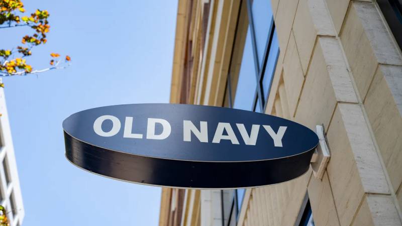
The logo anchors a broader visual system built on accessibility and fun. Old Navy’s brand guidelines specify how the wordmark works with secondary elements like taglines, photography style, and store design.
Everything connects back to the core idea. Value clothing for real families.
The logo appears on storefronts in massive scale, creating strong street presence. On clothing tags, it’s small but legible. In digital contexts, it adapts to various screen sizes without losing impact.
The visual hierarchy always puts the logo first. Other brand elements support it but never compete with it.
How Should the Old Navy Logo Be Used?
Official Usage Guidelines:
- Do: Maintain minimum clear space around the logo
- Do: Use approved color versions only (navy on white, white on navy)
- Do: Scale proportionally, never stretch or distort
- Don’t: Add effects like shadows, gradients, or outlines
- Don’t: Place on busy backgrounds that reduce legibility
- Don’t: Modify the letterforms or spacing
Accessing Official Logos:
Old Navy’s official logo files are available through Gap Inc.’s media resources for authorized partners and press. Unauthorized commercial use is prohibited under trademark law.
Trademark Protection:
The Old Navy name and logo are registered trademarks of Gap Inc. The company actively protects these marks against infringement and counterfeiting.
FAQ on The Old Navy Logo
What Font Does Old Navy Use in Its Logo?
Old Navy uses a custom geometric sans-serif typeface. The brand identity features rounded letterforms with clean curves.
This isn’t a publicly available font. Gap Inc. developed it specifically for brand recognition across retail stores and marketing materials.
What Are the Official Old Navy Logo Colors?
The primary color is navy blue (hex #003366). White serves as the secondary color for backgrounds and reversed applications.
This simple monochrome color approach keeps the visual identity clean. It works across digital platforms and store signage without losing impact.
Who Designed the Old Navy Logo?
Gap Inc.’s in-house creative team designed the logo. No external agency received credit for the original 1994 version or subsequent redesigns.
The corporate identity stayed internal. This gave the parent company full control over brand evolution.
When Was the Old Navy Logo First Created?
The original logo launched in 1994 when the clothing brand opened its first store in Colma, California.
The current version dates to 2020. That’s four logo iterations across three decades of American retail history.
Can I Download the Official Old Navy Logo?
Official logo files aren’t publicly available for download. Gap Inc. restricts access to authorized partners, vendors, and press contacts.
Using the trademark without permission violates intellectual property law. The company actively monitors for unauthorized commercial use.
What Does the Old Navy Logo Represent?
The logo represents affordable American casual style. Its bold wordmark communicates confidence and accessibility to family shoppers.
The font psychology here matters. Rounded letters feel friendly. The navy color suggests reliability and classic values.
Has Old Navy Changed Its Logo Over the Years?
Yes. The brand refreshed its logo four times since 1994. Each version refined the typography while keeping the core navy blue identity intact.
The changes followed minimalist design trends. Earlier versions had more personality. Recent ones prioritize clean readability.
Why Is the Old Navy Logo Blue?
The name demanded it. “Old Navy” practically requires navy blue.
Beyond the obvious wordplay, color theory supports this choice. Blue builds trust with consumers. It’s the most universally liked color in marketing research.
What Size Should the Old Navy Logo Be for Print?
Minimum print size is 0.75 inches wide. Anything smaller compromises legibility.
For high-quality reproduction, use files with at least 300 DPI. The brand style guide specifies clear space equal to the height of the letter “O” on all sides.
Is the Old Navy Logo Trademarked?
Yes. The Old Navy name and logo are registered trademarks of Gap Inc. with the U.S. Patent and Trademark Office.
This protection covers clothing, retail services, and advertising. Counterfeit merchandise using the logo faces legal action.
Conclusion
The Old Navy logo proves that effective retail branding doesn’t require complexity. A bold wordmark in navy blue has served this clothing company well for three decades.
Four redesigns refined the typography without abandoning what works. The current version balances store signage visibility with digital platform flexibility.
Gap Inc. built strong brand recognition through consistency. The logo appears on everything from shopping bags to packaging design to advertising campaigns.
Simple. Readable. Trustworthy. Sometimes that’s all a blue logo needs to be.

Renowned for his expertise in logo design and visual branding, Bogdan has developed a multitude of logos for various clients.
His skills extend to creating posters, vector illustrations, business cards, and brochures. Additionally, Bogdan's UI kits were featured on marketplaces like Visual Hierarchy and UI8.
He also wrote in the past years on sites like Design Your Way, WebDesignerDepot, WPDean, Designmodo, Speckyboy, Slider Revolution, and more.
- How to Install Fonts on Mac (Step-by-Step Guide) - 20 September 2026
- From Mockup to Code: How AI-Augmented Development Speeds Up the Design Handoff - 19 September 2026
- The Beehiiv Logo History, Colors, Font, And Meaning - 18 September 2026

Bogdan Sandu is a seasoned designer who has been designing websites since 2008. Renowned for his expertise in logo design and visual branding, Bogdan has developed a multitude of logos for various clients. His skills extend to creating posters, vector illustrations, business cards, and brochures. Additionally, Bogdan's UI kits were featured on marketplaces like Visual Hierarchy and UI8. He also wrote in the past years on sites like Design Your Way, WebDesignerDepot, WPDean, Designmodo, Speckyboy, Slider Revolution, and more.
You Might Also Like


