


The Stussy logo stands as one of streetwear’s most recognized symbols. A hand-drawn signature that started on surfboards in the early 1980s became a global fashion icon.
This interlocking double-S design represents the fusion of California surf culture with urban street style. The brand, founded by Shawn Stussy in 1980, has maintained its core logo identity through four decades of fashion shifts.
The signature-style wordmark has seen minor refinements but remains true to its handwritten origins. Few logos in fashion carry this level of authenticity and staying power.
What Is the Stussy Logo?

The Stussy logo is a stylized signature featuring interlocking S letters, created by founder Shawn Stussy around 1980. Originally drawn to sign custom surfboards, it became the brand’s official mark. The design reflects graffiti art influences and personal handwriting style.
- Design Type: Wordmark with signature-style lettering
- Primary Elements: Handwritten “Stussy” text featuring distinctive interlocking double-S
- Official Introduction Date: Circa 1980
- Designer: Shawn Stussy (founder)
- Trademark Status: Registered trademark, actively protected worldwide
- Color Palette: Primarily black (#000000) and white (#FFFFFF)
- Usage Context: Apparel labels, hang tags, packaging design, digital platforms, collaborations
How Has the Stussy Logo Evolved Over Time?
The Stussy logo has remained surprisingly consistent since 1980. Unlike most brands that undergo major redesigns, Stussy kept its original signature intact.
Minor weight adjustments and proportion tweaks happened over the years. But the core handwritten character never changed. That’s actually pretty rare in fashion branding.
Original Stussy Logo (1980-Present)
- Years Active: 1980 to present day
- Design Description: Flowing script with connected letters, prominent double-S formation at the start
- Color Scheme: Black on white, white on black (interchangeable based on application)
- Designer: Shawn Stussy
- Context: Created to sign surfboard designs in Laguna Beach, California
- Key Changes from Previous: N/A (original version)
- Cultural Significance: Bridged surf culture with emerging hip-hop and skate scenes
Refined Stussy Logo (1990s-2000s)
- Years Active: Throughout brand expansion period
- Design Description: Slightly cleaned-up version for better reproduction across merchandise
- Color Scheme: Maintained black and white core, introduced colored variations for special releases
- Designer: Internal brand team refinements
- Context: Global expansion required better scalability across products
- Key Changes from Previous: Smoother curves, consistent stroke weights
- Cultural Significance: Became synonymous with the International Stussy Tribe collective
Contemporary Stussy Logo (2010s-Present)
- Years Active: 2010 to present
- Design Description: Digital-optimized version maintaining hand-drawn aesthetic
- Color Scheme: Classic monochrome with seasonal color applications
- Designer: Brand design team
- Context: Adapted for digital platforms and e-commerce while preserving heritage
- Key Changes from Previous: Better screen rendering, maintained analog feel
- Cultural Significance: Continues representing authentic streetwear culture
What Do the Design Elements of the Stussy Logo Mean?

The Stussy logo carries meaning through its handwritten quality. The flowing script suggests authenticity and personal touch.
That interlocking double-S became the brand’s most recognizable feature. It wasn’t planned as a clever design trick. Shawn just wrote his name that way.
Why Did Stussy Choose These Specific Colors?
Black and white serve as the primary color palette for good reason. These monochrome colors work on any background and any product.
The psychological impact is straightforward. Black suggests rebellion and urban edge. White provides contrast and clean visibility.
No fancy color theory here. Just practical choices that happened to work perfectly.
What Typography Style Is Used in the Stussy Logo?
The typography is custom handwriting, not a commercial font. Shawn Stussy developed this style from his graffiti-influenced signature.
The letters connect in a flowing script font style. Readability takes a backseat to visual impact here.
Plenty of brands tried copying this look. None quite captured the original energy.
What Are the Hidden Meanings in the Stussy Logo?
The interlocking S formation draws comparisons to the Chanel double-C. Some see graffiti tag influences. Others notice surf culture aesthetics.
Shawn Stussy never claimed deep symbolism. He just signed his boards the way that felt right.
Sometimes the best logos happen without overthinking.
How Does the Stussy Logo Compare to Competitor Logos?

Stussy carved its own lane in streetwear branding. While competitors often use bold block letters or graphic symbols, Stussy stuck with handwritten authenticity.
Supreme uses a simple box logo. BAPE relies on its ape head mascot. The North Face logo features clean geometric lines.
Stussy feels more personal. The signature approach creates intimacy that corporate logos cannot match. Brands like Off-White later built identities around founder-centric design, following a similar philosophy.
What Are the Technical Specifications of the Stussy Logo?
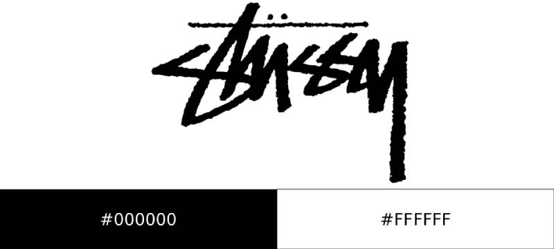
Official Color Codes
- Primary Color: Black
- Hex: #000000
- RGB: (0, 0, 0)
- CMYK: (0, 0, 0, 100)
- Secondary Color: White
- Hex: #FFFFFF
- RGB: (255, 255, 255)
- CMYK: (0, 0, 0, 0)
Dimensions and Proportions
- Aspect Ratio: Approximately 4:1 (width to height)
- Minimum Size Requirements: Varies by application, typically no smaller than 1 inch width for print
- Clear Space: Maintain padding equal to the height of the double-S on all sides
- File Formats: Available in vector graphics formats for scalability
What Cultural Impact Has the Stussy Logo Had?
The Stussy logo helped define streetwear as a legitimate fashion category. Before Stussy, surf and skate brands stayed in their lanes.
This logo crossed over. Hip-hop artists wore it. Skaters adopted it. Fashion insiders respected it.
The International Stussy Tribe spread the logo worldwide through a network of DJs, artists, and cultural figures. That grassroots approach created organic brand growth that marketing budgets cannot buy.
How Does the Stussy Logo Fit Into the Overall Brand Identity?

The logo anchors everything Stussy does. Product design, store interiors, and marketing all reference that signature style.
Collaborations with Nike, Dior, and other major brands always feature the Stussy signature prominently. The logo carries enough weight to stand alongside luxury houses.
Brand storytelling connects back to California origins. The logo serves as constant reminder of authentic roots.
How Should the Stussy Logo Be Used?
Official Usage Guidelines
- Do: Maintain clear space around the logo
- Do: Use official color versions only
- Do: Preserve the original proportions when scaling
- Don’t: Stretch, rotate, or distort the logo
- Don’t: Add effects, shadows, or gradients
- Don’t: Place on busy backgrounds that reduce readability
Licensing and Trademark Information
The Stussy logo is a protected trademark. Unauthorized use on merchandise is illegal and actively prosecuted.
Official logo files are available only to licensed partners and internal teams. The company maintains strict control over brand representation.
Counterfeit Stussy products remain a significant issue. The brand invests heavily in trademark enforcement across global markets.
FAQ on The Stussy Logo
Who Designed the Stussy Logo?
Shawn Stussy created the logo himself around 1980. He wasn’t a trained graphic designer.
The signature started as his way of signing custom surfboards in Laguna Beach, California. That handwritten style stuck and became the brand identity we recognize today.
What Does the Stussy Logo Mean?
The logo represents authenticity and creative independence. The interlocking S formation reflects graffiti art influences from 1980s street culture.
There’s no hidden corporate meaning here. It’s simply a stylized signature that connected surf culture with urban fashion.
When Was the Stussy Logo Created?
The logo originated around 1980 when Shawn started his surfboard shaping business. The clothing brand followed in 1984.
That original signature design has remained consistent for over four decades. Pretty impressive logo history for any fashion label.
Why Does the Stussy Logo Have Two S’s?
The double S logo comes from how Shawn naturally wrote his last name. The letters connect in a flowing script.
Some compare it to the Chanel logo with its interlocking C’s. But Stussy’s version came from personal handwriting, not calculated logo design principles.
Is the Stussy Logo Trademarked?
Yes. The Stussy signature is a registered trademark protected worldwide. The company actively pursues counterfeiters.
Using the logo without authorization on merchandise is illegal. This protection helps maintain brand recognition and product authenticity in the streetwear market.
What Font Is the Stussy Logo?
It’s not a commercial typeface. The Stussy logo uses custom hand-drawn lettering based on Shawn’s personal signature style.
The typography elements show graffiti influences. You won’t find this exact style in any font library because it was never digitized from a standard source. A Stussy font generator may imitate the general handwritten aesthetic, but it won’t reproduce the original custom lettering exactly.
How Can You Spot a Fake Stussy Logo?
Check the letter spacing and stroke weight. Authentic logos have consistent curves and proper kerning.
Fakes often show uneven lines or incorrect proportions. The interlocking S section is especially tricky for counterfeiters to replicate accurately.
Has the Stussy Logo Changed Over Time?
The core design stayed remarkably consistent. Minor refinements happened for better reproduction across apparel and digital platforms.
Unlike most brands that undergo major logo evolution, Stussy kept its original character. That consistency built lasting credibility in streetwear fashion.
What Colors Are Used in the Stussy Logo?
Black and white are the official primary colors. This simple approach works on any background and product type.
Seasonal releases sometimes feature colored versions. But the classic monochrome combination remains the standard for this iconic streetwear brand.
Why Is the Stussy Logo So Iconic?
Authenticity matters in street style. The handwritten signature connected with skate culture and hip-hop communities organically.
The International Stussy Tribe spread the logo globally through genuine cultural connections. No amount of marketing could replicate that grassroots brand heritage.
Conclusion
The Stussy logo proves that authentic design beats manufactured branding every time. A simple signature from a Laguna Beach surfboard shaper became a worldwide fashion symbol.
No focus groups. No design agency. Just Shawn Stussy writing his name the way that felt natural.
That graffiti-influenced handwriting connected surf culture, skate fashion, and hip-hop into one cohesive lifestyle brand. The interlocking S became instantly recognizable across urban fashion circles.
Four decades later, the logo meaning remains unchanged. It still represents the same creative independence and brand heritage that started it all.

Renowned for his expertise in logo design and visual branding, Bogdan has developed a multitude of logos for various clients.
His skills extend to creating posters, vector illustrations, business cards, and brochures. Additionally, Bogdan's UI kits were featured on marketplaces like Visual Hierarchy and UI8.
He also wrote in the past years on sites like Design Your Way, WebDesignerDepot, WPDean, Designmodo, Speckyboy, Slider Revolution, and more.
- Jujutsu Kaisen Font Generator - 12 October 2026
- The Windsurf Logo History, Colors, Font, And Meaning - 10 October 2026
- How to Remove Background From Product Photos (No Photoshop) - 10 October 2026

Bogdan Sandu is a seasoned designer who has been designing websites since 2008. Renowned for his expertise in logo design and visual branding, Bogdan has developed a multitude of logos for various clients. His skills extend to creating posters, vector illustrations, business cards, and brochures. Additionally, Bogdan's UI kits were featured on marketplaces like Visual Hierarchy and UI8. He also wrote in the past years on sites like Design Your Way, WebDesignerDepot, WPDean, Designmodo, Speckyboy, Slider Revolution, and more.
You Might Also Like


