


The Off-White logo stands as one of the most recognizable symbols in contemporary streetwear. Created by the late Virgil Abloh, this logo blends high fashion sensibilities with industrial design references.
What makes it stick? Quotation marks around text. Diagonal stripes. Crossed arrows. These elements broke every rule about luxury branding when they appeared in 2012.
The brand itself emerged from Abloh’s vision of bridging streetwear and haute couture. Before Off-White, few labels successfully occupied that space. The logo became a visual shorthand for this new category, appearing on everything from hoodies to runway pieces.
Off-White has gone through subtle refinements since launch, but the core identity remains intact.
What Is the Off-White Logo?

The Off-White logo features a bold wordmark with distinctive quotation marks, crossed arrows symbol, and diagonal stripe pattern. Introduced in 2012 by founder Virgil Abloh, these elements represent the brand’s philosophy of questioning established fashion norms.
Design Type: Combination mark (wordmark plus symbol)
Primary Elements:
- Helvetica Bold wordmark with quotation marks
- Crossed arrows symbol
- Diagonal stripes pattern (typically four stripes)
- Industrial-style zip tie hang tag
Official Introduction Date: 2012
Designer: Virgil Abloh (founder and creative director)
Trademark Status: Registered trademark, though the diagonal stripes faced legal challenges
Color Palette:
- Primary Black: #000000
- Primary White: #FFFFFF
- Accent Yellow: #FFC700 (used in industrial tape motif)
Usage Context: Apparel labels, hangtags, packaging, retail environments, digital platforms, collaboration products
How Has the Off-White Logo Evolved Over Time?
Off-White’s visual identity has remained remarkably consistent since 2012. The core elements stayed the same while applications expanded.
Abloh preferred evolution through context rather than redesign. The logo appeared on Nike sneakers, IKEA furniture, and Louis Vuitton collaborations without changing its fundamental structure.
Original Off-White Logo (2012-2017)
Years Active: 2012-2017
Design Description: Clean Helvetica Bold wordmark. Quotation marks flanking the brand name. Crossed arrows used as standalone symbol.
Color Scheme: Strict black and white with occasional yellow accents
Designer: Virgil Abloh
Context: Abloh launched Off-White after his Pyrex Vision project ended. The logo needed to signal something new, a brand sitting between streetwear and luxury.
Cultural Significance: These early designs established the “ironic quotation marks” trend that countless brands later copied.
Refined Off-White Logo (2017-Present)
Years Active: 2017-Present
Design Description: Same core elements with expanded applications. More flexible usage across diverse product categories.
Color Scheme: Black and white remained dominant. Seasonal collections introduced colored variations.
Key Changes from Previous: No structural changes. Refinements focused on sizing proportions and clear space requirements for different applications.
Context: LVMH acquired a majority stake. The logo needed to work across luxury retail environments worldwide.
Cultural Significance: Represented streetwear’s full acceptance into high fashion circles.
What Do the Design Elements of the Off-White Logo Mean?
Every element in the Off-White logo questions fashion industry conventions. The quotation marks suggest irony and self-awareness.
Abloh designed these symbols to make people think twice about what “luxury” really means. Nothing here is accidental.
Why Did Off-White Choose These Specific Colors?
Black (#000000)
- Symbolic meaning: Authority, sophistication, timelessness
- Psychological impact: Creates strong contrast and immediate recognition
- Brand connection: Aligns with luxury fashion expectations
White (#FFFFFF)
- Symbolic meaning: Purity, blank canvas, possibility
- Psychological impact: Feels clean and modern
- Brand connection: The brand name itself references this color
Industrial Yellow (#FFC700)
- Symbolic meaning: Caution, construction, work in progress
- Psychological impact: Grabs attention, feels urgent
- Brand connection: References industrial tape and “under construction” themes
What Typography Style Is Used in the Off-White Logo?
Off-White uses Helvetica Bold for its wordmark. This choice connects to Swiss design traditions while feeling accessible.
Helvetica is everywhere. That’s the point. Abloh took something common and made it feel exclusive through context and application.
The sans-serif font reads clearly at any size. It works on tiny clothing tags and massive billboards equally well.
What Are the Hidden Meanings in the Off-White Logo?
The quotation marks do heavy lifting here. They suggest the brand name is being “quoted” from somewhere else, like fashion itself is a reference.
Crossed arrows point in four directions. Some see this as representing global reach. Others interpret it as crossroads or decision points.
Abloh never gave definitive answers about symbolism. He preferred letting people find their own meanings in his work.
How Does the Off-White Logo Compare to Competitor Logos?

Off-White sits in a unique position among luxury streetwear brands. Traditional fashion houses like Louis Vuitton use heritage-focused logos.
Streetwear brands often go bold and graphic. Off-White does both at once.
Compare it to Balenciaga’s logo, which went minimal under Demna. Or Supreme’s Futura Bold box logo. Off-White carved out middle ground between these approaches.
The diagonal stripes became so associated with the brand that legal disputes arose with other companies using similar patterns. That’s a sign of strong brand recognition.
What Are the Technical Specifications of the Off-White Logo?
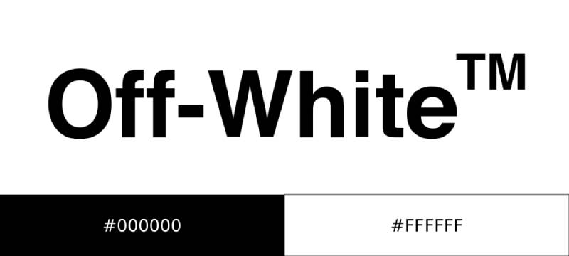
Official Color Codes:
Primary Black
Primary White
- Hex: #FFFFFF
- RGB: (255, 255, 255)
- CMYK: (0, 0, 0, 0)
Accent Yellow
- Hex: #FFC700
- RGB: (255, 199, 0)
- CMYK: (0, 22, 100, 0)
- Pantone: 116 C
Dimensions and Proportions:
- Aspect ratio varies by application
- Minimum size: 15mm width for wordmark
- Clear space: Equal to the height of the quotation mark on all sides
- Diagonal stripes maintain consistent 45-degree angle
What Cultural Impact Has the Off-White Logo Had?
Off-White changed how fashion brands communicate. The quotation marks spawned countless imitators across industries.
Streetwear kids and fashion editors both recognized the logo instantly. That crossover appeal was new for the industry.
After Abloh’s passing in 2021, the logo became a memorial symbol. People got tattoos of the arrows. The brand identity transcended commerce.
How Does the Off-White Logo Fit Into the Overall Brand Identity?

The logo anchors a complete visual system. Industrial tape patterns. Construction zone references. Helvetica everywhere.
These elements follow strict brand guidelines while feeling spontaneous. The tension between control and chaos defines Off-White’s aesthetic.
Retail stores use raw concrete and exposed materials. Packaging features the same industrial yellow tape motif. Everything connects back to those core logo elements.
How Should the Off-White Logo Be Used?
Official Usage Guidelines:
Do:
- Maintain clear space around all logo elements
- Use only approved color combinations
- Keep diagonal stripes at 45-degree angles
- Preserve quotation mark placement around wordmark
Don’t:
- Stretch or distort proportions
- Add effects like shadows or gradients
- Change the Helvetica Bold typeface
- Separate the quotation marks from the wordmark
Accessing Official Logos: Brand partners receive assets through Off-White’s corporate licensing department.
Trademark Protection: The wordmark, crossed arrows, and diagonal stripe pattern are protected. Unauthorized use results in legal action, something the brand has pursued actively against counterfeiters and trademark infringers.
FAQ on The Off-White Logo
What Font Does Off-White Use in Its Logo?
Off-White uses Helvetica Bold for its wordmark. This typeface choice connects the brand to industrial design traditions.
The clean letterforms work across all applications. From tiny clothing tags to massive retail signage, the typography stays readable.
Who Designed the Off-White Logo?
Virgil Abloh created the Off-White logo in 2012. He founded the Milan-based fashion house after his Pyrex Vision project.
Abloh studied architecture at Illinois Institute of Technology. That background shaped his approach to brand identity and visual systems.
What Do the Off-White Arrows Mean?
The crossed arrows symbol points in four directions. Many interpret this as representing global reach or crossroads decisions.
Abloh never confirmed a single meaning. He preferred letting the psychology of shapes speak for itself.
Why Does Off-White Use Quotation Marks?
The quotation marks create ironic distance. They suggest the brand name is being referenced rather than stated directly.
This approach questions what luxury fashion actually means. It became Abloh’s signature storytelling device across all his work.
What Are the Official Off-White Logo Colors?
The primary color palette consists of black and white. Industrial yellow appears as an accent color.
This monochrome approach fits perfectly with streetwear aesthetics. The yellow references caution tape and construction zones.
How Can I Tell if an Off-White Logo Is Authentic?
Check the font weight and spacing first. Counterfeits often get the Helvetica Bold proportions wrong.
Authentic items have consistent diagonal stripe angles at 45 degrees. The zip tie tag should feel substantial, not flimsy.
When Was the Off-White Logo Created?
Virgil Abloh introduced the Off-White brand identity in 2012. The logo launched alongside the first collection in Milan.
It replaced his earlier Pyrex Vision branding. The new identity needed to signal a shift toward luxury streetwear positioning.
What Do the Diagonal Stripes Represent?
The diagonal stripes reference industrial and construction imagery. They echo road barriers and caution markings.
Four stripes became standard. This repetition pattern created instant brand recognition across products and collaborations worldwide.
Can I Use the Off-White Logo for Personal Projects?
No. The Off-White wordmark, arrows, and diagonal stripes are protected trademarks. Using them requires official licensing.
The brand actively pursues counterfeiters. Personal projects using these elements risk legal action from the company.
Has the Off-White Logo Changed Since Virgil Abloh’s Death?
The core logo remains unchanged after Abloh’s passing in 2021. LVMH maintains the original brand identity he created.
New creative direction respects his vision. The quotation marks, arrows, and stripes continue as his lasting design legacy.
Conclusion
The Off-White logo redefined what luxury streetwear branding could look like. Virgil Abloh’s use of quotation marks, crossed arrows, and diagonal stripes created a visual hierarchy that fashion had never seen before.
His work proved that minimalist design choices can carry massive cultural weight.
The brand continues under LVMH ownership, preserving Abloh’s original vision. These design elements remain central to Off-White’s identity.
Few brands achieve this level of instant recognition. The Off-White aesthetic influenced countless Nike collaborations, runway collections, and streetwear competitors worldwide.

Renowned for his expertise in logo design and visual branding, Bogdan has developed a multitude of logos for various clients.
His skills extend to creating posters, vector illustrations, business cards, and brochures. Additionally, Bogdan's UI kits were featured on marketplaces like Visual Hierarchy and UI8.
He also wrote in the past years on sites like Design Your Way, WebDesignerDepot, WPDean, Designmodo, Speckyboy, Slider Revolution, and more.
- Jujutsu Kaisen Font Generator - 12 October 2026
- The Windsurf Logo History, Colors, Font, And Meaning - 10 October 2026
- How to Remove Background From Product Photos (No Photoshop) - 10 October 2026

Bogdan Sandu is a seasoned designer who has been designing websites since 2008. Renowned for his expertise in logo design and visual branding, Bogdan has developed a multitude of logos for various clients. His skills extend to creating posters, vector illustrations, business cards, and brochures. Additionally, Bogdan's UI kits were featured on marketplaces like Visual Hierarchy and UI8. He also wrote in the past years on sites like Design Your Way, WebDesignerDepot, WPDean, Designmodo, Speckyboy, Slider Revolution, and more.
You Might Also Like


