


The Balenciaga logo stands as one of the most recognizable marks in luxury fashion. It represents a Spanish-founded fashion house that has shaped haute couture since 1919. The current wordmark reflects a stripped-back approach that feels almost confrontational in its simplicity.
Within the broader context of luxury branding, Balenciaga occupies a unique position. The house has gone through several visual identity changes, with the current version introduced in 2017 under creative director Demna Gvasalia. Founded by Cristobal Balenciaga in San Sebastian, Spain, the brand has seen approximately four major logo iterations throughout its century-long history.
What is the Balenciaga Logo?

The Balenciaga logo is a custom sans-serif wordmark featuring the brand name in all capital letters. Officially updated in 2017 under Demna Gvasalia’s direction, it represents understated luxury through tight letter spacing and bold, uniform strokes. The design communicates exclusivity without decorative elements.
Design Type: Wordmark (logotype)
Primary Elements: Custom typography spelling “BALENCIAGA” in uppercase letters with consistent stroke width
Official Introduction Date: 2017 (current version)
Designer/Agency: In-house design team under Demna Gvasalia’s creative direction
Trademark Status: Registered trademark owned by Balenciaga, part of Kering Group
Color Palette: Primary black (#000000) on white, with reversed white on black applications
Usage Context: Clothing labels, packaging design, retail environments, digital platforms, advertising campaigns, and product hardware
How Has the Balenciaga Logo Evolved Over Time?
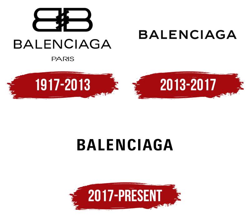
The Balenciaga logo has transformed from elegant script lettering to a bold, modern wordmark over its 100+ year history.
Each iteration reflected the creative direction of its era.
The most dramatic shift came in 2017 when the brand abandoned traditional luxury aesthetics for stark minimalism.
Original Balenciaga Logo (1919-1930s)
Years Active: 1919 to approximately late 1930s
Design Description: Elegant script lettering with flowing curves, reflecting the craftsmanship emphasis of early 20th century fashion houses
Color Scheme: Black ink on white or cream backgrounds, occasionally gold for special applications
Designer: Attributed to Cristobal Balenciaga or commissioned local artisans
Context: Introduced when Cristobal Balenciaga opened his first boutique in San Sebastian, Spain. The script font style aligned with the sophisticated handwriting aesthetic popular among European fashion houses.
Key Changes from Previous: This was the original mark, establishing the brand’s visual foundation
Cultural Significance: Represented Spanish craftsmanship and the founder’s personal touch in an era when couture was deeply personal
Mid-Century Balenciaga Logo (1940s-1990s)
Years Active: 1940s through 1990s
Design Description: Refined serif-based wordmark with more structured letterforms, maintaining elegance while gaining formality
Color Scheme: Black primary, with occasional navy applications
Designer: In-house design evolution
Context: Coincided with the brand’s move to Paris and establishment on Avenue George V. The more structured approach reflected the house’s growing reputation in Parisian haute couture.
Key Changes from Previous: Transition from flowing script to more controlled serif typography
Cultural Significance: Marked Balenciaga’s ascent to the pinnacle of French fashion, with Cristobal Balenciaga becoming known as “the master of us all” according to Christian Dior
Late 20th Century Balenciaga Logo (1990s-2017)
Years Active: 1990s to 2017
Design Description: Clean sans-serif wordmark with moderate letter spacing, more contemporary than previous versions but still somewhat traditional
Color Scheme: Black on white, consistent with luxury fashion conventions
Designer: Updated during various creative director tenures including Nicolas Ghesquiere and Alexander Wang
Context: The brand underwent revival in the late 1990s. This logo bridged traditional luxury expectations with emerging modern aesthetics.
Key Changes from Previous: Complete removal of serifs, adoption of cleaner lines
Cultural Significance: Represented the brand’s reinvention as a forward-thinking fashion house while respecting heritage
Current Balenciaga Logo (2017-Present)
Years Active: 2017 to present
Design Description: Bold sans-serif wordmark with extremely tight kerning, condensed letterforms, and uniform stroke width
Color Scheme: Pure black (#000000) on white, reversed for dark applications
Designer: Demna Gvasalia’s creative team
Context: Introduced alongside Demna’s radical creative overhaul. The stripped-down aesthetic matched his approach to fashion, which blended streetwear with high fashion.
Key Changes from Previous: Dramatically tighter letter spacing, bolder weight, more compressed proportions
Cultural Significance: Signals the brand’s break from traditional luxury aesthetics and embrace of contemporary, sometimes ironic, fashion statements
What Do the Design Elements of the Balenciaga Logo Mean?

The Balenciaga logo communicates through restraint.
Every element, from the condensed letters to the tight spacing, suggests confidence that needs no decoration.
The all-caps presentation demands attention without asking for it.
Why Did Balenciaga Choose These Specific Colors?
Black serves as the primary color. Its hex code is #000000, representing absolute darkness.
In color psychology, black communicates power, sophistication, and timelessness. It creates maximum contrast against white backgrounds.
White (#FFFFFF) functions as the secondary color. It provides breathing room and cleanliness.
Together, this monochrome combination strips away distraction. The brand avoids color entirely, which actually takes confidence. Most luxury houses lean on gold or specific signature hues.
Balenciaga essentially says: we don’t need that.
What Typography Style Is Used in the Balenciaga Logo?
The current Balenciaga wordmark uses a custom sans-serif font.
It features uniform stroke width across all letters. No thick-thin variation. The x-height is relatively tall, making the letters feel substantial.
Letter spacing sits extremely tight. Some letters nearly touch.
This creates visual tension and draws from Swiss design principles while pushing them further. The typeface prioritizes impact over traditional readability conventions.
What Are the Hidden Meanings in the Balenciaga Logo?
The tight letter spacing suggests exclusivity. Things are packed close, almost protective of their space.
Some designers interpret the condensed form as representing the compression of luxury into pure essence.
There’s no hidden symbol or clever negative space trick here. That’s actually the point.
Demna Gvasalia has stated his designs often challenge expectations. The logo’s refusal to play games might be its most subversive quality. It’s confident enough to just… be letters.
How Does the Balenciaga Logo Compare to Competitor Logos?

Balenciaga’s wordmark stands apart from traditional luxury fashion logos through its aggressive simplicity.
While the Chanel logo relies on interlocking Cs and the Louis Vuitton logo uses its iconic LV monogram, Balenciaga offers only letters.
The Prada logo maintains a more traditional approach with its rope frame and serif typography. Gucci keeps its distinctive double-G emblem.
Balenciaga’s approach feels almost anti-luxury in comparison. And that’s intentional.
Where competitors signal heritage through ornate details, Balenciaga signals modernity through their absence. The brand essentially flipped the script on what a luxury logo should look like.
What Are the Technical Specifications of the Balenciaga Logo?
Official Color Codes:
- Primary Color: Black – Hex: #000000, RGB: (0, 0, 0), CMYK: (0, 0, 0, 100), Pantone: Black 6 C
- Secondary Color: White – Hex: #FFFFFF, RGB: (255, 255, 255), CMYK: (0, 0, 0, 0)
Dimensions and Proportions:
- Aspect ratio: Approximately 7:1 (width to height)
- Minimum size requirements: Generally 25mm width for print applications to maintain legibility
- Clear space specifications: Minimum clear space equal to the height of the letter “B” on all sides
- The logo should never be stretched, compressed, or altered in proportions
File Formats Available:
Official assets typically distributed as vector graphics (AI, EPS, SVG) for scalability and bitmap formats (JPEG, PNG) for digital use. High DPI versions provided for print applications.
What Cultural Impact Has the Balenciaga Logo Had?
The Balenciaga logo redefined what luxury branding could look like in the 2010s.
Its stripped-back aesthetic influenced countless fashion and lifestyle brands to reconsider ornate approaches.
The wordmark became synonymous with a new wave of high-fashion streetwear. You see it on everything from Triple S sneakers to oversized hoodies.
It proved that minimalist design could command premium prices and cultural attention just as effectively as elaborate crests or monograms. Maybe more so.
How Does the Balenciaga Logo Fit Into the Overall Brand Identity?

The logo serves as the anchor point for Balenciaga’s entire visual system.
It connects directly to the brand’s typographic approach across all touchpoints. Advertising, web design, retail environments, and product tags all echo the same tight, bold aesthetic.
The white space strategy extends beyond the logo into campaign photography and store design.
Everything feels intentionally sparse. The visual hierarchy stays consistent: logo first, product second, everything else stripped away.
How Should the Balenciaga Logo Be Used?
Official Usage Guidelines:
- Do maintain the original proportions at all times
- Do use only approved color combinations (black on white, white on black)
- Do respect minimum clear space requirements
- Don’t add effects like shadows, gradients, or outlines
- Don’t place the logo on busy backgrounds that compromise legibility
- Don’t recreate the logo using standard fonts
Accessing Official Logos:
Official logo files are distributed through Kering Group’s brand asset management systems. Authorized partners receive assets through official channels only.
Licensing Information:
The Balenciaga name and logo are protected trademarks. Any commercial use requires explicit authorization from the brand. Counterfeit use carries serious legal consequences.
Trademark Protection:
Balenciaga actively monitors and enforces trademark rights globally. The brand’s brand guidelines document outlines all permissible applications for authorized users.
FAQ on The Balenciaga Logo
What Font Is Used in the Balenciaga Logo?
The Balenciaga wordmark uses a custom font designed specifically for the brand. It’s a bold sans-serif with extremely tight tracking.
The letters sit close together, almost touching. You won’t find this exact typeface for download anywhere.
It’s proprietary to the fashion house.
Who Designed the Current Balenciaga Logo?
Demna Gvasalia’s creative team introduced the current logo in 2017. He became creative director that year and overhauled the brand’s visual identity.
The original Balenciaga brand identity came from founder Cristobal Balenciaga back in 1919.
No external agency handled the 2017 redesign.
When Did Balenciaga Change Its Logo?
The most recent Balenciaga logo change happened in 2017. Before that, the brand updated its mark in the 1990s during its revival period.
The fashion house has seen roughly four major logo iterations since its founding in San Sebastian, Spain.
What Does the Balenciaga Logo Symbolize?
The Balenciaga logo represents understated luxury through deliberate simplicity. No symbols. No icons. Just letters.
This approach follows core logo design principles that prioritize clarity over decoration.
The condensed letterforms suggest exclusivity and modern haute couture confidence.
Does Balenciaga Have a Double B Logo?
Yes. Balenciaga introduced an interlocking BB monogram alongside the wordmark. It appears on hardware, buttons, and some product lines.
The double B creates a symmetrical pattern often compared to other luxury house monograms.
It’s secondary to the main wordmark though.
Why Is the Balenciaga Logo So Simple?
Demna Gvasalia stripped away traditional luxury signifiers intentionally. The stark wordmark reflects his design philosophy of challenging fashion norms.
Simple logos also work better across digital platforms and streetwear applications.
The black wordmark needs no explanation. It just exists.
How Can You Spot a Fake Balenciaga Logo?
Authentic Balenciaga logos show consistent letter spacing and uniform stroke weight. Fakes often have uneven spacing or incorrect font weights.
Check the stitching quality on clothing tags.
The letters should be sharp, never blurry or bleeding. Counterfeit detection requires examining these small details carefully.
What Colors Does Balenciaga Use in Its Logo?
Balenciaga sticks to a strict color palette of black and white only. No gradients. No accent colors.
This monochromatic approach differs from competitors who often incorporate gold or signature hues into their brand marks.
Can I Download or Use the Balenciaga Logo?
No. The Balenciaga trademark is protected intellectual property owned by Kering Group.
Understanding font licensing and trademark law matters here. Unauthorized commercial use will result in legal action.
Only authorized partners receive official logo files through proper channels.
How Does Balenciaga’s Logo Compare to Other Luxury Brands?
Most luxury fashion houses use emblems or monograms. Think interlocking letters or decorative crests.
Balenciaga rejected that entirely. The pure wordmark approach influenced other brands to reconsider their brand style direction.
It proved high-end branding doesn’t require ornate design elements.
Conclusion
The Balenciaga logo proves that luxury branding doesn’t require complexity. Its bold wordmark has become one of the most recognized marks in high fashion.
Demna Gvasalia’s 2017 redesign stripped everything back to pure typography. No monograms. No crests. Just confident letters with tight spacing.
This approach follows sound graphic design principles while breaking luxury conventions. The result sits alongside iconic typefaces that define their industries.
Whether on Triple S sneakers or runway pieces, the wordmark delivers visual unity across every touchpoint. Simple works.

Renowned for his expertise in logo design and visual branding, Bogdan has developed a multitude of logos for various clients.
His skills extend to creating posters, vector illustrations, business cards, and brochures. Additionally, Bogdan's UI kits were featured on marketplaces like Visual Hierarchy and UI8.
He also wrote in the past years on sites like Design Your Way, WebDesignerDepot, WPDean, Designmodo, Speckyboy, Slider Revolution, and more.
- Jujutsu Kaisen Font Generator - 12 October 2026
- The Windsurf Logo History, Colors, Font, And Meaning - 10 October 2026
- How to Remove Background From Product Photos (No Photoshop) - 10 October 2026

Bogdan Sandu is a seasoned designer who has been designing websites since 2008. Renowned for his expertise in logo design and visual branding, Bogdan has developed a multitude of logos for various clients. His skills extend to creating posters, vector illustrations, business cards, and brochures. Additionally, Bogdan's UI kits were featured on marketplaces like Visual Hierarchy and UI8. He also wrote in the past years on sites like Design Your Way, WebDesignerDepot, WPDean, Designmodo, Speckyboy, Slider Revolution, and more.
You Might Also Like


