


The Skims logo represents one of the most successful celebrity-founded fashion brands in recent history. Kim Kardashian launched this shapewear company in 2019, and the visual identity has become instantly recognizable across social media and retail spaces.
Within the intimate apparel industry, the Skims logo broke from tradition. Where competitors used ornate scripts and decorative elements, this brand went stark and modern. The current wordmark debuted alongside the company’s official launch in September 2019. No outside agency has been publicly credited with the design.
The brand has maintained its original logo since founding, making it one of those rare cases where a company got it right the first time. That consistency matters more than people realize.
What is the Skims Logo?

The Skims logo is a custom sans-serif wordmark spelling “SKIMS” in all capital letters. It was introduced in September 2019 when Kim Kardashian officially launched the brand after rebranding from “Kimono.” The design communicates modern minimalism and body inclusivity through clean, geometric letterforms.
Design Type: Wordmark (logotype)
Primary Elements: Five capital letters with consistent stroke width and geometric construction. No icon, symbol, or tagline accompanies the primary mark.
Official Introduction Date: September 2019
Designer/Agency: Not publicly disclosed. The rebrand happened quickly after the “Kimono” controversy, suggesting an in-house or closely connected creative team.
Trademark Status: Registered trademark in the United States and internationally for apparel, shapewear, and related goods.
Color Palette: The logo primarily appears in warm brown (#7B6B63), black (#000000), and white (#FFFFFF). These rotate based on application and product line.
Usage Context: Product tags, packaging, website headers, social media profiles, retail displays, and collaboration materials with partners like Fendi and the NBA.
How Has the Skims Logo Evolved Over Time?

The Skims logo has remained remarkably stable since launch. Unlike most fashion brands that tweak their identities every few years, this wordmark has stayed virtually unchanged.
That said, the brand itself went through a significant identity shift before even launching publicly.
The Kimono Era (June 2019)
Years Active: Approximately 3 months (announced but never fully launched)
Design Description: The original “Kimono” branding featured a similar minimalist approach but with different letterforms spelling out the culturally controversial name.
Color Scheme: Neutral tones similar to current branding
Context: Kim Kardashian initially filed trademarks for “Kimono” in 2019. The name sparked immediate backlash from Japanese communities and fashion critics who viewed it as cultural appropriation.
Cultural Significance: This era, though brief, shaped how the brand approached naming and cultural sensitivity moving forward.
Skims Wordmark (September 2019 to Present)
Years Active: 2019 to present
Design Description: Clean, geometric sans-serif font with uniform stroke weights. The letters sit on a consistent baseline with tight but readable spacing.
Color Scheme: Warm brown as primary, with black and white variants
Key Changes from Previous: Complete name change. The letterforms share DNA with the Kimono concept but spell an entirely new word.
Cultural Significance: The rapid pivot demonstrated brand agility and willingness to listen to criticism. It also established the tone for how Skims would handle public relations going forward.
What Do the Design Elements of the Skims Logo Mean?

The Skims wordmark communicates accessibility through simplicity. Every letter maintains equal visual weight, suggesting that the brand treats all body types with the same importance.
There is no hierarchy in the letterforms. No decorative flourishes. Just clean shapes that work together.
Why Did Skims Choose These Specific Colors?
The warm brown (#7B6B63) serves as the signature brand color. It sits somewhere between taupe and cocoa, matching the nude-tone philosophy of the products themselves.
This particular hue reads as skin-adjacent without claiming to match any specific skin tone.
Black (#000000) provides contrast for packaging and editorial uses. White (#FFFFFF) appears on darker product backgrounds.
The color psychology here is deliberate. Brown suggests warmth, earthiness, and body acceptance. It feels less clinical than the stark whites and pinks that dominated shapewear branding before Skims entered the market.
What Typography Style Is Used in the Skims Logo?
The wordmark uses a custom or heavily modified sans-serif typeface. The letterforms are geometric with subtle humanist touches.
Notice the “S” characters. They have a controlled curve that avoids feeling too rigid or too loose.
The kerning is tight but never cramped. Each letter breathes while maintaining visual cohesion as a unit.
All caps was a deliberate choice. It creates a sense of confidence without shouting.
What Are the Hidden Meanings in the Skims Logo?
Honestly? There is not much hidden here. And that is the point.
The logo does not try to be clever. No negative space tricks. No embedded symbols.
What you see is what you get. This directness mirrors the brand’s promise of shapewear that works without complicated engineering or uncomfortable construction.
Some have noted that the double “S” creates a visual bookend effect. Whether intentional or not, it gives the mark a sense of balance.
How Does the Skims Logo Compare to Competitor Logos?
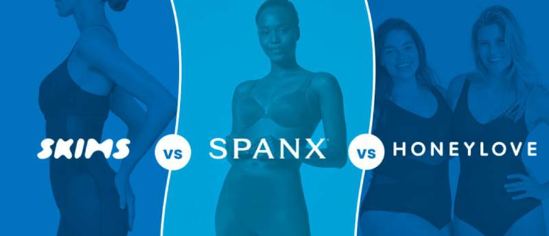
Most shapewear brands before Skims relied on script fonts or overtly feminine styling. Spanx uses a bold, playful wordmark. Victoria’s Secret leans into cursive elegance.
Skims went the opposite direction entirely.
The geometric sans-serif approach has more in common with tech companies or minimalist design studios than traditional lingerie brands.
This positioning was strategic. It appeals to a younger demographic that grew up with Apple aesthetics and Instagram’s clean interfaces.
Compared to the Lululemon logo, Skims feels warmer due to its color choices but equally modern in execution. Against luxury houses like Balenciaga logo treatments, it holds its own without trying to mimic high fashion codes.
What Are the Technical Specifications of the Skims Logo?

Official Color Codes:
-
Primary Brown:
- Hex:
#62554A - RGB: (98, 85, 74)
- CMYK: (0, 13, 24, 62)
- Pantone®: 411 C
- Hex:
- Black: Hex #000000, RGB (0, 0, 0), CMYK (0, 0, 0, 100)
- White: Hex #FFFFFF, RGB (255, 255, 255), CMYK (0, 0, 0, 0)
Dimensions and Proportions:
- Aspect ratio: Approximately 4:1 (horizontal wordmark)
- Minimum size: Generally maintained at sizes where letterforms remain legible (around 0.5 inches in print)
- Clear space: The brand maintains breathing room equal to roughly the height of one letter on all sides
The logo exists primarily as vector graphics for scalability across packaging, digital, and environmental applications.
What Cultural Impact Has the Skims Logo Had?
The Skims wordmark helped normalize minimalist branding in the intimates category. Before 2019, shapewear marketing felt clinical or overly sexy. There was not much middle ground.
This logo suggested a third option. Confidence without performance.
The visual identity influenced how newer brands in the space present themselves. You now see similar stripped-down wordmarks across direct-to-consumer shapewear startups.
On social media, the logo became a status symbol. People post their Skims packaging because it photographs well. That was not accidental.
How Does the Skims Logo Fit Into the Overall Brand Identity?
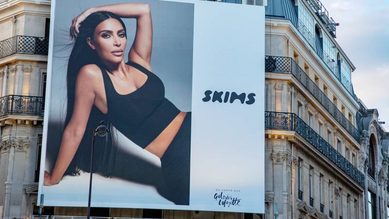
The logo anchors a broader visual system built on warm neutrals, clean typography, and generous white space.
Product photography, packaging design, and social content all follow the same restraint.
The brand guidelines clearly prioritize consistency. Whether you see Skims on a billboard, an Instagram ad, or a product tag, the visual language stays coherent.
Kim Kardashian’s personal brand intersects here too. Her own aesthetic evolution toward muted tones and architectural fashion mirrors what Skims projects.
How Should the Skims Logo Be Used?
Official Usage Guidelines:
- Do not stretch, distort, or rotate the wordmark
- Maintain minimum clear space around the logo
- Use only approved color variants (brown, black, white)
- Do not add effects like shadows, gradients, or outlines
- Do not place the logo on busy backgrounds that reduce legibility
Where to Access Official Logos: Press materials and partnership inquiries go through Skims’ official media contacts. The company does not provide public logo downloads.
Licensing Information: Any commercial use of the Skims logo requires written permission. The trademark is actively enforced.
Trademark Protection: Skims holds registered trademarks in multiple international jurisdictions. Counterfeits and unauthorized uses face legal action.
If you are a retailer or media outlet, reach out through official channels before reproducing the mark.
FAQ on The Skims Logo
What Font Does the Skims Logo Use?
The Skims wordmark uses a custom geometric font that has never been publicly identified.
It features uniform stroke weights and clean letterforms. The all-caps styling creates a modern, confident look.
Some designers compare it to fonts like Futura or Avenir, but the exact typeface remains proprietary to the brand.
Who Designed the Skims Logo?
The designer behind the Skims brand identity has not been publicly credited.
Given the rapid rebrand from Kimono in 2019, many suspect an in-house team or close collaborator of Kim Kardashian handled it.
No design agency has claimed the project.
What Colors Are in the Official Skims Logo?
The primary brand color is a warm brown that matches the nude-tone shapewear philosophy.
Black and white versions exist for different applications. The color palette intentionally avoids harsh tones.
This approach ties directly to color theory principles around warmth and approachability.
When Was the Skims Logo Created?
The current logo launched in September 2019 alongside the official brand debut.
This came after Kim Kardashian’s shapewear brand pivoted from its original Kimono name. The entire visual identity came together in roughly three months.
What Does the Skims Logo Represent?
The wordmark communicates body positivity and inclusive sizing through its balanced, equal-weight letterforms.
No single letter dominates. This reflects the brand’s promise to serve all body types equally.
The simplicity also signals a direct-to-consumer fashion approach without pretense.
Has the Skims Logo Changed Since Its Launch?
No. The Skims logo has remained unchanged since 2019.
This consistency is unusual for a celebrity clothing brand growing this fast. Most companies tweak their visual hierarchy and identity within the first few years.
Skims got it right immediately.
Why Did Skims Rebrand From Kimono?
The original Kimono name sparked backlash over cultural appropriation concerns from Japanese communities.
Kim Kardashian responded quickly. The rebrand to Skims happened within weeks of the controversy.
The new name better reflected the shapewear brand identity without cultural baggage.
Is the Skims Logo Trademarked?
Yes. Skims holds registered trademarks in the United States and multiple international markets.
The trademark covers apparel, loungewear, and related product categories. The billion-dollar fashion startup actively enforces its intellectual property rights against counterfeits.
What File Formats Is the Skims Logo Available In?
Skims does not offer public logo downloads.
For print design and media use, authorized partners receive vector files through official channels. The brand maintains strict control over how its visual identity appears.
Press inquiries go through their media team.
How Does the Skims Logo Compare to Other Fashion Brand Logos?
The Skims logo stands apart from traditional luxury underwear branding.
Where competitors like Victoria’s Secret use decorative scripts, Skims embraces logo design principles rooted in restraint.
It shares more visual DNA with tech company logos than classic fashion houses.
Conclusion
The Skims logo proves that restraint works. In a market crowded with decorative branding, this wordmark cut through by doing less.
Kim Kardashian’s shapewear company built a billion-dollar valuation partly on this visual identity. The clean letterforms and neutral color scheme became as recognizable as the products themselves.
No hidden symbols. No clever tricks. Just confident design elements that photograph well and scale across every platform.
For anyone studying modern fashion branding or celebrity entrepreneur ventures, this logo offers a masterclass in storytelling through simplicity.

Renowned for his expertise in logo design and visual branding, Bogdan has developed a multitude of logos for various clients.
His skills extend to creating posters, vector illustrations, business cards, and brochures. Additionally, Bogdan's UI kits were featured on marketplaces like Visual Hierarchy and UI8.
He also wrote in the past years on sites like Design Your Way, WebDesignerDepot, WPDean, Designmodo, Speckyboy, Slider Revolution, and more.
- Jujutsu Kaisen Font Generator - 12 October 2026
- The Windsurf Logo History, Colors, Font, And Meaning - 10 October 2026
- How to Remove Background From Product Photos (No Photoshop) - 10 October 2026

Bogdan Sandu is a seasoned designer who has been designing websites since 2008. Renowned for his expertise in logo design and visual branding, Bogdan has developed a multitude of logos for various clients. His skills extend to creating posters, vector illustrations, business cards, and brochures. Additionally, Bogdan's UI kits were featured on marketplaces like Visual Hierarchy and UI8. He also wrote in the past years on sites like Design Your Way, WebDesignerDepot, WPDean, Designmodo, Speckyboy, Slider Revolution, and more.
You Might Also Like


