


The Kendra Scott logo represents one of the most recognized jewelry brands to come out of Austin, Texas. It functions as a visual shorthand for accessible luxury, colorful gemstones, and a business built on philanthropy.
Within the accessories industry, this logo sits in an interesting spot. It competes with heritage luxury houses while maintaining approachability. The current wordmark was refined over multiple iterations since the company launched in 2002.
Kendra Scott herself founded the brand with just $500 in her spare bedroom. The logo has gone through roughly three to four major versions, each reflecting different stages of company growth.
What Is the Kendra Scott Logo?
The Kendra Scott logo is a refined wordmark featuring the founder’s name in elegant uppercase lettering. Introduced in its current form around 2010, the design uses custom typography that balances sophistication with warmth, reflecting the brand’s position in the accessible luxury jewelry market.
Design Type: Wordmark (logotype)
Primary Elements: Full brand name “KENDRA SCOTT” in custom uppercase letterforms with refined serifs and balanced spacing
Official Introduction Date: Current version refined circa 2010, with updates continuing through brand expansion
Designer/Agency: Internal brand team with outside consultants (specific agency not publicly disclosed)
Trademark Status: Registered trademark with the United States Patent and Trademark Office
Color Palette:
- Primary: Black (#000000) for standard applications
- Secondary: White for reversed applications
- Accent: Gold/Champagne tones for premium materials
Usage Context: Retail storefronts, jewelry packaging, shopping bags, website headers, social media profiles, marketing campaigns, and the signature Color Bar experience stations
How Has the Kendra Scott Logo Evolved Over Time?
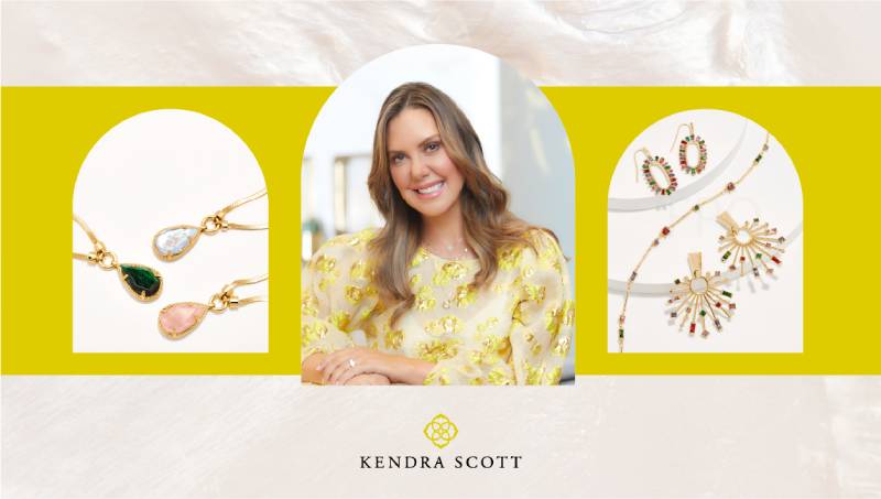
The logo started simple and grew more polished as the company expanded from local Austin boutiques to a national presence with over 100 retail locations.
Each version maintained the wordmark approach but refined the letterforms, spacing, and overall presence.
Original Kendra Scott Logo (2002-2007)
Years Active: 2002-2007
Design Description: Early versions featured a simpler typographic treatment. The name appeared in a straightforward serif font without much customization.
Color Scheme: Primarily black text on white backgrounds
Designer: Likely created in-house or by local Austin designers
Context: The brand was still small, selling primarily through trunk shows and a single storefront called the Hat Box. The logo needed to work on minimal materials.
Key Changes from Previous: This was the original, so no prior version existed
Cultural Significance: Represented the scrappy startup phase of a woman-owned business during a time when indie jewelry brands were gaining traction
Refined Kendra Scott Logo (2007-2010)
Years Active: 2007-2010
Design Description: Letterforms became more distinctive. The typography took on a slightly more editorial quality with adjusted kerning between characters.
Color Scheme: Black remained dominant, with gold accents appearing in premium applications
Context: Expansion into department stores like Nordstrom and Neiman Marcus required a more sophisticated visual presence
Key Changes from Previous: Tighter letter spacing, more refined serif details, better scalability across different sizes
Cultural Significance: Marked the transition from local favorite to regional brand with serious growth ambitions
Current Kendra Scott Logo (2010-Present)
Years Active: 2010-present
Design Description: The current iteration features carefully balanced uppercase letters with subtle serif treatments. Each character has been optically adjusted for visual harmony.
Color Scheme: Versatile black/white applications with champagne gold for luxury contexts
Context: The brand reached national prominence and needed a logo that could work across retail, digital, packaging, and experiential marketing
Key Changes from Previous: More refined proportions, improved digital rendering, clearer visual hierarchy in multi-element layouts
Cultural Significance: Now represents one of the largest privately held jewelry companies in America
What Do the Design Elements of the Kendra Scott Logo Mean?

The wordmark’s uppercase treatment signals confidence without being aggressive. It borrows from fashion magazine mastheads and editorial design traditions.
The refined serifs connect to jewelry’s heritage as a craft with long traditions.
Why Did Kendra Scott Choose These Specific Colors?
Black
- Hex: #000000
- Symbolic meaning: Timelessness, sophistication, versatility
- Psychological impact: Creates a neutral backdrop that lets the colorful jewelry products become the star
- Brand connection: Works with any gemstone color in product photography
Gold/Champagne
- Approximate Hex: #D4AF37 to #C9B037
- Symbolic meaning: Luxury, warmth, celebration
- Psychological impact: Evokes the precious metals used in the jewelry itself
- Brand connection: Mirrors the gold tones found in many signature pieces
The color psychology here is smart. Black disappears. Gold elevates. Neither competes with the product.
What Typography Style Is Used in the Kendra Scott Logo?
The typeface reads as a transitional serif with modern refinements. It sits somewhere between classic Didone styles and contemporary editorial fonts.
The x-height is moderate, giving the logo good legibility at smaller sizes while maintaining elegance at large scale.
Tracking is generous enough to feel airy but not so loose that the word breaks apart visually.
What Are the Hidden Meanings in the Kendra Scott Logo?
There’s no clever negative space trick or hidden symbol here. And that’s actually the point.
The logo’s meaning comes from its restraint. By keeping the mark simple, the brand allows its colorful products and in-store experiences to carry the visual weight.
Kendra Scott has stated that she wants the brand to feel welcoming, not intimidating. A complex logo would work against that goal.
How Does the Kendra Scott Logo Compare to Competitor Logos?

Most jewelry brand logos fall into two camps: script-based marks that feel romantic, or bold sans-serif wordmarks that feel modern. Kendra Scott splits the difference with its serif approach.
Compared to Louis Vuitton’s monogram, it’s far more accessible.
Against Chanel’s interlocking Cs, it lacks iconography but gains clarity.
Among direct competitors like Gorjana or BaubleBar, the Kendra Scott wordmark reads as more established and slightly more mature. It doesn’t try to look trendy, which helps it age better.
The Prada logo shares some DNA in its uppercase serif treatment, though Prada leans heavier into contrast and angularity.
What Are the Technical Specifications of the Kendra Scott Logo?
Official Color Codes:
Primary (Black):
Secondary (White):
- Hex: #FFFFFF
- RGB: (255, 255, 255)
- CMYK: (0, 0, 0, 0)
Accent (Champagne Gold):
- Hex: Approximately #C9B037
- RGB: (201, 176, 55)
- Pantone: Custom match (varies by application)
Dimensions and Proportions:
- Aspect ratio: Approximately 5:1 (wide horizontal format)
- Minimum size: Typically 1 inch wide for print, 120 pixels for digital
- Clear space: Minimum breathing room equal to the height of the letter “K” on all sides
- The brand maintains vector files for scalability across all applications
What Cultural Impact Has the Kendra Scott Logo Had?
The logo has become synonymous with a particular type of Southern accessible luxury. Walk through any college campus in Texas, and you’ll see that wordmark on packaging, gift bags, and store windows.
It helped establish the template for how direct-to-consumer jewelry brands present themselves.
The mark also represents something bigger: a woman who built a billion-dollar company while maintaining a strong philanthropic mission. That storytelling dimension adds meaning beyond pure aesthetics.
How Does the Kendra Scott Logo Fit Into the Overall Brand Identity?

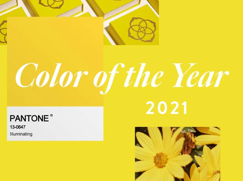
The logo anchors a broader system that includes signature yellow shopping bags, distinctive jewelry displays, and the interactive Color Bar experience.
Every touchpoint connects back to the wordmark as the central identifier.
The company’s brand guidelines ensure consistency across hundreds of retail locations, wholesale partners, and digital platforms.
Store design, packaging, and marketing all share a visual language that feels cohesive without being rigid.
How Should the Kendra Scott Logo Be Used?
Official Usage Guidelines:
- Never stretch, distort, or rotate the logo
- Maintain minimum clear space requirements
- Use only approved color variations (black, white, gold)
- Don’t add effects like shadows, gradients, or outlines
- Always reproduce from official brand style guide assets
Where to Access Official Logos:
- Authorized retailers receive assets through the wholesale portal
- Press and media can request files through the brand’s PR contacts
- The brand does not provide public logo downloads to prevent misuse
Licensing Information:
- The Kendra Scott name and logo are registered trademarks
- Unauthorized commercial use is prohibited
- Collaborations and partnerships require formal licensing agreements
Trademark Protection:
- The brand actively monitors for counterfeit products and unauthorized logo use
- Legal team enforces trademark rights across e-commerce platforms
- Counterfeit detection extends to unauthorized use of the wordmark on non-genuine jewelry
FAQ on The Kendra Scott Logo
What Does the Kendra Scott Logo Look Like?
The Kendra Scott logo is a wordmark featuring the founder’s full name in uppercase letters.
It uses refined serif letterforms with generous spacing. No symbol or icon accompanies the text.
The design reflects the brand’s position in the accessible luxury jewelry market.
What Font Does the Kendra Scott Logo Use?
The logo uses a custom font based on transitional serif styles.
It shares characteristics with editorial typefaces found in fashion magazines. The letterforms balance elegance with readability across different sizes.
This choice supports the brand’s visual identity goals.
What Are the Official Kendra Scott Logo Colors?
Primary applications use black (#000000) or white (#FFFFFF) depending on background.
Gold and champagne tones appear on premium materials. The restrained color palette ensures the colorful jewelry products remain the focal point.
Who Designed the Kendra Scott Logo?
The specific designer or agency hasn’t been publicly disclosed.
The Austin-based jewelry company likely worked with internal teams and outside consultants. What matters more is how the brand identity system evolved alongside business growth since 2002.
Has the Kendra Scott Logo Changed Over Time?
Yes. The logo went through three to four iterations.
Early versions were simpler. Each refinement improved the letterforms, adjusted font spacing, and strengthened brand recognition elements. The current version dates to around 2010.
Can I Download the Official Kendra Scott Logo?
Kendra Scott LLC does not provide public logo downloads.
Authorized retailers access assets through wholesale portals. Press contacts can request files directly. This protects the trademarked logo from unauthorized use and counterfeiting.
Why Doesn’t Kendra Scott Use a Symbol in Their Logo?
The wordmark approach keeps focus on the founder’s name, which carries significant brand equity.
Adding a symbol would compete with the colorful jewelry designs. Sometimes minimalist design choices work best for fashion brands.
Is the Kendra Scott Logo Trademarked?
Yes. The name and logo are registered with the United States Patent and Trademark Office.
The company actively monitors for counterfeit products. Legal teams enforce trademark rights across e-commerce platforms and retail channels.
What Does the Kendra Scott Logo Represent?
The logo represents accessible luxury, philanthropy, and Texas roots.
It signals a woman-founded business built from $500 in a spare bedroom. The logo design principles emphasize warmth over intimidation. That’s intentional.
How Does Kendra Scott Maintain Logo Consistency?
The company enforces strict usage guidelines across 100+ retail locations.
Clear space requirements, approved color variations, and minimum size specifications ensure unity across all touchpoints. Partners receive official assets through controlled distribution channels.
Conclusion
The Kendra Scott logo proves that restraint works. A simple wordmark carries the weight of a billion-dollar jewelry brand without competing with its colorful products.
Every design choice supports brand consistency across retail stores, e-commerce, and the signature Color Bar experience.
The serif letterforms signal accessible luxury. The generous white space keeps things breathable.
For women entrepreneurs building fashion brands, this logo offers a lesson. You don’t need complexity. You need clarity, balance, and a wordmark that ages well.
The Kendra Scott brand identity system shows what thoughtful design can achieve.

Renowned for his expertise in logo design and visual branding, Bogdan has developed a multitude of logos for various clients.
His skills extend to creating posters, vector illustrations, business cards, and brochures. Additionally, Bogdan's UI kits were featured on marketplaces like Visual Hierarchy and UI8.
He also wrote in the past years on sites like Design Your Way, WebDesignerDepot, WPDean, Designmodo, Speckyboy, Slider Revolution, and more.
- Jujutsu Kaisen Font Generator - 12 October 2026
- The Windsurf Logo History, Colors, Font, And Meaning - 10 October 2026
- How to Remove Background From Product Photos (No Photoshop) - 10 October 2026

Bogdan Sandu is a seasoned designer who has been designing websites since 2008. Renowned for his expertise in logo design and visual branding, Bogdan has developed a multitude of logos for various clients. His skills extend to creating posters, vector illustrations, business cards, and brochures. Additionally, Bogdan's UI kits were featured on marketplaces like Visual Hierarchy and UI8. He also wrote in the past years on sites like Design Your Way, WebDesignerDepot, WPDean, Designmodo, Speckyboy, Slider Revolution, and more.
You Might Also Like


