The Prada logo stands as one of the most recognized symbols in luxury fashion. Simple, clean, and deliberately understated. That inverted triangle has become shorthand for Italian craftsmanship and high-end design.
Within the broader history of fashion house branding, Prada occupies a unique position. While competitors lean toward ornate crests or elaborate monograms, Prada went minimal before minimal was trendy.
The current logo features the brand name in a custom serif typeface, often paired with the iconic triangular plaque. This version traces back to the early 1900s, though refinements happened along the way. Mario Prada founded the house in 1913, and the logo has seen roughly three significant iterations since then.
What Is the Prada Logo?
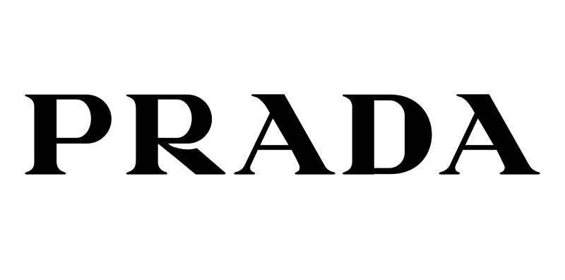
The Prada logo is a wordmark featuring “PRADA” in uppercase serif lettering, frequently displayed within an inverted triangle. Introduced in 1913 when Mario Prada opened his leather goods shop in Milan, the design represents Italian heritage and luxury craftsmanship.
Design Attributes
- Design Type: Combination mark (wordmark plus geometric emblem)
- Primary Elements: Custom serif typography, inverted triangle shape, rope border detail on classic version
- Official Introduction Date: 1913 (original founding), with the triangle element added after receiving the royal warrant
- Designer/Agency: Mario Prada (founder); no external agency credited for original design
- Trademark Status: Registered internationally; the inverted triangle is a protected trademark of Prada S.p.A.
- Color Palette: Primary black (#000000), white (#FFFFFF), with gold (#B8860B) used on metal hardware
- Usage Context: Products, retail environments, digital platforms, packaging, Prada Linea Rossa sportswear, Miu Miu sub-brand materials
How Has the Prada Logo Evolved Over Time?

Prada’s visual identity has remained remarkably consistent since 1913. The core elements stayed intact while minor refinements happened across decades.
Most luxury brands overhaul their logos every few years. Prada didn’t follow that path.
The triangle became official after the House of Savoy granted a royal warrant. Typography got cleaned up in the mid-20th century. And the modern minimalist version emerged under Miuccia Prada’s direction.
Original Prada Logo (1913-1919)
- Years Active: 1913-1919
- Design Description: Simple wordmark reading “Fratelli Prada” (Prada Brothers) in elegant serif typography
- Color Scheme: Black text on natural leather or packaging materials
- Designer: Mario Prada
- Context: Mario Prada opened his first shop in Galleria Vittorio Emanuele II, Milan. The logo needed to convey sophistication for wealthy European travelers.
- Cultural Significance: Established the brand’s association with Italian craftsmanship and premium leather goods
Royal Warrant Era Logo (1919-1970s)
- Years Active: 1919 through the 1970s
- Design Description: Introduction of the inverted triangle featuring the Savoy coat of arms, rope border, and “PRADA MILANO” text
- Color Scheme: Black and white primary, gold for metal plaques
- Designer: Internal design, incorporating royal heraldic elements
- Context: Prada became an official supplier to the Italian Royal Family. The warrant allowed use of the Savoy knot and coat of arms.
- Key Changes from Previous: Added the triangular shape, included “DAL 1913” (since 1913), incorporated royal symbols
- Cultural Significance: Elevated the brand from local leather shop to royally endorsed luxury house
Modern Prada Logo (1970s-Present)
- Years Active: 1970s to present day
- Design Description: Streamlined wordmark with refined serif typography; triangle retained but simplified on most applications
- Color Scheme: Predominantly black (#000000) and white (#FFFFFF)
- Designer: Evolution under Miuccia Prada and Patrizio Bertelli’s leadership
- Context: Miuccia took over in 1978 and modernized the brand’s aesthetic while respecting heritage elements
- Key Changes from Previous: Removed some heraldic details, cleaner letterforms, more versatile for digital applications
- Cultural Significance: Represents the shift toward intellectual fashion and conceptual luxury
What Do the Design Elements of the Prada Logo Mean?

The inverted triangle carries more weight than most people realize. It’s not just a shape. It references the brand’s connection to Italian royalty and the Savoy family crest.
The pointing-down orientation was unconventional for its time. Some say it represents a departure from tradition. Others see it as a nod to architectural elements in Milan.
Why Did Prada Choose These Specific Colors?
Black dominates the Prada visual identity. Hex code #000000. Pure, uncompromising black.
It signals sophistication without trying too hard. Black doesn’t compete with the product. It frames it.
White (#FFFFFF) provides contrast and breathing room. Gold (#B8860B) appears on hardware and special editions, connecting back to those royal warrant days.
The psychology here is straightforward. Black reads as authoritative and timeless. No trend-chasing. No seasonal palette shifts.
What Typography Style Is Used in the Prada Logo?
Prada uses a custom serif typeface. The letterforms are elegant but not fussy.
Look closely at the “R” and you’ll notice distinctive curves. The “A” characters have a classic triangular shape with sharp apexes.
Readability was clearly a priority. These letters work at small sizes on bag hardware and at massive scale on storefronts.
The typography hasn’t changed dramatically since the 1970s. Minor optical adjustments, sure. But the character of the letters remains consistent.
What Are the Hidden Meanings in the Prada Logo?
The rope border on the classic triangle references nautical themes. Mario Prada originally sold travel goods and steamer trunks. Ocean liners. Luxury voyages. That connection lives in the rope detail.
The inverted triangle itself might reference the shields used in heraldry. Some design historians point to Milanese architectural motifs as inspiration.
Miuccia Prada has never been one for explaining symbolism in interviews. The ambiguity seems intentional.
How Does the Prada Logo Compare to Competitor Logos?

Stand the Prada logo next to Gucci or Louis Vuitton and differences jump out immediately.
Gucci leans into that interlocking GG monogram. Very pattern-focused. Louis Vuitton has the LV monogram plus the decorative motifs everyone recognizes.
Prada? Just the name. Maybe a triangle. That’s confidence.
Where LVMH brands often maximize logo visibility, Prada takes a quieter approach. The triangle appears, sure, but it’s not plastered everywhere. This positions Prada as the thinking person’s luxury brand. Less obvious. More for those who know.
What Are the Technical Specifications of the Prada Logo?
Official Color Codes
- Primary Color (Black): Hex: #000000, RGB: (0, 0, 0), CMYK: (0, 0, 0, 100)
- Secondary Color (White): Hex: #FFFFFF, RGB: (255, 255, 255), CMYK: (0, 0, 0, 0)
- Accent Color (Gold): Hex: #B8860B, RGB: (184, 134, 11), CMYK: (0, 27, 94, 28)
Dimensions and Proportions
- Aspect Ratio: The wordmark maintains approximately 5:1 width to height ratio
- Triangle Proportions: Equilateral triangle inverted, with consistent angles across all applications
- Minimum Size: Wordmark should not appear smaller than 12mm in width for legibility on printed materials
- Clear Space: Minimum clear space equal to the height of the letter “P” on all sides
- Official Guidelines: Prada maintains strict brand guidelines through their corporate communications department; licensing requires direct approval from Prada S.p.A.
What Cultural Impact Has the Prada Logo Had?

The Prada triangle transcended fashion to become a cultural marker. You see it in contemporary art. In architecture discussions. In think pieces about minimalism and intellectual luxury.
Prada Marfa, that art installation in Texas by Elmgreen and Dragset, turned the logo into a commentary on consumerism. The Fondazione Prada in Milan (designed by Rem Koolhaas) extends brand identity into physical space.
Few fashion logos carry this kind of cross-disciplinary weight. The triangle signals something beyond “expensive bag.” It suggests taste, cultural awareness, maybe even a contrarian streak.
How Does the Prada Logo Fit Into the Overall Brand Identity?
Prada’s logo doesn’t exist in isolation. It connects to a whole network of brand elements.
There’s the Saffiano leather texture. The Pocono nylon that Miuccia made famous. The architectural retail spaces. The Prada Linea Rossa red stripe for sportswear.
Each touchpoint reinforces the same message. Understated quality. Intellectual approach to fashion. Italian heritage without being trapped by it. The logo anchors all of this but never overwhelms it.
How Should the Prada Logo Be Used?
Official Usage Guidelines
- Do: Maintain clear space around the logo; use official color codes; preserve aspect ratios when scaling
- Don’t: Stretch or distort the logo; place it on busy backgrounds that reduce legibility; modify the typography or triangle proportions
- Official Assets: Available through Prada’s press office and corporate communications for authorized media use
- Licensing: All commercial use requires written permission from Prada S.p.A.; unauthorized reproduction violates trademark protections
- Trademark Protection: The Prada name, triangle design, and “Milano Dal 1913” text are registered trademarks in major markets worldwide
FAQ on The Prada Logo
What Does the Prada Logo Look Like?
The Prada logo features uppercase serif lettering spelling “PRADA” alongside an inverted triangle emblem.
The triangle contains “PRADA MILANO DAL 1913” with a rope border detail.
Black and white dominate the color scheme. Gold appears on metal hardware for luxury handbags and leather goods.
Why Does Prada Use an Inverted Triangle?
The inverted triangle traces back to 1919 when the Italian Royal Family granted Prada a royal warrant.
It incorporated elements from the House of Savoy coat of arms.
Mario Prada added this emblem to signal official supplier status to Italian nobility.
When Was the Prada Logo Created?
Mario Prada established the original wordmark in 1913 when he opened his shop in Galleria Vittorio Emanuele II, Milan.
The triangle element came six years later.
The modern version evolved during the 1970s under Miuccia Prada’s creative direction at the Italian fashion house.
Who Designed the Prada Logo?
Mario Prada created the original brand identity for Fratelli Prada in Milan, Italy.
No external design agency gets credit.
Later refinements happened internally. Miuccia Prada and Patrizio Bertelli shaped the contemporary visual identity we recognize today.
What Font Does Prada Use in Its Logo?
Prada uses a custom serif typeface. The letterforms feature distinctive curves on the “R” and sharp apexes on both “A” characters.
Some designers compare it toOptima or classic Roman serifs.
The exact font remains proprietary to Prada S.p.A.
What Colors Are in the Official Prada Logo?
Black (#000000) serves as the primary color for all designer logo design applications.
White (#FFFFFF) provides contrast.
Gold (#B8860B) appears on hardware and special editions. This limited palette reinforces the brand’s understated luxury positioning.
How Can You Tell If a Prada Logo Is Authentic?
Authentic Prada logos show precise letter spacing and clean triangle edges. The “R” has a distinctive curved leg.
Check the Saffiano leather texture around hardware plaques.
Counterfeits often have uneven fonts or blurry rope border details.
What Is the Difference Between Prada and Miu Miu Logos?
Miu Miu is Prada Group’s secondary fashion line, named after Miuccia Prada’s nickname.
Its logo uses a simpler wordmark without the triangle.
The typography feels softer and more playful compared to the main Prada brand identity.
Does Prada Linea Rossa Have a Different Logo?
Prada Linea Rossa adds a red stripe to the standard logo for sportswear and athletic collections.
The core wordmark stays the same.
That red line signals performance and active lifestyle, separating it from mainline Italian craftsmanship pieces.
Has Prada Ever Changed Its Logo?
Prada’s logo evolution has been minimal compared to other luxury fashion brands.
The triangle arrived in 1919. Typography got refined in the 1970s.
No dramatic overhauls like competitors at Gucci or within the LVMH portfolio have pursued.
Conclusion
The Prada logo remains a masterclass in visual brand identity. Few heritage fashion brands achieve this level of recognition with such minimal design elements.
That inverted triangle has traveled from Via Monte Napoleone to Milan Fashion Week runways to the Fondazione Prada’s contemporary art spaces.
Brand consistency made the difference here. While competitors chase redesigns, Prada kept refining what already worked.
The authentication features built into genuine products protect this legacy. Logo placement stays deliberate and restrained.
Sometimes the quietest luxury brand logo speaks loudest.

Renowned for his expertise in logo design and visual branding, Bogdan has developed a multitude of logos for various clients.
His skills extend to creating posters, vector illustrations, business cards, and brochures. Additionally, Bogdan's UI kits were featured on marketplaces like Visual Hierarchy and UI8.
He also wrote in the past years on sites like Design Your Way, WebDesignerDepot, WPDean, Designmodo, Speckyboy, Slider Revolution, and more.
- Jujutsu Kaisen Font Generator - 12 October 2026
- The Windsurf Logo History, Colors, Font, And Meaning - 10 October 2026
- How to Remove Background From Product Photos (No Photoshop) - 10 October 2026

Bogdan Sandu is a seasoned designer who has been designing websites since 2008. Renowned for his expertise in logo design and visual branding, Bogdan has developed a multitude of logos for various clients. His skills extend to creating posters, vector illustrations, business cards, and brochures. Additionally, Bogdan's UI kits were featured on marketplaces like Visual Hierarchy and UI8. He also wrote in the past years on sites like Design Your Way, WebDesignerDepot, WPDean, Designmodo, Speckyboy, Slider Revolution, and more.
You Might Also Like