

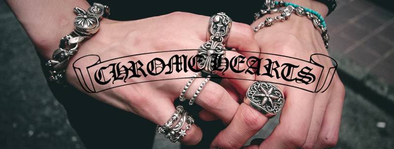
The Chrome Hearts logo stands as one of the most recognizable symbols in luxury streetwear. It carries a gothic aesthetic that feels deliberately rebellious, almost confrontational in how it presents itself to mainstream fashion.
Within the broader landscape of graphic design movements, Chrome Hearts occupies a unique position. The brand rejected clean minimalism when it launched in 1988. Richard Stark founded Chrome Hearts in Los Angeles, and the logo has gone through subtle refinements while keeping its core identity intact.
The current version maintains the gothic letterforms that defined the brand from day one. Three primary logo variations exist today, each carrying different applications across jewelry, leather goods, and apparel.
What Is the Chrome Hearts Logo?
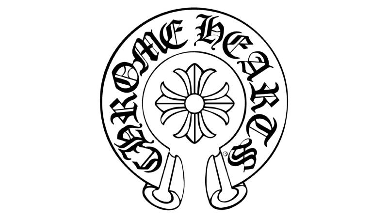
The Chrome Hearts logo is a gothic-style wordmark featuring ornate letterforms, officially introduced in 1988 by founder Richard Stark. It symbolizes rock and roll rebellion, artisan craftsmanship, and luxury exclusivity through its medieval-inspired design.
Design Type: Combination mark (wordmark with accompanying symbols)
Primary Elements:
- Gothic blackletter wordmark spelling “Chrome Hearts”
- Maltese cross symbol
- Fleur de lis motif
- Horseshoe emblem
- Dagger iconography
Official Introduction Date: 1988
Designer: Richard Stark (founder and creative director)
Trademark Status: Registered trademark, actively protected against counterfeiting
Color Palette:
- Primary Black (#000000)
- Sterling Silver (metallic application on products)
- White (#FFFFFF) for reversed applications
Usage Context: Stamped on sterling silver jewelry, embossed on leather goods, printed on apparel, etched into eyewear, applied to furniture and home goods
How Has the Chrome Hearts Logo Evolved Over Time?

The Chrome Hearts logo has remained remarkably consistent since 1988. Unlike brands that chase trends through frequent redesigns, Chrome Hearts kept its gothic foundation.
Minor refinements sharpened the letterforms over decades. The core visual language never wavered.
Original Chrome Hearts Logo (1988-1995)
Years Active: 1988-1995
Design Description: Hand-drawn gothic letterforms with uneven spacing. Raw, almost punk in execution. The letters carried visible imperfections that gave them character.
Color Scheme: Black ink on leather, sterling silver engravings
Designer: Richard Stark
Context: Chrome Hearts started as a leather motorcycle gear company. Stark wanted something that matched the Harley crowd but felt elevated. The logo needed to work when stamped into leather or engraved on silver.
Cultural Significance: It rejected the polished corporate logos of 1980s fashion. This was intentional. Stark wanted outsider credibility.
Refined Chrome Hearts Logo (1995-2010)
Years Active: 1995-2010
Design Description: Letterforms became more consistent while preserving gothic character. The kerning was tightened for better reproduction across different materials.
Color Scheme: Black primary, silver applications continued
Key Changes from Previous: Standardized letter heights, more uniform stroke weights, cleaner reproduction at smaller sizes
Context: Chrome Hearts expanded into jewelry as its primary category. The logo needed to work on tiny ring stamps and large store signage equally well.
Contemporary Chrome Hearts Logo (2010-Present)
Years Active: 2010-Present
Design Description: Digital optimization while maintaining hand-crafted appearance. Vector graphics versions now exist for digital applications.
Color Scheme: Black, white, silver remain standard
Key Changes from Previous: Subtle refinements for screen rendering, improved scalability, maintained intentional imperfections
Cultural Significance: The logo became a status symbol among celebrities. It represents authenticity in an era of mass production.
What Do the Design Elements of the Chrome Hearts Logo Mean?
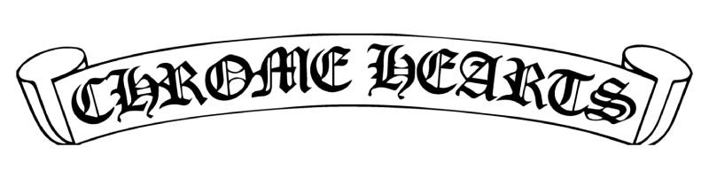
The gothic letterforms communicate rebellion against mainstream luxury. They reference medieval craftsmanship and religious iconography.
This creates tension between sacred and profane. The brand leans into that contradiction deliberately.
Why Did Chrome Hearts Choose These Specific Colors?
Black (#000000)
- Symbolic meaning: Power, mystery, luxury, rebellion
- Psychological impact: Creates exclusivity and seriousness
- Brand connection: Matches motorcycle culture roots and gothic aesthetic
Understanding color psychology explains why black dominates. It signals premium positioning without trying too hard.
Silver (Metallic)
- Symbolic meaning: Purity, craftsmanship, precious materials
- Psychological impact: Communicates value and authenticity
- Brand connection: Directly tied to sterling silver jewelry production
Many black logos in luxury fashion follow similar logic. Chrome Hearts took it further by making silver integral to product identity.
What Typography Style Is Used in the Chrome Hearts Logo?
The typeface draws from blackletter traditions. Think Old English but more aggressive.
Custom letterforms mean no standard font matches exactly. This was intentional for trademark protection.
The x-height varies slightly between letters. This irregularity creates visual interest and suggests handcraft.
Readability suffers at small sizes, honestly. But Chrome Hearts prioritizes aesthetic over legibility.
What Are the Hidden Meanings in the Chrome Hearts Logo?
The Maltese cross references both religious orders and biker culture. It works on multiple levels.
Fleur de lis motifs suggest royalty and French heritage. Strange choice for an LA brand, but it works.
Richard Stark never fully explained every symbolic choice. Some mystery remains intentional.
The dagger elements represent protection and edge. Pretty on-the-nose for a brand selling to rock stars.
How Does the Chrome Hearts Logo Compare to Competitor Logos?
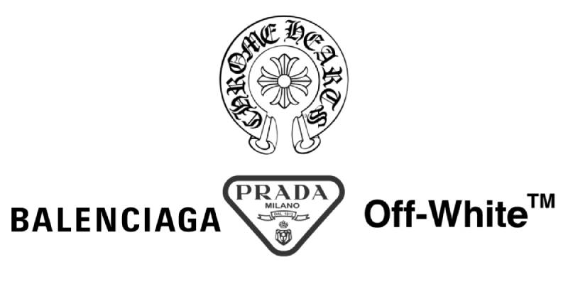
Chrome Hearts stands apart from luxury competitors. Most high-end fashion brands went minimal years ago.
Look at the Balenciaga logo or the Prada logo. Clean sans-serifs dominate that space.
Chrome Hearts refuses to follow. The gothic approach shares more DNA with the Off-White logo in terms of breaking conventions, though visually they look nothing alike.
Where Louis Vuitton logo uses refined monograms and Chanel logo relies on interlocking Cs, Chrome Hearts chose aggression over elegance.
This differentiation strategy paid off. The brand carved out space that nobody else occupies.
What Are the Technical Specifications of the Chrome Hearts Logo?

Official Color Codes:
Primary Black
White (Reversed Applications)
- Hex: #FFFFFF
- RGB: (255, 255, 255)
- CMYK: (0, 0, 0, 0)
Dimensions and Proportions:
- Aspect ratio varies by application (wordmark vs. symbol marks)
- Minimum size: 0.5 inches for engraved applications
- Clear space: Minimum of letter height on all sides
- The brand maintains strict control over proportions
High DPI files exist for print design applications. Digital versions are optimized for screens.
What Cultural Impact Has the Chrome Hearts Logo Had?
The logo became a celebrity uniform in the 2010s. Drake, Bella Hadid, Travis Scott. You see it constantly on Instagram.
It signifies insider status in fashion. Wearing Chrome Hearts means you know what you are doing.
Counterfeiting became a massive problem because of this cultural cachet. The logo itself holds value.
Younger audiences discovered the brand through hip hop. That shifted demographics significantly.
How Does the Chrome Hearts Logo Fit Into the Overall Brand Identity?
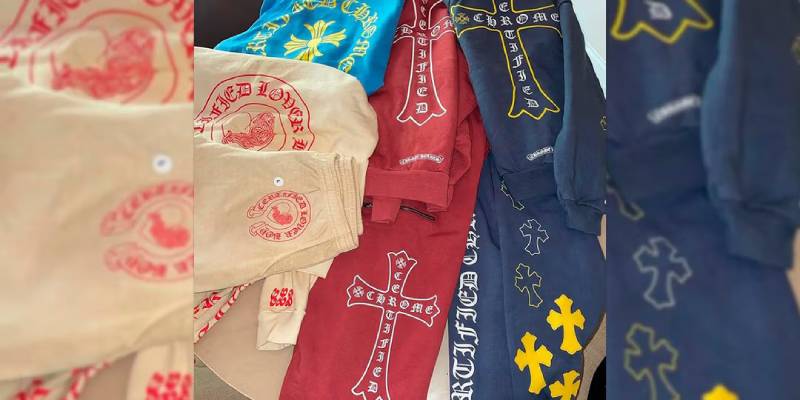
The logo anchors a complete visual system. Every product carries recognizable Chrome Hearts DNA.
The brand developed strict brand guidelines over decades. Nothing gets approved without matching the core aesthetic.
A comprehensive brand style guide controls everything from store interiors to packaging.
Cross motifs, gothic lettering, and silver hardware create unity across product categories. You recognize Chrome Hearts before reading the name.
How Should the Chrome Hearts Logo Be Used?
Official Usage Guidelines:
Do:
- Use official logo files from authorized sources
- Maintain minimum clear space requirements
- Apply on approved background colors only
- Preserve original proportions when scaling
Don’t:
- Stretch, distort, or rotate the logo
- Add effects like shadows or outlines
- Change official colors
- Combine with other brand elements
- Use unofficial recreations
Accessing Official Logos: Chrome Hearts does not provide public logo downloads. Authorized retailers receive files directly.
Licensing Information: No licensing program exists. Chrome Hearts maintains complete control over logo usage.
Trademark Protection: The company actively pursues counterfeiters. Legal action is common against unauthorized reproduction.
FAQ on The Chrome Hearts Logo
What Does the Chrome Hearts Logo Look Like?
The Chrome Hearts logo features gothic letterforms with medieval styling. It includes several iconic symbols like the Maltese cross, fleur de lis, horseshoe emblem, and dagger motif.
These elements create a distinctive luxury brand symbol. The design draws from rock and roll aesthetics mixed with religious iconography.
Who Designed the Chrome Hearts Logo?
Richard Stark created the original logo when he founded Chrome Hearts in Los Angeles in 1988. He handled the creative direction personally.
No outside design agency was involved. Stark drew inspiration from motorcycle culture and gothic art traditions prevalent in Hollywood circles at the time.
What Font Is Used in the Chrome Hearts Logo?
Chrome Hearts uses a custom blackletter font that cannot be replicated with standard typefaces. The gothic typography was hand-drawn originally.
This custom approach follows smart logo design principles. It prevents counterfeiting and creates trademark protection.
What Do the Chrome Hearts Symbols Mean?
The Maltese cross references both religious orders and biker culture. The fleur de lis suggests royalty and craftsmanship heritage.
Dagger iconography represents edge and protection. Understanding the psychology of shapes explains why these aggressive forms appeal to the brand’s audience.
Is the Chrome Hearts Logo Trademarked?
Yes. Chrome Hearts aggressively protects its designer trademark through legal action. The company pursues counterfeiters worldwide.
Every symbol, from the gothic cross design to the scroll pattern, carries legal protection. Unauthorized reproduction results in lawsuits.
Why Is the Chrome Hearts Logo So Popular?
Celebrity endorsement drove massive awareness. Drake, Bella Hadid, and Travis Scott wear Chrome Hearts constantly. This created cultural cachet.
The logo represents authenticity in an era of mass production. It signals insider knowledge about luxury streetwear and artisan jewelry.
How Can I Spot a Fake Chrome Hearts Logo?
Authentic pieces show precise sterling silver hallmarks with consistent engraving depth. Fakes often have uneven lettering and poor font spacing.
Check the jewelry mark quality carefully. Real Chrome Hearts stamps appear sharp. Counterfeits look blurry or shallow.
What Colors Are in the Chrome Hearts Logo?
The official color palette consists of black and silver primarily. White appears in reversed applications on dark backgrounds.
This monochrome approach creates strong contrast. It works equally well on leather goods, apparel, and precious metals.
Where Is the Chrome Hearts Logo Placed on Products?
Jewelry features engraved stamps on interior surfaces. Leather goods show embossed logos on straps and closures.
Apparel displays printed or embroidered marks. Eyewear carries etched temple logos. Each placement follows strict brand authentication standards.
Has the Chrome Hearts Logo Changed Over Time?
The core design remained consistent since 1988. Only subtle refinements occurred for better reproduction across materials.
Unlike brands chasing trends, Chrome Hearts kept its gothic foundation intact. This consistency built strong brand recognition over three decades.
Conclusion
The Chrome Hearts logo remains a defining symbol in luxury streetwear. Richard Stark built something that transcends typical fashion house branding.
Gothic cross designs, fleur de lis motifs, and handcrafted silver marks create instant recognition. The brand authentication value alone justifies collector interest.
Few luxury brand symbols carry this much cultural weight. Celebrity endorsement from figures like Drake and Bella Hadid only amplified what already worked.
Sterling silver jewelry bearing this mark holds resale value remarkably well. That says everything about the logo’s staying power.
The punk fashion roots still show through. Thirty-plus years later, Chrome Hearts refuses to soften its edge.

Renowned for his expertise in logo design and visual branding, Bogdan has developed a multitude of logos for various clients.
His skills extend to creating posters, vector illustrations, business cards, and brochures. Additionally, Bogdan's UI kits were featured on marketplaces like Visual Hierarchy and UI8.
He also wrote in the past years on sites like Design Your Way, WebDesignerDepot, WPDean, Designmodo, Speckyboy, Slider Revolution, and more.
- Jujutsu Kaisen Font Generator - 12 October 2026
- The Windsurf Logo History, Colors, Font, And Meaning - 10 October 2026
- How to Remove Background From Product Photos (No Photoshop) - 10 October 2026

Bogdan Sandu is a seasoned designer who has been designing websites since 2008. Renowned for his expertise in logo design and visual branding, Bogdan has developed a multitude of logos for various clients. His skills extend to creating posters, vector illustrations, business cards, and brochures. Additionally, Bogdan's UI kits were featured on marketplaces like Visual Hierarchy and UI8. He also wrote in the past years on sites like Design Your Way, WebDesignerDepot, WPDean, Designmodo, Speckyboy, Slider Revolution, and more.
You Might Also Like


