Every design that feels “right” has one thing in common. The colors, type, spacing, and imagery all work as a single composition rather than a collection of separate parts. That’s what unity in graphic design actually means.
It’s one of the core design principles, and probably the least understood. People confuse it with consistency or repetition, but unity runs deeper than following the same style rules.
This article breaks down how unity works, the methods professionals use to build it, and what happens when it falls apart. You’ll also see how movements from the Bauhaus to modern design systems each redefined visual coherence in their own way.
What Is Unity in Graphic Design
Unity is the visual and conceptual glue that makes every piece of a design feel like it belongs to the same composition. It’s one of the core graphic design principles, and probably the most misunderstood.
When a layout has unity, your eye moves across it without friction. Nothing feels random. The colors, the type choices, the spacing, the imagery. All of it talks to each other.
Without it? You get visual noise. The kind of design that makes people squint, scroll past, or close the tab entirely.
A Behaviour and Information Technology study found that users form opinions about a page’s visual appeal in just 50 milliseconds. That snap judgment depends heavily on whether the composition reads as one cohesive piece or a pile of disconnected parts.
Unity sits alongside balance, contrast, emphasis, and visual hierarchy as a foundational principle of design composition. But where those others control specific relationships between design elements, unity is the big-picture result. It’s the feeling that everything was placed with intention.
The theoretical backbone here comes from Gestalt psychology. Max Wertheimer, Wolfgang Köhler, and Kurt Koffka established in the 1920s that the human brain naturally groups visual information into patterns and wholes. We don’t process individual shapes and colors in isolation. We look for connections, and when those connections exist, we perceive the design as unified.
According to Figma’s research documentation, the human brain processes up to 11 million bits of sensory data per second, with roughly 80% entering through the visual cortex. That’s a lot of information to sort through. Unity makes the brain’s job easier by reducing visual complexity into a single, organized experience.
Look, this isn’t just an abstract art school concept. Brands like Apple and Coca-Cola have built their entire visual identity around it. Every touchpoint, from packaging to websites to billboards, feels unmistakably theirs. That’s unity working at scale.
How Unity Differs from Harmony, Consistency, and Repetition

People mix these up constantly. And honestly, I get it. They overlap. But they’re not interchangeable, and treating them like they are leads to weak design decisions.
Unity vs. Harmony
Harmony is about how pleasing the arrangement of elements feels. It’s the aesthetic quality of parts working well together.
Unity is broader. You can have a harmonious color scheme inside a composition that still lacks unity because the typography and layout are pulling in a completely different direction.
Think of it this way: harmony is one instrument playing well. Unity is the whole orchestra sounding like a single performance.
Unity vs. Consistency
Consistency means following the same style rules across a project. Same margins, same font sizes, same button colors.
It’s a tool that can build unity, but consistency alone won’t create it. A design can be perfectly consistent (same grid, same palette, same type scale everywhere) and still feel lifeless or disconnected from its message. Unity requires conceptual coherence on top of visual uniformity.
Renderforest reports that 71% of businesses agree inconsistent brand presentation leads to customer confusion. Consistency prevents confusion, yes. But unity creates recognition and trust.
Unity vs. Repetition
Repetition is a technique. You repeat a shape, a color, a visual motif. It’s one of several methods designers use to achieve unity, not the thing itself.
You can repeat elements obsessively and still end up with a monotonous layout that lacks any real sense of cohesion. The difference is intent. Repetition without purpose is decoration. Repetition with purpose is a building block toward a unified composition.
| Concept | What It Means | Relationship to Unity |
|---|---|---|
| Harmony | Elements arranged pleasingly together | Contributes to, but doesn’t guarantee unity |
| Consistency | Uniform style rules applied throughout | A tool that supports unity |
| Repetition | Reusing specific visual elements | A technique for creating unity |
| Unity | Total visual and conceptual coherence | The overall result |
Types of Unity in Design

Unity isn’t monolithic. It shows up in different ways depending on what’s holding the composition together. Most professional work uses more than one type at the same time, which is part of what makes strong design feel so effortless to look at.
Visual Unity
This is the most immediately obvious form. It comes from shared visual qualities across a layout.
- A restricted color palette tying every section together
- Consistent typographic hierarchy from heading to body text
- Grid systems maintaining structural coherence across pages
Consistent color usage alone can boost brand recognition by up to 80%, according to multiple branding studies cited by Zippia and Demand Metric. That’s visual unity doing measurable work.
Conceptual Unity
This one runs deeper. Conceptual unity exists when the theme, message, or narrative behind a design is coherent throughout. The visuals might vary, but the idea stays locked in.
A campaign for a sustainable brand might use different layouts across print and digital, but if every piece communicates the same environmental message through imagery, color psychology, and tone, that’s conceptual unity.
You see this a lot in storytelling driven design, where the narrative thread holds everything together regardless of the visual format.
Gestalt Unity
This is where perception science meets design practice. Gestalt principles describe how the brain naturally organizes visual input, and designers exploit these patterns to create automatic cohesion.
Proximity
Elements placed close together get read as a group. Proximity is probably the simplest way to signal that two things are related.
Similarity
When shapes, sizes, or colors match, the brain connects them. This is why consistent button styling across an interface immediately feels organized.
Continuation
The eye follows lines and curves naturally. Alignment exploits this. When elements sit along the same visual path, they feel unified even if they’re different shapes or sizes.
Closure
The brain fills in gaps to perceive complete shapes. This is why minimalist design works. You don’t need to show everything for the viewer to perceive the whole.
Research from the Interaction Design Foundation notes that every dollar invested in UX design (which relies heavily on these Gestalt grouping principles) returns roughly $100 in measurable value. That’s not a design theory argument. That’s a business case.
Methods Designers Use to Build Unity
Knowing what unity is doesn’t help much if you can’t produce it. This section is the practical part. These are the specific tools and techniques that working designers rely on, and I’ve seen most of these applied in real production environments.
Grid Systems and Structural Frameworks

Grids are the skeleton of unified layouts. The 12-column grid is standard in web design. Adobe InDesign uses baseline grids for editorial work. Figma’s auto-layout feature enforces structural consistency in UI design.
An 8-point spacing grid (where all spacing values are multiples of 8) has become the default in most modern design systems. Google’s Material Design and Apple’s Human Interface Guidelines both follow this pattern.
The golden ratio and the rule of thirds still show up regularly in composition decisions, though I’ll admit most people apply them intuitively after a while rather than calculating proportions manually.
Color and Type Restrictions
Fewer choices, more unity. That’s the general rule.
Restricting your color theory application to a primary palette of 2-3 colors plus neutrals forces visual cohesion. Schemes like analogous colors or monochrome colors naturally read as unified because they share underlying hue relationships.
On the type side, sticking to one typeface family (or at most two, if you’re pairing fonts carefully) keeps the text layer consistent. Control the leading, tracking, and kerning across the board, and the typography starts to feel like a system instead of a collection of random text blocks.
The Role of Design Systems and Style Guides
Sparkbox’s 2024 research found that design system adoption accelerates front-end development by 47%, with 38% gains for design teams specifically. But the unity benefit goes beyond speed.
Companies like Airbnb, IBM (Carbon Design System), and Atlassian built design systems that standardize everything from spacing tokens to interaction patterns. When every component comes from the same system, visual unity happens automatically across products, pages, and platforms.
Brand guidelines and brand style guides serve the same function for broader brand identity. They codify the rules that maintain unity when multiple designers or teams are touching the same brand.
Still, rigid systems have limits. Only 40% of design systems remain active beyond 18 months, according to the 2025 Design Systems Survey. That’s a governance problem more than a design one, but it shows that maintaining unity at scale takes ongoing effort.
White Space as a Unifying Force
White space is not filler. It’s a design element with just as much power as color or type.
Consistent spacing around and between elements creates rhythm in a layout. It groups related content, separates unrelated content, and gives the eye a clear path through the composition. Swiss design made this into an art form back in the mid-20th century, and the principle hasn’t changed.
Unity in Different Graphic Design Disciplines
Unity doesn’t look the same everywhere. What works in a poster design doesn’t automatically translate to a mobile app or a product box. The medium shapes how unity gets built and maintained.
Brand Identity and Logo Systems
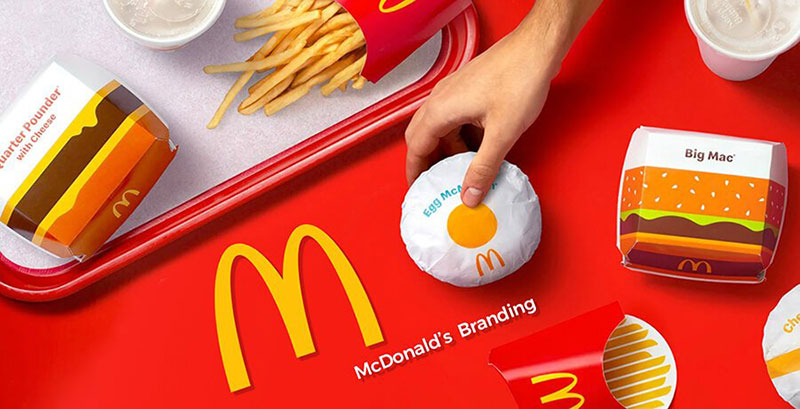
This is probably where unity matters most, financially speaking. Consistent brand presentation across all platforms can increase revenue by up to 23%, according to multiple studies cited by Demand Metric and LinkedIn.
A strong logo anchors the whole thing. But logo design on its own isn’t enough. The logo has to work within a system of brand typography, color standards, imagery style, and layout conventions that all speak the same visual language.
Apple is the textbook example. Every product page, retail store, keynote slide, and packaging box follows the same minimal aesthetic. You’d recognize an Apple ad with the logo covered. That’s unity at the brand level.
Editorial and Print
Try maintaining visual coherence across a 200-page magazine. That’s the challenge in print design and editorial work.
Publications like National Geographic pull it off through master page templates, consistent type scales, and strict color guidelines. The grid does most of the heavy lifting. Each spread can feel different enough to stay interesting, but the underlying structure ties it all back together.
Book cover design and framing decisions in editorial layouts both rely on establishing a visual system early and sticking to it throughout.
Web and UI Design
Component libraries and responsive design frameworks keep digital products unified across breakpoints and screen sizes.
The Baymard Institute found that consistent interfaces can boost conversion rates by up to 20%, while 68% of users abandon products that feel inconsistent or confusing (Adobe, 2024). That makes unity a conversion issue, not just a design preference.
Design tokens (standardized values for color, spacing, and typography stored as variables) are the current best practice. Figma, Tokens Studio, and tools tied into CI/CD pipelines help teams push unified design decisions directly into code.
Packaging and Motion Graphics
Packaging design has to maintain unity across a product line while still differentiating individual items. Think of any cereal brand’s shelf presence: the family resemblance between boxes needs to be instant, even from a distance.
In motion graphics, unity becomes temporal. Consistent transition styles, pacing, color grading, and type animations hold a piece together across time. Cropink’s data shows that 71% of brands now use motion graphics and video-based design in their marketing, making temporal unity increasingly relevant.
What Happens When Unity Breaks Down

Bad unity isn’t subtle. Your audience may not be able to name the problem, but they’ll feel it. Layouts that lack visual coherence create cognitive friction, the kind that makes people click away or distrust what they’re reading.
Visual Noise and Cognitive Overload
When too many competing styles, colors, typefaces, and layout patterns hit the screen at once, the brain can’t group anything into a coherent whole.
Forbes reports that 94% of first impressions are design-related. A chaotic first impression doesn’t just look bad. It actively damages perceived credibility before anyone reads a single word.
G2’s research adds that 50% of internet users say website design shapes their brand opinions. So visual noise isn’t just an aesthetic failure. It’s a business problem.
Inconsistent Branding and Audience Confusion
The 2010 Gap logo redesign is still the go-to case study here. The company swapped its iconic blue-box logo for a generic Helvetica wordmark with a small blue square. It lasted six days before public backlash forced a reversal.
The issue wasn’t that the new logo was ugly. It was disconnected from the brand’s existing visual language. There was no unity between what customers expected and what they received.
According to Demand Metric, uniformly presented brands are 3.5 times more visible to customers. Break that consistency, and you’re actively making yourself harder to find and recognize.
Hierarchy Collapse
Unity and movement through a layout are closely linked. When nothing feels connected, the eye doesn’t know where to go first. The focal point disappears. Headlines compete with body copy. Calls to action blend into the background.
This is different from intentional contrast or variety. Deliberate contrast serves unity by creating structured differences. Accidental disunity just creates confusion.
McKinsey’s 2024 research indicates that streamlined, consistent design systems cut 30-40% of development costs by reducing duplication and technical debt. The cost of disunity isn’t just lost users. It’s wasted resources fixing fragmented design work after the fact.
Unity vs. Variety: Finding the Balance
Too much unity and you get boredom. Too much variety and you get chaos. Every working designer deals with this tension on every single project.
The actual goal is “unity with variety.” It’s the working principle most professionals follow, even if they don’t articulate it that way. You build a strong visual foundation, then introduce controlled differences to keep the viewer engaged.
| Problem | What It Looks Like | Typical Cause |
|---|---|---|
| Too much unity | Flat, monotonous, forgettable | No variation in size, weight, or spacing |
| Too much variety | Chaotic, disorienting, unprofessional | Too many fonts, colors, or layout patterns |
| Balanced | Cohesive but visually interesting | Dominant style plus controlled variation |
How Contrast Works Within Unity
Contrast isn’t the opposite of unity. It’s one of the best tools for making a unified layout actually interesting.
A large heading against small body text. A bright accent color against a muted background. A display font paired with a clean sans-serif font. These differences serve the composition as long as they’re deliberate.
The Swiss International Typographic Style proved this. Josef Müller-Brockmann’s posters are some of the most unified compositions in design history, yet they rely heavily on scale and proportion contrast to create visual interest.
Practical Ratio Thinking
MindInventory’s UX research found that roughly 60% of users prefer simple interfaces over complex ones, and 84.6% prefer clean, organized layouts to cluttered alternatives.
That tracks with how most experienced designers approach the ratio. You pick a dominant style (the “unity” part), then allow 10-20% variation (the “variety” part). A layout with three typefaces is pushing it. Four? That’s almost always too many.
Coca-Cola’s brand system shows this well. The red-and-white scheme stays locked in across everything. But individual campaigns introduce unique photography, illustration styles, or layout treatments that keep it from looking stale.
How to Evaluate Unity in Your Own Work
Designing unity is one thing. Actually checking whether you got there is another. Most designers rely on a mix of quick visual tests and structured critique questions.
The Squint Test
Blur your vision and look at the layout. If it still reads as one organized piece rather than a scattered collection of parts, unity is probably working.
This is crude, but it’s fast. It strips away the details and shows you the raw structure, the big shapes, the color distribution, the overall visual weight. Took me a long time to trust this method, but it catches problems that pixel-level scrutiny misses.
Checking for Orphaned Elements
Look for anything that doesn’t connect visually to the rest of the composition.
- A color that only appears once and doesn’t relate to the palette
- A typeface used in a single spot with no repetition elsewhere
- An image style that clashes with the rest of the visual treatment
Every element should be able to justify its presence. If you can delete something and the layout feels more unified, it probably shouldn’t have been there.
Peer Critique Questions for Unity
When you hand a layout to someone else, asking “does this look good?” won’t tell you much. Better questions target unity specifically.
Ask these instead:
- “Does this feel like one piece or multiple designs stitched together?”
- “Which element feels the most out of place?”
- “Can you tell what the visual system is here?”
Stanford’s web credibility research found that 75% of users judge a company’s credibility based on website design alone. If your peer can’t identify the visual system, your audience won’t either.
Tool-Assisted Evaluation
Color consistency: Use accessibility checkers like WebAIM or the Stark plugin in Figma to audit your color usage across a layout. Inconsistent saturation levels or random color contrast ratios are quick indicators of broken unity.
Spacing audits: In Figma or Adobe InDesign, measure the spacing between repeating elements. If margins jump from 16px to 24px to 12px with no clear logic, the grid isn’t doing its job.
Unity in Graphic Design Across Historical Movements
Every major graphic design movement had its own definition of what “unified” meant. What the Bauhaus considered cohesive looked nothing like what De Stijl or the Postmodernists were going for. Understanding how different eras approached unity gives you more tools to work with today.
Bauhaus and Total Design Unity
The Bauhaus school (1919-1933) pushed the idea that all creative disciplines should operate under one unified system. “Form follows function” was the core motto.
Walter Gropius, Wassily Kandinsky, and Paul Klee taught at the school. Their work on color theory, the psychology of shapes, and typographic hierarchy directly shaped what we now consider fundamental design methodology.
Herbert Bayer’s Universal typeface (1925), designed for the school, was an early attempt at creating a single, unified typography system stripped of decoration. That same impulse toward functional unity drives modern sans-serif type design today.
Swiss International Typographic Style

Grid-based visual coherence, taken to its most refined form. The International Typographic Style came out of 1950s Switzerland and treated the mathematical grid as the primary tool for creating unified layouts.
Key figures: Josef Müller-Brockmann, Armin Hofmann, and Max Bill. Their work at the Kunstgewerbeschule in Zurich and the Schule für Gestaltung in Basel produced design principles still taught in every design program on the planet.
Helvetica, designed during this era, became almost synonymous with the idea of typographic unity. Its clean neutrality let the grid and the content do the talking. Philip B. Meggs noted in his History of Graphic Design that the Swiss grid was considered the most legible and harmonious way to structure information.
De Stijl and Geometric Abstraction
Piet Mondrian and Theo van Doesburg took a completely different path. De Stijl (1917-1931) pursued unity through radical reduction: only primary colors, black, white, and straight lines.
The result was a kind of spiritual harmony through geometric abstraction. Every element in a De Stijl composition followed the same strict visual rules, creating an almost mathematical sense of cohesion. The Constructivism movement in Russia pursued similar goals through different visual means.
How These Movements Compare
| Movement | Era | Unity Strategy | Primary Tool |
|---|---|---|---|
| Bauhaus | 1919–1933 | Function-driven coherence | Interdisciplinary systems |
| De Stijl | 1917–1931 | Geometric reduction | Primary colors + straight lines |
| Swiss Style | 1950s–1960s | Grid-based precision | Mathematical grids + sans-serif type |
| Postmodern | 1970s–1990s | Intentional fragmentation | Collage, mixed styles, rule-breaking |
Contemporary Digital Design
Modern tools have changed the mechanics of unity without changing the principle. Figma’s auto-layout, design tokens, and component-based architecture enforce structural unity automatically across products, pages, and screen sizes.
According to the 2025 Design Systems Survey, 71% of design teams expect to use AI automation within their workflows. That’s another layer of enforced consistency, where spacing, color, and type decisions get standardized at the code level.
But here’s the thing. Tools can enforce consistency. They can’t create conceptual unity. That still requires a human deciding what the design is about and making sure every element serves that idea. The mood board and creative brief still matter more than any plugin.
Every famous graphic designer you can name, from Massimo Vignelli to Paula Scher, built their reputation on a strong sense of visual unity applied across diverse projects. The tools change. The principle doesn’t.
FAQ on What Is Unity In Graphic Design
What is the definition of unity in graphic design?
Unity is the principle that makes all elements in a composition feel connected. Colors, type, spacing, and imagery work together as a whole rather than competing parts. It’s the difference between a cohesive layout and visual clutter.
Why is unity considered one of the most important design principles?
Without unity, viewers can’t process information efficiently. The brain needs visual patterns to make sense of a layout. Strong unity builds trust, guides the eye, and makes communication clearer across any medium.
What is the difference between unity and harmony in design?
Harmony describes how pleasing individual elements look together. Unity is broader. A design can have harmonious colors but still lack unity if the typography and layout pull in completely different directions.
How do Gestalt principles relate to unity?
Gestalt psychology explains how the brain groups visual information. Principles like proximity, similarity, continuation, and closure are the cognitive mechanisms that make viewers perceive separate elements as one unified composition.
What are the main types of unity in graphic design?
Three types. Visual unity comes from shared colors, fonts, and grids. Conceptual unity comes from a consistent theme or message. Gestalt unity comes from how the brain naturally organizes spatial relationships between elements.
How do designers achieve unity in a layout?
Grid systems, restricted color palettes, consistent type scales, and repeating visual motifs. Design systems and style guides formalize these choices. White space ties sections together by controlling the rhythm between elements.
Can a design have too much unity?
Yes. Excessive unity creates monotony. When everything looks identical, nothing stands out. The goal is unity with variety, where a dominant visual system includes controlled differences that keep the viewer engaged.
How does unity affect brand identity?
Consistent visual language across all touchpoints (packaging, web, print) builds recognition. Studies show consistent brand presentation can boost revenue by up to 23%. Apple and Coca-Cola are textbook examples of brand-level unity.
What tools help evaluate unity in a design?
The squint test reveals raw structure by blurring details. Figma’s spacing tools audit consistency. Accessibility plugins like Stark check color usage. Peer critique with targeted questions catches problems individual review misses.
How did historical design movements approach unity differently?
The Bauhaus used function-driven systems. Swiss Style relied on mathematical grids and sans-serif type. De Stijl reduced everything to primary colors and straight lines. Each movement redefined coherence for its era.
Conclusion
Understanding what is unity in graphic design comes down to one thing: making every element serve the same visual and conceptual goal. It’s not about rigid sameness. It’s about intentional relationships between color, typeface choices, spacing, and imagery.
The Gestalt principles give you the science behind it. Grid systems, brand guidelines, and design tokens give you the practical framework.
But tools alone won’t get you there. Strong visual coherence still requires a human deciding what the composition is about and holding every decision accountable to that direction.
Start with your next project. Run the squint test. Check for orphaned elements. Ask whether each piece justifies its place. Unity isn’t a finishing touch. It’s the foundation that makes everything else work.

Renowned for his expertise in logo design and visual branding, Bogdan has developed a multitude of logos for various clients.
His skills extend to creating posters, vector illustrations, business cards, and brochures. Additionally, Bogdan's UI kits were featured on marketplaces like Visual Hierarchy and UI8.
He also wrote in the past years on sites like Design Your Way, WebDesignerDepot, WPDean, Designmodo, Speckyboy, Slider Revolution, and more.
- Canva vs Midjourney: AI Design Tools Compared - 28 September 2026
- A Brand Identity Is Only Finished When Someone Else Can Use It - 28 September 2026
- Friendly Karla Font Pairing Ideas for Modern Brands - 26 September 2026

Bogdan Sandu is a seasoned designer who has been designing websites since 2008. Renowned for his expertise in logo design and visual branding, Bogdan has developed a multitude of logos for various clients. His skills extend to creating posters, vector illustrations, business cards, and brochures. Additionally, Bogdan's UI kits were featured on marketplaces like Visual Hierarchy and UI8. He also wrote in the past years on sites like Design Your Way, WebDesignerDepot, WPDean, Designmodo, Speckyboy, Slider Revolution, and more.
You Might Also Like